How can I help you?
Rows in WinUI TreeGrid
27 Feb 20257 minutes to read
This section explains about various row types in treegrid and its customization.
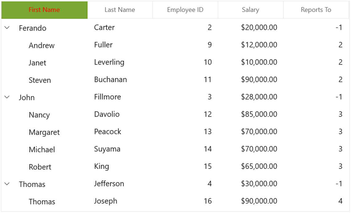
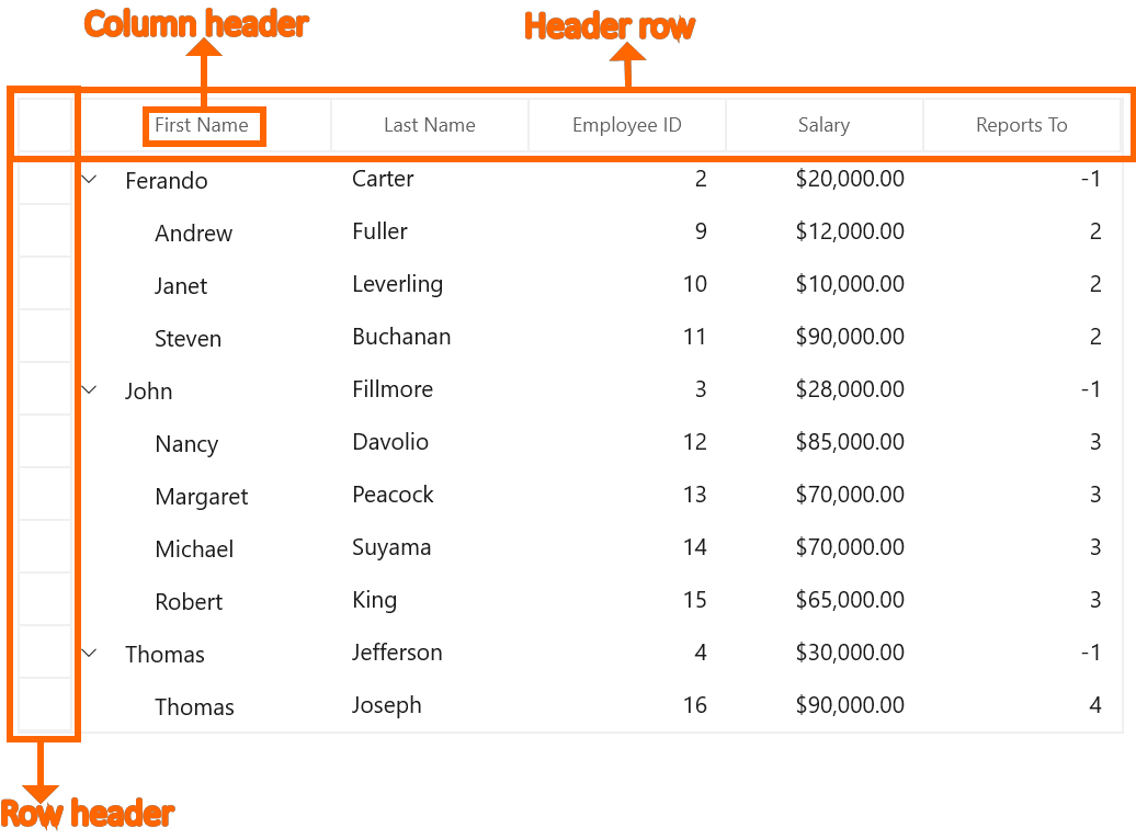
Row header
RowHeader is a special column used to indicate the status of row (current row, editing status, errors in row, etc.) which is placed as first cell of each row. You can show or hide the row header by setting SfTreeGrid.ShowRowHeader property.
<treeGrid:SfTreeGrid Name="treeGrid"
                       ColumnWidthMode="Star"
                       AutoExpandMode="AllNodesExpanded"
                       ShowRowHeader="True"
                       AutoGenerateColumns="False"
                       ChildPropertyName="Children"
                       ItemsSource="{Binding EmployeeDetails}" />
Row indicators and its description
| Row Indicator | Description |
|---|---|

|
Denotes the row which has current cell or selected item. |

|
Denotes row is being edited. |

|
Denotes the row has errors. |
Show row index in row header
You can display the row index value in row header by customizing the TreeGridRowHeaderCell style with the binding of RowIndex to TextBlock.Text property.
<Style TargetType="treeGrid:TreeGridRowHeaderCell">
    <Setter Property="Background" Value="Transparent" />
    <Setter Property="BorderBrush" Value="#FFE5E5E5" />
    <Setter Property="BorderThickness" Value="0,0,1,1" />
    <Setter Property="Padding" Value="0" />
    <Setter Property="IsTabStop" Value="False" />
    <Setter Property="Template">
        <Setter.Value>
            <ControlTemplate TargetType="treeGrid:TreeGridRowHeaderCell">
                <Border x:Name="PART_RowHeaderCellBorder"
            Background="{TemplateBinding Background}"
            BorderBrush="{TemplateBinding BorderBrush}"
            BorderThickness="{TemplateBinding BorderThickness}">
                    <Grid>
                        <!--RowIndex is displayed here -->
                        <TextBlock HorizontalAlignment="Center"
                        VerticalAlignment="Center"
                        Text="{Binding RowIndex,
                                          RelativeSource={RelativeSource TemplatedParent}}"
                        TextAlignment="Center" />
                    </Grid>
                </Border>
            </ControlTemplate>
        </Setter.Value>
    </Setter>
</Style>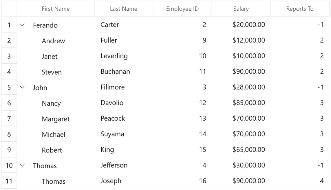
Header row
Header row is present in top of the treegrid which has column headers in it. Column header describes the caption to identify the column content.
Hiding header row
You can hide the header row by setting SfTreeGrid.HeaderRowHeight as 0 (zero).
<treeGrid:SfTreeGrid Name="treeGrid"
                       ColumnWidthMode="Star"
                       AutoExpandMode="AllNodesExpanded"
                       ShowRowHeader="True"
                       HeaderRowHeight="0"
                       AutoGenerateColumns="False"
                       ChildPropertyName="Children"
                       ItemsSource="{Binding EmployeeDetails}" />
Customize style of header row
You can change the header cell background and foreground for specific column or an entire grid by using HeaderStyle property.
<Grid>
    <Grid.Resources>
        <Style TargetType="treeGrid:TreeGridHeaderCell" x:Key="headerStyle">
            <Setter Property="Background" Value="#FF7AA732"/>
            <Setter Property="Foreground" Value="Red"/>
        </Style>
    </Grid.Resources>
<treeGrid:SfTreeGrid Name="treeGrid"
                       ColumnWidthMode="Star"
                       AutoExpandMode="AllNodesExpanded"
                       HeaderStyle="{StaticResource headerStyle}"
                       AutoGenerateColumns="False"
                       ChildPropertyName="Children"
                       ItemsSource="{Binding EmployeeDetails}" />
</Grid>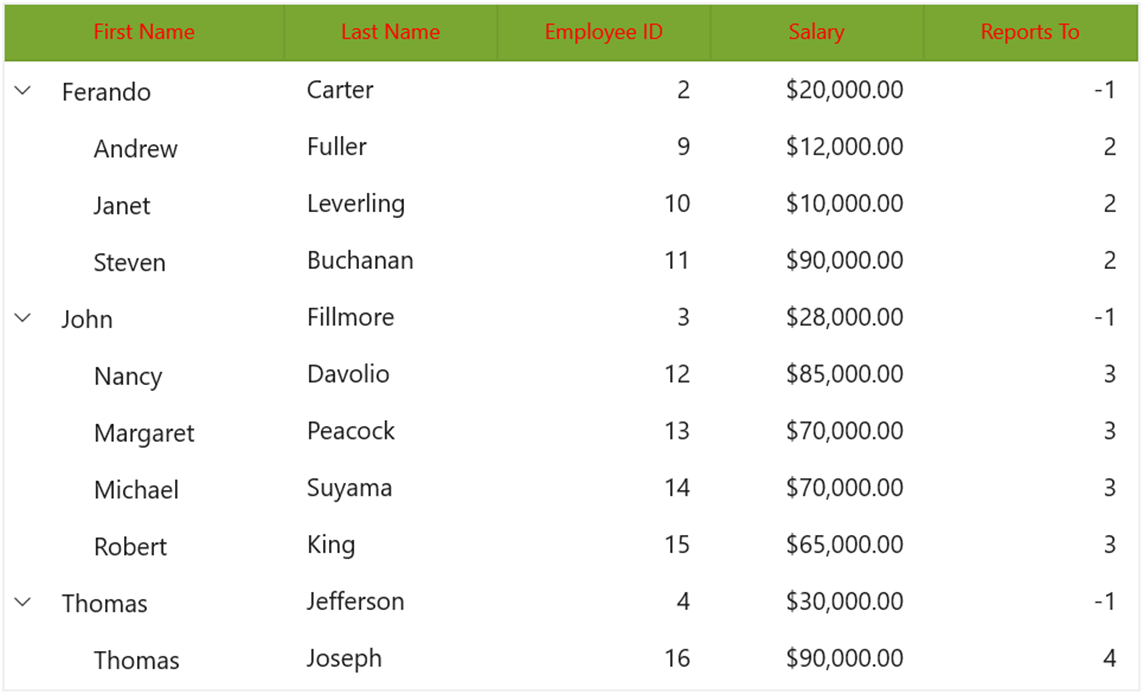
You can change the style of the particular column header by using the HeaderStyle property in column,
<syncfusion:TreeGridTextColumn HeaderText="First Name" HeaderStyle="{StaticResource headerStyle}" MappingName="FirstName" />