Filtering in WinUI TreeGrid
9 Jul 202624 minutes to read
Filtering is the process of retrieving the values from a collection that satisfies the specified condition. In SfTreeGrid, filtering can be applied through the UI as well as the programmatic filters.
FilterLevel
You can filter the nodes based on level using the SfTreeGrid.FilterLevel property.
treeGrid.FilterLevel = FilterLevel.All;-
Root - Filter will be applied to root nodes only in SfTreeGrid.
-
All - Filter will be applied to all the nodes in SfTreeGrid.
-
Extended - Filtering is applied based on the node hierarchy. Child nodes are included in filtering only when their parent node is expanded. If a node matches the filter condition, all of its ancestor nodes are displayed to preserve the hierarchy, even if those ancestor nodes do not match the filter condition.
Root
Filter will be applied to root nodes only in SfTreeGrid. For other nodes, IsFiltered value will be false, and they always will be displayed in view.
All
Filter will be applied to all the nodes in SfTreeGrid. If a parent node does not match the filter condition, filter will not be applied for child nodes. Else, filter will be applied to its child nodes also.
Extended
Filtering is applied based on the node hierarchy. Child nodes are included in filtering only when their parent node is expanded. If a node matches the filter condition, all of its ancestor nodes are displayed to preserve the hierarchy, even if those ancestor nodes do not match the filter condition. In such cases, the ancestor node’s IsFiltered property is set to false.
NOTE
You can change the
FilterLevelat run time.
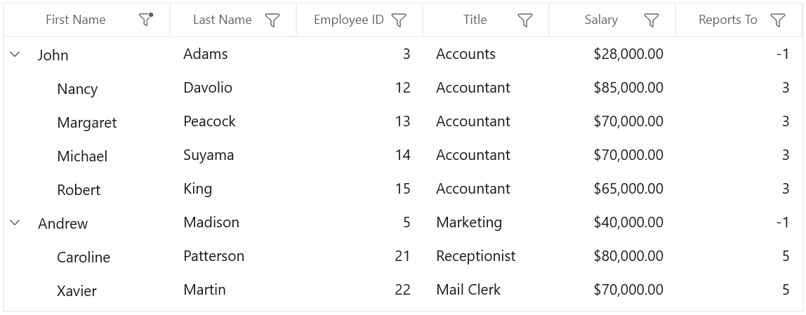
Programmatic filtering
The programmatic filtering can be applied to SfTreeGrid using the following methods:
- View Filtering
- Column Filtering
View filtering
View filtering can be achieved by setting the SfTreeGrid.View.Filter delegate and calling the SfTreeGrid.View.RefreshFilter method.
public bool FilerNodes(object o)
{
    var data = o as Employee;

    if (data.Salary > 12000)
        return true;
    return false;
}

private void Button_Click(object sender, RoutedEventArgs e)
{
    if (treeGrid != null && treeGrid.View != null)
    {
    	treeGrid.View.Filter = FilerNodes;
    	treeGrid.View.RefreshFilter();
    }
}
Here, FilterNodes delegate filters the data based on Salary. FilterNodes delegate is assigned to SfTreeGrid.View.Filter method is called to refresh the nodes. If the node satisfies the filter conditions, true will be returned. Else false will be returned.
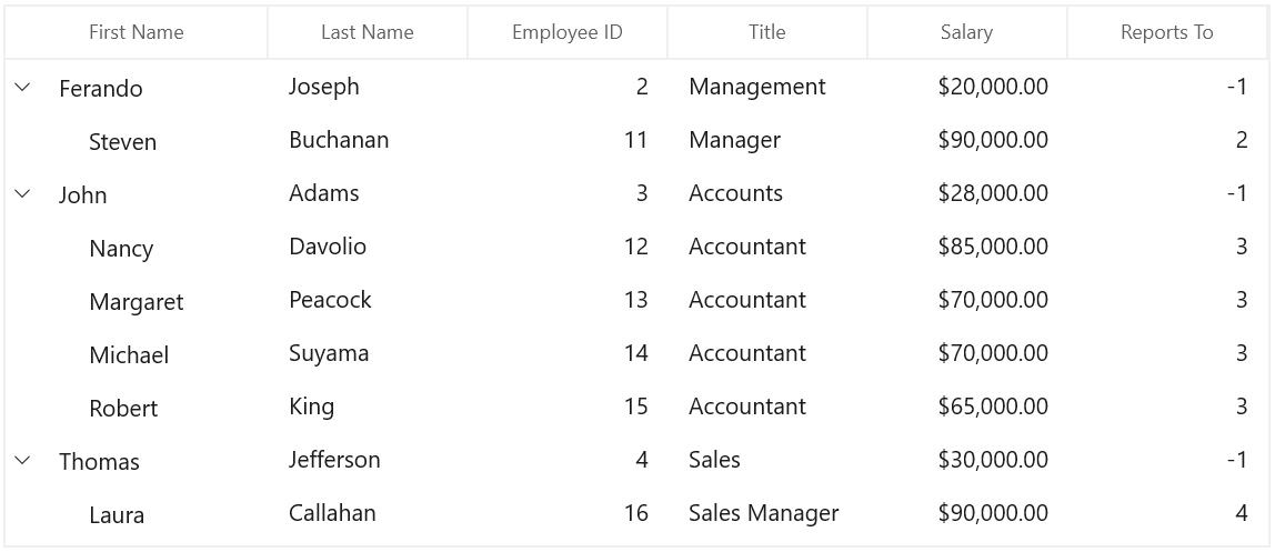
While filtering, if the node satisfies filter condition, IsFiltered property of TreeNode will be set as false. Else, it will be true. If IsFiltered value is True, the node will not be displayed in view, else it will be displayed in view.
NOTE
SfTreeGrid refreshes the filtering on property change if SfTreeGrid.LiveNodeUpdateMode is set as
AllowDataShaping.
Clear filters
You can clear the view filters applied in tree grid by setting the SfTreeGrid.View.Filter delegate to null and calling the SfTreeGrid.View.RefreshFilter method.
treeGrid.View.Filter = null;
treeGrid.View.RefreshFilter();
HasVisibleChildNodes
You can find whether a particular node has child node(s) displayed in a view (matches filtering criteria) using the HasVisibleChildNodes property in TreeNode.
var treeNode=treeGrid.View.Nodes[0];
var hasVisibleChildNodes = treeNode.HasVisibleChildNodes;
Column filtering
The column filtering can be achieved by adding the FilterPredicate to the TreeGridColumn.FilterPredicates property.
this.treeGrid.Columns["FirstName"].FilterPredicates.Add(
  new FilterPredicate()
  {
      FilterType = FilterType.Equals,
      FilterValue = "Chester"
  });
Filter behavior
The FilterBehavior property is used to specify whether to consider the FilterValue as string or specific data type.
- StringTyped - Records are filtered without considering the type and it takes FilterValue type as string.
- StronglyTyped - Records are filtered by considering the FilterValue underlying type.
Clear filtering
The filters applied to SfTreeGrid can be removed by clearing the FilterPredicates added for the columns. This can be achieved using the following methods:
- SfTreeGrid.ClearFilters - Clears filters for all the columns programmatically.
- SfTreeGrid.ClearFilter(String columnName) - Clears the filter for a specific column that has the columnName as MappingName.
- SfTreeGrid.ClearFilter(TreeGridColumn column) - Clears the filter for a specific column alone.
this.treeGrid.ClearFilters();
this.treeGrid.ClearFilter("FirstName");
this.treeGrid.ClearFilter(this.treeGrid.Columns["FirstName"]);
Adding multiple filter predicates for a column
The PredicateType property is used to apply multiple FilterPredicates for a column.
- And: Performs And operation in filters.
- AndAlso: Performs AndAlso operation in filters.
- Or: Performs Or operation in filters.
- OrElse: Performs OrElse operation in filters.
this.treeGrid.FilterLevel = FilterLevel.Root;

this.treeGrid.Columns["FirstName"].FilterPredicates.Add(
    new FilterPredicate()
    {
        FilterType = FilterType.Equals,
        FilterValue = "Theodore",
        PredicateType = PredicateType.Or
    });

this.treeGrid.Columns["FirstName"].FilterPredicates.Add(
    new FilterPredicate()
    {
        FilterType = FilterType.Equals,
        FilterValue = "Zachary",
        PredicateType = PredicateType.Or
    });
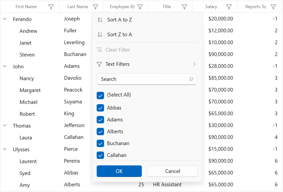
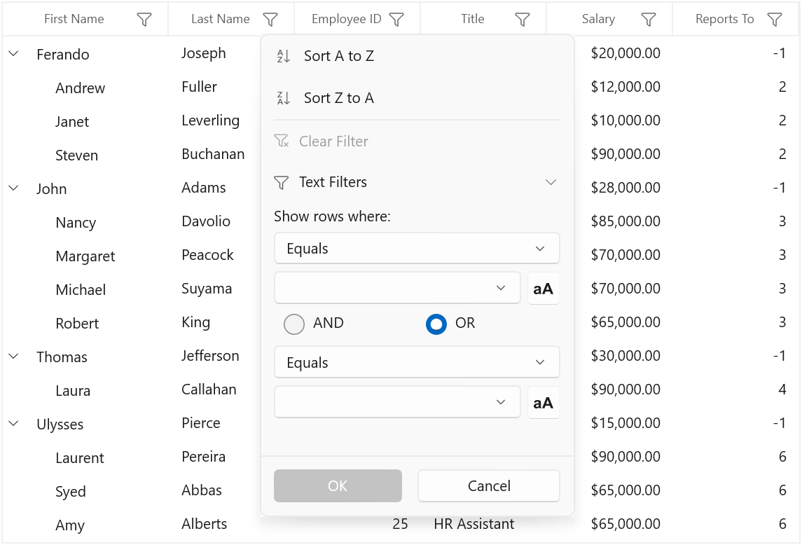
UI filtering
SfTreeGrid provides Excel-like filtering UI and advanced filter UI to filter the data easily. UI filtering can be enabled by setting the SfTreeGrid.AllowFiltering property to true. This allows to open the filter UI by clicking the filter icon on the column header to filter the nodes.
The filtering can be enabled or disabled for a specific column by setting the TreeGridColumn.AllowFiltering property.
// Enable UI filtering for SfTreeGrid.
this.treeGrid.AllowFiltering = true;

// Enable UI filtering for EmployeeID column.
this.treeGrid.Columns["EmployeeID"].AllowFiltering = true;
NOTE
TreeGridColumn.AllowFilteringhas higher priority than theSfTreeGrid.AllowFilteringproperty.
Built-in UI views
The SfTreeGrid provides the following types of filter pop-up modes:
-
Check box filter: Provides Excel-like filter interface with a list of check boxes.
-
Advanced filter: Provides advanced filter options to filter the data.
-
Both: Both check box filter and advanced filter are loaded while opening the filter pop-up.
By default, the filter pop-up mode of the column is set to Both. The check box and the advanced filters can be switched using the Advanced Filter button.
Checkbox filtering UI
Advanced filtering UI
Changing filter UI for grid
Filter UI view can be changed for all the columns in grid by changing the FilterMode in TreeGridFilterControl by writing style and assign it to SfTreeGrid.FilterPopupStyle.
xmlns:treeGridFiltering="using:Syncfusion.UI.Xaml.TreeGrid.Filtering"

<Application.Resources>
    <Style x:Key="filterControlStyle" TargetType="treeGridFiltering:TreeGridFilterControl">
        <Setter Property="FilterMode" Value="AdvancedFilter" />
    </Style>
</Application.Resources><treeGrid:SfTreeGrid Name="sfTreeGrid"
FilterPopupStyle="{StaticResource filterControlStyle}"
AllowFiltering="True”
ItemsSource="{Binding EmployeeDetails}" />Changing filter UI for a column
Filter UI view can be changed for a specific column by changing the FilterMode in TreeGridFilterControl by writing style and assigning it to TreeGridColumn.FilterPopupStyle.
xmlns:treeGridFiltering="using:Syncfusion.UI.Xaml.TreeGrid.Filtering"

<Application.Resources>
    <Style x:Key="filterControlStyle" TargetType="treeGridFiltering:TreeGridFilterControl">
        <Setter Property="FilterMode" Value="AdvancedFilter" />
    </Style>
</Application.Resources><treeGrid:TreeGridTextColumn MappingName="FirstName"
FilterPopupStyle="{StaticResource filterControlStyle}"/>Setting default filter popup style for a specific column
You can skip the TreeGridFilterControl styling for a specific column in SfTreeGrid.FilterPopupStyle by setting TreeGridColumn.FilterPopupStyle to null.
xmlns:treeGridFiltering="using:Syncfusion.UI.Xaml.TreeGrid.Filtering"

<Application.Resources>
    <Style x:Key="filterControlStyle" TargetType="treeGridFiltering:TreeGridFilterControl">
        <Setter Property="FilterMode" Value="AdvancedFilter" />
    </Style>
</Application.Resources><treeGrid:SfTreeGrid Name="sfTreeGrid"
FilterPopupStyle="{StaticResource filterControlStyle}"
AllowFiltering="True”
ItemsSource="{Binding EmployeeDetails}" >
<treeGrid:TreeGridTextColumn MappingName="LastName" FilterPopupStyle="{x:Null}"/>
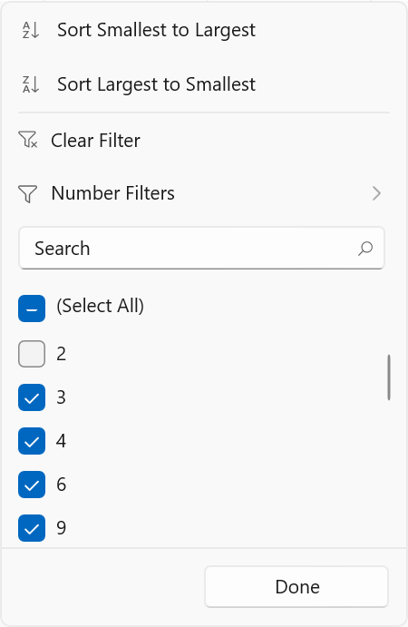
</treeGrid:SfTreeGrid>Check box filtering
The check box filtering is the same as Excel-like filter popup, which displays a search text box and a list of check boxes with unique items from the expanded tree nodes.
The items in the checked state will be visible in the view, and the other items will be filtered out of the view.
This filtering operation is performed based on the value of SfTreeGrid.FilterLevel property.
Advanced filtering
Advanced filter UI provides multiple filter options to filter the data easily. Filter menu options are loaded based on advanced filter type by automatically detecting the underlying data type.
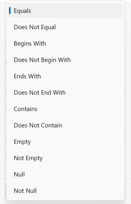
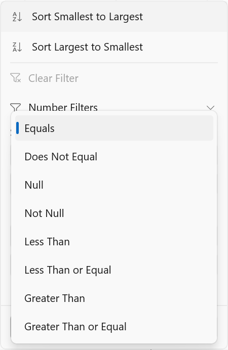
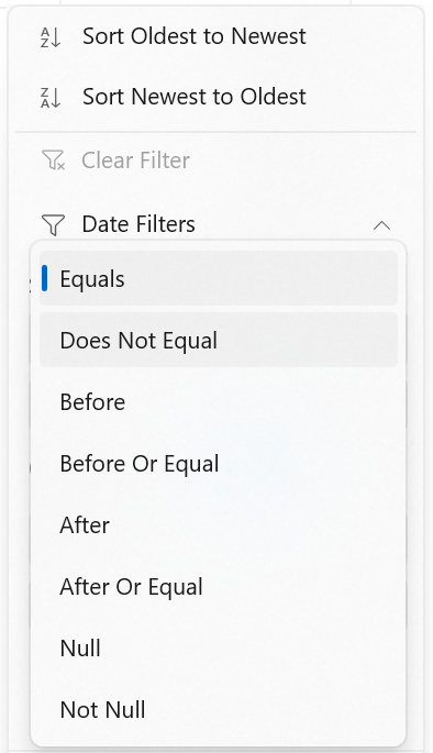
The following built-in filter types are supported in SfTreeGrid:
-
Text filter: Loads various menu options to filter the display text effectively.
-
Number filter: Loads various menu options to filter the numeric data.
-
Date filter: Loads various menu options and SfCalendarDatePicker to filter DateTimeOffset type column.
| Text filters | Number filters | Date filters |
|---|---|---|
| When the string value is bound to the or the items source is , then `TextFilters` are loaded in . | When integer, double, short, decimal, byte, or long are bound to the , then `Number Filters` are loaded in . | When the DateTimeOffset type value is bound to the , then `Date Filters` are loaded in . |
|
|
|
|
Filter menu options
|
Filter menu options
|
Filter menu options
|
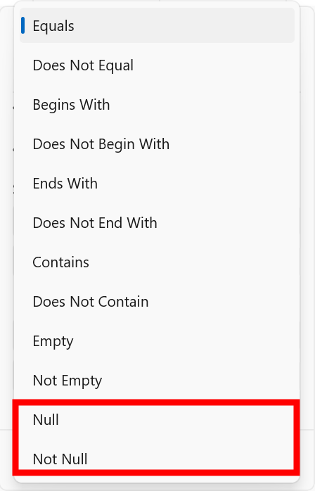
NOTE
The
NullandNot Nulloptions are available only whenAllowBlankFiltersis set toTrue.
Instant filtering
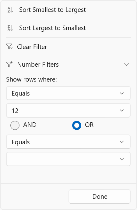
By default, filters are applied to the columns when OK button is clicked in UI filtering. To update the filters immediately whenever update in filter popup, set TreeGridColumn.ImmediateUpdateColumnFilter to true.
<treeGrid:TreeGridTextColumn MappingName="EmployeeID"
ImmediateUpdateColumnFilter="True"/>this.sfTreeGrid.Columns["EmployeeID"].ImmediateUpdateColumnFilter = true;Here, the OK and Cancel buttons are unavailable and Done button is available to just close the popup.
The following screenshot illustrates the check box filter when ImmediateUpdateColumnFilter is set to true.
The following screenshot illustrates the advanced filter when ImmediateUpdateColumnFilter is set to true.
NOTE
In check box filter, the
SelectAlloption is not reflected in the filter updates if ImmediateUpdateColumnFilter is true.
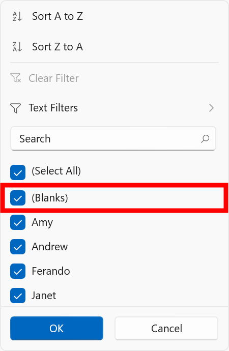
Filtering null values
To filter the null values, the TreeGridColumn.AllowBlankFilters property should be enabled. Enabling AllowBlankFilters includes null values into the filter items list.
<treeGrid:TreeGridTextColumn MappingName="FirstName" AllowBlankFilters="True"/>this.sfTreeGrid.Columns["FirstName"].AllowBlankFilters = true;The following screenshot illustrates the check box filter when AllowBlankFilters is set to true.
The following screenshot illustrates advanced filter when AllowBlankFilters is set to true.
Changing AdvancedFilter type when loading dynamic ItemsSource
By default, the text filters will be loaded for the columns if ItemsSource is dynamic. The TreeGridColumn.ColumnMemberType property loads number filters or date filters based on the column values.
this.sfTreeGrid.Columns["EmployeeID"].ColumnMemberType = typeof(double);Customization using events
Loading text filter for number or date column
The SfTreeGrid.FilterItemsPopulating event is used to load text filters for the columns that have number or date value as underlying type by setting value of the TreeGridFilterItemsPopulatingEventArgs.FilterControl.AdvancedFilterType property to AdvancedFilterType.TextFilter.
this.sfTreeGrid.FilterItemsPopulating += OnSfTreeGridFilterItemsPopulating;

private void OnSfTreeGridFilterItemsPopulating(object sender, TreeGridFilterItemsPopulatingEventArgs e)
 {
     if (e.Column.MappingName == "EmployeeID")
         e.FilterControl.AdvancedFilterType = AdvancedFilterType.TextFilter;
 }
Customizing filter predicates
The filter predicates can be customized using the SfTreeGrid.FilterChanging event. This event occurs when applying filter using the filter control. Here, FilterValue is changed based on some conditions.
this.sfTreeGrid.FilterChanging += OnSfTreeGridFilterChanging;

private void OnSfTreeGridFilterChanging(object sender, TreeGridFilterChangingEventArgs e)
{
    if (e.FilterPredicates == null || e.Column.MappingName != "FirstName")
        return;

    if (e.FilterPredicates[0].FilterValue.Equals("Chester"))
        e.FilterPredicates[0].FilterValue = "Abraham";
}
Customizing Excel-like filter ItemsSource
The TreeGridFilterControl ItemsSource can be customized to restrict some data from filtering using the SfTreeGrid.FilterItemsPopulated event. Here, the FilterElement that has actual value as 0 is removed from ItemsSource.
this.sfTreeGrid.FilterItemsPopulated += OnSfTreeGridFilterItemsPopulated;

private void OnSfTreeGridFilterItemsPopulated(object sender, TreeGridFilterItemsPopulatedEventArgs e)
{
    if (e.Column.MappingName == "EmployeeID")
    {
        var itemsSource = e.ItemsSource as List<FilterElement>;

        // Get the FilterElement to remove from itemsSource.
        var filterElement = itemsSource.FirstOrDefault(items => items.ActualValue.Equals(0));

        // Remove the FilterElement from itemsSource.
        itemsSource.Remove(filterElement);
    }
}
Changing filter UI
Filter UI can be changed either for all the columns or for a specific column in SfTreeGrid by changing the FilterMode property value using the SfTreeGrid.FilterItemsPopulating event.
Here, filter UI is changed to AdvancedFilter only for EmployeeID column.
this.sfTreeGrid.FilterItemsPopulating += SfTreeGrid_FilterItemsPopulating;

private void SfTreeGrid_FilterItemsPopulating(object sender, TreeGridFilterItemsPopulatingEventArgs e)
{
    if (e.Column.MappingName == "EmployeeID")
        e.FilterControl.FilterMode = FilterMode.AdvancedFilter;
}
Customizing sort options text
Sort options text can be customized by changing the value of AscendingSortString and DescendingSortString properties in the TreeGridFilterControl using the SfTreeGrid.FilterItemsPopulating event.
this.sfTreeGrid.FilterItemsPopulating += OnSfTreeGridFilterItemsPopulating;

private void OnSfTreeGridFilterItemsPopulating(object sender, TreeGridFilterItemsPopulatingEventArgs e)
{
    if (e.Column.MappingName == "FirstName")
    {
        e.FilterControl.AscendingSortString = "Sort Ascending";
        e.FilterControl.DescendingSortString = "Sort Descending";
    }
}
Appearance
Hiding sort options
Sort options can be collapsed by setting the SortOptionVisibility property in TreeGridFilterControl.
xmlns:treeGridFiltering="using:Syncfusion.UI.Xaml.TreeGrid.Filtering"

<Application.Resources>
    <Style TargetType="treeGridFiltering:TreeGridFilterControl" x:Key="filterControlStyle">
        <Setter Property="SortOptionVisibility" Value="Collapsed"/>
    </Style>
</Application.Resources><treeGrid:SfTreeGrid Name="treeGrid"
FilterPopupStyle="{StaticResource filterControlStyle}"
AllowFiltering="True”
ItemsSource="{Binding EmployeeDetails}" />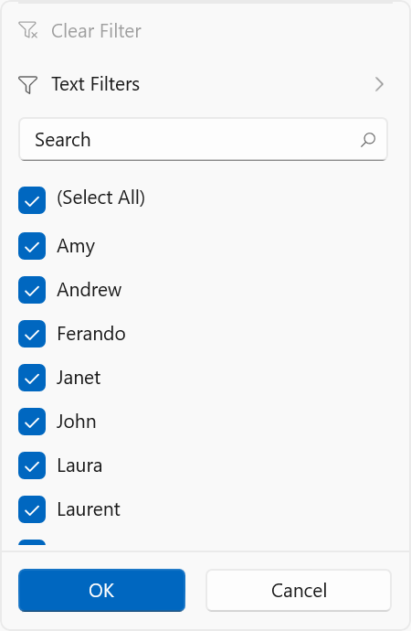
Customizing the filter popup size
The size of the filter popup can be changed using the FilterPopupHeight and FilterPopupWidth properties in TreeGridFilterControl.
xmlns:treeGridFiltering="using:Syncfusion.UI.Xaml.TreeGrid.Filtering"

<Application.Resources>
    <Style TargetType="treeGridFiltering:TreeGridFilterControl">
        <Setter Property="FilterPopupHeight" Value="530"/>
        <Setter Property="FilterPopupWidth" Value="450"/>
    </Style>
</Application.Resources>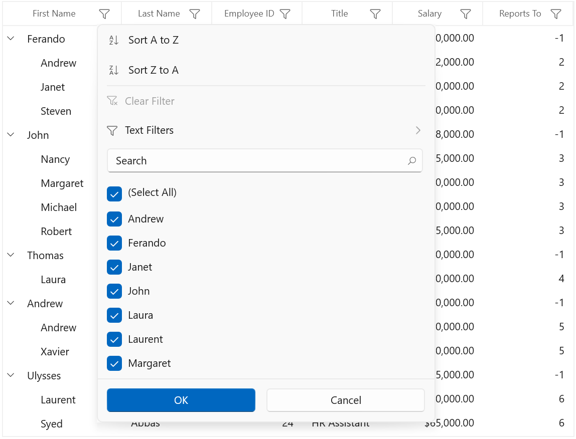
Changing filter icon style after applying filters
The filter icon style can be changed by writing style with TargetType as FilterToggleButton.
<Style TargetType="grid:FilterToggleButton">
<Setter Property="Template">
<Setter.Value>
<ControlTemplate TargetType="grid:FilterToggleButton">
<Grid>
<VisualStateManager.VisualStateGroups>
<VisualStateGroup x:Name="FilterStates">
<VisualState x:Name="Filtered">
<Storyboard BeginTime="0">
<ObjectAnimationUsingKeyFrames BeginTime="0"
Duration="1"
Storyboard.TargetName="PART_FilterToggleButtonIndicator"
Storyboard.TargetProperty="FontFamily">
<DiscreteObjectKeyFrame KeyTime="0" Value="ms-appx:///Syncfusion.Grid.WinUI/Themes/Assets/ControlIcons.ttf#font" />
</ObjectAnimationUsingKeyFrames>
<ObjectAnimationUsingKeyFrames BeginTime="0"
Duration="1"
Storyboard.TargetName="PART_FilterToggleButtonIndicator"
Storyboard.TargetProperty="Glyph">
<DiscreteObjectKeyFrame KeyTime="0" Value="" />
</ObjectAnimationUsingKeyFrames>
<ObjectAnimationUsingKeyFrames BeginTime="0"
Duration="1"
Storyboard.TargetName="PART_FilterToggleButtonIndicator"
Storyboard.TargetProperty="Foreground">
<DiscreteObjectKeyFrame KeyTime="0" Value="Red" />
</ObjectAnimationUsingKeyFrames>
</Storyboard>
</VisualState>
<VisualState x:Name="UnFiltered">
<Storyboard BeginTime="0">
<ObjectAnimationUsingKeyFrames BeginTime="0"
Duration="1"
Storyboard.TargetName="PART_FilterToggleButtonIndicator"
Storyboard.TargetProperty="Glyph">
<DiscreteObjectKeyFrame KeyTime="0" Value="" />
</ObjectAnimationUsingKeyFrames>
</Storyboard>
</VisualState>
</VisualStateGroup>
</VisualStateManager.VisualStateGroups>
<Border HorizontalAlignment="{TemplateBinding HorizontalAlignment}">
<FontIcon Name="PART_FilterToggleButtonIndicator"
FontSize="14"
Glyph=""
Foreground="{StaticResource TextFillColorSecondary}">
<FontIcon.RenderTransform>
<TransformGroup>
<TransformGroup.Children>
<RotateTransform Angle="0" />
<ScaleTransform ScaleX="1" ScaleY="1" />
</TransformGroup.Children>
</TransformGroup>
</FontIcon.RenderTransform>
</FontIcon>
</Border>
</Grid>
</ControlTemplate>
</Setter.Value>
</Setter>
</Style>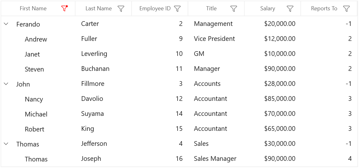