Selection in WinUI ComboBox (SfComboBox)
14 Jul 202614 minutes to read
The ComboBox allows the user to select single or multiple items from the drop-down list. The selection mode can be set by using the SelectionMode property. The default value of SelectionMode is Single. There are two different selection modes: Single, and Multiple.
NOTE
The Syncfusion.Editors.WinUI NuGet package is required to use the
SfComboBoxcontrol. Refer to Getting Started for setup details and sample data.
Single selection
The ComboBox allows the user to select a single item from the drop-down list.
UI Selection
The selected item can be changed interactively by selecting from the drop-down list or entering the value using keyboard and pressing the Enter key or losing the control focus. The selected item can be retrieved from the SelectedItem or SelectedIndex property of ComboBox control.
<editors:SfComboBox IsEditable="True"
                    ItemsSource="{Binding SocialMedias}"
                    DisplayMemberPath="Name"
                    TextMemberPath="Name" />
Programmatic selection
The selected item can be changed programmatically by using the SelectedItem or SelectedIndex property of ComboBox control.
<editors:SfComboBox x:Name="comboBox"
                    IsEditable="True"
                    ItemsSource="{Binding SocialMedias}"
                    DisplayMemberPath="Name"
                    TextMemberPath="Name"
SelectedIndex="2" />comboBox.SelectedIndex = 2;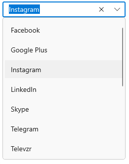
Decide when to update selected item
The SelectionChangeTrigger property of the ComboBox can be used to update the selected item when the user commits a selection or each time the user navigates to a new selection in the ComboBox. The default value is Committed. The available SelectionChangeTrigger modes are:
-
Committed - Selected item is updated when the user commits a selection in the
ComboBox. -
Always - Selected item is updated each time the user navigates to a new selection in the
ComboBox.
<editors:SfComboBox IsEditable="True"
Width="250"
ItemsSource="{Binding SocialMedias}"
SelectionChangeTrigger="Always"
DisplayMemberPath="Name"
TextMemberPath="Name"
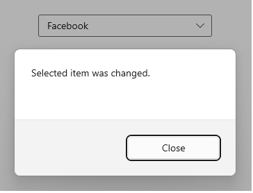
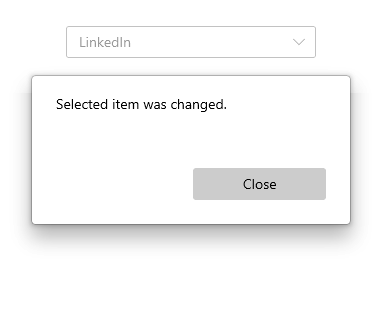
SelectionChanged="OnComboBoxSelectionChanged" />private async void OnComboBoxSelectionChanged(object sender, ComboBoxSelectionChangedEventArgs e)
{
var cd = new ContentDialog
{
Content = "Selected item was changed.",
CloseButtonText = "Close"
};
cd.XamlRoot = this.Content.XamlRoot;
var result = await cd.ShowAsync();
}The following screenshot demonstrates, while typing f in ComboBox control Facebook will be set as selected item.
NOTE
You can refer to more information about the
SelectionChangedevent from this link.
Multiple selection
The ComboBox allows the user to select multiple values from the drop-down list. The multi-select ComboBox mode can be enabled by setting the SelectionMode property as Multiple.
There are two different display modes to perform multiple selection in ComboBox: Delimiter, and Token. The multiple selection display modes will be briefly explained in the upcoming section.
Programmatic selection
The selected items can be changed programmatically by using the SelectedItems property of ComboBox control.
<editors:SfComboBox x:Name="comboBox"
ItemsSource="{Binding SocialMedias}"
SelectionMode="Multiple"
DisplayMemberPath="Name"
TextMemberPath="Name" />SocialMediaViewModel socialMediaViewModel = (this.comboBox.DataContext as SocialMediaViewModel);
ObservableCollection<SocialMedia> socialMediasList = socialMediaViewModel.SocialMedias;
this.comboBox.SelectedItems.Add(socialMediasList[0]);
this.comboBox.SelectedItems.Add(socialMediasList[2]);
this.comboBox.SelectedItems.Add(socialMediasList[3]);
this.comboBox.SelectedItems.Add(socialMediasList[5]);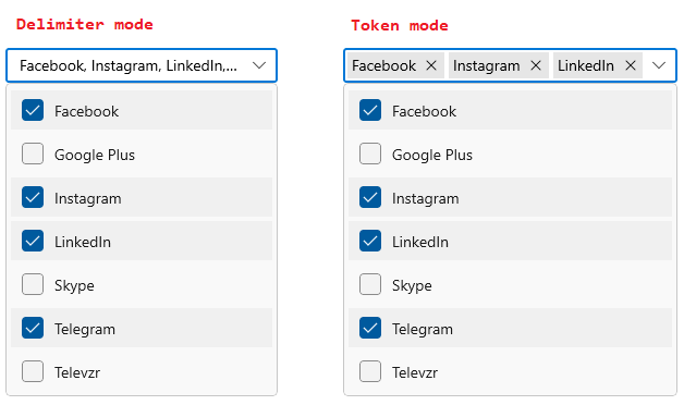
How to hide the check box
The check box that is displayed in a drop-down list can be hidden by using the IsMultiSelectCheckBoxEnabled property of ComboBox control. The default value of IsMultiSelectCheckBoxEnabled property is true.
NOTE
When the check box is hidden, users can still toggle item selection by clicking the item text.
<editors:SfComboBox x:Name="comboBox"
IsMultiSelectCheckBoxEnabled="False"
ItemsSource="{Binding SocialMedias}"
SelectionMode="Multiple"
DisplayMemberPath="Name"
TextMemberPath="Name" />comboBox.IsMultiSelectCheckBoxEnabled = false;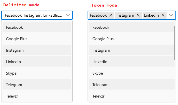
Multiple selection display
Display multiple selected items with token representation or simply divide them with a delimiter text. The multiple selection display mode can be set by using the MultiSelectionDisplayMode property. The default value of MultiSelectionDisplayMode property is Delimiter.
Delimiter
When selecting multiple items, the selected items can be separated from each other with a desired character given for a delimiter.
NOTE
The
IsEditableproperty has no effect whenMultiSelectionDisplayModeisDelimiter.
UI selection
The selected items can be changed interactively by using keyboard or by selecting from a drop-down list. The selected items can be retrieved from the SelectedItems property of ComboBox control.
<editors:SfComboBox ItemsSource="{Binding SocialMedias}"
SelectionMode="Multiple"
DisplayMemberPath="Name"
TextMemberPath="Name" />
Separate items using delimiter
The ComboBox supports various delimiter characters to separate the selected items. The delimiter character can be set by using the DelimiterText property. The default delimiter character is ,.
<editors:SfComboBox x:Name="comboBox"
DelimiterText="-"
ItemsSource="{Binding SocialMedias}"
SelectionMode="Multiple"
DisplayMemberPath="Name"
TextMemberPath="Name" />comboBox.DelimiterText = "-";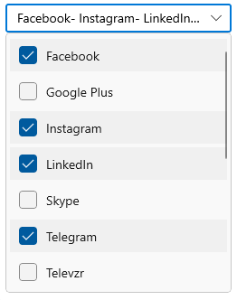
Token
Selected items will be displayed with a customizable token representation and the users can remove each tokenized item by clicking the close button. Token mode supports both editable and non-editable text boxes for selecting items from a data source.
UI selection
The selected items can be changed interactively by using keyboard or by selecting from a drop-down list. The selected items can be retrieved from the SelectedItems property of ComboBox control.
<StackPanel>
<editors:SfComboBox x:Name="comboBox"
ItemsSource="{Binding SocialMedias}"
SelectionMode="Multiple"
MultiSelectionDisplayMode="Token"
DisplayMemberPath="Name"
TextMemberPath="Name" />
<CheckBox Margin="20,0,0,0"
IsChecked="{Binding ElementName=comboBox, Path=IsEditable, Mode=TwoWay}"
Content="IsEditable" />
</StackPanel>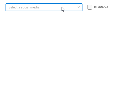
NOTE
Refer to more information about customization of
ComboBoxTokenItemfrom this link.
Auto-append UI
The ComboBox control provides auto-append support with the selection of text as well as text alone. The auto-append UI can be defined by using the AutoAppendType property. The available AutoAppendType values are:
- TextWithSelection - The appended text appears with the selection highlighted.
- Text - The appended text appears with a faded foreground, similar to Windows 11.
Auto-append UI as TextWithSelection
When entering text in the text box selection area, if the AutoAppendType property is TextWithSelection, the appended text appears with the selection.
<editors:SfComboBox AutoAppendType="TextWithSelection">
</editors:SfComboBox>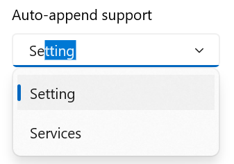
Auto-append UI as Text
When entering text in the text box selection area, if the AutoAppendType property is Text, the appended text appears with a faded foreground.
<editors:SfComboBox AutoAppendType="Text">
</editors:SfComboBox>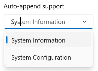
Selection changed notification
When selecting an item from the drop-down list, the SelectionChanged event is triggered. The SelectionChanged event contains the newly selected and removed items in the AddedItems and RemovedItems properties. The ComboBoxSelectionChangedEventArgs contains the following properties:
-
AddedItems- Contains the items that were selected. -
RemovedItems- Contains the items that were unselected.
<editors:SfComboBox x:Name="comboBox"
Width="250"
TextMemberPath="Name"
DisplayMemberPath="Name"
ItemsSource="{Binding SocialMedias}"
SelectionChanged="OnComboBoxSelectionChanged" />comboBox.SelectionChanged += OnComboBoxSelectionChanged;The SelectionChanged event can be handled as follows.
private async  void OnComboBoxSelectionChanged(object sender, ComboBoxSelectionChangedEventArgs e)
{
    var cd = new ContentDialog
    {
        Content = "Selected item was changed.",
        CloseButtonText = "Close"
    };

    cd.XamlRoot = this.Content.XamlRoot;
    var result = await cd.ShowAsync();
}
Selection changing notification
The SelectionChanging event occurs before processing the selection. This is a cancelable event. The ComboBoxSelectionChangingEventArgs contains the following properties:
-
AddedItems- Contains the items that are being selected. -
RemovedItems- Contains the items that are being unselected. -
AllowDetachedSelection- Gets or sets a value indicating whether an item not present in theItemsSourceshould be displayed in the selection box. -
Cancel- Gets or sets a value that indicates whether the selection should be canceled or not.
<editors:SfComboBox x:Name="comboBox"
                    Width="250"
                    TextMemberPath="Name"
                    DisplayMemberPath="Name"
                    ItemsSource="{Binding SocialMedias}"
SelectionChanging="OnComboBoxSelectionChanging" />comboBox.SelectionChanging += OnComboBoxSelectionChanging;
private void OnComboBoxSelectionChanging(object sender, Syncfusion.UI.Xaml.Editors.ComboBoxSelectionChangingEventArgs e)
{
e.AllowDetachedSelection = true;
}