UI Customization in WinUI ComboBox (SfComboBox)
14 Jul 202624 minutes to read
This section explains different UI customization available in ComboBox.
NOTE
The Syncfusion.Editors.WinUI NuGet package is required to use the
SfComboBoxcontrol. Refer to Getting Started for setup details.
Header for ComboBox
The header of the ComboBox control can be changed by using the Header or HeaderTemplate properties. The default value of HeaderTemplate is null and Header is null.
<editors:SfComboBox x:Name="comboBox"
                    Width="250"
                    Header="Favourite Social Media"
                    ItemsSource="{Binding SocialMedias}"
                    DisplayMemberPath="Name"
                    TextMemberPath="Name"
                    SelectedIndex="2">
    <editors:SfComboBox.HeaderTemplate>
        <DataTemplate>
            <TextBlock Foreground="Red"
                       FontWeight="SemiBold"
                       FontSize="16"
                       Text="{Binding}" />
        </DataTemplate>
    </editors:SfComboBox.HeaderTemplate>
</editors:SfComboBox>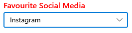
Description for ComboBox
The description of the ComboBox control can be changed by using the Description property. The default value of Description is null.
<editors:SfComboBox x:Name="comboBox"
                    Width="280"
                    Header="Favourite Social Media"
                    ItemsSource="{Binding SocialMedias}"
                    DisplayMemberPath="Name"
                    TextMemberPath="Name"
                    SelectedIndex="2"
                    Description="Instagram is an online photo sharing service.">
    <editors:SfComboBox.HeaderTemplate>
        <DataTemplate>
            <TextBlock Foreground="Red"
                       FontWeight="SemiBold"
                       FontSize="16"
                       Text="{Binding}" />
        </DataTemplate>
    </editors:SfComboBox.HeaderTemplate>
</editors:SfComboBox>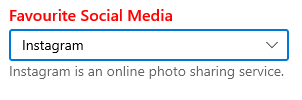
Placeholder text
You can prompt the user with any information by using the PlaceholderText property. This text will be displayed only when no item is selected or edit text is empty. The default value of PlaceholderText property is string.Empty (No string will be displayed).
<editors:SfComboBox x:Name="comboBox"
                    Width="250"
                    ItemsSource="{Binding SocialMedias}"
                    DisplayMemberPath="Name"
                    TextMemberPath="Name"
PlaceholderText="Select a social media" />comboBox.PlaceholderText = "Select a social media";
Change foreground of placeholder text
The placeholder text’s foreground can be changed by using the PlaceholderForeground property. The default value of PlaceholderForeground property is null.
<editors:SfComboBox x:Name="comboBox"
                    Width="250"
                    ItemsSource="{Binding SocialMedias}"
                    DisplayMemberPath="Name"
                    TextMemberPath="Name"
                    PlaceholderForeground="Red"
PlaceholderText="Select a social media" />comboBox.PlaceholderForeground = new SolidColorBrush(Colors.Red);
Customize the edit mode TextBox
The appearance of the edit mode TextBox in the ComboBox control can be customized by using the TextBoxStyle property. The default value of TextBoxStyle is null.
NOTE
TextBoxStylewill only have an effect in single selection editable mode.
<editors:SfComboBox x:Name="comboBox"
                    Width="250"
                    IsEditable="True"
                    SelectionMode="Single"
                    ItemsSource="{Binding SocialMedias}"
                    DisplayMemberPath="Name"
                    TextMemberPath="Name">

    <editors:SfComboBox.TextBoxStyle>
        <Style TargetType="TextBox">
            <Style.Setters>
                <Setter Property="SelectionHighlightColor" Value="Green"/>
                <Setter Property="BorderThickness" Value="0"/>
            </Style.Setters>
        </Style>
    </editors:SfComboBox.TextBoxStyle>
</editors:SfComboBox>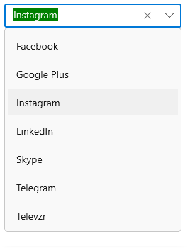
Styling ComboBoxItem
The ComboBox control allows you to customize the style of ComboBoxItem, generated in drop-down by using the ItemContainerStyle property. The default value of ItemContainerStyle is null.
<editors:SfComboBox x:Name="comboBox"
                    Width="250"
                    IsEditable="True"
                    ItemsSource="{Binding SocialMedias}"
                    DisplayMemberPath="Name"
                    TextMemberPath="Name"
                    PlaceholderText="Select a social media">
    <editors:SfComboBox.ItemContainerStyle>
        <Style TargetType="editors:SfComboBoxItem">
            <Setter Property="Foreground" Value="Red"/>
            <Setter Property="Background" Value="LightCyan"/>
            <Setter Property="FontStyle" Value="Italic"/>
        </Style>
    </editors:SfComboBox.ItemContainerStyle>
</editors:SfComboBox>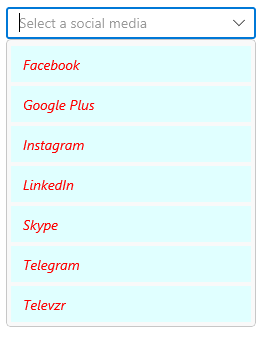
Style ComboBoxItem based on condition
The ComboBox control allows you to customize the style of ComboBoxItem conditionally based on its content by using the ItemContainerStyleSelector property. The default value of ItemContainerStyleSelector is null.
public class SocialMediaStyleSelector : StyleSelector
{
    public Style MediaStyle1 { get; set; }
    public Style MediaStyle2 { get; set; }
    protected override Style SelectStyleCore(object item, DependencyObject container)
    {
        var mediaItem = (item as SocialMedia).Name;
        if (mediaItem.ToString() == "Facebook" || mediaItem.ToString() == "Instagram" ||
            mediaItem.ToString() == "Twitter" || mediaItem.ToString() == "WhatsApp" ||
            mediaItem.ToString() == "Skype")
        {
            return MediaStyle1;
        }
        else
        {
            return MediaStyle2;
        }
    }
}<Grid>
<Grid.Resources>
<Style x:Key="MediaStyle1" TargetType="editors:SfComboBoxItem">
<Setter Property="Foreground" Value="Blue"/>
<Setter Property="Background" Value="LightCyan"/>
<Setter Property="Content" Value="{Binding}"/>
</Style>
<Style x:Key="MediaStyle2" TargetType="editors:SfComboBoxItem">
<Setter Property="Foreground" Value="Red"/>
<Setter Property="Background" Value="LightCyan"/>
<Setter Property="Content" Value="{Binding}"/>
</Style>
<local:SocialMediaStyleSelector x:Key="socialMediaStyleSelector"
MediaStyle1="{StaticResource MediaStyle1}"
MediaStyle2="{StaticResource MediaStyle2}"/>
</Grid.Resources>
<editors:SfComboBox x:Name="comboBox"
Width="250"
PlaceholderText="Select a social media"
IsEditable="True"
ItemsSource="{Binding SocialMedias}"
ItemContainerStyleSelector="{StaticResource socialMediaStyleSelector}"
DisplayMemberPath="Name"
TextMemberPath="Name" />
</Grid>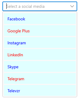
Customize ComboBoxItem
The ItemTemplate property helps you to decorate drop-down items using custom templates. The default value of ItemTemplate is null. The following example shows how to add an image or custom control in drop-down items using templates.
NOTE
Add the required
usingdirectives:using System.Collections.ObjectModel;andusing Microsoft.UI.Xaml.Media.Imaging;(forBitmapImage).
//Model.cs
public class Employee
{
    public string Name { get; set; }
    public BitmapImage ProfilePicture { get; set; }
    public string Designation { get; set; }
}

//ViewModel.cs
public class EmployeeViewModel
{
    public ObservableCollection<Employee> Employees { get; set; }
    public EmployeeViewModel()
    {
        this.Employees = new ObservableCollection<Employee>();
        this.Employees.Add(new Employee {
            Name = "Anne Dodsworth",
            ProfilePicture = new BitmapImage(new Uri(@"ms-appx:///Assets/Employees/AnneDodsworth.png",
                                                 UriKind.RelativeOrAbsolute)),
            Designation = "Developer"
        });
        this.Employees.Add(new Employee {
            Name = "Andrew Fuller",
            ProfilePicture = new BitmapImage(new Uri(@"ms-appx:///Assets/Employees/AndrewFuller.png",
                                                 UriKind.RelativeOrAbsolute)),
            Designation = "Team Lead"
        });
        this.Employees.Add(new Employee {
            Name = "Emilia Alvaro",
            ProfilePicture = new BitmapImage(new Uri(@"ms-appx:///Assets/Employees/EmiliaAlvaro.png",
                                                 UriKind.RelativeOrAbsolute)),
            Designation = "Product Manager"
        });

        this.Employees.Add(new Employee {
            Name = "Janet Leverling",
            ProfilePicture = new BitmapImage(new Uri(@"ms-appx:///Assets/Employees/JanetLeverling.png",
                                                 UriKind.RelativeOrAbsolute)),
            Designation = "HR"
        });
        this.Employees.Add(new Employee {
            Name = "Laura Callahan",
            ProfilePicture = new BitmapImage(new Uri(@"ms-appx:///Assets/ComboBox/Employees/LauraCallahan.png",
                                                 UriKind.RelativeOrAbsolute)),
            Designation = "Product Manager"
        });
    }
}<editors:SfComboBox x:Name="comboBox"
Width="250"
TextMemberPath="Name"
IsEditable="True"
ItemsSource="{Binding Employees}">
<editors:SfComboBox.DataContext>
<local:EmployeeViewModel/>
</editors:SfComboBox.DataContext>
<editors:SfComboBox.ItemTemplate>
<DataTemplate>
<Grid Margin="0,5"
HorizontalAlignment="Stretch"
VerticalAlignment="Stretch">
<Grid.ColumnDefinitions>
<ColumnDefinition Width="48"/>
<ColumnDefinition Width="*"/>
</Grid.ColumnDefinitions>
<Image Grid.Column="0"
HorizontalAlignment="Center"
VerticalAlignment="Center"
Source="{Binding ProfilePicture}"
Stretch="Uniform"/>
<StackPanel Grid.Column="1"
Margin="15,0,0,0"
HorizontalAlignment="Left"
VerticalAlignment="Center">
<TextBlock Opacity="0.87"
FontSize="14"
Text="{Binding Name}"/>
<TextBlock Opacity="0.54"
FontSize="12"
Text="{Binding Designation}"/>
</StackPanel>
</Grid>
</DataTemplate>
</editors:SfComboBox.ItemTemplate>
</editors:SfComboBox>
Customize ComboBoxItem based on condition
The ItemTemplateSelector property helps you to decorate drop-down items based on their content using custom templates. The default value of ItemTemplateSelector is null.
NOTE
This example uses the
Employeemodel andEmployeeViewModeldefined in the Customize ComboBoxItem section above.
//Model.cs
public class Employee
{
    public string Name { get; set; }
    public BitmapImage ProfilePicture { get; set; }
    public string Designation { get; set; }
}

//ViewModel.cs
public class EmployeeViewModel
{
    public ObservableCollection<Employee> Employees { get; set; }
    public EmployeeViewModel()
    {
        this.Employees = new ObservableCollection<Employee>();
        this.Employees.Add(new Employee {
            Name = "Anne Dodsworth",
            ProfilePicture = new BitmapImage(new Uri(@"ms-appx:///Assets/Employees/AnneDodsworth.png",
                                                 UriKind.RelativeOrAbsolute)),
            Designation = "Developer"
        });
        this.Employees.Add(new Employee {
            Name = "Andrew Fuller",
            ProfilePicture = new BitmapImage(new Uri(@"ms-appx:///Assets/Employees/AndrewFuller.png",
                                                 UriKind.RelativeOrAbsolute)),
            Designation = "Team Lead"
        });
        this.Employees.Add(new Employee {
            Name = "Emilia Alvaro",
            ProfilePicture = new BitmapImage(new Uri(@"ms-appx:///Assets/Employees/EmiliaAlvaro.png",
                                                 UriKind.RelativeOrAbsolute)),
            Designation = "Product Manager"
        });

        this.Employees.Add(new Employee {
            Name = "Janet Leverling",
            ProfilePicture = new BitmapImage(new Uri(@"ms-appx:///Assets/Employees/JanetLeverling.png",
                                                 UriKind.RelativeOrAbsolute)),
            Designation = "HR"
        });
        this.Employees.Add(new Employee {
            Name = "Laura Callahan",
            ProfilePicture = new BitmapImage(new Uri(@"ms-appx:///Assets/ComboBox/Employees/LauraCallahan.png",
                                                 UriKind.RelativeOrAbsolute)),
            Designation = "Product Manager"
        });
    }
}

public class EmployeeTemplateSelector : DataTemplateSelector
{
    public DataTemplate EmployeeTemplate1 { get; set; }
    public DataTemplate EmployeeTemplate2 { get; set; }

    protected override DataTemplate SelectTemplateCore(object item, DependencyObject container)
    {
        var employeeName = (item as Employee).Name;
        if (employeeName.ToString() == "Anne Dodsworth" || employeeName.ToString() == "Emilia Alvaro" ||
            employeeName.ToString() == "Laura Callahan")
        {
            return EmployeeTemplate1;
        }
        else
        {
            return EmployeeTemplate2;
        }
    }
}<Grid>
<Grid.Resources>
<DataTemplate x:Key="employeeTemplate1">
<Grid Margin="0,5">
<Grid.ColumnDefinitions>
<ColumnDefinition Width="48"/>
<ColumnDefinition Width="*"/>
</Grid.ColumnDefinitions>
<Image
Grid.Column="0"
Source="{Binding ProfilePicture}"
Stretch="Uniform"/>
<StackPanel
Grid.Column="1"
Margin="15,0,0,0">
<TextBlock
Foreground="Blue"
Opacity="0.87"
FontSize="14"
Text="{Binding Name}"/>
<TextBlock
Foreground="Coral"
Opacity="0.54"
FontSize="12"
Text="{Binding Designation}"/>
</StackPanel>
</Grid>
</DataTemplate>
<DataTemplate x:Key="employeeTemplate2">
<Grid Margin="0,5">
<Grid.ColumnDefinitions>
<ColumnDefinition Width="48"/>
<ColumnDefinition Width="*"/>
</Grid.ColumnDefinitions>
<Image
Grid.Column="0"
Source="{Binding ProfilePicture}"
Stretch="Uniform"/>
<StackPanel
Grid.Column="1"
Margin="15,0,0,0">
<TextBlock
Foreground="Red"
Opacity="0.87"
FontSize="14"
Text="{Binding Name}"/>
<TextBlock
Foreground="Green"
Opacity="0.54"
FontSize="12"
Text="{Binding Designation}"/>
</StackPanel>
</Grid>
</DataTemplate>
<local:EmployeeTemplateSelector x:Key="employeeTemplateSelector"
EmployeeTemplate1="{StaticResource employeeTemplate1}"
EmployeeTemplate2="{StaticResource employeeTemplate2}"/>
</Grid.Resources>
<editors:SfComboBox x:Name="comboBox"
Width="250"
TextMemberPath="Name"
ItemsSource="{Binding Employees}"
PlaceholderText="Select an employee"
IsEditable="True"
ItemTemplateSelector="{StaticResource employeeTemplateSelector}">
<editors:SfComboBox.DataContext>
<local:EmployeeViewModel/>
</editors:SfComboBox.DataContext>
</editors:SfComboBox>
</Grid>
Styling token items
The ComboBox control allows you to customize the style of ComboBoxTokenItem generated in the selection area by using the TokenItemStyle property. The default value of TokenItemStyle is null.
<editors:SfComboBox SelectionMode="Multiple"
                    MultiSelectionDisplayMode="Token"
                    ItemsSource="{Binding SocialMedias}"
                    DisplayMemberPath="Name"
                    TextMemberPath="Name">
            <editors:SfComboBox.TokenItemStyle>
                <Style TargetType="editors:ComboBoxTokenItem">
                    <Setter Property="Foreground" Value="Red"/>
                    <Setter Property="Background" Value="LightCyan"/>
                </Style>
            </editors:SfComboBox.TokenItemStyle>
</editors:SfComboBox>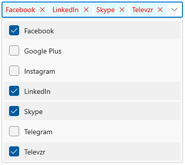
Style token items based on condition
The ComboBox control allows you to customize the style of ComboBoxTokenItem based on its content by using the TokenItemStyleSelector property. The default value of TokenItemStyleSelector is null.
public class SocialMediaTokenStyleSelector : StyleSelector
{
    public Style MediaStyle1 { get; set; }
    public Style MediaStyle2 { get; set; }
    protected override Style SelectStyleCore(object item, DependencyObject container)
    {
        var mediaItem = (item as SocialMedia).Name;
        if (mediaItem.ToString() == "Facebook" || mediaItem.ToString() == "Instagram" ||
            mediaItem.ToString() == "Twitter" || mediaItem.ToString() == "WhatsApp" ||
            mediaItem.ToString() == "Skype")
        {
            return MediaStyle1;
        }
        else
        {
            return MediaStyle2;
        }
    }
}<Grid>
<Grid.Resources>
<Style x:Key="MediaStyle1" TargetType="editors:ComboBoxTokenItem">
<Setter Property="Foreground" Value="Blue"/>
<Setter Property="Background" Value="LightCyan"/>
<Setter Property="Content" Value="{Binding}"/>
</Style>
<Style x:Key="MediaStyle2" TargetType="editors:ComboBoxTokenItem">
<Setter Property="Foreground" Value="Red"/>
<Setter Property="Background" Value="LightCyan"/>
<Setter Property="Content" Value="{Binding}"/>
</Style>
<local:SocialMediaTokenStyleSelector x:Key="socialMediaTokenStyleSelector"
MediaStyle1="{StaticResource MediaStyle1}"
MediaStyle2="{StaticResource MediaStyle2}"/>
</Grid.Resources>
<editors:SfComboBox SelectionMode="Multiple"
MultiSelectionDisplayMode="Token"
ItemsSource="{Binding SocialMedias}"
TokenItemStyleSelector="{StaticResource socialMediaTokenStyleSelector}"
DisplayMemberPath="Name"
TextMemberPath="Name" />
</Grid>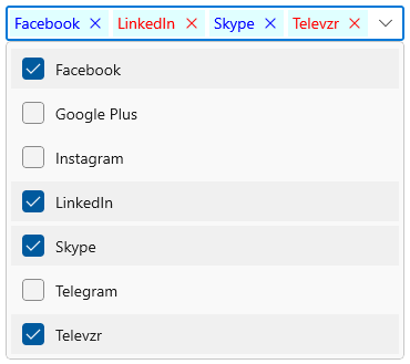
Templating ComboBox tokens
The TokenItemTemplate property helps you to decorate token items using custom templates. The default value of TokenItemTemplate is null. The following example shows how to add an image or custom control in token items using templates.
NOTE
TokenItemTemplaterequiresMultiSelectionDisplayMode="Token"andSelectionMode="Multiple".
//Model.cs
public class CountryInfo
{
    public string CountryName { get; set; }
    public BitmapImage FlagImage { get; set; }
}

//ViewModel.cs
public class CountryViewModel
{
    public ObservableCollection<CountryInfo> Countries { get; set; }
    public CountryViewModel()
    {
        this.Countries = new ObservableCollection<CountryInfo>();
        this.Countries.Add(new CountryInfo
        {
            FlagImage = new BitmapImage(new Uri(@"ms-appx:///Flags/UnitedStates.png", UriKind.RelativeOrAbsolute)),
            CountryName = "United States"
        });

        this.Countries.Add(new CountryInfo
        {
            FlagImage = new BitmapImage(new Uri(@"ms-appx:///Flags/turkey.png", UriKind.RelativeOrAbsolute)),
            CountryName = "Turkey"
        });

        this.Countries.Add(new CountryInfo
        {
            FlagImage = new BitmapImage(new Uri(@"ms-appx:///Flags/Mexico.png", UriKind.RelativeOrAbsolute)),
            CountryName = "Mexico"
        });

        this.Countries.Add(new CountryInfo
        {
            FlagImage = new BitmapImage(new Uri(@"ms-appx:///Flags/Basque.png", UriKind.RelativeOrAbsolute)),
            CountryName = "Basque"
        });

        this.Countries.Add(new CountryInfo
        {
            FlagImage = new BitmapImage(new Uri(@"ms-appx:///Flags/India.png", UriKind.RelativeOrAbsolute)),
            CountryName = "India"
        });

        this.Countries.Add(new CountryInfo
        {
            FlagImage = new BitmapImage(new Uri(@"ms-appx:///Flags/Portugal.png", UriKind.RelativeOrAbsolute)),
            CountryName = "Portugal"
        });

        this.Countries.Add(new CountryInfo
        {
            FlagImage = new BitmapImage(new Uri(@"ms-appx:///Flags/UnitedKingdom.png", UriKind.RelativeOrAbsolute)),
            CountryName = "United Kingdom"
        });

        this.Countries.Add(new CountryInfo
        {
            FlagImage = new BitmapImage(new Uri(@"ms-appx:///Flags/france.png", UriKind.RelativeOrAbsolute)),
            CountryName = "France"
        });
    }
}<editors:SfComboBox SelectionMode="Multiple"
MultiSelectionDisplayMode="Token"
PlaceholderText="Select countries"
DisplayMemberPath="CountryName"
ItemsSource="{Binding Countries}">
<editors:SfComboBox.DataContext>
<local:CountryViewModel/>
</editors:SfComboBox.DataContext>
<editors:SfComboBox.TokenItemTemplate>
<DataTemplate>
<Grid HorizontalAlignment="Center"
VerticalAlignment="Center">
<Grid.ColumnDefinitions>
<ColumnDefinition Width="auto"/>
<ColumnDefinition Width="*"/>
</Grid.ColumnDefinitions>
<Image Grid.Column="0"
HorizontalAlignment="Center"
VerticalAlignment="Center"
Source="{Binding FlagImage}"
Width="36" Height="20"
Stretch="Uniform"/>
<TextBlock Margin="8,0,0,0"
Grid.Column="1"
TextAlignment="Center"
HorizontalAlignment="Left"
VerticalAlignment="Center"
Text="{Binding CountryName}"/>
</Grid>
</DataTemplate>
</editors:SfComboBox.TokenItemTemplate>
</editors:SfComboBox>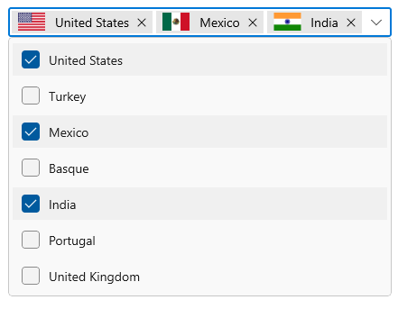
Templating ComboBox tokens based on condition
The TokenItemTemplateSelector property helps you to decorate token items based on their content using custom templates. The default value of TokenItemTemplateSelector is null.
public class CountryTemplateSelector : DataTemplateSelector
{
    public DataTemplate CountryTemplate1 { get; set; }
    public DataTemplate CountryTemplate2 { get; set; }

    protected override DataTemplate SelectTemplateCore(object item, DependencyObject container)
    {
        var countryName = (item as CountryInfo).CountryName;
        if (countryName.ToString() == "United States" || countryName.ToString() == "Mexico" ||
            countryName.ToString() == "India" || countryName.ToString() == "United Kingdom")
        {
            return CountryTemplate1;
        }
        else
        {
            return CountryTemplate2;
        }
    }
}<Grid>
<Grid.DataContext>
<local:CountryViewModel/>
</Grid.DataContext>
<Grid.Resources>
<DataTemplate x:Key="countryTemplate1">
<Grid HorizontalAlignment="Center"
VerticalAlignment="Center">
<Grid.ColumnDefinitions>
<ColumnDefinition Width="auto"/>
<ColumnDefinition Width="*"/>
</Grid.ColumnDefinitions>
<Image Grid.Column="0"
HorizontalAlignment="Center"
VerticalAlignment="Center"
Source="{Binding FlagImage}"
Width="36" Height="20"
Stretch="Uniform"/>
<TextBlock Margin="8,0,0,0"
Grid.Column="1"
Foreground="DarkBlue"
FontStyle="Italic"
TextAlignment="Center"
HorizontalAlignment="Left"
VerticalAlignment="Center"
Text="{Binding CountryName}"/>
</Grid>
</DataTemplate>
<DataTemplate x:Key="countryTemplate2">
<Grid HorizontalAlignment="Center"
VerticalAlignment="Center">
<Grid.ColumnDefinitions>
<ColumnDefinition Width="auto"/>
<ColumnDefinition Width="*"/>
</Grid.ColumnDefinitions>
<Image Grid.Column="0"
HorizontalAlignment="Center"
VerticalAlignment="Center"
Source="{Binding FlagImage}"
Width="36" Height="20"
Stretch="Uniform"/>
<TextBlock Margin="8,0,0,0"
Grid.Column="1"
Foreground="Red"
FontStyle="Italic"
TextAlignment="Center"
HorizontalAlignment="Left"
VerticalAlignment="Center"
Text="{Binding CountryName}"/>
</Grid>
</DataTemplate>
<local:CountryTemplateSelector x:Key="countryTemplateSelector"
CountryTemplate1="{StaticResource countryTemplate1}"
CountryTemplate2="{StaticResource countryTemplate2}"/>
</Grid.Resources>
<editors:SfComboBox SelectionMode="Multiple"
MultiSelectionDisplayMode="Token"
DisplayMemberPath="CountryName"
TokenItemTemplateSelector="{StaticResource countryTemplateSelector}"
ItemsSource="{Binding Countries}" />
</Grid>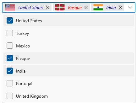
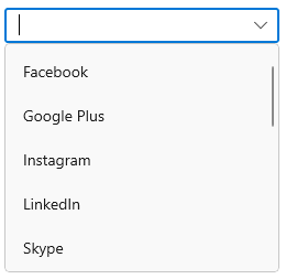
How to change drop-down max height
The maximum height of the drop-down can be changed by using the MaxDropDownHeight property of ComboBox control. The default value of MaxDropDownHeight property is 288.
NOTE
If the
MaxDropDownHeightis too small compared to the populated items, a scroll viewer will be automatically shown to navigate the hidden items.
<editors:SfComboBox x:Name="comboBox"
                    Width="250"
                    IsEditable="true"
                    MaxDropDownHeight="208"
                    ItemsSource="{Binding SocialMedias}"
                    DisplayMemberPath="Name"
TextMemberPath="Name" />comboBox.MaxDropDownHeight = 208;