How can I help you?
Appearance Settings in Windows Forms TabControl (TabControlAdv)
4 Feb 20257 minutes to read
The various appearance settings for TabControlAdv are discussed in this section.
Background settings
This section discusses the various Background Settings available in TabControlAdv.
BackgroundImage settings
The Essential® TabControlAdv provides the following options to customize the images:
- Images inside the TabItems.
- Images outside the TabBounds.
- Image as Background for the TabPage.
Images in TabItems
To set images to the TabItems, add an ImageListControl and populate it with the required images. Then, set the ImageIndex property of the TabPage to one of the indices, to display the corresponding image to the left of the text, by default.
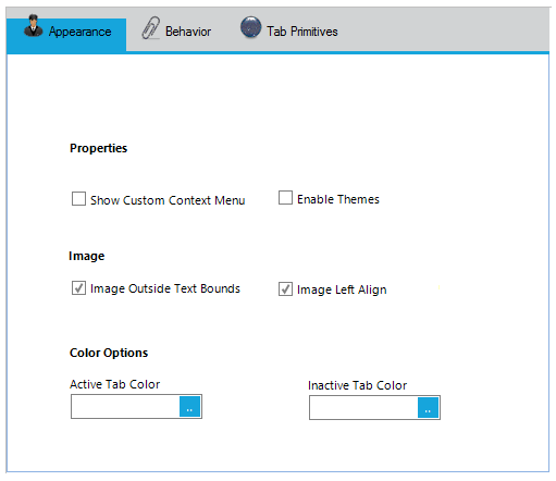
The ImageAlignmentR property allows you to set the Tab’s text and image relation. By default, the image appears to the left and the text appears to the right. This setting can be changed using one of the below given options.
Code snippets showing the Image Settings
this.tabControlAdv1.ImageAlignmentR = Syncfusion.Windows.Forms.Tools.RelativeImageAlignment.RightOfText;

this.tabPageAdv1.ImageIndex = 0;Me.tabControlAdv1.ImageAlignmentR = Syncfusion.Windows.Forms.Tools.RelativeImageAlignment.RightOfText
Me.tabPageAdv1.ImageIndex = 0Images outside the TabBounds
TabControlAdv has images that are set outside the TabBounds.
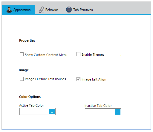
To move the image outside the TabBounds, set the ImageOffset, AdjustTopGap, LevelTextAndImage, ItemSize properties of TabControlAdv.
Background image for TabPages
The BackgroundImage and BackgroundImageLayout properties used to set the background image for the TabPages.
this.tabPageAdv1.BackgroundImage = imageList1.Images[0];

this.tabPageAdv1.BackgroundImageLayout = System.Windows.Forms.ImageLayout.Right;
Private Me.tabPageAdv1.BackgroundImage = imageList1.Images(0)
Private Me.tabPageAdv1.BackgroundImageLayout = System.Windows.Forms.ImageLayout.RightDisableInActivePageImage
The DisableInactivePageImage property specifies the value which determines whether the image should be disabled when the TabPage is not selected. The default value is true.
this.tabPageAdv1.DisableInactivePageImage = imageList1.Images[0];Private Me.tabPageAdv1.DisableInactivePageImage = imageList1.Images(0)Color customization
The look and feel of the TabControlAdv can be customized using the ActiveTabColor, InActiveTabColor and TabPanelBackColor properties.
BackColor settings for the TabItems
The BackColor of the individual tab items can be customized by setting the TabBackColor property of the corresponding tab pages.
this.tabControlAdv1.ActiveTabColor = System.Drawing.Color.Ivory;

this.tabControlAdv1.InactiveTabColor = System.Drawing.Color.Silver;

this.tabControlAdv1.TabPanelBackColor = System.Drawing.Color.White;

this.tabControlAdv1.BackColor = System.Drawing.Color.Yellow;

this.tabPageAdv1.TabBackColor = System.Drawing.Color.Pink;
Private Me.tabControlAdv1.ActiveTabColor = System.Drawing.Color.Ivory
Private Me.tabControlAdv1.InactiveTabColor = System.Drawing.Color.Silver
Private Me.tabControlAdv1.TabPanelBackColor = System.Drawing.Color.White
Private Me.tabControlAdv1.BackColor = System.Drawing.Color.Yellow
Private Me.tabPageAdv1.TabBackColor = System.Drawing.Color.Pink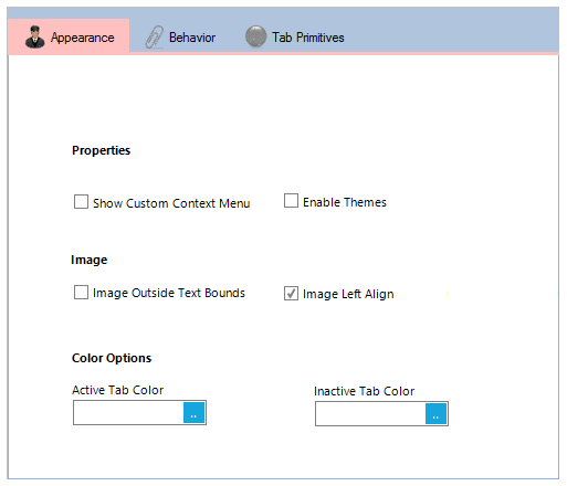
Foreground settings
This section discusses the various Foreground Settings available in TabControlAdv.
Font settings
The font settings for the TabControlAdv can be controlled through Font and ActiveTabFont properties.
this.tabControlAdv1.ActiveTabFont = new System.Drawing.Font("Verdana", 8.25F, System.Drawing.FontStyle.Bold, System.Drawing.GraphicsUnit.Point, ((byte)(0)));

this.tabControlAdv1.Font = new System.Drawing.Font("Verdana", 8.25F, System.Drawing.FontStyle.Regular, System.Drawing.GraphicsUnit.Point, ((byte)(0)));
Private Me.tabControlAdv1.ActiveTabFont = New System.Drawing.Font("Verdana", 8.25F, System.Drawing.FontStyle.Bold, System.Drawing.GraphicsUnit.Point, (CByte(0)))
Private Me.tabControlAdv1.Font = New System.Drawing.Font("Verdana", 8.25F, System.Drawing.FontStyle.Regular, System.Drawing.GraphicsUnit.Point, (CByte(0)))| TabPageAdv property | Description |
|---|---|
| TabFont | Specifies the Font for the tab item. |
this.tabPageAdv1.TabFont = new System.Drawing.Font("Trebuchet MS", 8.25F, System.Drawing.FontStyle.Regular, System.Drawing.GraphicsUnit.Point, ((byte)(0)));Me.tabPageAdv1.TabFont = New System.Drawing.Font("Trebuchet MS", 8.25F, System.Drawing.FontStyle.Regular, System.Drawing.GraphicsUnit.Point, CType((0), Byte))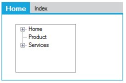
To set image for tab items, see BackgroundImage Settings.
ForeColor settings
The text color of the tab items can be customized by setting the TabForeColor property of the corresponding TabPages.
this.tabPageAdv1.TabForeColor = System.Drawing.Color.Sienna;Private Me.tabPageAdv1.TabForeColor = System.Drawing.Color.Sienna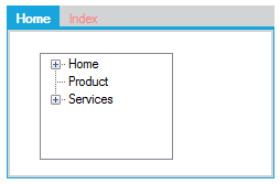
Border settings
This section discusses the border settings available for the TabControlAdv. Set the BorderVisible property to true to display the control border. Default value is false.
this.tabControlAdv1.BorderVisible = true;Me.tabControlAdv1.BorderVisible = True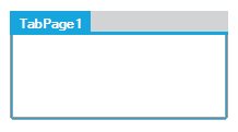
We can set width for the border using BorderWidth property. Default value is 5.
this.tabControlAdv1.BorderWidth = 10;Me.tabControlAdv1.BorderWidth = 10