How can I help you?
Styling and Customization in Windows Forms Radial Menu
1 Oct 20217 minutes to read
Drill region
Default state
OuterArcColor is used to fill the drill-down region in the normal state.
// DrillDown color
this.radialMenu1.OuterArcColor= Color.Black;
' DrillDown color
Me.RadialMenu1.OuterArcColor = Color.Black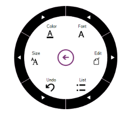
OuterArcHighLightedColor property is used to fill the drilldown region while hovering.
// DrillDown hover color
this.radialMenu1.OuterArcHighLightedColor = System.Drawing.Color.FromArgb(((int)(((byte)(64)))), ((int)(((byte)(64)))), ((int)(((byte)(64)))));</td></tr>
' DrillDown hover color
Me.radialMenu1.OuterArcHighLightedColor = System.Drawing.Color.FromArgb(((int)(((byte)(64)))), ((int)(((byte)(64)))), ((int)(((byte)(64)))))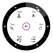
Outer rim (static region)
Outer edge is customized by using the RimBackground and OuterRimThickness properties.
Background
Outer Edge Background is customized using the following code example.
// OuterRim color

this.radialMenu1.RimBackground = Color.Blue;
' OuterRim color
Me.radialMenu1.RimBackground = Color.Blue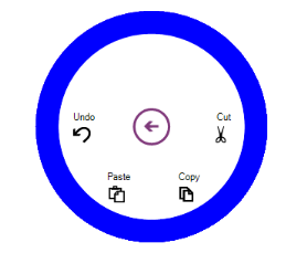
Thickness
The Thickness of the outer edge is set using the following code example.
// Rim thickness

this.radialMenu1.OuterRimThickness = 20;
' Rim thickness
Me.RadialMenu1.OuterRimThickness = 20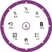
Arc gap
The gap between highlighted Arc and Drilldown region is defined using the following code example.
//Gap between OuterRim and HoverArc

this.radialMenu1.OuterArcGap = 50;
' Gap between OuterRim and HoverArc
Me.RadialMenu1.OuterArcGap = 50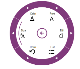
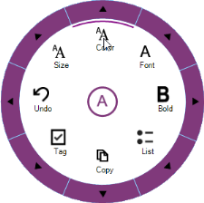
Display style
The Display style of Radial Menu items is customized using different options. They are
- text above the image
- text below the image
- text or image only
// Display style of the text and image.

  this.radialMenu1.DisplayStyle = Syncfusion.Windows.Forms.Tools.DisplayStyle.ImageAboveText;
'Display style of the text and image.
Me.radialMenu1.DisplayStyle = Syncfusion.Windows.Forms.Tools.DisplayStyle. ImageAboveText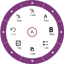
Image size customization
The RadialMenu control allows to change the size of the radial menu items images. The MenuItemImageSize property is used to change the image size of all radial menu items.
private RadialMenu radialMenu;

RadialMenuItem radialMenuItem1 = new RadialMenuItem();
RadialMenuItem radialMenuItem2 = new RadialMenuItem();
RadialMenuItem radialMenuItem3 = new RadialMenuItem();
RadialMenuItem radialMenuItem4 = new RadialMenuItem();
RadialMenuItem radialMenuItem5 = new RadialMenuItem();
RadialMenuItem radialMenuItem6 = new RadialMenuItem();

this.radialMenu.Style =RadialMenuStyle.Office2016Colorful;
this.radialMenu.DisplayStyle = DisplayStyle.ImageAboveText;
this.radialMenu.WedgeCount = 4;

this.radialMenuItem1.ImageIndex = 7;
this.radialMenuItem1.Text = "Edit";

this.radialMenuItem2.ImageIndex = 2;
this.radialMenuItem2.Text = "Cut";

this.radialMenuItem3.ImageIndex = 1;
this.radialMenuItem3.Text = "Copy";

this.radialMenuItem4.ImageIndex = 4;
this.radialMenuItem4.Text = "Paste";

this.radialMenu.Items.Add(this.radialMenuItem1);
this.radialMenu.Items.Add(this.radialMenuItem2);
this.radialMenu.Items.Add(this.radialMenuItem3);
this.radialMenu.Items.Add(this.radialMenuItem4);
this.radialMenu.Items.Add(this.radialMenuItem5);

// Customize all the image size of radialMenu items
this.radialMenu.MenuItemImageSize = new Size(24, 24);

this.radialMenu.Icon = global::GettingStartedDemo.Properties.Resources.A_Colorful;
this.radialMenu.MenuIcon = global::GettingStartedDemo.Properties.Resources.Arrow_Colorful;
this.radialMenu.Size = new System.Drawing.Size(280, 280);
this.radialMenu.Location = new System.Drawing.Point(339, 97);
this.radialMenu.OuterRimThickness = 28;
this.radialMenu.Visible = true;
this.Controls.Add(this.radialMenu);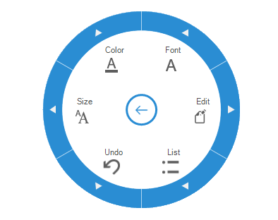
The ImageSize property of RadialMenuItem is used to change the image size of each radial menu item.
private RadialMenu radialMenu;

RadialMenuItem radialMenuItem1 = new RadialMenuItem();
RadialMenuItem radialMenuItem2 = new RadialMenuItem();
RadialMenuItem radialMenuItem3 = new RadialMenuItem();
RadialMenuItem radialMenuItem4 = new RadialMenuItem();
RadialMenuItem radialMenuItem5 = new RadialMenuItem();
RadialMenuItem radialMenuItem6 = new RadialMenuItem();

this.radialMenu.Style =RadialMenuStyle.Office2016Colorful;
this.radialMenu.DisplayStyle = DisplayStyle.ImageAboveText;
this.radialMenu.WedgeCount = 4;

this.radialMenuItem1.ImageIndex = 7;
this.radialMenuItem1.Text = "Edit";

this.radialMenuItem2.ImageIndex = 2;
this.radialMenuItem2.Text = "Cut";

this.radialMenuItem3.ImageIndex = 1;
this.radialMenuItem3.Text = "Copy";

this.radialMenuItem4.ImageIndex = 4;
this.radialMenuItem4.Text = "Paste";

this.radialMenu.Items.Add(this.radialMenuItem1);
this.radialMenu.Items.Add(this.radialMenuItem2);
this.radialMenu.Items.Add(this.radialMenuItem3);
this.radialMenu.Items.Add(this.radialMenuItem4);
this.radialMenu.Items.Add(this.radialMenuItem5);

// Customize the image size of individual radialMenu item
this.radialMenuItem3.ImageSize = new Size(44, 44);

this.radialMenu.Icon = global::GettingStartedDemo.Properties.Resources.A_Colorful;
this.radialMenu.MenuIcon = global::GettingStartedDemo.Properties.Resources.Arrow_Colorful;
this.radialMenu.Size = new System.Drawing.Size(280, 280);
this.radialMenu.Location = new System.Drawing.Point(339, 97);
this.radialMenu.OuterRimThickness = 28;
this.radialMenu.Visible = true;
this.Controls.Add(this.radialMenu);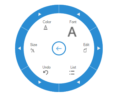
NOTE
If the
ImageSizeis defined, setting theMenuItemImageSizeproperty has no effect for particular radial menu item.