How can I help you?
GroupBar Settings in Windows Forms Navigation Pane (GroupBar)
28 Apr 20214 minutes to read
The look and feel of the GroupBar can be controlled through the appearance properties of the control. These properties are discussed in detail in the below topics.
Integrated scrolling
Scroll buttons can be included for the client controls in the GroupBar by setting the IntegratedScrolling property to true.
this.groupBar1.IntegratedScrolling = true;Me.groupBar1.IntegratedScrolling = True
StackedGroupBar
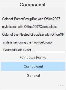
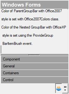
The following are the properties available for GroupBar Items when the GroupBar is in the Stacked Mode. The Stacked Mode can be enabled by setting the StackedMode property to true.
// StackeMode set to true.

this.groupBarItem1.InNavigationPane = true;

this.groupBarItem1.NavigationPaneIcon = ((System.Drawing.Icon)(resources.GetObject("groupBarItem1.NavigationPaneIcon")));

this.groupBarItem1.NavigationPaneImage = ((System.Drawing.Image)(resources.GetObject("groupBarItem1.NavigationPaneImage")));
' StackeMode set to true.
Me.groupBarItem1.InNavigationPane = True
Me.groupBarItem1.NavigationPaneIcon = DirectCast((Resources.GetObject("groupBarItem1.NavigationPaneIcon")), System.Drawing.Icon)
Me.groupBarItem1.NavigationPaneImage = DirectCast((Resources.GetObject("groupBarItem1.NavigationPaneImage")), System.Drawing.Image)If you want to display an icon or image for the GroupBar Item displayed in the GroupBar’s navigation pane, set the InNavigationPane property to true and associate icons or images with the NavigationPaneIcon and NavigationPaneImage
properties respectively.

Stacked GroupBar Item automatically shows the Chevron, which can be made invisible by setting the ShowChevron property to false.

NOTE
You should set LargeImageMode of GroupBarItem to
trueto display the item images in the GroupBar’s navigation pane.
Navigation pane
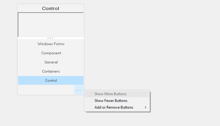
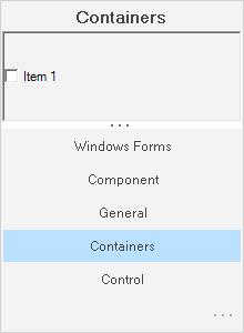
You can set the navigation pane button width and height by using NavigationPaneButtonWidth and NavigationPaneHeight properties respectively.
// StackeMode set to true.

this.groupBar1.NavigationPaneButtonWidth = 25;

this.groupBar1.NavigationPaneHeight = 35;
' StackeMode set to true.
Me.groupBar1.NavigationPaneButtonWidth = 25
Me.groupBar1.NavigationPaneHeight = 35The Navigation Pane is displayed when the GroupBar is in the Stacked Mode. It’s height and width can be adjusted by setting the NavigationPaneButtonWidth and NavigationPaneHeight properties to integer values.

Collapse/expand settings
This section discusses settings of a groupbar in its collapsed state.
NOTE
AllowCollapse property should be set to
trueto effect the below settings.
this.groupBar1.AllowCollapse = true;

this.groupBar1.Collapsed = true;

this.groupBar1.CollapsedText = "Navigation Pane";

this.groupBar1.CollapsedWidth = 45;Me.groupBar1.AllowCollapse = True
Me.groupBar1.Collapsed = True
Me.groupBar1.CollapsedText = "Navigation Pane"
this.groupBar1.CollapsedWidth = 45;Image for collapse/expand states
The below properties set images for the collapse button based on the button states.
this.groupBar1.CollapseImage = ((System.Drawing.Image)(resources.GetObject("groupBar1.CollapseImage")));

this.groupBar1.ExpandImage = ((System.Drawing.Image)(resources.GetObject("groupBar1.ExpandImage")));Me.groupBar1.CollapseImage = DirectCast((resources.GetObject("groupBar1.CollapseImage")), System.Drawing.Image)
Me.groupBar1.ExpandImage = DirectCast((resources.GetObject("groupBar1.ExpandImage")), System.Drawing.Image)