How can I help you?
Appearance and Styling in Windows Forms Hub Tile
28 Apr 20215 minutes to read
Banner visibility
HubTile provides support to render Banner similar to Windows 8 live tiles.

Banner can be added using the following code example.
this.HubTile1.ShowBanner = true;Me.HubTile1.ShowBanner = TrueNOTE
Banner visibility customization is applicable only for DefaultTile type.
Banner text customization
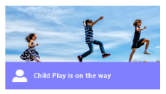
In HubTile, information in the form of text can be displayed in Banner.
this.HubTile1.Banner.Text  = "Child Play is on the way”;
this.HubTile1.Banner.TextColor = Color.White;Me.HubTile1.Banner.Text = "Child Play is on the way”
Me.HubTile1.Banner.TextColor = Color.WhiteNOTE
Banner Text properties are applicable only for DefaultTile and RotateTile types.
Banner icon
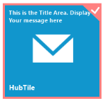
In Banner, icons can be added, like the following image. Use the following code example to create a Banner icon.

this.HubTile1.ShowBannerIcon = true;
this.HubTile1.BannerIcon = this.ImageListAdv1.Images[0];Me.HubTile1.ShowBannerIcon = True
Me.HubTile1.BannerIcon = Me.ImageListAdv1.Images[0]NOTE
BannerIcon customization is applicable only for DefaultTile type.
Banner color
HubTileBanner color can be changed using the BannerColor property.
Banner Color
this.HubTile1.BannerColor= Color.Green;Me.HubTile1.BannerColor= Color.GreenNOTE
BannerColor is applicable only for DefaultTile and RotateTile types.
Selection marker
HubTile provides selection marker support similar to Windows 8 Start screen tile.
The following code example demonstrates how to keep a tile selection marked.
this.HubTile1.IsSelectionMarked = true;Me.HubTile1.IsSelectionMarked = TrueNOTE
Selection Marker is applicable only for DefaultTile type.
Selection marker border color
In HubTile, Selection Marker Border color can be customized using the SelectionMarkerColor.
this.HubTile1.SelectionMarkerColor = Color.Blue;Me.HubTile1.SelectionMarkerColor = Color.BlueNOTE
SelectionMarkerColor is applicable only for DefaultTile type.
Hovered border color
In HubTile, border highlight is rendered once it is focused. Its appearance can be customized using the HoveredBorderColor property.
The following code example demonstrates how you can customize the border color of HubTile on mouse hovering.
this.HubTile1.HoveredBorderColor= Color.Green;Me.HubTile1.HoveredBorderColor= Color.GreenThe following code example illustrates how to enable the hover border color.
this.HubTile1.EnableHoverColor= true;Me.HubTile1.EnableHoverColor= TrueExpand on hover
HubTile can be expanded once it is focused. It can be enabled by using the ExpandOnHover property.
this.HubTile1.ExpandOnHover= true;Me.HubTile1.ExpandOnHover= TrueNOTE
ExpandOnHover is applicable only for DefaultTile type.
Tile press behavior
Tile sliding effect occurs on mouse click and based on the position of the mouse pointer. The EnableTileSlideEffect property allows you to enable or disable the sliding effect in HubTile.
this.HubTile1.EnableTileSlideEffect = true;Me.HubTile1.EnableTileSlideEffect = TrueNOTE
EnableTileSlideEffect is applicable only for DefaultTile and PulsingTile types.