How can I help you?
Scrolling in Windows Forms Diagram
29 Nov 20245 minutes to read
The interactive features like scrolling, zooming and panning support are discussed in this section:
Scroll Support
The horizontal and vertical scrollbars can be displayed or hidden by handling the HScroll and VScroll properties.
Scroll Support
| Properties | Description |
|---|---|
| HScroll | Specifies whether to display the horizontal scroll bar. |
| VScroll | Specifies whether to display the vertical scroll bar. |
Programmatically, these properties can be set as follows.
this.diagram1.HScroll = true;
this.diagram1.VScroll = true;Me.diagram1.HScroll = True
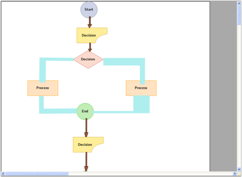
Me.diagram1.VScroll = TrueSample diagram is as follows,
ScrollGranularity determines the level of granularity for scrolling. The value of this property must be greater than 0. This value is multiplied by virtual size of the view in order to get the scroll range. For example, if the virtual size of the view is 100x50 and this property is set to 0.5f, then the horizontal scroll range is set to 0.50 and the vertical scroll range is set to 0.25.
SmoothMouseWheelScrolling specifies whether the control should perform one scroll command (faster) or if it should perform multiple scroll commands with smaller increments (smoother) when user rolls mouse wheel.
Properties
| Property | Description |
|---|---|
| EnableIntelliMouse | Toggles support for Intelli-Mouse panning. When the user presses the middle-mouse button and drags the mouse, the window will scroll. |
| ScrollGranularity | Specifies the level of granularity for scrolling. This value is to scale the scroll range of the scrollbars. |
| SmoothMouseWheelScrolling | Specifies whether the control should perform one scroll command (faster) or if it should perform multiple scroll commands with smaller increments (smoother) when user rolls mouse wheel. |
| HScrollBar | Returns a reference to an object with horizontal scrollbar settings of the control. |
Programmatically these properties can be set as follows.
this.diagram1.EnableIntelliMouse = true;
this.diagram1.ScrollGranularity = .9F;
this.diagram1.SmoothMouseWheelScrolling = false;
this.diagram1.HScrollBar.SmallChange = 200;Me.diagram1.EnableIntelliMouse = True
Me.diagram1.ScrollGranularity = .9F
Me.diagram1.SmoothMouseWheelScrolling = False
Me.diagram1.HScrollBar.SmallChange = 200
Scrollable Area
Diagram has ScrollVirtualBounds property, which determines the bounds of the scrollable area. This sets the Diagram control’s virtual space i.e, gray area around the control. Sometimes, we may need to remove that area and use Diagram control area alone.
this.diagram1.ScrollVirtualBounds = new RectangleF(0, 0, 0, 0);Me.diagram1.ScrollVirtualBounds = New RectangleF(0, 0, 0, 0)
Scroll Behavior
Scrolling behavior can be controlled by setting the AccelerateScrolling property.
Scroll Behavior
| Property | Description |
|---|---|
| AccelerateScrolling | Specifies the scrolling behavior. The options included are as follows:* None* Default* Fast* Immediate |
|
AllowIncreaseSmallChange |
Specifies if the scroll control can increase the ScrollBar.SmallChange property during accelerated scrolling. |
Here, setting the AccelerateScrolling to Fast, will increase the scroll speed when the horizontal or vertical thumb is pressed continuously.
this.diagram1.AccelerateScrolling = Syncfusion.Windows.Forms.AccelerateScrollingBehavior.Fast;
this.diagram1.AllowIncreaseSmallChange = true;Me.diagram1.AccelerateScrolling = Syncfusion.Windows.Forms.AccelerateScrollingBehavior.Fast
Me.diagram1.AllowIncreaseSmallChange = TrueThumbTrack
The HorizontalThumbTrack and VerticalThumbTrack properties allows to handle whether the scroll bar thumb should be used for scrolling.
ThumbTrack
| Property | Description |
|---|---|
| HorizontalThumbTrack | Specifies if the control should scroll while the user is dragging a horizontal scrollbar thumb. |
| VerticalThumbTrack | Specifies if the control should scroll while the user is dragging a vertical scrollbar thumb. |
Programmatically, these properties can be set as follows.
this.diagram1.HorizontalThumbTrack = true;
this.diagram1.VerticalThumbTrack = true;Me.diagram1.HorizontalThumbTrack = True
Me.diagram1.VerticalThumbTrack = TrueScrollTips
ScrollTips can be enabled or disabled for horizontal and vertical scroll bars individually by setting the HorizontalScrollTips and VerticalScrollTips properties.
The format in which the ScrollTip should be displayed can be specified using the ScrollTipFormat property. The default format is ‘Position{0}’.
ScrollTips
| Properties | Description |
|---|---|
| HorizontalScrollTips | Specifies whether to display the horizontal scroll bar. |
| VerticalScrollTips | Specifies whether to display the vertical scroll bar. |
| ScrollTipFormat | Specifies the format for the ScrollTip to be displayed. |
Programmatically these properties can be set as follows.
this.diagram1.HorizontalScrollTips = true;
	this.diagram1.VerticalScrollTips = true;
this.diagram1.ScrollTipFormat = "Offset{0}";Me.diagram1.HorizontalScrollTips = True
Me.diagram1.VerticalScrollTips = True
Me.diagram1.ScrollTipFormat = "Offset{0}"Using Splitter control
When splitter control is used and one or more diagram controls are added, setting the FillSplitterPane docks the diagram control inside the splitter control and fills the entire space.
Splitter
| Property | Description |
|---|---|
| FillSplitterPane | Specifies whether to fill the splitter control with diagram. |
Programmatically these properties can be set as follows.
this.diagram1.FillSplitterPane = true;Me.diagram1.FillSplitterPane = True