Overview of .NET MAUI ListView
18 Nov 20185 minutes to read
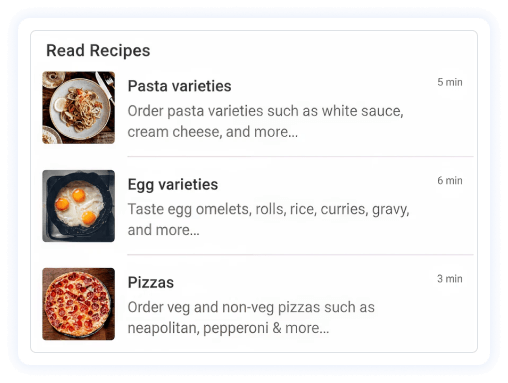
The Syncfusion® .NET MAUI ListView renders set of data items using Maui views or custom templates. Data can easily be grouped, sorted, and filtered.
Business use cases
- Data-driven applications that require efficient display of large collections using list or grid layouts.
- E-commerce and catalog apps that present products with rich templates and grouped categories.
- Messaging and social apps that display dynamic lists with real-time updates and infinite scrolling.
- Business applications that require sorting, grouping, and filtering of data in list-based views.
Key features
- Optimized performance support allows smooth rendering using efficient view reuse techniques.
- Item templating support allows designing rich and customized UI layouts for each data item.
- Dynamic template selection allows using DataTemplateSelector to define different UI layouts based on item type.
- Auto-fit item sizing allows adjusting item size automatically based on content within the template.
- Multiple layout support allows displaying items in both linear and grid arrangements.
- Orientation support allows switching between horizontal and vertical list layouts.
- Data operations support allows sorting, grouping, and filtering data efficiently.
- Group header customization allows customizing group headers with sticky header support.
- Selection support allows choosing items using various selection modes and gestures.
- Header and footer support allows adding sticky headers and footers for better content organization.
- Load more support allows loading additional data automatically or manually when scrolling reaches the list boundaries.
Globalization
The following table summarizes the globalization support available in this control.
 Full Support
 Partial Support
 Not Applicable
| Control | Localization | RTL | Time zone | Screen reader | Keyboard navigation |
|---|---|---|---|---|---|
| ListView | |
|
|
|
|
Related controls
- DataGrid for displaying structured data in a tabular format.
- Cards for presenting content using card-based layouts.
- ComboBox for displaying and selecting items from a dropdown list.
See Also
- Getting Started shows a step‑by‑step guide to begin using the ListView control.
- Layouts explains how to configure list and grid layouts.
- Grouping helps implement grouping and data organization.
- UI Kit provides interactive demos and ready‑made UI examples.
Resources
Feature Tour
Get a quick overview of key features and capabilities to kick start your journey.
Explore Features
Tutorial Videos
Watch step‑by‑step video guides to quickly understand concepts and implementation.
Watch now
Knowledge Base
Find practical solutions, troubleshooting tips and how‑to guides for common scenarios.
Search KB's
Use Case Sample
Explore a real-world application that demonstrates the practical use of the ListView.
View Sample