Header and Footer in .NET MAUI ListView
18 Nov 201824 minutes to read
This section explains how to define and customize the header and footer in the SfListView.
Header and footer customization
The SfListView allows you to add and customize the appearance of the header and footer by setting the SfListView.HeaderTemplate and SfListView.FooterTemplate properties.
The following example defines both a header and a footer for the SfListView.
<ContentPage xmlns:syncfusion="clr-namespace:Syncfusion.Maui.ListView;assembly=Syncfusion.Maui.ListView">
    <syncfusion:SfListView x:Name="listView"
                    ItemsSource="{Binding BookInfo}"
                    ItemSize="100">
        <syncfusion:SfListView.HeaderTemplate>
            <DataTemplate>
            <Grid BackgroundColor="Blue" HeightRequest="45">
                <Label LineBreakMode="NoWrap"
                    Margin="10,0,0,0" Text="Book Information" FontAttributes="Bold"
                    FontSize="18" TextColor="White" HorizontalOptions="Center"
                    VerticalOptions="Center"/>
            </Grid>
            </DataTemplate>
        </syncfusion:SfListView.HeaderTemplate>
        <syncfusion:SfListView.FooterTemplate>
            <DataTemplate>
                <Grid BackgroundColor="LightGray" HeightRequest="40">
                    <Label Text="End of books" FontAttributes="Italic"
                           TextColor="Black" FontSize="14"
                           HorizontalOptions="Center" VerticalOptions="Center"/>
                </Grid>
            </DataTemplate>
        </syncfusion:SfListView.FooterTemplate>
    </syncfusion:SfListView>
</ContentPage>
public partial class MainPage : ContentPage
{
SfListView listView;
ViewModel viewModel;
public MainPage()
{
InitializeComponent();
viewModel = new ViewModel();
listView = new SfListView();
listView.ItemsSource = viewModel.BookInfo;
listView.HeaderTemplate = new DataTemplate(() =>
{
var grid = new Grid
{
BackgroundColor = Colors.Blue,
HeightRequest = 45
};
var headerLabel = new Label
{
LineBreakMode = LineBreakMode.NoWrap,
Margin = new Thickness(10, 0, 0, 0),
Text = "Book Information",
FontAttributes = FontAttributes.Bold,
FontSize = 18,
TextColor = Colors.White,
HorizontalOptions = LayoutOptions.Center,
VerticalOptions = LayoutOptions.Center
};
grid.Children.Add(headerLabel);
return grid;
});
listView.FooterTemplate = new DataTemplate(() =>
{
var grid = new Grid
{
BackgroundColor = Colors.LightGray,
HeightRequest = 40
};
var footerLabel = new Label
{
Text = "End of books",
FontAttributes = FontAttributes.Italic,
TextColor = Colors.Black,
FontSize = 14,
HorizontalOptions = LayoutOptions.Center,
VerticalOptions = LayoutOptions.Center
};
grid.Children.Add(footerLabel);
return grid;
});
this.Content = listView;
}
}Header and footer items appearance
The SfListView allows you to customize the size of the header and footer items by setting the SfListView.HeaderSize and SfListView.FooterSize properties. The default value is 40. These properties can be customized at runtime.
<syncfusion:SfListView x:Name="listView" ItemsSource="{Binding BookInfo}" HeaderSize="70" FooterSize="60" />listView.HeaderSize = 70;
listView.FooterSize = 60;For vertical orientation, the header and footer size are considered as height. For horizontal orientation, that will be considered as width.
Sticky header and footer
The SfListView allows you to stick the header and footer items to view by enabling the SfListView.IsStickyHeader and SfListView.IsStickyFooter properties. If the SfListView.IsStickyHeader is true, the header item will stick to the top (or leading edge in horizontal orientation) of the SfListView. If the SfListView.IsStickyFooter is true, the footer item will stick to the bottom (or trailing edge in horizontal orientation) of the SfListView.
<syncfusion:SfListView x:Name="listView" ItemsSource="{Binding CategoryInfo}" IsStickyHeader="true" IsStickyFooter="true" />listView.IsStickyHeader = true;
listView.IsStickyFooter = true;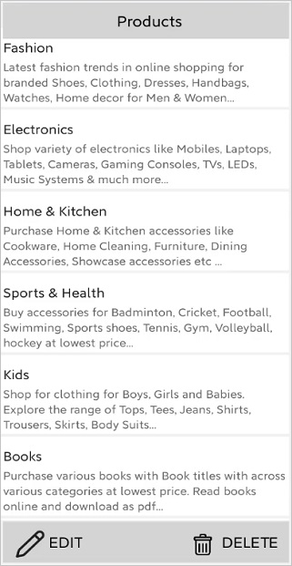
Sticky footer position
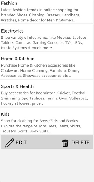
The SfListView allows you to position the footer item by using the StickyFooterPosition property.
The StickyFooterPosition property accepts values of type ListViewFooterPosition. The available options are:
- Body: The footer item will be positioned inside the body of the ListView when the items are less than the view size.
- Default: The footer item will be positioned at the bottom of the ListView.
<syncfusion:SfListView x:Name="listView" ItemsSource="{Binding CategoryInfo}" IsStickyFooter="True" StickyFooterPosition="Body"/>listView.IsStickyFooter = true;
listView.StickyFooterPosition = ListViewFooterPosition.Body;This API is applicable when
IsStickyFooteris enabled.
How to
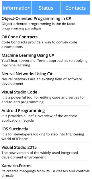
TabView appearance using listview header
The SfListView allows you to create a tab view layout by customizing the HeaderTemplate to load any view.
<ContentPage xmlns:syncfusion="clr-namespace:Syncfusion.Maui.ListView;assembly=Syncfusion.Maui.ListView"
             xmlns:local="clr-namespace:HeaderFooterSample.ViewModels">
    <ContentPage.BindingContext>
        <local:BookInfoRepository />
    </ContentPage.BindingContext>
    <ContentPage.Resources>
        <ResourceDictionary>
            <DataTemplate x:Key="template">
                        <Grid x:Name="grid" RowSpacing="0" Margin="5">
                            <Grid.RowDefinitions>
                                <RowDefinition Height="*" />
                                <RowDefinition Height="1" />
                            </Grid.RowDefinitions>
                            <Grid RowSpacing="0" Grid.Row="0">
                                <Grid.RowDefinitions>
                                    <RowDefinition Height="*" />
                                    <RowDefinition Height="*" />
                                </Grid.RowDefinitions>
                                <Label Grid.Row="0" Text="{Binding BookName}" FontAttributes="Bold" TextColor="Black" FontSize="14" />
                                <Label Grid.Row="1" Text="{Binding BookDescription}" TextColor="Black" FontSize="12"/>
                            </Grid>
                            <StackLayout Grid.Row="1" BackgroundColor="#E4E4E4" HeightRequest="1"/>
                        </Grid>
            </DataTemplate>
        </ResourceDictionary>
    </ContentPage.Resources>
    <syncfusion:SfListView x:Name="listView" IsStickyHeader="True" IsStickyFooter="True"
                               HeaderSize="80" FooterSize="60" SelectionBackground="LightBlue"
                               ItemSize="90" SelectionMode="Single" ItemTemplate="{StaticResource template}">
        <syncfusion:SfListView.HeaderTemplate>
            <DataTemplate>
                <Grid BackgroundColor="#4CA1FE" HeightRequest="60">
                    <Grid.ColumnDefinitions>
                        <ColumnDefinition Width="2" />
                        <ColumnDefinition Width="*" />
                        <ColumnDefinition Width="2" />
                        <ColumnDefinition Width="*" />
                        <ColumnDefinition Width="2" />
                        <ColumnDefinition Width="*" />
                        <ColumnDefinition Width="2" />
                    </Grid.ColumnDefinitions>
                    <Grid Grid.Column="1" HorizontalOptions="FillAndExpand" VerticalOptions="FillAndExpand" >
                        <Label x:Name="info" BackgroundColor="Transparent" Text="Informations" FontAttributes="Bold" FontSize="18" TextColor="White"
                              HorizontalTextAlignment="Center" VerticalTextAlignment="Center"  />
                        <Grid.GestureRecognizers>
                            <TapGestureRecognizer Tapped="InfoTapGestureRecognizerTapped" NumberOfTapsRequired="1"/>
                        </Grid.GestureRecognizers>
                    </Grid>
                    <Grid Grid.Column="3" HorizontalOptions="FillAndExpand" VerticalOptions="FillAndExpand" >
                        <Label x:Name="status" BackgroundColor="Transparent" Text="Status" FontAttributes="Bold" FontSize="18" TextColor="White"
                                HorizontalTextAlignment="Center" VerticalTextAlignment="Center" />
                        <Grid.GestureRecognizers>
                            <TapGestureRecognizer Tapped="StatusTapGestureRecognizerTapped" NumberOfTapsRequired="1"/>
                        </Grid.GestureRecognizers>
                    </Grid>
                    <Grid Grid.Column="5" HorizontalOptions="FillAndExpand" VerticalOptions="FillAndExpand" >
                        <Label x:Name="contacts" BackgroundColor="Transparent" Text="Contacts" FontAttributes="Bold" FontSize="18" TextColor="White"
                               HorizontalTextAlignment="Center" VerticalTextAlignment="Center"/>
                        <Grid.GestureRecognizers>
                            <TapGestureRecognizer Tapped="ContactsTapGestureRecognizerTapped" NumberOfTapsRequired="1"/>
                        </Grid.GestureRecognizers>
                    </Grid>
                    <BoxView Grid.Column="0" BackgroundColor="White" />
                    <BoxView Grid.Column="2" BackgroundColor="White" />
                    <BoxView Grid.Column="4" BackgroundColor="White" />
                    <BoxView Grid.Column="6" BackgroundColor="White" />
                </Grid>
            </DataTemplate>
        </syncfusion:SfListView.HeaderTemplate>
    </syncfusion:SfListView>
</ContentPage>
public partial class MainPage : ContentPage
{
// Flat collection of BookInfo items (used by the "Informations" tab).
BookInfoRepository viewModel = new BookInfoRepository();
// Flat collection of BookInfo1 items (used by the "Status" tab).
BookInfoRepository1 viewModel1 = new BookInfoRepository1();
// Grouped collection of EmployeeInfo items (used by the "Contacts" tab).
ContactsViewModel viewModel2 = new ContactsViewModel();
public MainPage()
{
InitializeComponent();
this.listView.ItemsSource = viewModel.BookInfo;
}
public void InfoTapGestureRecognizerTapped(object sender, EventArgs e)
{
// Flat data: reuse the shared "template" DataTemplate.
this.listView.ItemsSource = viewModel.BookInfo;
this.listView.ItemTemplate = this.Resources["template"] as DataTemplate;
}
public void StatusTapGestureRecognizerTapped(object sender, EventArgs e)
{
// Flat data: reuse the shared "template" DataTemplate.
this.listView.ItemsSource = viewModel1.BookInfo1;
this.listView.ItemTemplate = this.Resources["template"] as DataTemplate;
}
public void ContactsTapGestureRecognizerTapped(object sender, EventArgs e)
{
// Grouped data: assign the grouped collection and rebuild the
// item/group templates in code (see InitializeTemplate()).
this.listView.ItemsSource = viewModel2.EmployeeInfo;
InitializeTemplate();
}
private void InitializeTemplate()
{
listView.ItemTemplate = new DataTemplate(() => { return CreateItemTemplate(); });
listView.ItemSize = 70;
listView.GroupHeaderSize = 60;
listView.IsStickyGroupHeader = true;
listView.AllowGroupExpandCollapse = true;
listView.ItemSpacing = new Thickness(0, 0, 5, 0);
listView.IsStickyHeader = true;
listView.GroupHeaderTemplate = new DataTemplate(() =>
{
var grid = new Grid { BackgroundColor = Color.FromHex("#E4E4E4") };
var label = new Label
{
FontAttributes = FontAttributes.Bold,
FontSize = 22,
VerticalOptions = LayoutOptions.Center,
HorizontalOptions = LayoutOptions.Start,
Margin = new Thickness(20, 0, 0, 0),
};
label.SetBinding(Label.TextProperty, new Binding("Key"));
grid.Children.Add(label);
return grid;
});
}
private Grid CreateItemTemplate()
{
var gridView = new Grid();
gridView.RowSpacing = 1;
var row0 = new RowDefinition { Height = new GridLength(1, GridUnitType.Star) };
var row1 = new RowDefinition { Height = 1 };
gridView.RowDefinitions.Add(row0);
gridView.RowDefinitions.Add(row1);
var grid = new Grid();
var column0 = new ColumnDefinition { Width = 50 };
var column1 = new ColumnDefinition { Width = new GridLength(1, GridUnitType.Star) };
var column2 = new ColumnDefinition { Width = 70 };
grid.ColumnDefinitions.Add(column0);
grid.ColumnDefinitions.Add(column1);
grid.ColumnDefinitions.Add(column2);
var contactImage = new Image();
contactImage.SetBinding(Image.SourceProperty, new Binding("EmployeeImage"));
contactImage.HeightRequest = 50;
contactImage.VerticalOptions = LayoutOptions.Center;
contactImage.HorizontalOptions = LayoutOptions.Center;
var innerGridView = new Grid();
innerGridView.RowSpacing = 1;
innerGridView.Padding = new Thickness(10, 0, 0, 0);
innerGridView.VerticalOptions = LayoutOptions.Center;
var rowdefinition0 = new RowDefinition { Height = new GridLength(1, GridUnitType.Star) };
var rowdefinition1 = new RowDefinition { Height = new GridLength(1, GridUnitType.Star) };
innerGridView.RowDefinitions.Add(rowdefinition0);
innerGridView.RowDefinitions.Add(rowdefinition1);
var contactName = new Label();
contactName.SetBinding(Label.TextProperty, new Binding("EmployeeName"));
contactName.LineBreakMode = LineBreakMode.NoWrap;
contactName.TextColor = Color.FromHex("#474747");
contactName.FontSize = 20;
var contactNumber = new Label();
contactNumber.FontAttributes = FontAttributes.None;
contactNumber.FontSize = 18;
contactNumber.LineBreakMode = LineBreakMode.NoWrap;
contactNumber.SetBinding(Label.TextProperty, new Binding("ContactNumber"));
contactNumber.TextColor = Color.FromHex("#474747");
var contactType = new Label();
contactType.Margin = new Thickness(5);
contactType.FontAttributes = FontAttributes.None;
contactType.LineBreakMode = LineBreakMode.NoWrap;
contactType.VerticalOptions = LayoutOptions.End;
contactType.VerticalTextAlignment = TextAlignment.End;
contactType.HorizontalOptions = LayoutOptions.End;
contactType.SetBinding(Label.TextProperty, new Binding("Designation"));
contactType.TextColor = Color.FromHex("#474747");
contactType.FontSize = 12;
var stackLayout = new StackLayout();
stackLayout.HeightRequest = 1;
stackLayout.BackgroundColor = Color.Gray;
innerGridView.Children.Add(contactName);
innerGridView.Children.Add(contactNumber);
innerGridView.SetRow(contactName, 0);
innerGridView.SetRow(contactNumber, 1);
grid.Children.Add(contactImage);
grid.Children.Add(innerGridView);
grid.SetColumn(contactImage, 0);
grid.SetColumn(innerGridView, 1);
gridView.Children.Add(grid);
gridView.Children.Add(stackLayout);
gridView.SetRow(grid, 0);
gridView.SetRow(stackLayout, 1);
return gridView;
}
}