Item Reordering in .NET MAUI ListView (SfListView)
18 Jun 202619 minutes to read
The SfListView allows reordering by dragging and dropping items. It supports displaying the customized view in a template while dragging the item. It can be enabled by setting the SfListView.DragStartMode property to OnHold. The drag-and-drop options are listed as follows:
- None: Disables drag and drop. This is the default value.
- OnHold: Allows dragging and dropping by holding the item.
- OnDragIndicator: Allows dragging and dropping by loading the DragIndicatorView within SfListView.ItemTemplate.
NOTE
The GridLayout does not support drag and drop.
The drag and drop scenarios are as follows:
- Items can be reordered to any position by auto-scrolling.
- Items can be reordered in the same group or in other groups but, no groups can be added to other groups.
- Groups, header, and footer cannot be reordered.
To enable drag and drop using OnHold, follow the code example below.
<ContentPage  xmlns:syncfusion="clr-namespace:Syncfusion.Maui.ListView;assembly=Syncfusion.Maui.ListView">
  <syncfusion:SfListView x:Name="listView"
                   ItemsSource="{Binding ToDoList}"
                   DragStartMode="OnHold" />
</ContentPage>listView.DragStartMode = DragStartMode.OnHold;To enable drag and drop using both OnHold and OnDragIndicator, follow the code example below.
<ContentPage xmlns:syncfusion="clr-namespace:Syncfusion.Maui.ListView;assembly=Syncfusion.Maui.ListView">
  <syncfusion:SfListView x:Name="listView"
                   ItemsSource="{Binding ToDoList}"
                   DragStartMode="OnHold, OnDragIndicator"/>
</ContentPage>listView.DragStartMode = DragStartMode.OnHold | DragStartMode.OnDragIndicator;NOTE
Reordering changes made only in view, and not in the underlying collection. Thus, the changes will be reverted when performing sorting, grouping, or any other operation that refreshes the view. You can update the underlying collection by setting UpdateSource to
true.
Drag indicator view
To drag and drop the items by the DragIndicatorView, set the SfListView.DragStartMode property to OnDragIndicator. To display the dragging item, define any custom user interface(UI) in the DragIndicatorView.
NOTE
You must set the SfListView instance as a reference to the ListView property in
DragIndicatorView.
<ContentPage xmlns:syncfusion="clr-namespace:Syncfusion.Maui.ListView;assembly=Syncfusion.Maui.ListView">
  <syncfusion:SfListView x:Name="listView"
                   ItemsSource="{Binding ToDoList}"
                   DragStartMode="OnDragIndicator">
  <syncfusion:SfListView.ItemTemplate>
    <DataTemplate>
      <Grid>
          <Grid.ColumnDefinitions>
            <ColumnDefinition Width="*" />
            <ColumnDefinition Width="60" />
          </Grid.ColumnDefinitions>
          <Label x:Name="textLabel" Text="{Binding Name}" Grid.Column="0" FontSize="15" TextColor="#333333" />
          <syncfusion:DragIndicatorView Grid.Column="1" ListView="{x:Reference listView}"
                    HorizontalOptions="Center"
                    VerticalOptions="Center">
            <Grid Padding="10, 20, 20, 20">
              <Image Source="dragindicator.png" />
            </Grid>
          </syncfusion:DragIndicatorView>
      </Grid>
    </DataTemplate>
  </syncfusion:SfListView.ItemTemplate>
</syncfusion:SfListView>
</ContentPage>listView.ItemTemplate = new DataTemplate(() =>
{
var grid = new Grid();
var name = new Label
{
FontSize = 15,
VerticalOptions = LayoutOptions.Center
};
name.SetBinding(Label.TextProperty, new Binding("Name"));
var indicatorGrid = new Grid()
{
Padding = new Thickness(10, 20, 20, 20),
HorizontalOptions = LayoutOptions.End,
VerticalOptions = LayoutOptions.Center
};
var dragIndicatorView = new DragIndicatorView() { ListView = this.listView };
var indicator = new Image() { Source = "dragindicator.png" };
indicatorGrid.Children.Add(indicator);
dragIndicatorView.Content = indicatorGrid;
grid.Children.Add(name);
grid.Children.Add(dragIndicatorView);
grid.SetColumn(name, 0);
grid.SetColumn(dragIndicatorView, 1);
return grid;
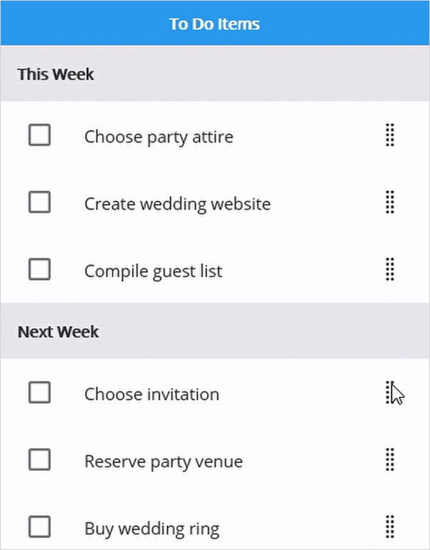
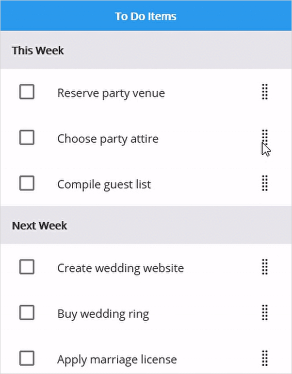
});The screenshot shows the output of the reordering items by drag and drop. Download the entire source code from GitHub here.
Drag item customization
By defining the SfListView.DragItemTemplate property of the SfListView, you can display a custom user interface (UI) when performing drag and drop operations. The template can be defined either in code or XAML.
<ContentPage xmlns:syncfusion="clr-namespace:Syncfusion.Maui.ListView;assembly=Syncfusion.Maui.ListView">
  <syncfusion:SfListView x:Name="listView"
                   ItemsSource="{Binding ToDoList}"
                   DragStartMode="OnHold">
  <syncfusion:SfListView.DragItemTemplate>
    <DataTemplate>
      <Grid Padding="10">
        <Label x:Name="textLabel" Text="{Binding Name}" FontSize="15" />
      </Grid>
    </DataTemplate>
  </syncfusion:SfListView.DragItemTemplate>
</syncfusion:SfListView>
</ContentPage>listView.DragItemTemplate = new DataTemplate(() => {
var grid = new Grid();
var name = new Label { FontSize = 15 };
name.SetBinding(Label.TextProperty, new Binding("Name"));
grid.Children.Add(name);
return grid;
});Event
The ItemDragging event is raised while dragging and dropping the item in the SfListView. The ItemDraggingEventArgs has the following members which provide the information for the ItemDragging event:
-
Action: Return the drag
Actionsuch as start, dragging, and drop. - Bounds: Return bounds of drag item when dragging and dropping.
-
Handled: If this member is set to
true, dragging can be handled. It is applicable only ifActionisDragging. - DataItem: Return the underlying data of the dragging item.
- NewIndex: Return the item index of the DataSource.DisplayItems where the dragging item will be dropped.
-
OldIndex: Return the item index of the DataSource.DisplayItems where the dragging item started. The OldIndex and NewIndex will be the same if
ActionisStart. - Position: Returns the touch position of the drag item from the screen coordinates.
Auto scroll options
Auto scroll margin
To adjust the auto scroll margin, set a value to the ScrollMargin property of AutoScroller to enable auto-scrolling while dragging. The default value is 15. Auto-scrolling will be enabled when reaching the ScrollMargin from view bounds while dragging.
To disable auto-scrolling, set the value to 0 for ScrollMargin.
this.listView.AutoScroller.ScrollMargin = 20;Auto scroll interval
To adjust the auto-scroll interval while dragging, set the Interval property of AutoScroller. The default value is 150 milliseconds.
this.listView.AutoScroller.Interval = new TimeSpan(0, 0, 0, 0, 200);Disable outside scroll
To disable auto-scroll when dragging item moves outside the SfListView while dragging, set the AllowOutsideScroll property of AutoScroller to false. The default value is true.
this.listView.AutoScroller.AllowOutsideScroll = false;Disable dragging for particular item
To disable dragging for a particular item, handle the ItemDragging event based on the conditions of the Action event argument.
You can cancel the dragging action for a particular item by setting the Cancel property of the ItemDraggingEventArgs.
private void ListView_ItemDragging(object sender, ItemDraggingEventArgs e)
{
  // Disable the dragging for 4th item.
  if (e.Action == DragAction.Start && e.NewIndex == 3)
    e.Cancel = true;
}
Cancel dropping for the dragged item
To cancel dropping for the dragged item, handle the ItemDragging event based on the conditions of the Action event argument.
You can cancel the dropping action for an item by setting the Cancel property of the ItemDraggingEventArgs.
using Syncfusion.Maui.ListView.Helpers;
private void ListView_ItemDragging(object sender, ItemDraggingEventArgs e)
{
  // Cancel the dropping if drop the drag item into out of view.
  var listView = sender as ListView;
  var totalExtent = this.listView.GetVisualContainer().Bounds.Bottom;
  if (e.Action == DragAction.Drop && (e.Bounds.Y < -30 || e.Bounds.Bottom > totalExtent + 40))
    e.Cancel = true;
}
Reorder the underlying collection
The underlying collection can be reordered directly by setting the DragDropController.UpdateSource property to true. The default value is false.
<ContentPage xmlns:syncfusion="clr-namespace:Syncfusion.Maui.ListView;assembly=Syncfusion.Maui.ListView">
  <syncfusion:SfListView x:Name="listView"
                   ItemsSource="{Binding ToDoList}"
                   DragStartMode="OnHold">
  <syncfusion:SfListView.DragDropController>
                <syncfusion:DragDropController
                    UpdateSource="True">
                </syncfusion:DragDropController>
   </syncfusion:SfListView.DragDropController>
</syncfusion:SfListView>
</ContentPage>this.listView.DragDropController.UpdateSource = true;You can update collection even when UpdateSource is false. Like, the user can decide where the dragged item should be dropped actually by handling the ItemDragging event with DragAction.Drop.
private void ListView_ItemDragging(object sender, ItemDraggingEventArgs e)
{
   if (e.Action == DragAction.Drop)
      {
        viewModel.ToDoList.MoveTo(1, 5);
      }
}
NOTE
Underlying collection will not be updated when any data operation like sorting or grouping is performed. The order will be maintained only in the
DisplayItemsof the data source. When drag and drop an item between groups, the value of the property in which grouping is performed is updated in the data object.
Delete item when dropping in particular view
To delete the dragged item when dropping into a view, handle the ItemDragging event based on the conditions of the Action and Bounds event arguments.
To delete the dragged item from the underlying collection when dropping into the delete icon, follow the code example. It will enable or disable whenever drag started, and dropped by the IsVisible property in ViewModel.
<ContentPage xmlns:syncfusion="clr-namespace:Syncfusion.Maui.ListView;assembly=Syncfusion.Maui.ListView">
<Grid>
  <Grid.RowDefinitions>
    <RowDefinition Height="40" />
    <RowDefinition Height="*" />
  </Grid.RowDefinitions>

  <Grid BackgroundColor="#2196F3">
    <Label Text="To Do Items" x:Name="headerLabel"  TextColor="White" FontAttributes="Bold" VerticalOptions="Center" HorizontalOptions="Center" />
    <StackLayout x:Name="stackLayout" IsVisible="{Binding Path=IsVisible, Source={x:Reference headerLabel}, Converter={StaticResource inverseBoolConverter}}" Orientation="Horizontal" VerticalOptions="Center" HorizontalOptions="Center">
          <Image Source="delete.png" HeightRequest="30" WidthRequest="30" VerticalOptions="Center" HorizontalOptions="Center" />
          <Label x:Name="deleteLabel" Text="Delete Item" FontAttributes="Bold" TextColor="White" VerticalTextAlignment="Center" />
    </StackLayout>
  </Grid>
  <syncfusion:SfListView x:Name="listView" Grid.Row="1"
                   ItemsSource="{Binding ToDoList}"
                   DragStartMode="OnHold"/>
</Grid>
</ContentPage>
public partial class MainPage : ContentPage
{
public MainPage()
{
InitializeComponent();
var maingrid = new Grid();
maingrid.RowDefinitions.Add(new RowDefinition { Height = new GridLength(40) });
maingrid.RowDefinitions.Add(new RowDefinition { Height = new GridLength(1, GridUnitType.Star) });
var grid = new Grid();
var headerLabel = new Label()
{
Text = "To Do Items"
};
var stackLayout = new StackLayout();
stackLayout.SetBinding(StackLayout.IsVisibleProperty, new Binding("IsVisible"));
var image = new Image() { Source = "delete.png" };
var deleteLabel = new Label() { Text = "DeleteItem" };
stackLayout.Children.Add(image);
stackLayout.Children.Add(deleteLabel);
grid.Children.Add(headerLabel);
grid.Children.Add(stackLayout);
var listView = new SfListView()
{
DragStartMode = DragStartMode.OnHold,
ItemSize = 60,
SelectionMode = Syncfusion.Maui.ListView.SelectionMode.None,
BackgroundColor = Color.FromHex("#FFE8E8EC")
};
listView.ItemsSource = viewModel.ToDoList;
maingrid.Children.Add(grid);
maingrid.SetRow(grid, 0);
maingrid.Children.Add(listView);
maingrid.SetRow(listView, 1);
this.Content = maingrid;
}
}private async void ListView_ItemDragging(object sender, ItemDraggingEventArgs e)
{
var viewModel = this.listView.BindingContext as ViewModel;
var position = new Point(e.Position.X - this.ListView.Bounds.X, Math.Abs(e.Position.Y - this.ListView.Bounds.Y));
if (e.Action == DragAction.Start)
{
this.headerLabel.IsVisible = false;
}
if(e.Action == DragAction.Dragging)
{
if ((this.Stack.Bounds.Y < position.Y) && (this.Stack.Bounds.Y + this.Stack.Height) > position.Y)
{
this.deleteLabel.TextColor = Colors.Red;
}
else
this.deleteLabel.TextColor = Colors.White;
}
if(e.Action == DragAction.Drop)
{
if ((this.Stack.Bounds.Y < position.Y) && (this.Stack.Bounds.Y + this.Stack.Height) > position.Y)
{
await Task.Delay(100);
viewModel.ToDoList.Remove(e.DataItem as ToDoItem);
}
this.deleteLabel.TextColor = Colors.White;
this.headerLabel.IsVisible = true;
}
}Download the sample from GitHub here.
Drag and drop customization
Adjust drag item axis
To adjust the X and Y coordinates of the drag item while dragging, you can set the CanAdjustDragItemAxis property of the DragDropController class to true. By default, the Y coordinates can be adjusted if the SfListView.Orientation is set to Vertical, and the X coordinates can be adjusted if the Orientation is set to Horizontal.
this.listView.DragDropController = new DragDropControllerExt(this.listView);

public class DragDropControllerExt : DragDropController
{
  public DragDropControllerExt(SfListView listView) : base(listView)
  {
    CanAdjustDragItemAxis = true;
  }
}