Getting Started with .NET Maui ListView (SfListView)

29 Aug 202324 minutes to read

This section provides a quick overview of how to get started with the .NET Maui ListView (SfListView) for Maui. Walk-through the entire process of creating the real world SfListView.

To get start quickly with .NET MAUI ListView, you can check on this video:

Creating an application using the .NET MAUI ListView

  1. Create a new .NET MAUI application in Visual Studio.
  2. Syncfusion .NET MAUI components are available on nuget.org. To add SfListView to your project, open the NuGet package manager in Visual Studio, search for Syncfusion.Maui.ListView and then install it.
  3. Import the control namespace Syncfusion.Maui.ListView in XAML or C# code.
  4. Initialize the SfListView control.
<ContentPage   
    . . .
    xmlns:syncfusion="clr-namespace:Syncfusion.Maui.ListView;assembly=Syncfusion.Maui.ListView">

    <syncfusion:SfListView />
</ContentPage>
using Syncfusion.Maui.ListView;
. . .

public partial class MainPage : ContentPage
{
    public MainPage()
    {
        InitializeComponent();
        SfListView listView = new SfListView();
        this.Content = listView;
    }
}

Register the handler

The Syncfusion.Maui.Core NuGet is a dependent package for all Syncfusion controls of .NET MAUI. In the MauiProgram.cs file, register the handler for Syncfusion core.

using Microsoft.Maui.Controls.Hosting;
using Microsoft.Maui.Controls.Xaml;
using Microsoft.Maui.Hosting;
using Syncfusion.Maui.Core.Hosting;

namespace GettingStarted
{
    public class MauiProgram 
    {
        public static MauiApp CreateMauiApp()
        {
            var builder = MauiApp.CreateBuilder();
            builder
                .UseMauiApp<App>()
                .ConfigureFonts(fonts =>
                {
                    fonts.AddFont("OpenSans-Regular.ttf", "OpenSansRegular");
                });

            builder.ConfigureSyncfusionCore();
            return builder.Build();
        }
    }
}

Creating data model for the listview

Create a data model to bind it to the control.

Create a simple data source in a new class file as shown in the following code example, and save it as BookInfo.cs file.

public class BookInfo : INotifyPropertyChanged
{
    private string bookName;
    private string bookDesc;

    public string BookName
    {
        get { return bookName; }
        set
        {
            bookName = value;
            OnPropertyChanged("BookName");
        }
    }

    public string BookDescription
    {
        get { return bookDesc; }
        set
        {
            bookDesc = value;
            OnPropertyChanged("BookDescription");
        }
    }

    public event PropertyChangedEventHandler PropertyChanged;

    public void OnPropertyChanged(string name)
    {
        if (this.PropertyChanged != null)
           this.PropertyChanged(this, new PropertyChangedEventArgs(name));
    }
}

NOTE

If you want your data model to respond to property changes, then implement INotifyPropertyChanged interface in your model class.

Create a model repository class with BookInfo collection property initialized with required number of data objects in a new class file as shown in the following code example, and save it as BookInfoRepository.cs file:

public class BookInfoRepository
{
    private ObservableCollection<BookInfo> bookInfo;

    public ObservableCollection<BookInfo> BookInfo
    {
        get { return bookInfo; }
        set { this.bookInfo = value; }
    }

    public BookInfoRepository()
    {
        GenerateBookInfo();
    }

    internal void GenerateBookInfo()
    {
        bookInfo = new ObservableCollection<BookInfo>();
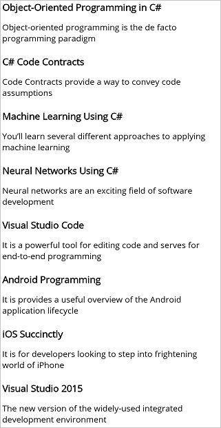
        bookInfo.Add(new BookInfo() { BookName = "Object-Oriented Programming in C#", BookDescription = "Object-oriented programming is a programming paradigm based on the concept of objects" });
        bookInfo.Add(new BookInfo() { BookName = "C# Code Contracts", BookDescription = "Code Contracts provide a way to convey code assumptions" });
        bookInfo.Add(new BookInfo() { BookName = "Machine Learning Using C#", BookDescription = "You will learn several different approaches to applying machine learning" });
        bookInfo.Add(new BookInfo() { BookName = "Neural Networks Using C#", BookDescription = "Neural networks are an exciting field of software development" });
        bookInfo.Add(new BookInfo() { BookName = "Visual Studio Code", BookDescription = "It is a powerful tool for editing code and serves for end-to-end programming" });
        bookInfo.Add(new BookInfo() { BookName = "Android Programming", BookDescription = "It provides a useful overview of the Android application life cycle" });
        bookInfo.Add(new BookInfo() { BookName = "iOS Succinctly", BookDescription = "It is for developers looking to step into frightening world of iPhone" });
        bookInfo.Add(new BookInfo() { BookName = "Visual Studio 2015", BookDescription = "The new version of the widely-used integrated development environment" });
        bookInfo.Add(new BookInfo() { BookName = "Xamarin.Forms", BookDescription = "It creates mappings from its C# classes and controls directly" });
        bookInfo.Add(new BookInfo() { BookName = "Windows Store Apps", BookDescription = "Windows Store apps present a radical shift in Windows development" });
    }
}

Binding data to the listview

To bind the data source of the SfListView, set the SfListView.ItemsSource property as follows. You can bind the data source of the SfListView either from XAML or code.

The following code example binds the previously created collection to the SfListView.ItemsSource property:

<ContentPage xmlns="http://schemas.microsoft.com/dotnet/2021/maui"
             xmlns:x="http://schemas.microsoft.com/winfx/2009/xaml"
             xmlns:syncfusion="clr-namespace:Syncfusion.Maui.ListView;assembly=Syncfusion.Maui.ListView"
             xmlns:local="clr-namespace:GettingStarted;assembly=GettingStarted"
             x:Class="GettingStarted.MainPage">
  <ContentPage.BindingContext>
    <local:BookInfoRepository />
  </ContentPage.BindingContext>
   <syncfusion:SfListView x:Name="listView" 
                   ItemsSource="{Binding BookInfo}" />
</ContentPage>
BookInfoRepository viewModel = new BookInfoRepository ();
listView.ItemsSource = viewModel.BookInfo;

Defining an item template

By defining the SfListView.ItemTemplate of the SfListView, a custom user interface(UI) can be achieved to display the data items.

<ContentPage xmlns:syncfusion="clr-namespace:Syncfusion.Maui.ListView;assembly=Syncfusion.Maui.ListView">
  <syncfusion:SfListView x:Name="listView" 
                   ItemsSource="{Binding BookInfo}"
                   ItemSize="100">
    <syncfusion:SfListView.ItemTemplate>
        <DataTemplate>
        <Grid Padding="10">
            <Grid.RowDefinitions>
            <RowDefinition Height="0.4*" />
            <RowDefinition Height="0.6*" />
            </Grid.RowDefinitions>
            <Label Text="{Binding BookName}" FontAttributes="Bold" TextColor="Teal" FontSize="21" />
            <Label GridLayout.Row="1" Text="{Binding BookDescription}" TextColor="Teal" FontSize="15"/>
        </Grid>
        </DataTemplate>
    </syncfusion:SfListView.ItemTemplate>
  </syncfusion:SfListView>
</ContentPage>
using Microsoft.Maui.Controls;
using Syncfusion.Maui.ListView;
using System;

namespace GettingStarted
{
    public class App : Application
    {
        SfListView listView;
        public App()
        {
            BookInfoRepository viewModel = new BookInfoRepository ();
            listView = new SfListView();
            listView.ItemSize = 100;
            listView.ItemsSource = viewModel.BookInfo;
            listView.ItemTemplate = new DataTemplate(() => {
                var grid = new Grid();
                grid.RowDefinitions.Add(new RowDefinition());
                grid.RowDefinitions.Add(new RowDefinition());
                var bookName = new Label { FontAttributes = FontAttributes.Bold, BackgroundColor = Colors.Teal, FontSize = 21 };
                bookName.SetBinding(Label.TextProperty, new Binding("BookName"));
                var bookDescription = new Label { BackgroundColor = Colors.Teal, FontSize = 15 };
                bookDescription.SetBinding(Label.TextProperty, new Binding("BookDescription"));

                grid.Children.Add(bookName);
                grid.Children.Add(bookDescription);
                grid.SetRow(bookName, 0);
                grid.SetRow(bookDescription, 1);

                return grid;
            });
            MainPage = new ContentPage { Content = listView };
        }
    }
}

You can also download the entire source code of this demo here.

.Net MAUI ListView with ItemTemplate

Layouts

SfListView supports different layouts such as linear and grid layouts. The linear layout arranges the items in a single column, whereas the grid layout arranges the items in a predefined number of columns defined by the SpanCount property of GridLayout.

The SfListView.ItemsLayout property is used to define the layout of the SfListView. LinearLayout is default layout of this control.

<ContentPage xmlns:syncfusion="clr-namespace:Syncfusion.Maui.ListView;assembly=Syncfusion.Maui.ListView">
 <syncfusion:SfListView x:Name="listView" 
                   ItemsSource="{Binding BookInfo}"
                   ItemSize="100">
    <syncfusion:SfListView.ItemsLayout>
      <syncfusion:GridLayout SpanCount="2" />
    </syncfusion:SfListView.ItemsLayout>
  </syncfusion:SfListView>
</ContentPage>
listView.ItemsLayout = new GridLayout() { SpanCount = 3 };

.Net MAUI ListView with GridLayout

DataSource

The DataSource gets raw data and performs data operations such as sorting, filtering, and grouping in SfListView. The data source of the ListView is set by using the ItemsSource attribute.

<ContentPage xmlns="http://schemas.microsoft.com/dotnet/2021/maui"
             xmlns:x="http://schemas.microsoft.com/winfx/2009/xaml"
             xmlns:syncfusion="clr-namespace:Syncfusion.Maui.ListView;assembly=Syncfusion.Maui.ListView"
             xmlns:data="clr-namespace:Syncfusion.Maui.DataSource;assembly=Syncfusion.Maui.DataSource"             
             xmlns:local="clr-namespace:GettingStarted;assembly=GettingStarted"
             x:Class="GettingStarted.MainPage">             
             
  <syncfusion:SfListView x:Name="listView"  ItemsSource="{Binding DataSource.DisplayItems}" >
  </syncfusion:SfListView>
</ContentPage>
SfListView listView = new SfListView();
 DataSource dataSource = new DataSource();
 dataSource.Source = ViewModel.BookInfo;
 listView.DataSource = dataSource;
 listView.DataSource.Refresh();

Sorting

The SfListView allows you to sort its data by using the SfListView.DataSource.SortDescriptors property. Create a SortDescriptor for the property to be sorted, and add it to the DataSource.SortDescriptors collection.

Refresh the view by calling the SfListView.RefreshView method.

SortDescriptor object holds the following three properties:

<ContentPage xmlns="http://schemas.microsoft.com/dotnet/2021/maui"
             xmlns:x="http://schemas.microsoft.com/winfx/2009/xaml"
             xmlns:syncfusion="clr-namespace:Syncfusion.Maui.ListView;assembly=Syncfusion.Maui.ListView"
             xmlns:data="clr-namespace:Syncfusion.Maui.DataSource;assembly=Syncfusion.Maui.DataSource"            
             xmlns:local="clr-namespace:GettingStarted;assembly=GettingStarted"
             x:Class="GettingStarted.MainPage">             
             
  <syncfusion:SfListView x:Name="listView">
    <syncfusion:SfListView.DataSource>
      <data:DataSource>
        <data:DataSource.SortDescriptors>
          <data:SortDescriptor PropertyName="BookName" Direction="Ascending"/>
        </data:DataSource.SortDescriptors>
      </data:DataSource>
    </syncfusion:SfListView.DataSource>
  </syncfusion:SfListView>
</ContentPage>
listView.DataSource.SortDescriptors.Add(new SortDescriptor()
 {
   PropertyName = "BookName",
   Direction = ListSortDirection.Ascending,
 }); 
 listView.RefreshView();

Filtering

The SfListView supports you to filter the records in view by setting predicate to the SfListView.DataSource.Filter property. Call the DataSource.RefreshFilter method after assigning the Filter property for refreshing the view.

To filter the items based on the Title property of the underlying data by using FilterContacts method, follow the code example:

<ContentPage xmlns:syncfusion="clr-namespace:Syncfusion.Maui.ListView;assembly=Syncfusion.Maui.ListView">
    <Grid>
	 <Grid.RowDefinitions>
           <RowDefinition Height="Auto"/>
           <RowDefinition Height="Auto"/>
     </Grid.RowDefinitions>
      <SearchBar x:Name="filterText" HeightRequest="40"
           Placeholder="Search here to filter"
           TextChanged="OnFilterTextChanged" GridLayout.Row="0"/>
      <syncfusion:SfListView x:Name="listView" GridLayout.Row="1" ItemsSource="{Binding BookInfo}"/>
    </Grid>
  </ContentPage>
var grid = new Grid();
grid.RowDefinitions.Add(new RowDefinition());
var viewModel = new BookInfoRepository ();

var searchBar = new SearchBar() { Placeholder = "Search here to filter" };
searchBar.TextChanged += OnFilterTextChanged;

listView = new SfListView();
listView.ItemsSource = viewModel.BookInfo;

grid.Children.Add(searchBar);
grid.Children.Add(listView);
grid.SetRow(searchBar, 0);
grid.SetRow(listView, 1);
...
private void OnFilterTextChanged(object sender, TextChangedEventArgs e)
{
  searchBar = (sender as SearchBar);
  if (listView.DataSource != null)
  {
     this.listView.DataSource.Filter = FilterContacts;
     this.listView.DataSource.RefreshFilter();
  }
}

private bool FilterContacts(object obj)
{
  if (searchBar == null || searchBar.Text == null)
    return true;

  var bookInfo = obj as BookInfo;
  if (bookInfo.BookName.ToLower().Contains(searchBar.Text.ToLower())
      || bookInfo.BookDescription.ToLower().Contains(searchBar.Text.ToLower()))
      return true;
  else
      return false;
}

Grouping

By using the SfListView.DataSource.GroupDescriptors property, the SfListView can display the items in a group. Create GroupDescriptor for the property to be grouped, and add it to the DataSource.GroupDescriptors collection.

GroupDescriptor object holds the following properties:

  • PropertyName: Describes the name of the property to be grouped.
  • KeySelector: Describes selector to return the group key.
  • Comparer: Describes the comparer that will be applied when sorting.

It also supports you to stick the group header by enabling the SfListView.IsStickyGroupHeader property.

<ContentPage  xmlns:syncfusion="clr-namespace:Syncfusion.Maui.ListView;assembly=Syncfusion.Maui.ListView"
              xmlns:data="clr-namespace:Syncfusion.Maui.DataSource;assembly=Syncfusion.Maui.DataSource">
  <syncfusion:SfListView x:Name="listView">
    <syncfusion:SfListView.DataSource>
      <data:DataSource>
        <data:DataSource.GroupDescriptors>
          <data:GroupDescriptor PropertyName="BookName"/>
        </data:DataSource.GroupDescriptors>
      </data:DataSource>
    </syncfusion:SfListView.DataSource>
  </syncfusion:SfListView>
</ContentPage>
listView.DataSource.GroupDescriptors.Add(new GroupDescriptor()
 {
   PropertyName = "BookName",
 });

.Net MAUI ListView with Grouping

Selection

The SfListView allows selecting the item by setting the SfListView.SelectionMode property. Set the SfListView.SelectionMode property to single, multiple, and none based on the requirements. Information about the selected item can be tracked using the SfListView.SelectedItem and SfListView.SelectedItems properties. It also allows changing the selection highlight color by using the SfListView.SelectionBackground.

The gesture type can be changed to select the item by setting the SfListView.SelectionGesture property. Set the SfListView.SelectionGesture property to Tap, DoubleTap, and Hold based on the requirements.

The SelectionChanging and SelectionChanged events of the SfListView can be used to handle selection operations.

<ContentPage xmlns:syncfusion="clr-namespace:Syncfusion.Maui.ListView;assembly=Syncfusion.Maui.ListView">
  <syncfusion:SfListView x:Name="listView" 
                 SelectionMode="Single"
                 SelectionGesture="Tap"
                 SelectionBackgroundColor="#E4E4E4"/>}
</ContentPage>
listView.SelectionMode = SelectionMode.Single;
listView.SelectionGesture = TouchGesture.Tap;
listView.SelectionBackgroundColor = Colors.FromHex("#E4E4E4");

The SfListView allows setting the header and footer to the user interface(UI) view by setting the DataTemplate to the HeaderTemplate and FooterTemplate.

The header and footer can be handled as scrollable or sticky to the view by enabling or disabling the IsStickyHeader and IsStickyFooter properties.

<ContentPage xmlns:syncfusion="clr-namespace:Syncfusion.Maui.ListView;assembly=Syncfusion.Maui.ListView">
<syncfusion:SfListView x:Name="listView"
                 ItemsSource="{Binding BookInfo}"
                 IsStickyHeader="true"
                 IsStickyFooter="true">
  <syncfusion:SfListView.HeaderTemplate>
    <DataTemplate>
      <Grid BackgroundColor="#4CA1FE" HeightRequest="45">
        <Label Text="Header Item" FontAttributes="Bold" FontSize="18" TextColor="White" />
      </Grid>
    </DataTemplate>
  </syncfusion:SfListView.HeaderTemplate>
  <syncfusion:SfListView.FooterTemplate>
    <DataTemplate>
      <Grid BackgroundColor="#DC595F">
        <Label Text="Footer Item" FontAttributes="Bold" FontSize="18" TextColor="White" />
      </Grid>
    </DataTemplate>
  </syncfusion:SfListView.FooterTemplate>
  </syncfusion:SfListView>
</ContentPage>
ViewModel viewModel = new ViewModel ();
listView.ItemsSource = viewModel.BookInfo; 
listView.IsStickyHeader = true;
listView.IsStickyFooter = true;
listView.HeaderTemplate = new DataTemplate(() =>
{
  var grid = new Grid();
  grid.ColumnDefinitions.Add(new ColumnDefinition());
  grid.BackgroundColor = Color.FromHex("#4CA1FE");
  var headerLabel = new Label { BackgroundColor = Colors.White, FontSize = 18,
                                FontAttributes = FontAttributes.Bold };
  headerLabel.Text = "Header Item";
  grid.Children.Add(headerLabel);
  return grid;
});
listView.FooterTemplate = new DataTemplate(() =>
{
  var grid = new Grid();
  grid.ColumnDefinitions.Add(new ColumnDefinition());
  grid.BackgroundColor = Colors.FromHex("#DC595F");
  var footerLabel = new Label { BackgroundColor = Colors.White, FontSize = 18,
                                FontAttributes = FontAttributes.Bold };
  footerLabel.Text = "Footer Item";
  grid.Children.Add(footerLabel);
  return grid;
});

.Net MAUI ListView with Header and Footer

NOTE

You can refer to our .NET MAUI ListView feature tour page for its groundbreaking feature representations. You can also explore our .NET MAUI ListView example that shows you how to render the ListView in .NET MAUI.