Appearance in .NET MAUI ListView (SfListView)
15 Jun 202624 minutes to read
The SfListView allows customizing the appearance of the underlying data, and provides different functionalities to the end-user.
To get start quickly with .NET MAUI ListView Appearance, you can check on this video:
Item template
A template can be used to present the data in a way that makes sense for the application by using different controls. SfListView allows customizing the appearance of the view by setting the ItemTemplate property.
Data template selector
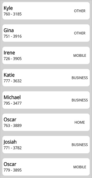
The SfListView allows customizing the appearance of each item with different templates based on specific constraints by using the DataTemplateSelector. You can choose a DataTemplate for each item at runtime based on the value of data-bound property using DataTemplateSelector.
Here, an ItemsCacheLimit property is used to maintain the number of items that can be reused in the view. This cache limit is used to create and reuse the ListViewItem if different templates are used in DataTemplateSelector for better scrolling performance. Based on this value,. Based on this value, SfListView creates a number of ListViewItem for different templates in the view, if a new template is created while scrolling, and reuses them, if the same template is used to improve the scrolling performance.
Create a data template selector
Create a custom class that inherits from DataTemplateSelector, and override the OnSelectTemplate method to return the DataTemplate for that item. At runtime, the SfListView invokes the OnSelectTemplate method for each item and passes the data object as parameter.
class MyDataTemplateSelector : DataTemplateSelector
{

   private readonly DataTemplate incomingDataTemplate;
   private readonly DataTemplate outgoingDataTemplate;

   public MyDataTemplateSelector()
   {
      this.incomingDataTemplate = new DataTemplate(typeof(IncomingTemplate));
      this.outgoingDataTemplate = new DataTemplate(typeof(OutgoingTemplate));
   }

   protected override DataTemplate OnSelectTemplate(object item, BindableObject container)
   {
      var message = item as Message;
      if (message == null)
         return null;
      return message.IsIncoming ? this.incomingDataTemplate : this.outgoingDataTemplate;
   }

}
Applying the data template selector
Assign custom DataTemplateSelector to the ItemTemplate of the SfListView in XAML or C#.
<ContentPage xmlns="http://schemas.microsoft.com/dotnet/2021/maui"
             xmlns:x="http://schemas.microsoft.com/winfx/2009/xaml"
             x:Class="DataTemplateSelector.MainPage"
             xmlns:syncfusion="clr-namespace:Syncfusion.Maui.ListView;assembly=Syncfusion.Maui.ListView"
             xmlns:local="clr-namespace:DataTemplateSelector;assembly=DataTemplateSelector">
  <ContentPage.Resources>
    <ResourceDictionary>
      <local:MyDataTemplateSelector x:Key="MessageTemplateSelector" />
    </ResourceDictionary>
  </ContentPage.Resources>
  <Grid>
    <syncfusion:SfListView x:Name="ListView"
                           ItemTemplate="{StaticResource MessageTemplateSelector}"
                           ItemsSource="{Binding Messages}"
                           ItemSize="100">
    </syncfusion:SfListView>
  </Grid>
</ContentPage>
public class MainPage : ContentPage
{
public MainPage()
{
var viewModel = new MainPageViewModel();
BindingContext = viewModel;
Content = new SfListView()
{
ItemSize = 100,
ItemsSource = viewModel.Messages,
ItemTemplate = new MyDataTemplateSelector()
};
}
}
Setting DisplayMemberPath
The DisplayMemberPath property in the SfListView provides a simple and efficient way to display a specific property from business objects without creating custom item template. This feature is especially useful for simple lists where you want to display a single property without defining a custom template.
<syncfusion:SfListView x:Name="listView"
DisplayMemberPath="BookName" />listView.DisplayMemberPath = "BookName";NOTE
The
ItemTemplateproperty takes precedence overDisplayMemberPath. If both are set,ItemTemplatewill be used.
Horizontal ListView
The SfListView allows you to layout every item in the SfListView.ItemsSource property either in Vertical or Horizontal orientation by setting the SfListView.Orientation. The default orientation is Vertical.
<syncfusion:SfListView x:Name="listView" Orientation="Horizontal" />listView.Orientation = ItemsLayoutOrientation.Horizontal;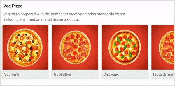
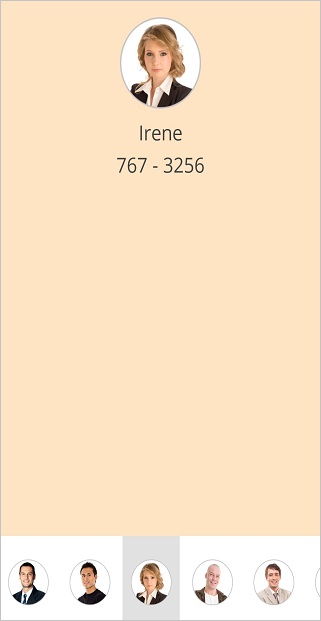
Navigate across views (like TabView)
The SfListView allows you to layout the items like TabView in the horizontal direction by setting the Orientation property as Horizontal using the ItemTapped event. It brings any desired view above the horizontal list as follows.
<ContentPage xmlns:syncfusion="clr-namespace:Syncfusion.Maui.ListView;assembly=Syncfusion.Maui.ListView">
    <ContentPage.Content>
        <Grid x:Name="GridView">
            <Label Text="Tap image to expand"/>
            <Grid>
                <Image Source="{Binding ContactImage}" />
                <Label Text="{Binding ContactName}" />
                <Label Text="{Binding ContactNumber}" />
            </Grid>
            <syncfusion:SfListView x:Name="listView" ItemTapped="list_ItemTapped" ItemSize="70" ItemsSource="{Binding ContactsInfo}">
                <syncfusion:SfListView.ItemTemplate>
                    <DataTemplate x:Name="ItemTemplate"  x:Key="ItemTemplate" >
                        <Image Source="{Binding ContactImage}" />
                    </DataTemplate>
                </syncfusion:SfListView.ItemTemplate>
            </syncfusion:SfListView>
        </Grid>
    </ContentPage.Content>
</ContentPage>
public partial class MainPage : ContentPage
{
public MainPage()
{
InitializeComponent();
list.BindingContext = new ContactsViewModel();
var grid = new Grid();
var label = new Label();
label.Text = "Tap image to expand";
var grid1 = new Grid();
var image = new Image();
image.SetBinding(Image.SourceProperty, new Binding("ContactImage"));
var label1 = new Label();
label.SetBinding(Label.TextProperty, new Binding("ContactName"));
var label2 = new Label();
label1.SetBinding(Label.TextProperty, new Binding("ContactNumber"));
grid1.Children.Add(image);
grid1.Children.Add(label1);
grid1.Children.Add(label2);
var listView = new SfListView();
ContactsViewModel contactsViewModel = new ContactsViewModel();
listView.ItemsSource = contactsViewModel.ContactsInfo;
listView.ItemSize = 70;
listView.ItemTapped += ListView_ItemTapped;
listView.ItemTemplate = new DataTemplate(() =>
{
var image1 = new Image();
image1.SetBinding(Image.SourceProperty, new Binding("ContactImage"));
return image1;
});
grid.Children.Add(label);
grid.Children.Add(grid1);
grid.Children.Add(listView);
}
private void ListView_ItemTapped(object sender, Syncfusion.Maui.ListView.ItemTappedEventArgs e)
{
GridView.BindingContext = e.DataItem;
}
}
Horizontal list inside vertical list
The SfListView allows you to layout the items in a horizontal list within a vertical list. You can load the nested SfListView by customizing the ItemTemplate of outer SfListView.
You should either define the size for each inner SfListView or set the AutoFitMode of the inner SfListView to Height, and define the ItemSize for outer SfListView.
<ContentPage xmlns:syncfusion="clr-namespace:Syncfusion.Maui.ListView;assembly=Syncfusion.Maui.ListView">
  <ContentPage.BindingContext>
    <local:ListViewModel x:Name="viewModel"/>
  </ContentPage.BindingContext>
    <Grid>
        <syncfusion:SfListView x:Name="listView" ItemsSource="{Binding OuterList}" ItemSize="100">
            <syncfusion:SfListView.ItemTemplate>
                <DataTemplate>
                    <Grid>
                        <Label Text="{Binding Label}" />
                        <syncfusion:SfListView ItemsSource="{Binding InnerList}" ItemSize="100" Orientation="Horizontal">
                            <syncfusion:SfListView.ItemTemplate>
                                <DataTemplate>
                                    <Grid>
                                        <Image Source="{Binding Image}"/>
                                    </Grid>
                                </DataTemplate>
                            </syncfusion:SfListView.ItemTemplate>
                        </syncfusion:SfListView>
                    </Grid>
                </DataTemplate>
            </syncfusion:SfListView.ItemTemplate>
        </syncfusion:SfListView>
    </Grid>
</ContentPage>
public partial class MainPage : ContentPage
{
public MainPage()
{
InitializeComponent();
var grid = new Grid();
var label1 = new Label();
label1.SetBinding(Label.TextProperty, new Binding("Label"));
var listView = new SfListView();
listView.ItemsSource = OuterList;
listView.ItemSize = 100;
listView.ItemTemplate = new DataTemplate(() =>
{
var InnerListView = new SfListView();
InnerListView.ItemSize = 100;
InnerListView.ItemsSource = InnerList;
InnerListView.Orientation = ItemsLayoutOrientation.Horizontal;
listView.ItemTemplate = new DataTemplate(() =>
{
var grid1 = new Grid();
var image = new Image();
image.SetBinding(Image.SourceProperty, new Binding("Image"));
grid1.Children.Add(image);
}
return InnerListView;
});
grid.Children.Add(label1);
grid.Children.Add(listView);
}
}
Item size
The SfListView allows customizing the size of items by setting the ItemSize property. The default value of this property is 48d. This property can be customized at runtime.
<syncfusion:SfListView x:Name="listView" ItemSize="60" />listView.ItemSize = 60;Item spacing
The SfListView allows specifying space between each item in the list by setting the ItemSpacing property. Generate the space around the item. The default value of this property is 0. This property can be customized at runtime.
<syncfusion:SfListView x:Name="listView" ItemSpacing="5,0,0,0" />listView.ItemSpacing = new Thickness(5, 0, 0, 0)
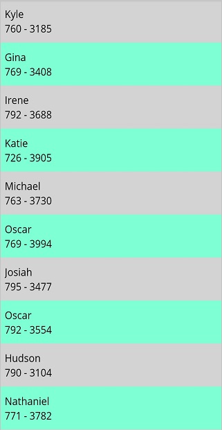
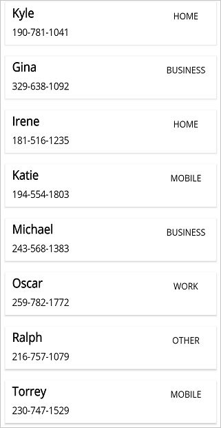
Alternate row styling
The SfListView allows applying alternate row styling for items by using the IValueConverter to find the index of the underlying object.
<ContentPage xmlns:syncfusion="clr-namespace:Syncfusion.Maui.ListView;assembly=Syncfusion.Maui.ListView">
    <ContentPage.Resources>
        <ResourceDictionary>
            <local:IndexToColorConverter x:Key="IndexToColorConverter"/>
        </ResourceDictionary>
    </ContentPage.Resources>
    <ContentPage.Content>
        <syncfusion:SfListView x:Name="listView" ItemsSource="{Binding Items}" ItemSize="50">
            <syncfusion:SfListView.ItemTemplate>
                <DataTemplate>
                    <Grid BackgroundColor="{Binding .,Converter={StaticResource IndexToColorConverter},ConverterParameter={x:Reference Name=listView}}">
                        <Label Text="{Binding ContactName}" />
                        <Label Text="{Binding ContactNumber}" />
                    </Grid>
                </DataTemplate>
            </syncfusion:SfListView.ItemTemplate>
        </syncfusion:SfListView>
    </ContentPage.Content>
</ContentPage>
public partial class MainPage : ContentPage
{
public MainPage()
{
InitializeComponent();
ContactsViewModel viewModel = new ContactsViewModel();
var listView = new SfListView();
listView.ItemsSource = viewModel.Items;
listView.ItemSize = 50;
listView.ItemTemplate = new DataTemplate(() =>
{
var grid = new Grid();
var label1 = new Label();
label1.SetBinding(Label.TextProperty, new Binding("ContactName"));
var label2 = new Label();
label2.SetBinding(Label.TextProperty, new Binding("ContactNumber"));
grid.SetBinding(Grid.BackgroundColorProperty, new Binding(".", BindingMode.Default, new IndexToColorConverter(), listView));
return grid;
});
}
}public class IndexToColorConverter : IValueConverter
{
public object Convert(object value, Type targetType, object parameter, CultureInfo culture)
{
var listview = parameter as SfListView;
var index = listview.DataSource.DisplayItems.IndexOf(value);
if (index % 2 == 0)
return Color.LightGray;
return Color.Aquamarine;
}
public object ConvertBack(object value, Type targetType, object parameter, CultureInfo culture)
{
}
}
Rounded corner on items
The SfListView allows customizing the item appearance, such as rounded corners, by using the Border layout in the ItemTemplate property. By defining the CornerRadius property of the border, you can perform rounded corner for items.
<ContentPage xmlns:syncfusion="clr-namespace:Syncfusion.Maui.ListView;assembly=Syncfusion.Maui.ListView">
    <ContentPage.Content>
        <syncfusion:SfListView x:Name="listView" ItemSize="60" ItemsSource="{Binding customerDetails}">
            <syncfusion:SfListView.ItemTemplate>
                <DataTemplate>
                    <Border x:Name="frame" CornerRadius="10" Padding="0">
                        <StackLayout>
                            <Label Text="{Binding ContactName}" />
                            <Label Text="{Binding ContactNumber}" />
                            <Label Text="{Binding ContactType}" />
                        </StackLayout>
                    </Border>
                </DataTemplate>
            </syncfusion:SfListView.ItemTemplate>
        </syncfusion:SfListView>
    </ContentPage.Content>
</ContentPage>
public partial class MainPage : ContentPage
{
public MainPage()
{
InitializeComponent();
var listView = new SfListView();
listView.ItemsSource = customerDetails;
listView.ItemSize = 60;
listView.ItemTemplate = new DataTemplate(() =>
{
var border = new Border();
border.CornerRadius = 10;
var stackLayout = new StackLayout();
var label1 = new Label();
label.SetBinding(Label.TextProperty, new Binding("ContactName"));
var label2 = new Label();
label.SetBinding(Label.TextProperty, new Binding("ContactName"));
var label3 = new Label();
label1.SetBinding(Label.TextProperty, new Binding("ContactType"));
stackLayout.Children.Add(label1);
stackLayout.Children.Add(label2);
stackLayout.Children.Add(label3);
border.Content = stackLayout;
return border;
});
}
}
Drop shadow effect on items
The SfListView allows customizing the item appearance like shadow effect for items by using a Border inside the ItemTemplate property.
NOTE
Define the border within any view inside
ItemTemplatewith some margin around it.
<ContentPage  xmlns:syncfusion="clr-namespace:Syncfusion.Maui.ListView;assembly=Syncfusion.Maui.ListView">
    <ContentPage.Content>
        <syncfusion:SfListView x:Name="listView" ItemSize="60" ItemsSource="{Binding customerDetails}">
            <syncfusion:SfListView.ItemTemplate>
                <DataTemplate>
                    <Grid Padding="2" Margin="2" >
                        <Border x:Name="frame" Padding="2" Margin="2">
                            <StackLayout>
                                <Label Text="{Binding ContactName}" />
                                <Label Text="{Binding ContactNumber}" />
                                <Label Text="{Binding ContactType}" />
                            </StackLayout>
                        </Border>
                    </Grid>
                </DataTemplate>
            </syncfusion:SfListView.ItemTemplate>
        </syncfusion:SfListView>
    </ContentPage.Content>
</ContentPage>
public partial class MainPage : ContentPage
{
public MainPage()
{
InitializeComponent();
var listView = new SfListView();
listView.ItemsSource = customerDetails;
listView.ItemSize = 60;
listView.ItemTemplate = new DataTemplate(() =>
{
var grid = new Grid();
grid.Padding = 2;
grid.Margin = 2;
var border = new Border();
border.Padding = 2;
border.Margin = 2;
var stackLayout = new StackLayout();
var label1 = new Label();
label.SetBinding(Label.TextProperty, new Binding("ContactName"));
var label2 = new Label();
label.SetBinding(Label.TextProperty, new Binding("ContactName"));
var label3 = new Label();
label1.SetBinding(Label.TextProperty, new Binding("ContactType"));
stackLayout.Children.Add(label1);
stackLayout.Children.Add(label2);
stackLayout.Children.Add(label3);
border.Content = stackLayout;
grid.Children.Add(border);
return grid;
});
}
}
Visual State Manager
The appearance of the ListViewItem can be customized using the following VisualStates:
- Normal
- PointerOver
- Pressed
- Selected
<ContentPage xmlns="http://schemas.microsoft.com/dotnet/2021/maui"
             xmlns:x="http://schemas.microsoft.com/winfx/2009/xaml"
             x:Class="ListViewMaui.MainPage"
             xmlns:local="clr-namespace:ListViewMaui"
             xmlns:syncfusion="clr-namespace:Syncfusion.Maui.ListView;assembly=Syncfusion.Maui.ListView">
    <ContentPage.Resources>
        <Style TargetType="syncfusion:ListViewItem">
            <Setter Property="VisualStateManager.VisualStateGroups">
                <VisualStateGroupList>
                    <VisualStateGroup>
                        <VisualState x:Name="Normal">
                            <VisualState.Setters>
                                <Setter Property="Background"
                                        Value="Transparent"/>
                            </VisualState.Setters>
                        </VisualState>
                        <VisualState x:Name="PointerOver">
                            <VisualState.Setters>
                                <Setter Property="Background"
                                        Value= "Gray"/>
                            </VisualState.Setters>
                        </VisualState>
                        <VisualState x:Name="Pressed">
                            <VisualState.Setters>
                                <Setter Property="Background"
                                        Value="DarkGrey"/>
                            </VisualState.Setters>
                        </VisualState>
                        <VisualState x:Name="Selected">
                            <VisualState.Setters>
                                <Setter Property="Background"
                                        Value="LightBlue"/>
                            </VisualState.Setters>
                        </VisualState>
                    </VisualStateGroup>
                </VisualStateGroupList>
            </Setter>
        </Style>
    </ContentPage.Resources>
    <ContentPage.Content>
        <syncfusion:SfListView ItemsSource="{Binding ContactsInfo}">
                <syncfusion:SfListView.ItemTemplate>
                    <DataTemplate>
                        <Label Text="{Binding ContactName}" />
                    </DataTemplate>
                </syncfusion:SfListView.ItemTemplate>
        </syncfusion:SfListView>
    </ContentPage.Content>
</ContentPage>
NOTE
Only the
Backgroundproperty ofListViewItemcan be customized using visual state.
ListViewItem customization
The SfListView allows customizing the ListViewItem based on the ItemType. Follow the code example to customize the Header, Footer, GroupHeader, LoadMore, and ListViewItem.
public partial class MainPage : ContentPage
{
    public MainPage()
    {
        InitializeComponent();
        this.listView.ItemGenerator = new ItemGeneratorExt(this.listView);
    }
}
Extension class for ItemGenerator
public class ItemGeneratorExt : ItemsGenerator
{
    public SfListView listView;

    public ItemGeneratorExt(SfListView listView) : base(listView)
    {
        this.listView = listView;
    }

    protected override ListViewItem OnCreateListViewItem(int itemIndex, ItemType type, object data = null)
    {
        if (type == ItemType.Header)
            return new HeaderItemExt(this.listView);
        else if (type == ItemType.Footer)
            return new FooterItemExt(this.listView);
        else if (type == ItemType.GroupHeader)
            return new GroupHeaderItemExt(this.listView);
        else if (type == ItemType.LoadMore)
            return new LoadMoreItemExt(this.listView);
        else if (type == ItemType.Record)
            return new ListViewItemExt(this.listView);
        return base.OnCreateListViewItem(itemIndex, type, data);
    }
}
Extension class for HeaderItem
public class HeaderItemExt : HeaderItem
{
    private SfListView listView;

    public HeaderItemExt(SfListView listView)
    {
        this.listView = listView;
    }

    protected override void OnItemAppearing()
    {
        base.OnItemAppearing();
        this.BackgroundColor = Colors.Yellow;
    }
}
Extension class for FooterItem
public class FooterItemExt : FooterItem
{
    private SfListView listView;

    public FooterItemExt(SfListView listView)
    {
        this.listView = listView;
    }

    protected override void OnItemAppearing()
    {
        base.OnItemAppearing();
        this.BackgroundColor = Colors.Yellow;
    }
}
Extension class for GroupHeaderItem
public class GroupHeaderItemExt : GroupHeaderItem
{
    private SfListView listView;

    public GroupHeaderItemExt(SfListView listView)
    {
        this.listView = listView;
    }

    protected override void OnItemAppearing()
    {
        base.OnItemAppearing();
        this.BackgroundColor = Colors.Yellow;
    }
}
Extension class for LoadMoreItem
public class LoadMoreItemExt : LoadMoreItem
{
    private SfListView listView;

    public LoadMoreItemExt(SfListView listView)
    {
        this.listView = listView;
    }

    protected override void OnItemAppearing()
    {
        base.OnItemAppearing();
        this.BackgroundColor = Colors.Yellow;
    }
}
Extension class for ListViewItem
public class ListViewItemExt : ListViewItem
{
    private SfListView listView;

    public ListViewItemExt(SfListView listView)
    {
        this.listView = listView;
    }

    protected override void OnItemAppearing()
    {
        base.OnItemAppearing();
        this.BackgroundColor = Colors.Yellow;
    }
}
Accordion view
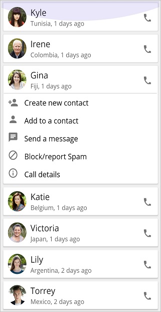
The SfListView supports accordion view to display a list of items. Each item can be expanded or stretched to reveal the content associated with that item. There can be zero expanded items, exactly one item, or more than one item can be expanded at a time depending on the configuration.
<ContentPage xmlns:syncfusion="clr-namespace:Syncfusion.Maui.ListView;assembly=Syncfusion.Maui.ListView">
  <ContentPage.Behaviors>
    <local:SfListViewAccordionBehavior />
  </ContentPage.Behaviors>
  <ContentPage.Content>
    <Grid x:Name="mainGrid" BackgroundColor="#F0F0F0" Padding="4">
      <syncfusion:SfListView x:Name="listView" AutoFitMode="DynamicHeight" SelectionMode ="None"  ItemSpacing="0">
        <syncfusion:SfListView.ItemTemplate>
          <DataTemplate>
            <Grid Padding="2" Margin="1" BackgroundColor="#F0F0F0" >
                <Border x:Name="frame" CornerRadius="2" Padding="1" Margin="1" Stroke="White">
                <Grid VerticalOptions="FillAndExpand" BackgroundColor="White" HorizontalOptions="FillAndExpand">
                    <Grid.RowDefinitions>
                    <RowDefinition Height="Auto" />
                    </Grid.RowDefinitions>
                    <Grid x:Name="grid" >
                    <Grid.RowDefinitions>
                        <RowDefinition Height="60" />
                    </Grid.RowDefinitions>
                    <Grid RowSpacing="0">
                        <Grid.ColumnDefinitions>
                        <ColumnDefinition Width="60" />
                        <ColumnDefinition Width="*" />
                        <ColumnDefinition Width="50" />
                        </Grid.ColumnDefinitions>
                        <Image Grid.Row="0" Grid.Column="0" Source="{Binding ContactImage}" VerticalOptions="Center"/>
                        <Grid Grid.Row="0" Grid.Column="1" VerticalOptions="CenterAndExpand">
                        <Grid.RowDefinitions>
                            <RowDefinition Height="*" />
                            <RowDefinition Height="*" />
                        </Grid.RowDefinitions>
                        <Label Grid.Row="0" LineBreakMode="NoWrap" TextColor="#474747" Text="{Binding ContactName}" />
                        <Label Grid.Row="1" TextColor="#474747" LineBreakMode="NoWrap" Text="{Binding CallTime}" />
                        </Grid>
                        <Grid Grid.Row="0" Grid.Column="2" HorizontalOptions="Center" VerticalOptions="Center">
                        <Image Source="{Binding PhoneImage}" HeightRequest="20" WidthRequest="20" HorizontalOptions="Center" VerticalOptions="Center" />
                        </Grid>
                    </Grid>
                    </Grid>
                    <Grid IsVisible="{Binding IsVisible, Mode=TwoWay}" ColumnSpacing="0" RowSpacing="0" Grid.Row="1" BackgroundColor="White"
                        HorizontalOptions="FillAndExpand" Padding="5" VerticalOptions="FillAndExpand">
                    <Grid.RowDefinitions>
                        <RowDefinition Height="1" />
                        <RowDefinition Height="40" />
                        <RowDefinition Height="40" />
                        <RowDefinition Height="40" />
                        <RowDefinition Height="40" />
                        <RowDefinition Height="40" />
                    </Grid.RowDefinitions>
                    <Grid.ColumnDefinitions >
                        <ColumnDefinition Width="50" />
                        <ColumnDefinition Width="*" />
                    </Grid.ColumnDefinitions>
                    <BoxView Grid.Row="0" Grid.Column="0" BackgroundColor="LightGray" />
                    <Image Grid.Row="1" Grid.Column="0" Source="{Binding NewContact}"  />
                    <Image Grid.Row="2" Grid.Column="0" Source="{Binding AddContact}" />
                    <Image Grid.Row="3" Grid.Column="0" Source="{Binding SendMessage}"  />
                    <Image Grid.Row="4" Grid.Column="0" Source="{Binding BlockSpan}"  />
                    <Image Grid.Row="5" Grid.Column="0" Source="{Binding CallDetails}" />
                    <BoxView Grid.Row="0" Grid.Column="1" BackgroundColor="LightGray" />
                    <Label Grid.Row="1" Grid.Column="1" Text="Create new contact" TextColor="#000000" />
                    <Label Grid.Row="2" Grid.Column="1" Text="Add to a contact" TextColor="#000000"/>
                    <Label Grid.Row="3" Grid.Column="1" Text="Send a message" TextColor="#000000" />
                    <Label Grid.Row="4" Grid.Column="1" Text="Block/report Spam" TextColor="#000000" />
                    <Label Grid.Row="5" Grid.Column="1" Text="Call details" TextColor="#000000" />
                    </Grid>
                </Grid>
                </Border>
            </Grid>
          </DataTemplate>
        </syncfusion:SfListView.ItemTemplate>
      </syncfusion:SfListView>
    </Grid>
  </ContentPage.Content>
</ContentPage>
Accordion view can be displayed by defining two different ItemTemplates. The ItemTemplates can be enabled or disabled in the ItemTapped event.
internal class SfListViewAccordionBehavior : Behavior<ContentPage>
{
    #region Fields

    private Contact tappedItem;
    private SfListView listview;
    private AccordionViewModel AccordionViewModel;

    #endregion

    #region Properties
    public SfListViewAccordionBehavior()
    {
        AccordionViewModel = new AccordionViewModel();
    }

    #endregion

    #region Override Methods

    protected override void OnAttachedTo(ContentPage bindable)
    {
        listview = bindable.FindByName<SfListView>("listView");
        listview.ItemsSource = AccordionViewModel.ContactsInfo;
        listview.ItemTapped += ListView_ItemTapped;
    }

    #endregion

    #region Private Methods
    private void ListView_ItemTapped(object sender, ItemTappedEventArgs e)
    {
        var tappedItemData = obj as Contact;
        if (tappedItem != null && tappedItem.IsVisible)
        {
            tappedItem.IsVisible = false;
        }

        if (tappedItem == tappedItemData)
        {
            tappedItem = null;
            return;
        }

        tappedItem = tappedItemData;
        tappedItem.IsVisible = true;
    }

    #endregion

    protected override void OnDetachingFrom(ContentPage bindable)
    {
        listview.ItemTapped -= ListView_ItemTapped;
    }
}
The IsVisible model property, which is bound to the second template, will be enabled when the item is tapped and disabled when the item is tapped again.
Item animation on appearing
The SfListView supports animating the items by using an OnItemAppearing virtual method. It is raised when the items appearing in the view on scrolling, loading, and navigating from one page to another page. To apply the animation effect for items, follow these steps:
Extension of ItemGenerator
public class ItemGeneratorExt : ItemGenerator
{
    public SfListView listView;

    public ItemGeneratorExt(SfListView listView) : base(listView)
    {
        this.listView = listView;
    }

    protected override ListViewItem OnCreateListViewItem(int itemIndex, ItemType type, object data = null)
    {
        if (type == ItemType.Record)
            return new ListViewItemExt(this.listView);
        return base.OnCreateListViewItem(itemIndex, type, data);
    }
}
Initialize and assign ItemGenerator extension to ListView
public partial class MainPage : ContentPage
{
    public MainPage()
    {
        InitializeComponent();
        this.listView.ItemGenerator = new ItemGeneratorExt(this.listView);
    }
}
Extension of ListViewItem
To apply the animation for items while appearing, override the OnItemAppearing method.
public class ListViewItemExt : ListViewItem
{
    private SfListView listView;

    public ListViewItemExt(SfListView listView)
    {
        this.listView = listView;
    }

    protected override void OnItemAppearing()
    {
        this.Opacity = 0;
        this.FadeTo(1, 400, Easing.SinInOut);
        base.OnItemAppearing();
    }
}
Here FadeTo animation is applied for ListViewItem, when comes in the view.

Right to left(RTL)
SfListView supports to change the flow of text to the right-to-left direction by setting the FlowDirection property.
<ContentPage xmlns:syncfusion="clr-namespace:Syncfusion.Maui.ListView;assembly=Syncfusion.Maui.ListView">
  <syncfusion:SfListView x:Name="listView"
                 ItemsSource="{Binding Products}"
                 FlowDirection="RightToLeft"/>
</ContentPage>this.FlowDirection = FlowDirection.RightToLeft;
Limitations
-
SfListViewdoes not support the right-to-left(RTL) direction whenSfListView.OrientationisHorizontal.
How to
Disable ripple effect on item click
To disable the ripple effect when clicking a ListViewItem, set color value Transparent to the built-in key SfListViewItemRippleBackground.
<ContentPage xmlns="http://schemas.microsoft.com/dotnet/2021/maui"
                xmlns:x="http://schemas.microsoft.com/winfx/2009/xaml"
				...
                xmlns:syncTheme="clr-namespace:Syncfusion.Maui.Themes;assembly=Syncfusion.Maui.Core"
				...
				>
	<ContentPage.Resources>
        <syncTheme:SyncfusionThemeDictionary>
            <syncTheme:SyncfusionThemeDictionary.MergedDictionaries>
                <ResourceDictionary>
                   <x:String x:Key="SfListViewTheme">CustomTheme</x:String>
                   <Color x:Key="SfListViewItemRippleBackground">Transparent</Color>
                </ResourceDictionary>
            </syncTheme:SyncfusionThemeDictionary.MergedDictionaries>
        </syncTheme:SyncfusionThemeDictionary>
    </ContentPage.Resources>
</ContentPage>
See also
How to change selected image in .NET MAUI ListView (SfListView)
How to apply alternate item background in .NET MAUI ListView (SfListView)
How to apply the item text color in .NET MAUI ListView(SfListView)