Track in Flutter Range Slider (SfRangeSlider)
21 May 202517 minutes to read
This section helps to learn about how to customize the track in the range slider.
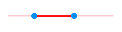
Track color
You can change the active and inactive track color of the range slider using the activeTrackColor and inactiveTrackColor properties respectively.
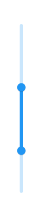
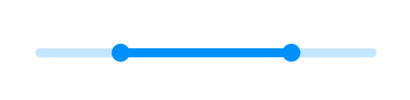
The active side of the range slider is between start and end thumbs.
The inactive side of the range slider is between the min value and the left thumb, and the right thumb and the max value.
For RTL, the inactive side is between the max value and the left thumb, and the right thumb and the min value.
NOTE
You must import the
theme.dartlibrary from theCorepackage to useSfRangeSliderTheme.
Horizontal
SfRangeValues _values = SfRangeValues(4.0, 7.0);

@override
Widget build(BuildContext context) {
  return MaterialApp(
      home: Scaffold(
          body: Center(
              child: SfRangeSliderTheme(
                    data: SfRangeSliderThemeData(
                        activeTrackColor: Colors.red,
                        inactiveTrackColor: Colors.red[100],
                    ),
                    child:  SfRangeSlider(
                        min: 2.0,
                        max: 10.0,
                        values: _values,
                        onChanged: (SfRangeValues newValues){
                            setState(() {
                                _values = newValues;
                            });
                        },
                    ),
              )
          )
      )
  );
}
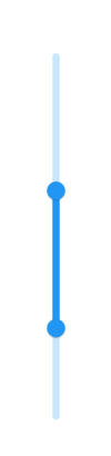
Vertical
SfRangeValues _values = SfRangeValues(4.0, 7.0);

@override
Widget build(BuildContext context) {
  return MaterialApp(
      home: Scaffold(
          body: Center(
              child: SfRangeSliderTheme(
                    data: SfRangeSliderThemeData(
                        activeTrackColor: Colors.red,
                        inactiveTrackColor: Colors.red[100],
                    ),
                    child:  SfRangeSlider.vertical(
                        min: 2.0,
                        max: 10.0,
                        values: _values,
                        onChanged: (SfRangeValues newValues){
                            setState(() {
                                _values = newValues;
                            });
                        },
                    ),
              )
          )
      )
  );
}
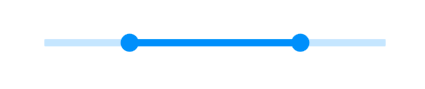
Track height
You can change the track height of the range slider using the activeTrackHeight and the inactiveTrackHeight properties. The default value of the activeTrackHeight and the inactiveTrackHeight properties are 6.0 and 4.0.
NOTE
You must import the
theme.dartlibrary from theCorepackage to useSfRangeSliderTheme.
Horizontal
SfRangeValues _values = SfRangeValues(4.0, 7.0);

@override
Widget build(BuildContext context) {
  return MaterialApp(
      home: Scaffold(
          body: Center(
              child: SfRangeSliderTheme(
                    data: SfRangeSliderThemeData(
                        activeTrackHeight: 8,
                        inactiveTrackHeight: 8,
                    ),
                    child:  SfRangeSlider(
                        min: 2.0,
                        max: 10.0,
                        values: _values,
                        onChanged: (SfRangeValues newValues){
                            setState(() {
                                _values = newValues;
                            });
                        },
                    ),
              )
          )
      )
  );
}
Vertical
SfRangeValues _values = SfRangeValues(4.0, 7.0);

@override
Widget build(BuildContext context) {
  return MaterialApp(
      home: Scaffold(
          body: Center(
              child: SfRangeSliderTheme(
                    data: SfRangeSliderThemeData(
                        activeTrackHeight: 8,
                        inactiveTrackHeight: 8,
                    ),
                    child:  SfRangeSlider.vertical(
                        min: 2.0,
                        max: 10.0,
                        values: _values,
                        onChanged: (SfRangeValues newValues){
                            setState(() {
                                _values = newValues;
                            });
                        },
                    ),
              )
          )
      )
  );
}
Track corner radius
You can change the corner of the track to be round in the range slider using the trackCornerRadius property. The default value of the trackCornerRadius property is 1.0.
NOTE
You must import the
theme.dartlibrary from theCorepackage to useSfRangeSliderTheme.
Horizontal
SfRangeValues _values = SfRangeValues(4.0, 7.0);

@override
Widget build(BuildContext context) {
  return MaterialApp(
      home: Scaffold(
          body: Center(
              child: SfRangeSliderTheme(
                    data: SfRangeSliderThemeData(
                        activeTrackHeight: 10,
                        inactiveTrackHeight: 10,
                        trackCornerRadius: 5,
                    ),
                    child: SfRangeSlider(
                        min: 2.0,
                        max: 10.0,
                        values: _values,
                        onChanged: (SfRangeValues newValues){
                            setState(() {
                                _values = newValues;
                            });
                        },
                    ),
              )
          )
      )
  );
}
Vertical
SfRangeValues _values = SfRangeValues(4.0, 7.0);

@override
Widget build(BuildContext context) {
  return MaterialApp(
      home: Scaffold(
          body: Center(
              child: SfRangeSliderTheme(
                    data: SfRangeSliderThemeData(
                        activeTrackHeight: 10,
                        inactiveTrackHeight: 10,
                        trackCornerRadius: 5,
                    ),
                    child: SfRangeSlider.vertical(
                        min: 2.0,
                        max: 10.0,
                        values: _values,
                        onChanged: (SfRangeValues newValues){
                            setState(() {
                                _values = newValues;
                            });
                        },
                    ),
              )
          )
      )
  );
}