Flutter Range Slider (SfRangeSlider) Overview
21 May 20251 minute to read
Syncfusion® Flutter Range Slider is a highly interactive UI widget that allows users to select a smaller range from a larger data set. It provides rich features such as numeric and date values, labels, ticks, dividers, and tooltips.
Features
- Numeric and date support - Provides functionality for selecting numeric and date ranges. For date ranges, support is provided up to the seconds interval.
- Labels - Renders labels for date and numeric ranges with options to customize their format based on your requirements.
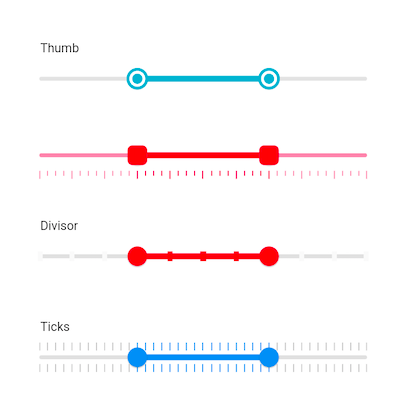
- Ticks and dividers - Provides options to show ticks and dividers based on intervals. Also enables minor ticks to indicate values between each interval. These features present the selected range in a more intuitive way for end users.
- Highly customizable - In addition to the rich set of built-in features, the control can be fully customized in a simple way using the wide range of provided options.
- Tooltips - Renders tooltips to clearly show the selected range. It is also possible to customize the format of text shown in tooltips.
- Orientation - Supports both horizontal and vertical orientations.