Labels in Flutter Range Slider (SfRangeSlider)
27 Jul 202524 minutes to read
This section explains about how to add the labels and dividers in the range slider.
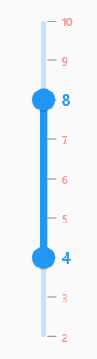
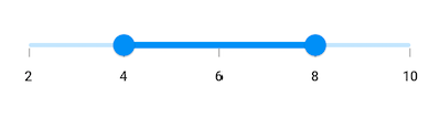
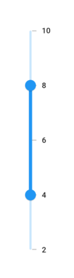
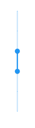
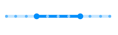
Show labels
The showLabels property is used to render the labels at given interval. The default value of showLabels property is false.
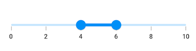
Horizontal
SfRangeValues _values = SfRangeValues(4.0, 6.0);

@override
Widget build(BuildContext context) {
  return MaterialApp(
      home: Scaffold(
          body: Center(
              child: SfRangeSlider(
                    min: 0.0,
                    max: 10.0,
                    interval: 2,
                    showLabels: true,
                    showTicks: true,
                    values: _values,
                    onChanged: (SfRangeValues newValues) {
                        setState(() {
                            _values = newValues;
                        });
                   },
              ),
          )
      )
  );
}
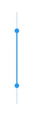
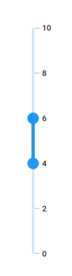
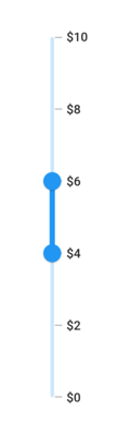
Vertical
SfRangeValues _values = SfRangeValues(4.0, 6.0);

@override
Widget build(BuildContext context) {
  return MaterialApp(
      home: Scaffold(
          body: Center(
              child: SfRangeSlider.vertical(
                    min: 0.0,
                    max: 10.0,
                    interval: 2,
                    showLabels: true,
                    showTicks: true,
                    values: _values,
                    onChanged: (SfRangeValues newValues) {
                        setState(() {
                            _values = newValues;
                        });
                   },
              ),
          )
      )
  );
}
NOTE
- Refer the
numberFormatanddateFormatfor formatting the numeric and date labels respectively.- Refer the
SfRangeSliderThemeDatafor customizing the appearance of the labels.
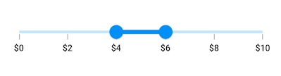
Number format
The numberFormat property is used to format the numeric labels. The default value of numberFormat property is null.
NOTE
You must import
intlpackage for formatting numeric range slider using theNumberFormatclass.
Horizontal
SfRangeValues _values = SfRangeValues(4.0, 6.0);

@override
Widget build(BuildContext context) {
  return MaterialApp(
      home: Scaffold(
          body: Center(
              child: SfRangeSlider(
                     min: 0.0,
                     max: 10.0,
                     values: _values,
                     interval: 2,
                     showTicks: true,
                     showLabels: true,
                     numberFormat: NumberFormat("\$"),
                     onChanged: (SfRangeValues newValues) {
                        setState(() {
                            _values = newValues;
                        });
                   },
              ),
          )
      )
  );
}
Vertical
SfRangeValues _values = SfRangeValues(4.0, 6.0);

@override
Widget build(BuildContext context) {
  return MaterialApp(
      home: Scaffold(
          body: Center(
              child: SfRangeSlider.vertical(
                     min: 0.0,
                     max: 10.0,
                     values: _values,
                     interval: 2,
                     showTicks: true,
                     showLabels: true,
                     numberFormat: NumberFormat("\$"),
                     onChanged: (SfRangeValues newValues) {
                        setState(() {
                            _values = newValues;
                        });
                   },
              ),
          )
      )
  );
}
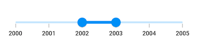
Date format
The dateFormat property is used to format the date labels. It is mandatory for date SfRangeSlider. For date values, the range slider does not have auto interval support. So, it is mandatory to set interval, dateIntervalType, and dateFormat for date values. The default value of dateFormat property is null.
NOTE
You must import
intlpackage for formatting date range slider using theDateFormatclass.
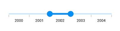
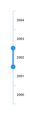
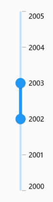
Year format
Horizontal
SfRangeValues _values = SfRangeValues(DateTime(2002, 01, 01), DateTime(2003, 01, 01));

@override
Widget build(BuildContext context) {
  return MaterialApp(
      home: Scaffold(
          body: Center(
              child: SfRangeSlider.vertical(
                    min: DateTime(2000, 01, 01, 00),
                    max: DateTime(2004, 12, 31, 24),
                    values: _values,
                    interval: 1,
                    showLabels: true,
                    showTicks: true,
                    dateFormat: DateFormat.y(),
                    dateIntervalType: DateIntervalType.years,
                    onChanged: (SfRangeValues newValues) {
                        setState(() {
                            _values = newValues;
                        });
                   },
              ),
          )
      )
  );
}
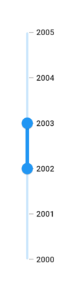
Vertical
SfRangeValues _values = SfRangeValues(DateTime(2002, 01, 01), DateTime(2003, 01, 01));

@override
Widget build(BuildContext context) {
  return MaterialApp(
      home: Scaffold(
          body: Center(
              child: SfRangeSlider.vertical(
                    min: DateTime(2000, 01, 01, 00),
                    max: DateTime(2004, 12, 31, 24),
                    values: _values,
                    interval: 1,
                    showLabels: true,
                    showTicks: true,
                    dateFormat: DateFormat.y(),
                    dateIntervalType: DateIntervalType.years,
                    onChanged: (SfRangeValues newValues) {
                        setState(() {
                            _values = newValues;
                        });
                   },
              ),
          )
      )
  );
}
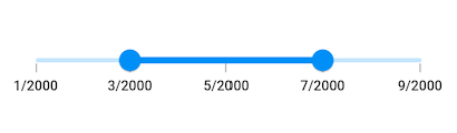
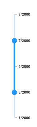
Month format
Horizontal
SfRangeValues _values = SfRangeValues(DateTime(2000, 03, 01), DateTime(2000, 07, 01));

@override
Widget build(BuildContext context) {
  return MaterialApp(
      home: Scaffold(
          body: Center(
              child: SfRangeSlider(
                    min: DateTime(2000, 01, 01, 00),
                    max: DateTime(2000, 09, 01, 24),
                    values: _values,
                    interval: 2,
                    showLabels: true,
                    showTicks: true,
                    dateFormat: DateFormat.yM(),
                    dateIntervalType: DateIntervalType.months,
                    onChanged: (SfRangeValues newValues) {
                        setState(() {
                            _values = newValues;
                        });
                    },
              ),
          )
      )
  );
}
Vertical
SfRangeValues _values = SfRangeValues(DateTime(2000, 03, 01), DateTime(2000, 07, 01));

@override
Widget build(BuildContext context) {
  return MaterialApp(
      home: Scaffold(
          body: Center(
              child: SfRangeSlider.vertical(
                    min: DateTime(2000, 01, 01, 00),
                    max: DateTime(2000, 09, 01, 24),
                    values: _values,
                    interval: 2,
                    showLabels: true,
                    showTicks: true,
                    dateFormat: DateFormat.yM(),
                    dateIntervalType: DateIntervalType.months,
                    onChanged: (SfRangeValues newValues) {
                        setState(() {
                            _values = newValues;
                        });
                    },
              ),
          )
      )
  );
}
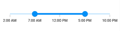
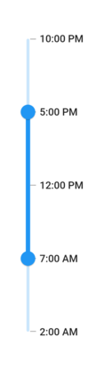
Hour format
Horizontal
SfRangeValues _values = SfRangeValues(DateTime(2000, 01, 01, 07, 00, 00), DateTime(2000, 01, 01, 17, 00, 00));

@override
Widget build(BuildContext context) {
  return MaterialApp(
      home: Scaffold(
          body: Center(
              child: SfRangeSlider(
                  min: DateTime(2000, 01, 01, 02, 00, 00),
                  max: DateTime(2000, 01, 01, 22, 00, 00),
                  values: _values,
                  interval: 5,
                  showLabels: true,
                  showTicks: true,
                  dateFormat: DateFormat('h:mm a'),
                  dateIntervalType: DateIntervalType.hours,
                  onChanged: (SfRangeValues newValues) {
                       setState(() {
                            _values = newValues;
                       });
                  },
              ),
          )
      )
  );
}
Vertical
SfRangeValues _values = SfRangeValues(DateTime(2000, 01, 01, 07, 00, 00), DateTime(2000, 01, 01, 17, 00, 00));

@override
Widget build(BuildContext context) {
  return MaterialApp(
      home: Scaffold(
          body: Center(
              child: SfRangeSlider.vertical(
                  min: DateTime(2000, 01, 01, 02, 00, 00),
                  max: DateTime(2000, 01, 01, 22, 00, 00),
                  values: _values,
                  interval: 5,
                  showLabels: true,
                  showTicks: true,
                  dateFormat: DateFormat('h:mm a'),
                  dateIntervalType: DateIntervalType.hours,
                  onChanged: (SfRangeValues newValues) {
                       setState(() {
                            _values = newValues;
                       });
                  },
              ),
          )
      )
  );
}
NOTE
Refer the
DateFormatclass for other date format.
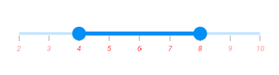
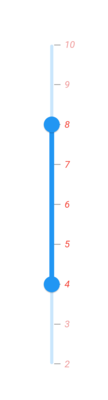
Label placement
The labelPlacement property is used to place the labels either between the major ticks or on the major ticks. The default value of labelPlacement property is LabelPlacement.onTicks.
Horizontal
SfRangeValues _values = SfRangeValues(DateTime(2002, 01, 01), DateTime(2003, 01, 01));

@override
Widget build(BuildContext context) {
  return MaterialApp(
      home: Scaffold(
          body: Center(
              child: SfRangeSlider(
                    min: DateTime(2000, 01, 01, 00),
                    max: DateTime(2004, 12, 31, 24),
                    values: _values,
                    interval: 1,
                    showLabels: true,
                    showTicks: true,
                    labelPlacement: LabelPlacement.betweenTicks,
                    dateFormat: DateFormat.y(),
                    dateIntervalType: DateIntervalType.years,
                    onChanged: (SfRangeValues newValues) {
                        setState(() {
                            _values = newValues;
                        });
                   },
              ),
          )
      )
  );
}
Vertical
SfRangeValues _values = SfRangeValues(DateTime(2002, 01, 01), DateTime(2003, 01, 01));

@override
Widget build(BuildContext context) {
  return MaterialApp(
      home: Scaffold(
          body: Center(
              child: SfRangeSlider.vertical(
                    min: DateTime(2000, 01, 01, 00),
                    max: DateTime(2004, 12, 31, 24),
                    values: _values,
                    interval: 1,
                    showLabels: true,
                    showTicks: true,
                    labelPlacement: LabelPlacement.betweenTicks,
                    dateFormat: DateFormat.y(),
                    dateIntervalType: DateIntervalType.years,
                    onChanged: (SfRangeValues newValues) {
                        setState(() {
                            _values = newValues;
                        });
                   },
              ),
          )
      )
  );
}
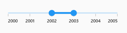
Edge label placement
The edgeLabelPlacement property determines how the edge (first and last) labels are positioned on the range slider. This property allows the edge labels to be placed either inside the major ticks or directly on the major ticks.
The default value of edgeLabelPlacement property is EdgeLabelPlacement.auto.
Horizontal
SfRangeValues _values = SfRangeValues(DateTime(2002, 01, 01), DateTime(2003, 01, 01));

@override
Widget build(BuildContext context) {
  return MaterialApp(
      home: Scaffold(
          body: Center(
              child: SfRangeSlider(
                    min: DateTime(2000, 01, 01, 00),
                    max: DateTime(2004, 12, 31, 24),
                    values: _values,
                    interval: 1,
                    showLabels: true,
                    showTicks: true,
                    edgeLabelPlacement: EdgeLabelPlacement.inside,
                    dateFormat: DateFormat.y(),
                    dateIntervalType: DateIntervalType.years,
                    onChanged: (SfRangeValues newValues) {
                        setState(() {
                            _values = newValues;
                        });
                   },
              ),
          )
      )
  );
}
Vertical
SfRangeValues _values = SfRangeValues(DateTime(2002), DateTime(2003));

@override
Widget build(BuildContext context) {
  return MaterialApp(
      home: Scaffold(
          body: Center(
              child: SfRangeSlider.vertical(
                    min: DateTime(2000, 01, 01, 00),
                    max: DateTime(2004, 12, 31, 24),
                    values: _values,
                    interval: 1,
                    showLabels: true,
                    showTicks: true,
                    edgeLabelPlacement: EdgeLabelPlacement.inside,
                    dateFormat: DateFormat.y(),
                    dateIntervalType: DateIntervalType.years,
                    onChanged: (SfRangeValues newValues) {
                        setState(() {
                            _values = newValues;
                        });
                   },
              ),
          )
      )
  );
}
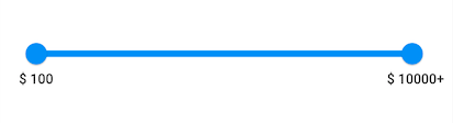
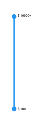
Customize label text
You can format or change the whole numeric or date label text using the labelFormatterCallback. Its arguments are,
- actualValue – either
DateTimeordoublebased on givenvalues. - formattedText – If the actual value is
double, it is formatted bynumberFormatand if the actual value isDateTime, it is formatted bydateFormat.
NOTE
labelFormatterCallbackhas been deprecated, you can useonLabelCreatedcallback to customize both the text and text style of the label.
Horizontal
SfRangeValues _values = SfRangeValues(100.0, 9900.0);

@override
Widget build(BuildContext context) {
  return MaterialApp(
      home: Scaffold(
          body: Center(
              child: SfRangeSlider(
                    min: 100.0,
                    max: 10000.0,
                    values: _values,
                    showLabels: true,
                    interval: 9900,
                    labelFormatterCallback: (dynamic actualValue, String formattedText) {
                        return actualValue == 10000 ? '\$ $formattedText+' : '\$ $formattedText';
                    },
                    onChanged: (SfRangeValues newValues) {
                        setState(() {
                            _values = newValues;
                        });
                   },
              ),
          )
      )
  );
}
Vertical
SfRangeValues _values = SfRangeValues(100.0, 9900.0);

@override
Widget build(BuildContext context) {
  return MaterialApp(
      home: Scaffold(
          body: Center(
              child: SfRangeSlider.vertical(
                    min: 100.0,
                    max: 10000.0,
                    values: _values,
                    showLabels: true,
                    interval: 9900,
                    labelFormatterCallback: (dynamic actualValue, String formattedText) {
                        return actualValue == 10000 ? '\$ $formattedText+' : '\$ $formattedText';
                    },
                    onChanged: (SfRangeValues newValues) {
                        setState(() {
                            _values = newValues;
                        });
                   },
              ),
          )
      )
  );
}
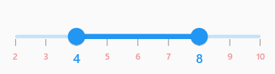
Label style
You can change the active and inactive label appearance of the range slider using the activeLabelStyle and inactiveLabelStyle properties respectively.
The active side of the range slider is between start and end thumbs.
The inactive side of the range slider is between the min value and the left thumb, and the right thumb and the max value.
For RTL, the inactive side is between the max value and the left thumb, and the right thumb and the min value.
NOTE
You must import the
theme.dartlibrary from theCorepackage to useSfRangeSliderTheme.
Horizontal
SfRangeValues _values = SfRangeValues(4.0, 8.0);

@override
Widget build(BuildContext context) {
  return MaterialApp(
      home: Scaffold(
          body: Center(
              child: SfRangeSliderTheme(
                    data: SfRangeSliderThemeData(
                         activeLabelStyle: TextStyle(color: Colors.red, fontSize: 12, fontStyle: FontStyle.italic),
                         inactiveLabelStyle: TextStyle(color: Colors.red[200], fontSize: 12, fontStyle: FontStyle.italic),
                    ),
                    child:  SfRangeSlider(
                       min: 2.0,
                       max: 10.0,
                       values: _values,
                       interval: 1,
                       showLabels: true,
                       showTicks: true,
                       onChanged: (SfRangeValues newValues){
                            setState(() {
                                _values = newValues;
                            });
                        },
                    ),
              )
          )
      )
  );
}
Vertical
SfRangeValues _values = SfRangeValues(4.0, 8.0);

@override
Widget build(BuildContext context) {
  return MaterialApp(
      home: Scaffold(
          body: Center(
              child: SfRangeSliderTheme(
                    data: SfRangeSliderThemeData(
                         activeLabelStyle: TextStyle(color: Colors.red, fontSize: 12, fontStyle: FontStyle.italic),
                         inactiveLabelStyle: TextStyle(color: Colors.red[200], fontSize: 12, fontStyle: FontStyle.italic),
                    ),
                    child:  SfRangeSlider.vertical(
                       min: 2.0,
                       max: 10.0,
                       values: _values,
                       interval: 1,
                       showLabels: true,
                       showTicks: true,
                       onChanged: (SfRangeValues newValues){
                            setState(() {
                                _values = newValues;
                            });
                        },
                    ),
              )
          )
      )
  );
}
Individual label style
You can now customize the appearance of each label on the SfRangeSlider individually by using the onLabelCreated callback. This callback allows you to have complete control over the text and text style for each label.
Horizontal
SfRangeValues _values = const SfRangeValues(4.0, 8.0);

  @override
  Widget build(BuildContext context) {
    return Scaffold(
      body: Center(
        child: SfRangeSlider(
          min: 2.0,
          max: 10.0,
          values: _values,
          interval: 1,
          showLabels: true,
          showTicks: true,
          onChanged: (SfRangeValues newValues) {
            setState(() {
              _values = newValues;
            });
          },
          onLabelCreated: (
            dynamic actualValue,
            String text,
            TextStyle labelTextStyle,
          ) {
            final int value = actualValue.toInt();
            final int start = _values.start.toInt();
            final int end = _values.end.toInt();
            return RangeSliderLabel(
              text: text,
              textStyle:
                  (value == start || value == end)
                      ? const TextStyle(
                        color: Colors.blue,
                        fontSize: 14,
                      )
                      : TextStyle(
                        color: Colors.red[200],
                        fontSize: 10,
                      ),
            );
          },
        ),
      ),
    );
  }
Vertical
SfRangeValues _values = const SfRangeValues(4.0, 8.0);

  @override
  Widget build(BuildContext context) {
    return Scaffold(
      body: Center(
        child: SfRangeSlider.vertical(
          min: 2.0,
          max: 10.0,
          values: _values,
          interval: 1,
          showLabels: true,
          showTicks: true,
          onChanged: (SfRangeValues newValues) {
            setState(() {
              _values = newValues;
            });
          },
          onLabelCreated: (
            dynamic actualValue,
            String text,
            TextStyle labelTextStyle,
          ) {
            final int value = actualValue.toInt();
            final int start = _values.start.toInt();
            final int end = _values.end.toInt();
            return RangeSliderLabel(
              text: text,
              textStyle:
                  (value == start || value == end)
                      ? const TextStyle(
                        color: Colors.blue,
                        fontSize: 14,
                      )
                      : TextStyle(
                        color: Colors.red[200],
                        fontSize: 10,
                      ),
            );
          },
        ),
      ),
    );
  }
Label offset
You can adjust the space between ticks and labels of the range slider using the labelOffset property.
NOTE
You must import the
theme.dartlibrary from theCorepackage to useSfRangeSliderTheme.
Horizontal
The default value of labelOffset property is Offset(0.0, 13.0) if the showTicks property is false.
The default value of labelOffset property is Offset(0.0, 5.0) if the showTicks property is true.
SfRangeValues _values = SfRangeValues(4.0, 8.0);

@override
Widget build(BuildContext context) {
  return MaterialApp(
      home: Scaffold(
          body: Center(
              child: SfRangeSliderTheme(
                    data: SfRangeSliderThemeData(
                        labelOffset: Offset(0.0, 10.0),
                    ),
                    child:  SfRangeSlider(
                       min: 2.0,
                       max: 10.0,
                       values: _values,
                       interval: 2,
                       showTicks: true,
                       showLabels: true,
                       onChanged: (SfRangeValues newValues){
                            setState(() {
                                _values = newValues;
                            });
                        },
                    ),
              )
          )
      )
  );
}
Vertical
The default value of labelOffset property is Offset(13.0, 0.0) if the showTicks property is false.
The default value of labelOffset property is Offset(5.0, 0.0) if the showTicks property is true.
SfRangeValues _values = SfRangeValues(4.0, 8.0);

@override
Widget build(BuildContext context) {
  return MaterialApp(
      home: Scaffold(
          body: Center(
              child: SfRangeSliderTheme(
                    data: SfRangeSliderThemeData(
                        labelOffset: Offset(10.0, 0.0),
                    ),
                    child:  SfRangeSlider.vertical(
                       min: 2.0,
                       max: 10.0,
                       values: _values,
                       interval: 2,
                       showTicks: true,
                       showLabels: true,
                       onChanged: (SfRangeValues newValues){
                            setState(() {
                                _values = newValues;
                            });
                        },
                    ),
              )
          )
      )
  );
}
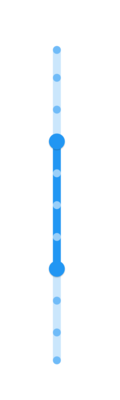
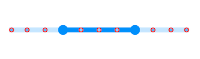
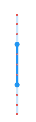
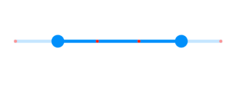
Show dividers
The showDividers property is used to render the dividers on the track. The default value of showDividers property is false. It is a shape which is used to represent the major interval points of the track.
For example, if min is 0.0 and max is 10.0 and interval is 2.0, the range slider will render the dividers at 0.0, 2.0, 4.0 and so on.
Horizontal
SfRangeValues _values = SfRangeValues(4.0, 6.0);

@override
Widget build(BuildContext context) {
  return MaterialApp(
      home: Scaffold(
          body: Center(
              child: SfRangeSliderTheme(
                 data: SfRangeSliderThemeData(
                    activeTrackHeight: 5,
                    inactiveTrackHeight: 5,
                 ),
                 child: SfRangeSlider(
                    min: 0.0,
                    max: 10.0,
                    interval: 2,
                    showDividers: true,
                    values: _values,
                    onChanged: (SfRangeValues newValues) {
                        setState(() {
                           _values = newValues;
                        });
                    },
                 ),
              ),
          )
      )
  );
}
Vertical
SfRangeValues _values = SfRangeValues(4.0, 6.0);

@override
Widget build(BuildContext context) {
  return MaterialApp(
      home: Scaffold(
          body: Center(
              child: SfRangeSliderTheme(
                 data: SfRangeSliderThemeData(
                    activeTrackHeight: 5,
                    inactiveTrackHeight: 5,
                 ),
                 child: SfRangeSlider.vertical(
                    min: 0.0,
                    max: 10.0,
                    interval: 2,
                    showDividers: true,
                    values: _values,
                    onChanged: (SfRangeValues newValues) {
                        setState(() {
                           _values = newValues;
                        });
                    },
                 ),
              ),
          )
      )
  );
}
Divider radius
You can change the active and inactive divider radius of the range slider using the activeDividerRadius and the inactiveDividerRadius properties respectively.
NOTE
You must import the
theme.dartlibrary from theCorepackage to useSfRangeSliderTheme.
Horizontal
SfRangeValues _values = SfRangeValues(3.0, 7.0);

@override
Widget build(BuildContext context) {
  return MaterialApp(
      home: Scaffold(
          body: Center(
              child: SfRangeSliderTheme(
                 data: SfRangeSliderThemeData(
                    activeTrackHeight: 10,
                    inactiveTrackHeight: 10,
                    activeDividerRadius: 5,
                    inactiveDividerRadius: 5
                 ),
                 child: SfRangeSlider(
                    min: 0.0,
                    max: 10.0,
                    interval: 1,
                    showDividers: true,
                    values: _values,
                    onChanged: (SfRangeValues newValues) {
                        setState(() {
                           _values = newValues;
                        });
                    },
                 ),
              ),
          )
      )
  );
}
Vertical
SfRangeValues _values = SfRangeValues(3.0, 7.0);

@override
Widget build(BuildContext context) {
  return MaterialApp(
      home: Scaffold(
          body: Center(
              child: SfRangeSliderTheme(
                 data: SfRangeSliderThemeData(
                    activeTrackHeight: 10,
                    inactiveTrackHeight: 10,
                    activeDividerRadius: 5,
                    inactiveDividerRadius: 5
                 ),
                 child: SfRangeSlider.vertical(
                    min: 0.0,
                    max: 10.0,
                    interval: 1,
                    showDividers: true,
                    values: _values,
                    onChanged: (SfRangeValues newValues) {
                        setState(() {
                           _values = newValues;
                        });
                    },
                 ),
              ),
          )
      )
  );
}
Divider stroke width and stroke color
You can change the active and inactive divider stroke width of the range slider using the activeDividerStrokeWidth and the inactiveDividerStrokeWidth properties respectively.
Also, you can change the active and inactive divider stroke color of the range slider using the activeDividerStrokeColor and the inactiveDividerStrokeColor properties respectively.
NOTE
You must import the
theme.dartlibrary from theCorepackage to useSfRangeSliderTheme.
Horizontal
SfRangeValues _values = SfRangeValues(3.0, 7.0);

@override
Widget build(BuildContext context) {
  return MaterialApp(
      home: Scaffold(
          body: Center(
              child: SfRangeSliderTheme(
                 data: SfRangeSliderThemeData(
                     activeTrackHeight: 10,
                     inactiveTrackHeight: 10,
                     activeDividerRadius:4 ,
                     inactiveDividerRadius: 4,
                     activeDividerStrokeColor: Colors.red,
                     activeDividerStrokeWidth: 2,
                     inactiveDividerStrokeWidth: 2,
                     inactiveDividerStrokeColor: Colors.red,
                 ),
                 child: SfRangeSlider(
                    min: 0.0,
                    max: 10.0,
                    interval: 1,
                    showDividers: true,
                    values: _values,
                    onChanged: (SfRangeValues newValues) {
                        setState(() {
                           _values = newValues;
                        });
                    },
                 ),
              ),
          )
      )
  );
}
Vertical
SfRangeValues _values = SfRangeValues(3.0, 7.0);

@override
Widget build(BuildContext context) {
  return MaterialApp(
      home: Scaffold(
          body: Center(
              child: SfRangeSliderTheme(
                 data: SfRangeSliderThemeData(
                     activeTrackHeight: 10,
                     inactiveTrackHeight: 10,
                     activeDividerRadius:4 ,
                     inactiveDividerRadius: 4,
                     activeDividerStrokeColor: Colors.red,
                     activeDividerStrokeWidth: 2,
                     inactiveDividerStrokeWidth: 2,
                     inactiveDividerStrokeColor: Colors.red,
                 ),
                 child: SfRangeSlider.vertical(
                    min: 0.0,
                    max: 10.0,
                    interval: 1,
                    showDividers: true,
                    values: _values,
                    onChanged: (SfRangeValues newValues) {
                        setState(() {
                           _values = newValues;
                        });
                    },
                 ),
              ),
          )
      )
  );
}
Divider color
You can change the active and inactive divider color of the range slider using the activeDividerColor and inactiveDividerColor properties respectively.
NOTE
You must import the
theme.dartlibrary from theCorepackage to useSfRangeSliderTheme.
Horizontal
SfRangeValues _values = SfRangeValues(2.0, 8.0);

@override
Widget build(BuildContext context) {
  return MaterialApp(
      home: Scaffold(
          body: Center(
              child: SfRangeSliderTheme(
                    data: SfRangeSliderThemeData(
                         activeTrackHeight: 5,
                         inactiveTrackHeight: 5,
                         activeDividerColor: Colors.red,
                         inactiveDividerColor: Colors.red[200],
                    ),
                    child:  SfRangeSlider(
                      min: 0.0,
                      max: 10.0,
                      interval: 1,
                      showDividers: true,
                      values: _values,
                      onChanged: (SfRangeValues newValues){
                            setState(() {
                                _values = newValues;
                            });
                        },
                    )
              )
          )
      )
  );
}
Vertical
SfRangeValues _values = SfRangeValues(2.0, 8.0);

@override
Widget build(BuildContext context) {
  return MaterialApp(
      home: Scaffold(
          body: Center(
              child: SfRangeSliderTheme(
                    data: SfRangeSliderThemeData(
                         activeTrackHeight: 5,
                         inactiveTrackHeight: 5,
                         activeDividerColor: Colors.red,
                         inactiveDividerColor: Colors.red[200],
                    ),
                    child:  SfRangeSlider.vertical(
                      min: 0.0,
                      max: 10.0,
                      interval: 1,
                      showDividers: true,
                      values: _values,
                      onChanged: (SfRangeValues newValues){
                            setState(() {
                                _values = newValues;
                            });
                        },
                    )
              )
          )
      )
  );
}