Flutter Date Range Picker Selections (SfDateRangePicker)
16 Apr 20269 minutes to read
Dates can be selected by touching the month view cells. The default selectionMode is Single that allows the user to select one date at a time. SfDateRangePicker provides support to select dates in five modes such as Single, Multiple, Range MultiRange and ExtendableRange selection
NOTE When the allowViewNavigation property is set to
false, the Date range picker allows you to select the cells in the year, decade, and century views of date range picker.
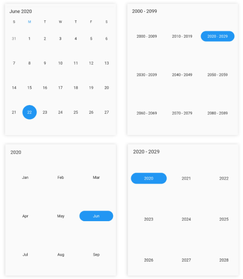
Single selection
A single date range picker cell can be selected in a date range picker view by setting the DateRangePickerSelectionMode to single.
@override
  Widget build(BuildContext context) {
    return Scaffold(
      body: SfDateRangePicker(
        view: DateRangePickerView.month,
        selectionMode: DateRangePickerSelectionMode.single,
      ),
    );
  }
NOTE
- The year, decade, and century view allow you to select cells only when the allowViewNavigation is set to
false.- In this scenario, the
selection changedcallback will return the first date of the month, year, or decade of the selected cell when the selection mode set tosingleandmultiple.- In the year view, when the May month cell is selected then the selected date value will be 01-05-2020.
- In the decade view, when the (2025) year cell is selected then the selected date value will be 01-01-2025.
- In the century view, when the (2020-2029) decade cell is selected then the selected date value will be 01-01-2020.
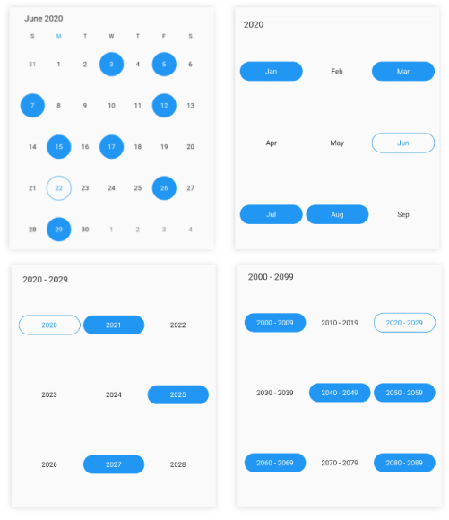
Multiple selection
You can randomly select more than one date range picker cell by setting the DateRangePickerSelectionMode to multiple. By clicking again you can deselect the selected cells.
@override
  Widget build(BuildContext context) {
    return Scaffold(
      body: SfDateRangePicker(
        view: DateRangePickerView.month,
        selectionMode: DateRangePickerSelectionMode.multiple,
      ),
    );
  }
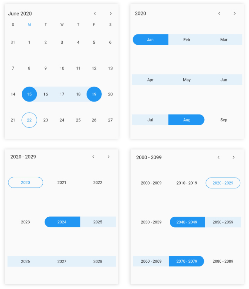
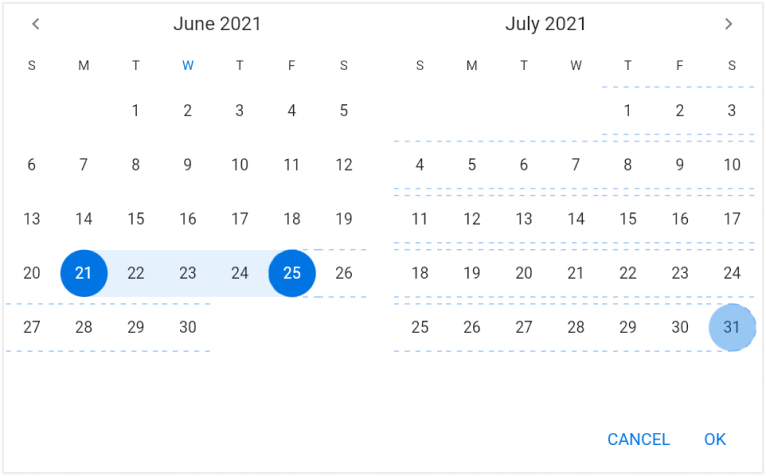
Range selection
You can select a range of cells in any date range picker view by setting the DateRangePickerSelectionMode to the range.
@override
  Widget build(BuildContext context) {
    return Scaffold(
      body: SfDateRangePicker(
        view: DateRangePickerView.month,
        selectionMode: DateRangePickerSelectionMode.range,
      ),
    );
  }
NOTE
- The year, decade, and century view allow you to select cells only when the allowViewNavigation is set to
false.- In this scenario, the
selection changedcallback will return the first and last date of the month, year, or decade of the selected cell when the selection mode is set torangeandmulti-range.- In the year view, when the range is selected as May – June, then the range value will be 01-05-2020 to 30-06-2020.
- In the decade view, when the range is selected as 2025 – 2030, then the range value will be 01-01-2025 to 31-12-2030.
- In the century view, when the range is selected as 2020-2029 to 2030-2039, then the range value will be 01-01-2020 to 31-12-2039.
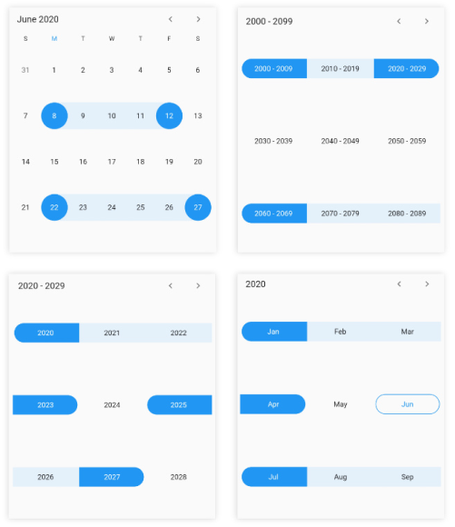
Multi range selection
You can select more than one range of cells in any of the date range picker views by setting the DateRangePickerSelectionMode to the multiRange.
@override
  Widget build(BuildContext context) {
    return Scaffold(
      body: SfDateRangePicker(
        view: DateRangePickerView.month,
        selectionMode: DateRangePickerSelectionMode.multiRange,
      ),
    );
  }
Extendable range selection
Extend the selected range with the new selected date in any date range picker view by setting the DateRangePickerSelectionMode to extendableRange.
@override
  Widget build(BuildContext context) {
    return MaterialApp(
      home: Scaffold(
        body: SfDateRangePicker(
          view: DateRangePickerView.month,
          selectionMode: DateRangePickerSelectionMode.extendableRange,
        ),
      ),
    );
  }
NOTE
- The hovering effect which occurs while extending the range will not be displayed when the
DateRangePickerNavigationModeis set asDateRangePickerNavigationMode.scroll.
Extendable range selection Direction
It allows to extend the selection direction by using the extendableRangeSelectionDirection property of the DateRangePicker.
You can set the extendable range selection direction as forward, backward, both and none.
@override
  Widget build(BuildContext context) {
    return MaterialApp(
      home: Scaffold(
        body: SfDateRangePicker(
          view: DateRangePickerView.month,
          selectionMode: DateRangePickerSelectionMode.extendableRange,
          extendableRangeSelectionDirection:
              ExtendableRangeSelectionDirection.forward,
        ),
      ),
    );
  }
NOTE
- If it is set to none, it won’t allow to extend the selection. It will remain in the initial range.
- If it is set to forward direction, the start date will not be changed here.
- If it is set to backward direction, the end date will not be changed here.
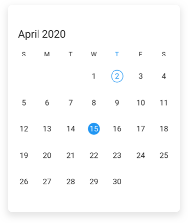
Selection radius
Customize the radius of the selection using the selectionRadius property of the SfDateRangePicker.
@override
  Widget build(BuildContext context) {
    return Scaffold(
      body: SfDateRangePicker(
        view: DateRangePickerView.month,
        selectionRadius: 10,
      ),
    );
  }
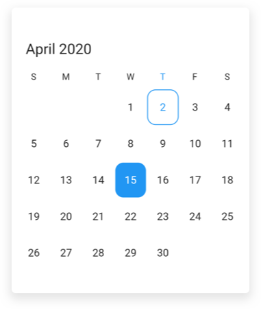
Selection shape
You can customize the selection shape of the selected date using the selectionShape property of the SfDateRangePicker.
@override
  Widget build(BuildContext context) {
    return Scaffold(
      body: SfDateRangePicker(
        view: DateRangePickerView.month,
        selectionShape: DateRangePickerSelectionShape.rectangle,
      ),
    );
  }
Enable swipe selection
Using the enableSwipeSelection property of the SfDateRangePicker, you can select the dates by using swiping. By default, enableSwipeSelection property is set to true.
@override
  Widget build(BuildContext context) {
    return Scaffold(
      body: SfDateRangePicker(
        view: DateRangePickerView.month,
        selectionMode: DateRangePickerSelectionMode.range,
        monthViewSettings: DateRangePickerMonthViewSettings(
          enableSwipeSelection: false,
        ),
      ),
    );
  }
Toggle day selection
You can deselect the selected date using the toggleDaySelection property of the SfDateRangePicker.
@override
  Widget build(BuildContext context) {
    return Scaffold(
      body: SfDateRangePicker(
        view: DateRangePickerView.month,
        toggleDaySelection: true,
      ),
    );
  }
See also
- How to restrict swipe gesture for range selection in Flutter date range picker (SfDateRangePicker)?
- How to change the selection radius in the Flutter date range picker (SfDateRangePicker)
- How to add an image as background in the Flutter date range picker (SfDateRangePicker)
- How to get the start and end date of the selected range in the Flutter date range picker (SfDateRangePicker)
- How to change the selection shape in Flutter date range picker (SfDateRangePicker)?
- How to deselect the selected date in the Flutter date range picker (SfDateRangePicker)
- How to select previous or next dates based on the selected date in the Flutter date range picker (SfDateRangePicker)
- How to select all days when clicking on the day header in the Flutter date range picker (SfDateRangePicker)