Flutter Hijri Date Range Picker Brief (SfHijriDateRangePicker)
16 Apr 202624 minutes to read
Along with the Gregorian calendar, the picker package contains a Hijri date picker to display the Islamic calendar. Islamic calendar or Hijri calendar is a lunar calendar consisting of 12 months in a year of 354 or 355 days. To know more about the Islamic calendar, kindly refer to Wikipedia.
It consists of all the Gregorian calendar functionalities like min and max date, the first day of the week, different selection modes, RTL, and customization for special dates.
To display the Hijri date picker, initialize the HijriDateRangePicker widget as a child of any widget. Here, the Hijri date range picker added as a child of the scaffold widget.
@override
  Widget build(BuildContext context) {
    return MaterialApp(
      home: Scaffold(
        body: SfHijriDateRangePicker()
      )
    );
  }
NOTE
- Most of the properties type and classes were same from SfDateRangePicker except the followings HijriDatePickerController, HijriDatePickerMonthCellStyle, HijriDatePickerMonthViewSettings, HijriDatePickerViewChangedArgs, HijriDatePickerYearCellStyle, HijriDateRange and HijriDatePickerView.
- Use the HijriDateTime class to define the date for SfHijriDateRangePicker.
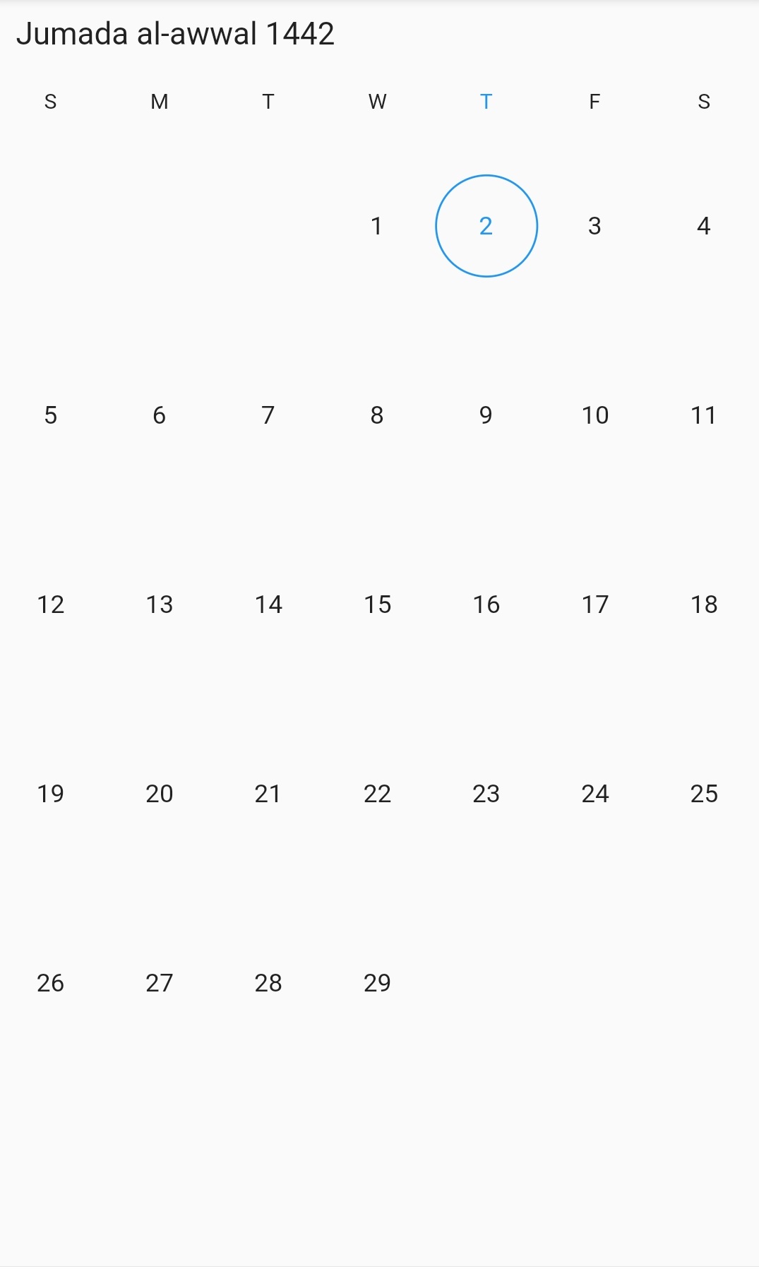
Multiple picker views
The SfHijriDateRangePicker widget provides three different types of views to display. It can be assigned to the widget constructor by using the view property. The default view of the widget is the month view. By default, the current date will be displayed initially for all the date range picker views.
@override
  Widget build(BuildContext context) {
    return MaterialApp(
      home: Scaffold(
        body: SfHijriDateRangePicker(view: HijriDatePickerView.year),
      ),
    );
  }
Change first day of week
The SfHijriDateRangePicker widget will be rendered with Sunday as the first day of the week but you can customize it to any day by using the firstDayOfWeek property HijriDatePickerMonthViewSettings.
@override
  Widget build(BuildContext context) {
    return MaterialApp(
      home: Scaffold(
        body: SfHijriDateRangePicker(
          view: HijriDatePickerView.month,
          monthViewSettings: HijriDatePickerMonthViewSettings(
            firstDayOfWeek: 1,
          ),
        ),
      ),
    );
  }
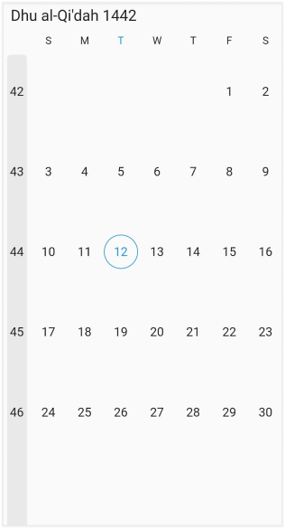
Week number
Display the Week number of the year in the month view by setting the showWeekNumber property of the HijriDatePickerMonthViewSettings as true, and by default it is false. The Week numbers will be displayed based on the ISO standard.
@override
  Widget build(BuildContext context) {
    return MaterialApp(
      home: Scaffold(
        body: SfHijriDateRangePicker(
          view: HijriDatePickerView.month,
          monthViewSettings: const HijriDatePickerMonthViewSettings(
            showWeekNumber: true,
          ),
        ),
      ),
    );
  }
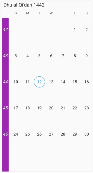
Week number appearance
Customize the Week number style by using the textStyle and the backgroundColor properties of the DateRangePickerWeekNumberStyle.
@override
  Widget build(BuildContext context) {
    return MaterialApp(
      home: Scaffold(
        body: SfHijriDateRangePicker(
          view: HijriDatePickerView.month,
          monthViewSettings: const HijriDatePickerMonthViewSettings(
            showWeekNumber: true,
            weekNumberStyle: DateRangePickerWeekNumberStyle(
              textStyle: TextStyle(fontStyle: FontStyle.italic),
              backgroundColor: Colors.purple,
            ),
          ),
        ),
      ),
    );
  }
Date selection
The SfHijriDateRangePicker supports selecting single, multiple, and range of dates. It also supports the programmatic selection.
The selected date or range details can be obtained using the onSelectionChanged callback of Hijri date range picker. The callback will return the DateRangePickerSelectionChangedArgs, which contains the selected date or range details.
void _onSelectionChanged(DateRangePickerSelectionChangedArgs args) {
    /// TODO: implement your code here
  }

  @override
  Widget build(BuildContext context) {
    return MaterialApp(
      home: Scaffold(
        body: SfHijriDateRangePicker(
        view: HijriDatePickerView.month,
        selectionMode: DateRangePickerSelectionMode.range,
        onSelectionChanged: _onSelectionChanged,
      )),
    );
  }
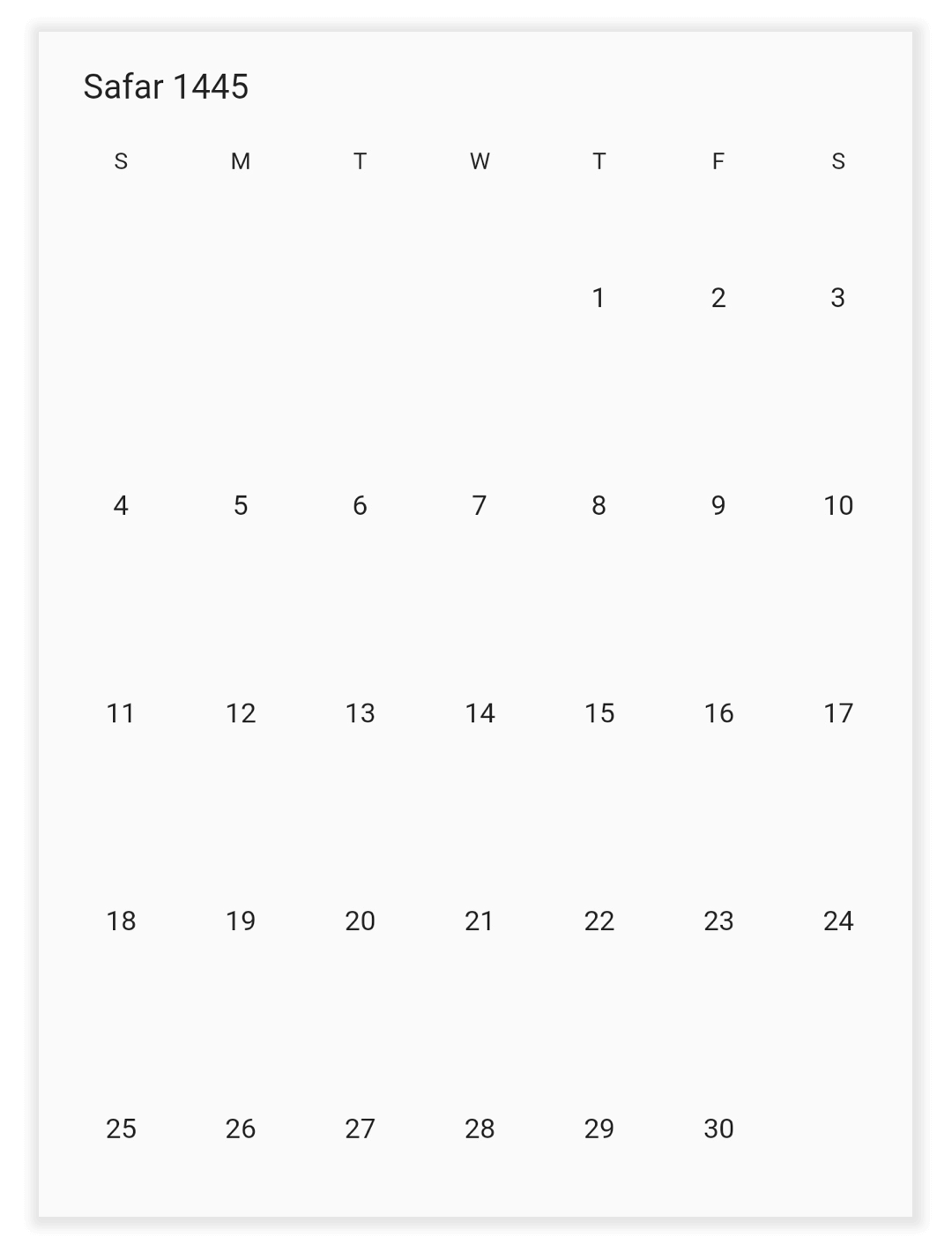
Programmatic date navigation
You can programmatically navigate date in the Hijri date picker widget by using the displayDate property from HijriDatePickerController.
class MyAppState extends State<MyApp> {
  HijriDatePickerController _controller = HijriDatePickerController();

  @override
  void initState() {
    _controller.displayDate = HijriDateTime(1445, 02, 05);
    super.initState();
  }

  @override
  Widget build(BuildContext context) {
    return MaterialApp(
      home: Scaffold(
          body: SfHijriDateRangePicker(
        controller: _controller,
        view: HijriDatePickerView.month,
      )),
    );
  }
}
Programmatic view navigation
You can programmatically navigate to any view in the Hijri date picker widget by using the view property of HijriDatePickerController.
class MyAppState extends State<MyApp> {
  HijriDatePickerController _controller = HijriDatePickerController();

  @override
  void initState() {
    _controller.view = HijriDatePickerView.month;
    super.initState();
  }

  @override
  Widget build(BuildContext context) {
    return MaterialApp(
      home: Scaffold(
          body: SfHijriDateRangePicker(
        controller: _controller,
      )),
    );
  }
}
Programmatic date selection
You can select dates programmatically on the Hijri date picker widget by using the HijriDatePickerController.
For selection refer.
Single selection
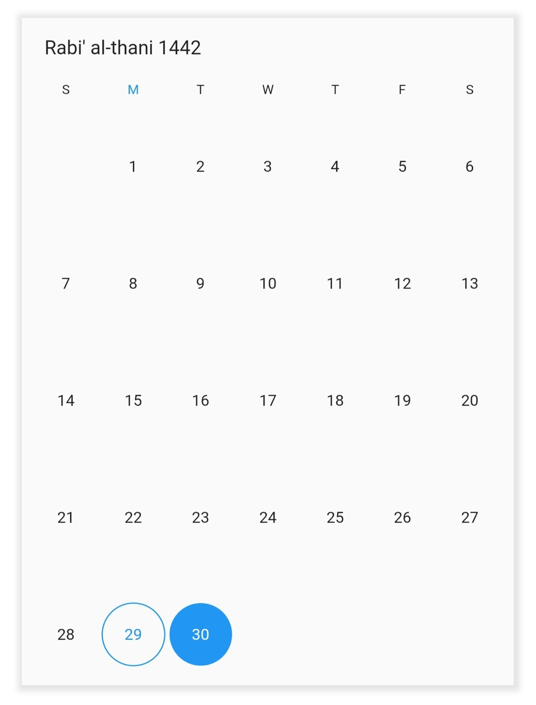
You can select the date programmatically by using the selectedDate property of HijriDatePickerController. It is only applicable when the selectionMode is set to DateRangePickerSelectionMode.single.
class MyAppState extends State<MyApp> {
  HijriDatePickerController _controller = HijriDatePickerController();

  @override
  void initState() {
    _controller.view = HijriDatePickerView.month;
    _controller.selectedDate = HijriDateTime.now().add(Duration(days: 1));
    super.initState();
  }

  @override
  Widget build(BuildContext context) {
    return MaterialApp(
      home: Scaffold(
        body: SfHijriDateRangePicker(
          selectionMode: DateRangePickerSelectionMode.single,
          controller: _controller,
        ),
      ),
    );
  }
}
Multi selection
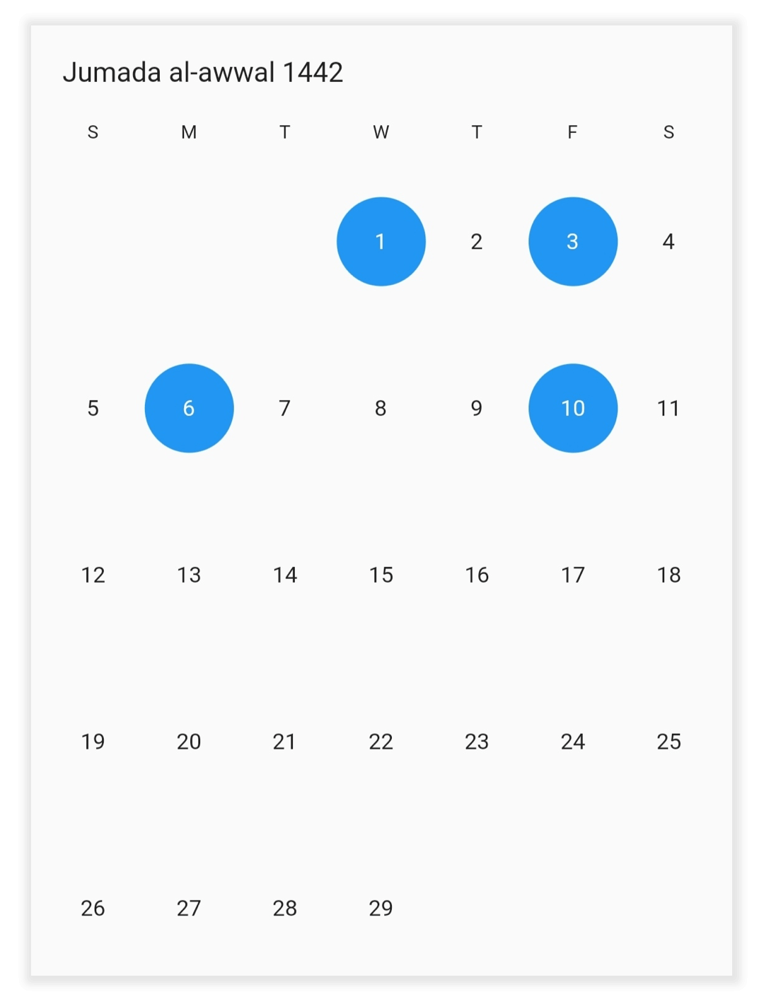
You can select the multiple dates programmatically by using the selectedDates property of HijriDatePickerController. It is only applicable when the selectionMode is set to DateRangePickerSelectionMode.multiple.
class MyAppState extends State<MyApp> {
  HijriDatePickerController _controller = HijriDatePickerController();

  @override
  void initState() {
    _controller.view = HijriDatePickerView.month;
    _controller.selectedDates = <HijriDateTime>[
      HijriDateTime.now().add(Duration(days: 2)),
      HijriDateTime.now().add(Duration(days: 4)),
      HijriDateTime.now().add(Duration(days: 7)),
      HijriDateTime.now().add(Duration(days: 11))
    ];
    super.initState();
  }

  @override
  Widget build(BuildContext context) {
    return MaterialApp(
      home: Scaffold(
        body: SfHijriDateRangePicker(
          selectionMode: DateRangePickerSelectionMode.multiple,
          controller: _controller,
        ),
      ),
    );
  }
}
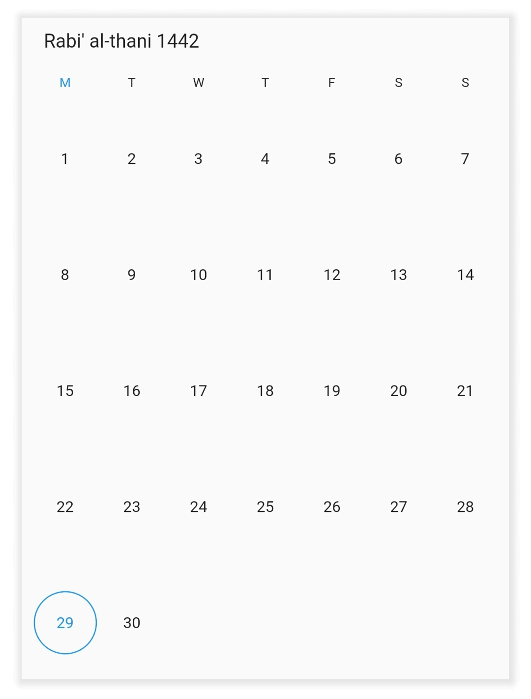
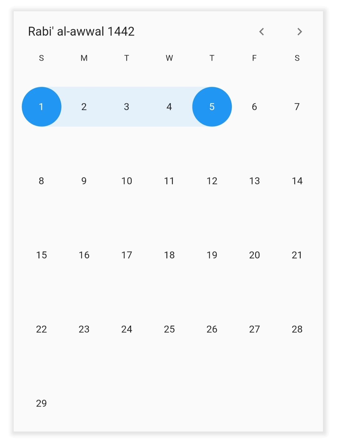
Range selection
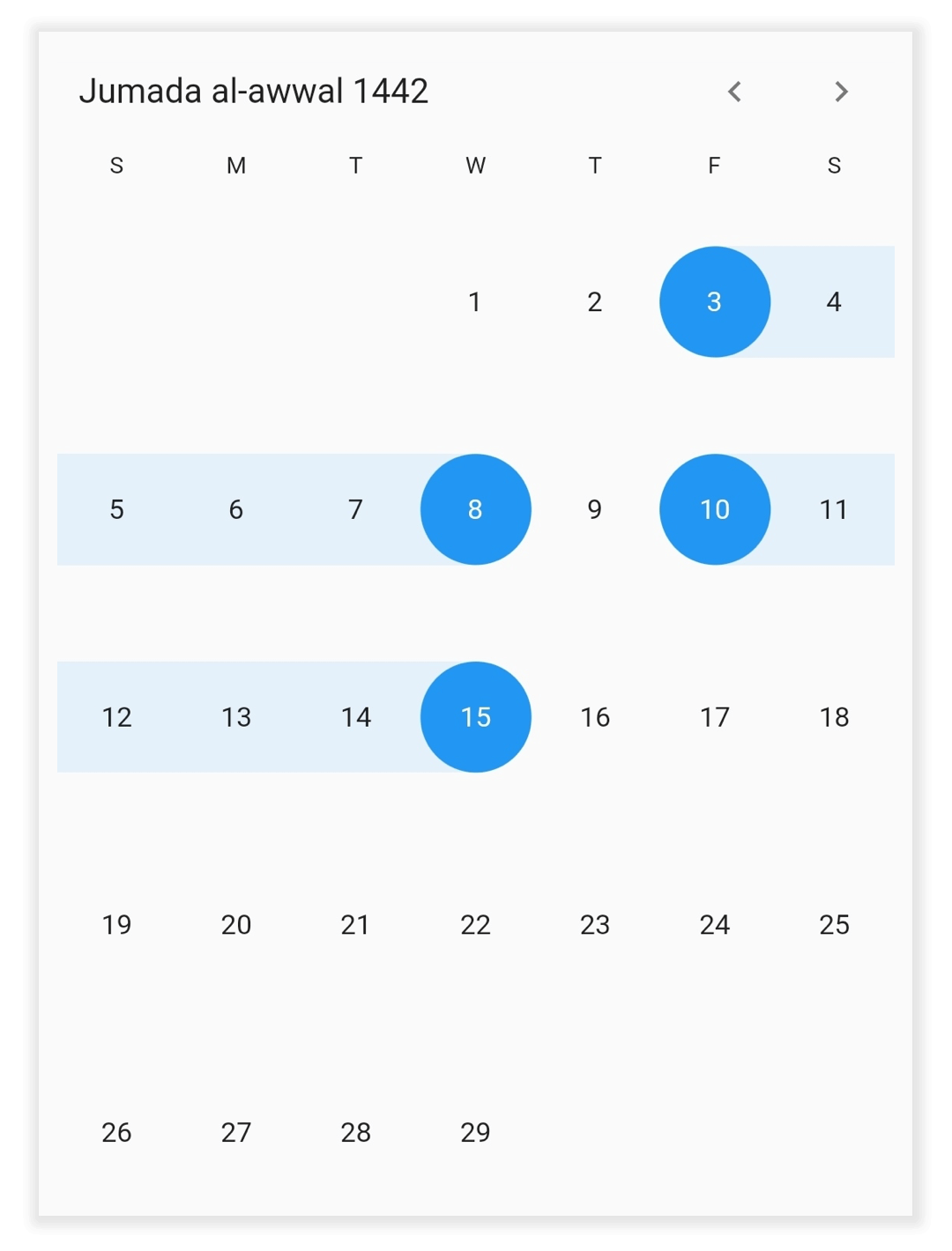
You can select the single date range programmatically by using the selectedRange property of HijriDatePickerController. It is only applicable when the selectionMode is set to DateRangePickerSelectionMode.range.
Use the HijriDateRange to define the date range for the Hijri date picker.
class MyAppState extends State<MyApp> {
  HijriDatePickerController _controller = HijriDatePickerController();

  @override
  void initState() {
    _controller.view = HijriDatePickerView.month;
    _controller.selectedRange = HijriDateRange(
        HijriDateTime(1442, 03, 01), HijriDateTime(1442, 03, 05));
    super.initState();
  }

  @override
  Widget build(BuildContext context) {
    return MaterialApp(
      home: Scaffold(
        body: SfHijriDateRangePicker(
          selectionMode: DateRangePickerSelectionMode.range,
          controller: _controller,
        ),
      ),
    );
  }
}
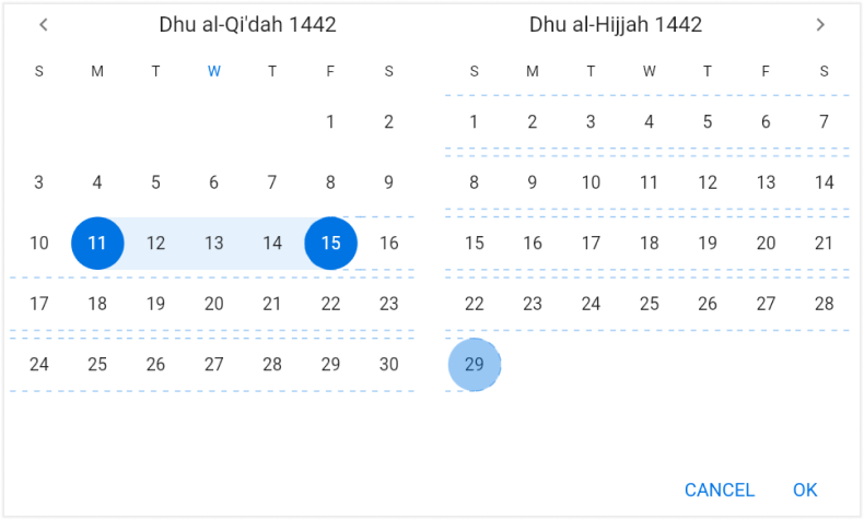
Multi-range selection
You can select more than one date range programmatically by using the selectedRanges property of HijriDatePickerController. It is only applicable when the selectionMode is set to DateRangePickerSelectionMode.multiRange.
class MyAppState extends State<MyApp> {
  HijriDatePickerController _controller = HijriDatePickerController();

  @override
  void initState() {
    _controller.view = HijriDatePickerView.month;
    _controller.selectedRanges = <HijriDateRange>[
      HijriDateRange(HijriDateTime.now().add(Duration(days: 4)),
          HijriDateTime.now().add(Duration(days: 9))),
      HijriDateRange(HijriDateTime.now().add(Duration(days: 11)),
          HijriDateTime.now().add(Duration(days: 16)))
    ];
    super.initState();
  }

  @override
  Widget build(BuildContext context) {
    return MaterialApp(
      home: Scaffold(
        body: SfHijriDateRangePicker(
          selectionMode: DateRangePickerSelectionMode.multiRange,
          controller: _controller,
        ),
      ),
    );
  }
}
Extendable range selection
Extend the selected range with the new selected date in any date range picker view by setting the DateRangePickerSelectionMode to extendableRange.
class MyAppState extends State<MyApp> {
  final HijriDatePickerController _controller = HijriDatePickerController();

  @override
  void initState() {
    _controller.view = HijriDatePickerView.month;
    _controller.selectedRange = HijriDateRange(
        HijriDateTime.now(), HijriDateTime.now().add(const Duration(days: 2)));
    super.initState();
  }

  @override
  Widget build(BuildContext context) {
    return MaterialApp(
      home: Scaffold(
        body: SfHijriDateRangePicker(
          selectionMode: DateRangePickerSelectionMode.extendableRange,
          controller: _controller,
        ),
      ),
    );
  }
}
NOTE
- The hovering effect which occurs while extending the range will not be displayed when the DateRangePickerNavigationMode is set as DateRangePickerNavigationMode.scroll.
Extendable range selection Direction
It allows to extend the selection direction by using the extendableRangeSelectionDirection property of the SfHijriDateRangePicker.
You can set the extendable range selection direction as forward, backward, both and none.
@override
  Widget build(BuildContext context) {
    return MaterialApp(
      home: Scaffold(
        body: SfHijriDateRangePicker(
          view: HijriDatePickerView.month,
          selectionMode: DateRangePickerSelectionMode.extendableRange,
          extendableRangeSelectionDirection:
              ExtendableRangeSelectionDirection.forward,
        ),
      ),
    );
  }
NOTE
- If it is set to none, it won’t allow to extend the selection. It will remain in the initial range.
- If it is set to forward direction, the start date will not be changed here.
- If it is set to backward direction, the end date will not be changed here.
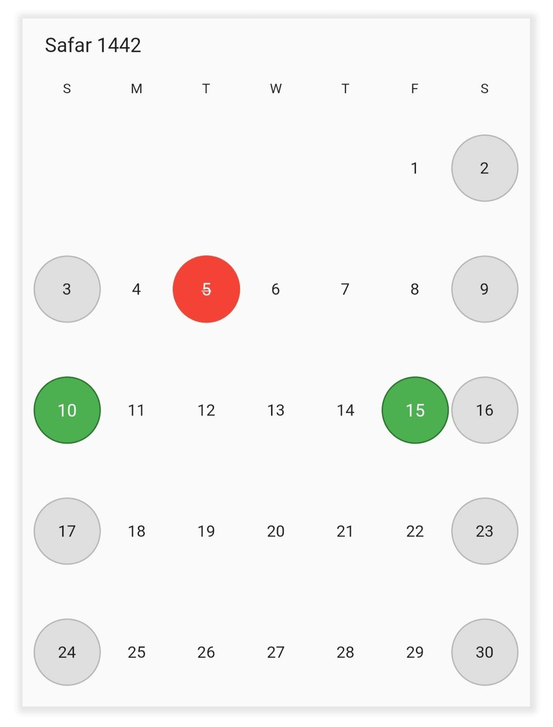
Month cell customization
Customize the Hijri date picker month view by using the monthCellStyle property of SfHijriDateRangePicker.
- Current month dates: You can customize the text style and background of the current month dates in the SfHijriDateRangePicker by using the textStyle and cellDecoration properties of HijriDatePickerMonthCellStyle.
- Today date: You can customize the text style and background of the today’s date in the SfHijriDateRangePicker by using the todayTextStyle and todayCellDecoration.
- Blackout Dates: You can customize the text style and background of the blackout dates in the SfHijriDateRangePicker by using the blackoutDateTextStyle and blackoutDatesDecoration.
- Disabled dates: Disable the dates text style and background beyond of the minDate and maxDate in SfHijriDateRangePicker by using the disableDatesTextStyle and disableDatesDecoration.
- Special Dates: You can add special dates in the SfHijriDateRangePicker by using the specialDates property, and you can also customize the special dates text style and background by using the specialDatesTextStyle and specialDatesDecoration.
- Weekend Dates: You can change the weekend dates in SfHijriDateRangePicker by using the weekendDays property, and you can also customize the weekend dates text style and background by using the weekendDatesTextStyle and weekendDatesDecoration.
@override
  Widget build(BuildContext context) {
    return MaterialApp(
      home: Scaffold(
        body: SfHijriDateRangePicker(
          view: HijriDatePickerView.month,
          monthViewSettings: HijriDatePickerMonthViewSettings(
            blackoutDates: <HijriDateTime>[HijriDateTime(1442, 02, 05)],
            weekendDays: <int>[6, 7],
            specialDates: <HijriDateTime>[
              HijriDateTime(1442, 02, 10),
              HijriDateTime(1442, 02, 15),
            ],
          ),
          monthCellStyle: HijriDatePickerMonthCellStyle(
            blackoutDatesDecoration: BoxDecoration(
              color: Colors.red,
              border: Border.all(color: const Color(0xFFF44436), width: 1),
              shape: BoxShape.circle,
            ),
            weekendDatesDecoration: BoxDecoration(
              color: const Color(0xFFDFDFDF),
              border: Border.all(color: const Color(0xFFB6B6B6), width: 1),
              shape: BoxShape.circle,
            ),
            specialDatesDecoration: BoxDecoration(
              color: Colors.green,
              border: Border.all(color: const Color(0xFF2B732F), width: 1),
              shape: BoxShape.circle,
            ),
            blackoutDateTextStyle: TextStyle(
              color: Colors.white,
              decoration: TextDecoration.lineThrough,
            ),
            specialDatesTextStyle: const TextStyle(color: Colors.white),
          ),
        ),
      ),
    );
  }
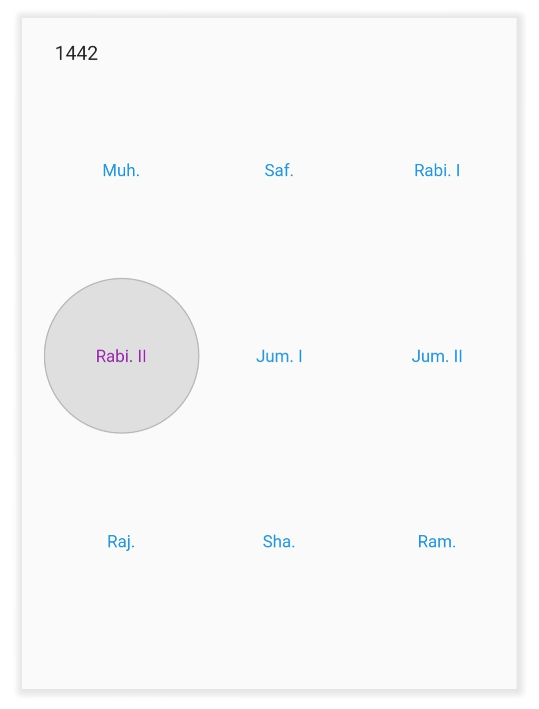
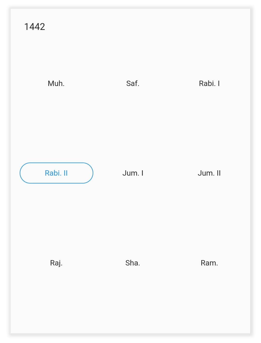
Year cell customization
You can customize the calendar year, and decade view by using the yearCellStyle of SfHijriDateRangePicker.
- Current year: You can customize the current month dates text style and background of the SfHijriDateRangePicker by using the textStyle and cellDecoration properties of HijriDatePickerYearCellStyle.
- Disabled dates: Disable the dates text style and background of the SfHijriDateRangePicker by using the disableDatesTextStyle and disableDatesDecoration.
- Today date: You can customize the today date text style and background of the SfHijriDateRangePicker by using the todayTextStyle and todayCellDecoration.
@override
  Widget build(BuildContext context) {
    return MaterialApp(
      home: Scaffold(
        body: SfHijriDateRangePicker(
          view: HijriDatePickerView.year,
          yearCellStyle: HijriDatePickerYearCellStyle(
            disabledDatesDecoration: BoxDecoration(
              color: const Color(0xFFDFDFDF),
              border: Border.all(color: const Color(0xFFB6B6B6), width: 1),
              shape: BoxShape.circle,
            ),
            disabledDatesTextStyle: const TextStyle(color: Colors.black),
            textStyle: const TextStyle(color: Colors.blue),
            todayCellDecoration: BoxDecoration(
              color: const Color(0xFFDFDFDF),
              border: Border.all(color: const Color(0xFFB6B6B6), width: 1),
              shape: BoxShape.circle,
            ),
            todayTextStyle: const TextStyle(color: Colors.purple),
          ),
        ),
      ),
    );
  }