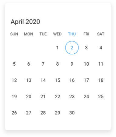
Flutter Date Range Picker Headers (SfDateRangePicker)
16 Apr 20265 minutes to read
You can customize the header of the date range picker using the headerStyle and headerHeight properties in date range picker.
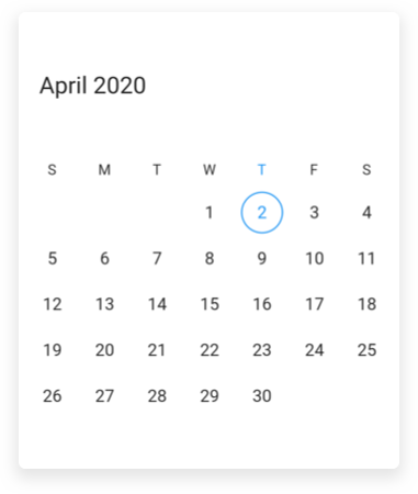
Customize the header height
You can customize the height of the header of SfDateRangePicker by using the headerHeight property.
@override
  Widget build(BuildContext context) {
    return Scaffold(
      body: SfDateRangePicker(
        view: DateRangePickerView.month,
        headerHeight: 100,
      ),
    );
  }
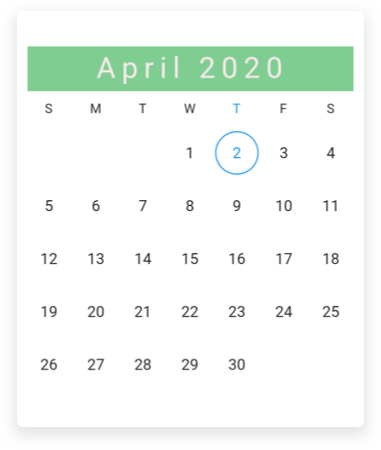
Header appearance
You can customize the header style of the SfDateRangePicker by using the backgroundColor, textStyle, and textAlign properties of DateRangePickerHeaderStyle.
@override
  Widget build(BuildContext context) {
    return Scaffold(
      body: SfDateRangePicker(
        view: DateRangePickerView.month,
        headerStyle: DateRangePickerHeaderStyle(
          backgroundColor: Color(0xFF7fcd91),
          textAlign: TextAlign.center,
          textStyle: TextStyle(
            fontStyle: FontStyle.normal,
            fontSize: 25,
            letterSpacing: 5,
            color: Color(0xFFffeaea),
          ),
      ),
    ),
  );
}
View header
You can customize the view header of the SfDateRangePicker using the viewHeaderHeight and viewHeaderStyle properties of DateRangePickerMonthViewSettings.
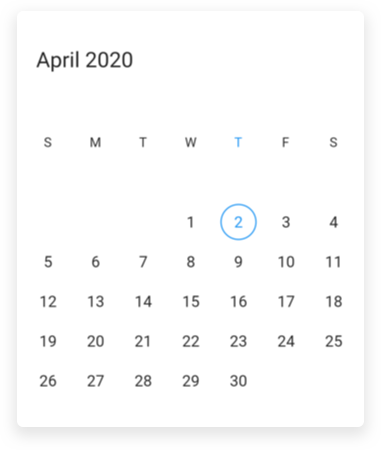
Customize view header height
You can customize the view header height of SfDateRangePicker using the viewHeaderHeight property of DateRangePickerMonthViewSettings.
@override
  Widget build(BuildContext context) {
    return Scaffold(
      body: SfDateRangePicker(
        view: DateRangePickerView.month,
        monthViewSettings: DateRangePickerMonthViewSettings(
          viewHeaderHeight: 100,
        ),
      ),
    );
  }
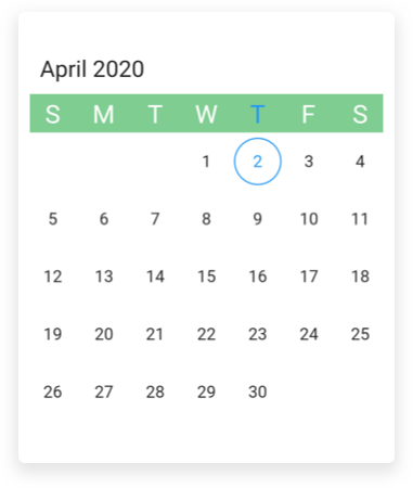
View header appearance
You can customize the view header style of SfDateRangePicker by using the backgroundColor, textStyle properties of DateRangePickerViewHeaderStyle.
@override
  Widget build(BuildContext context) {
    return Scaffold(
      body: SfDateRangePicker(
        view: DateRangePickerView.month,
        monthViewSettings: DateRangePickerMonthViewSettings(
          viewHeaderStyle: DateRangePickerViewHeaderStyle(
            backgroundColor: Color(0xFF7fcd91),
            textStyle: TextStyle(fontSize: 20, letterSpacing: 5),
          ),
        ),
      ),
    );
  }
View header day format
You can customize the view header of SfDateRangePicker by using the dayFormat property of DateRangePickerMonthViewSettings.
@override
  Widget build(BuildContext context) {
    return Scaffold(
      body: SfDateRangePicker(
        view: DateRangePickerView.month,
        monthViewSettings: DateRangePickerMonthViewSettings(dayFormat: 'EEE'),
      ),
    );
  }
See also
- How to replace the view header with the custom widget in Flutter date range picker (SfDateRangePicker)
- How to restrict the year view navigation while tapping header of the Flutter date range picker (SfDateRangePicker)
- How to customize the header in Flutter multi date range picker (SfDateRangePicker)?
- How to style a header in the Flutter date range picker (SfDateRangePicker)
- How to select all days when clicking on the day header in the Flutter date range picker (SfDateRangePicker)