Flutter Date Range Picker Customizations (SfDateRangePicker)
16 Apr 202612 minutes to read
You can customize the month and year cells, month format, and selection cells in Flutter Date Range Picker (SfDateRangePicker).
Month cell customization
You can customize the calendar month view by using the monthCellStyle of SfDateRangePicker.
-
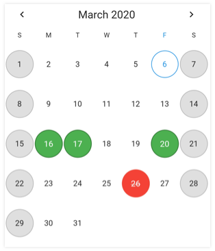
Current month dates – You can customize the text style and background of the current month dates in the SfDateRangePicker by using the textStyle and cellDecoration properties of the DateRangePickerMonthCellStyle
-
Today date – You can customize the today date text style and background of the SfDateRangePicker by using the todayTextStyle and todayCellDecoration.
-
Leading dates – You can hide the leading dates by using the showTrailingAndLeadingDates property in the DateRangePickerMonthViewSettings class. You can also customize the leading month dates text style and background of the SfDateRangePicker by using the leadingDatesTextStyle and leadingDatesDecoration.
-
Trailing dates - You can hide the trailing dates by using showTrailingAndLeadingDates dates property in DateRangePickerMonthViewSettings class. You can also customize the trailing month dates text style and background of the SfDateRangePicker by using the trailingDatesTextStyle and trailingDatesDecoration.
-
Blackout Dates - You can customize the text style and background of the blackout dates in the SfDateRangePicker by using the blackoutDateTextStyle and blackoutDatesDecoration.
-
Disabled dates – Disable dates text style and background of the minDate and maxDate in the SfDateRangePicker, and the dates which are disabled by the selectableDayPredicate callback are customized by using disableDatesTextStyle and disableDatesDecoration.
-
Special Dates – You can add special dates to the SfDateRangePicker by using specialDates property, and you can also customize the special dates text style and background by using the specialDatesTextStyle and specialDatesDecoration.
-
Weekend Dates – You can change weekend dates to SfDateRangePicker by using the weekendDays property, and you can also customize the weekend dates text style and background by using the weekendDatesTextStyle and weekendDatesDecoration.
@override
  Widget build(BuildContext context) {
    return Scaffold(
      body: SfDateRangePicker(
        view: DateRangePickerView.month,
        monthViewSettings: DateRangePickerMonthViewSettings(
          blackoutDates: [DateTime(2020, 03, 26)],
          weekendDays: [7, 6],
          specialDates: [
            DateTime(2020, 03, 20),
            DateTime(2020, 03, 16),
            DateTime(2020, 03, 17),
          ],
          showTrailingAndLeadingDates: true,
        ),
        monthCellStyle: DateRangePickerMonthCellStyle(
          blackoutDatesDecoration: BoxDecoration(
            color: Colors.red,
            border: Border.all(color: const Color(0xFFF44436), width: 1),
            shape: BoxShape.circle,
          ),
          weekendDatesDecoration: BoxDecoration(
            color: const Color(0xFFDFDFDF),
            border: Border.all(color: const Color(0xFFB6B6B6), width: 1),
            shape: BoxShape.circle,
          ),
          specialDatesDecoration: BoxDecoration(
            color: Colors.green,
            border: Border.all(color: const Color(0xFF2B732F), width: 1),
            shape: BoxShape.circle,
          ),
          blackoutDateTextStyle: TextStyle(
            color: Colors.white,
            decoration: TextDecoration.lineThrough,
          ),
          specialDatesTextStyle: const TextStyle(color: Colors.white),
        ),
      ),
    );
  }
NOTE
- Based on the given decoration, cell decoration will be rendered in the following order: blackout dates, special dates, disable dates, today date, weekend dates, leading or trailing dates, and dates decoration.
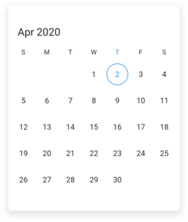
Month format
You can customize the month format of the SfDateRangePicker using the monthFormat property.
@override
  Widget build(BuildContext context) {
    return Scaffold(
      body: SfDateRangePicker(
        view: DateRangePickerView.month,
        monthFormat: 'MMM',
      ),
    );
  }
Selection cell customization
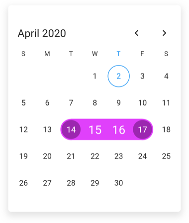
You can also customize the date range picker section by using the monthCellStyle of SfDateRangePicker.
-
Selection date text style – Selected date text style can be customized using the selectionTextStyle property of SfDateRangePicker that is applicable for selectionMode is single and multiple, it is also applicable to start and end of the selected range text style in the single and multiRange selection.
-
Selection color – Selected date background color can be customized using the selectionColor property of SfDateRangePicker that is applicable for single and multiple selections.
-
Range selection text style – Range selection date text style can be customized using the rangeTextStyle property that is applicable when selectionMode is range or multiRange.
-
Range selection color - Range selection color text style can be customized using the startRangeSelectionColor, endRangeSelectionColor , rangeSelectionColor properties that is applicable when selectionMode is in range or multiRange.
@override
  Widget build(BuildContext context) {
    return Scaffold(
      body: SfDateRangePicker(
        view: DateRangePickerView.month,
        selectionMode: DateRangePickerSelectionMode.range,
        selectionTextStyle: const TextStyle(color: Colors.white),
        selectionColor: Colors.blue,
        startRangeSelectionColor: Colors.purple,
        endRangeSelectionColor: Colors.purple,
        rangeSelectionColor: Colors.purpleAccent,
        rangeTextStyle: const TextStyle(color: Colors.white, fontSize: 20),
      ),
    );
  }
Year cell customization
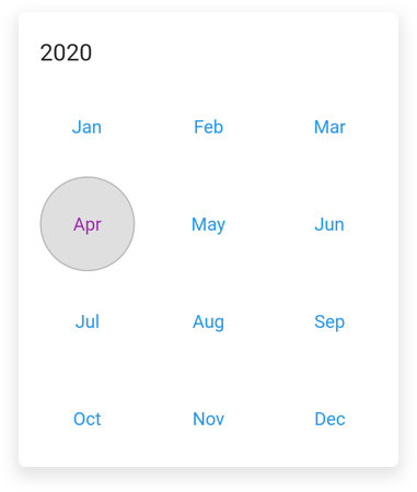
You can customize the calendar year, decade, and century view by using the yearCellStyle of SfDateRangePicker.
-
Current year – You can customize the text style and background of the current year in the SfDateRangePicker by using the textStyle and cellDecoration properties of DateRangePickerYearCellStyle
-
Disabled dates – Disable dates text style and background of the minDate and maxDate in the SfDateRangePicker, and the dates which are disabled by the selectableDayPredicate callback are customized by using disabledDatesTextStyle and disabledDatesDecoration.
-
Leading dates – You can also customize the text style and background of the leading month dates in the SfDateRangePicker by using the leadingDatesTextStyle and leadingDatesDecoration.
-
Today date – You can customize the text style and background of the today’s date in the SfDateRangePicker by using the todayTextStyle and todayCellDecoration.
@override
  Widget build(BuildContext context) {
    return Scaffold(
      body: SfDateRangePicker(
        view: DateRangePickerView.month,
        selectionMode: DateRangePickerSelectionMode.range,
        yearCellStyle: DateRangePickerYearCellStyle(
          disabledDatesDecoration: BoxDecoration(
            color: const Color(0xFFDFDFDF),
            border: Border.all(color: const Color(0xFFB6B6B6), width: 1),
            shape: BoxShape.circle,
          ),
          disabledDatesTextStyle: const TextStyle(color: Colors.black),
          leadingDatesDecoration: BoxDecoration(
            color: const Color(0xFFDFDFDF),
            border: Border.all(color: const Color(0xFFB6B6B6), width: 1),
            shape: BoxShape.circle,
          ),
          leadingDatesTextStyle: const TextStyle(color: Colors.black),
          textStyle: const TextStyle(color: Colors.blue),
          todayCellDecoration: BoxDecoration(
            color: const Color(0xFFDFDFDF),
            border: Border.all(color: const Color(0xFFB6B6B6), width: 1),
            shape: BoxShape.circle,
          ),
          todayTextStyle: const TextStyle(color: Colors.purple),
        ),
      ),
    );
  }
NOTE
- Based on the given decoration, cell decoration will be rendered in the following order: disable dates, today date, leading or trailing dates, and dates decoration.
See also
- How to customize the month cell of the Flutter date range picker (SfDateRangePicker)?
- How to style the current month date cell in the Flutter date range picker (SfDateRangePicker)
- How to change the week end dates in the Flutter date range picker (SfDateRangePicker)
- How to change the month format in the Flutter date range picker (SfDateRangePicker)
- How to customize the selected range cells in the Flutter date range picker (SfDateRangePicker)
- How to add the indicator in the month cells of the date range picker (SfDateRangePicker), when the Flutter event calendar (SfCalendar) has an appointments?
- How to add custom fonts in Flutter date range picker (SfDateRangePicker)
- How to style the year, decade, century views in the Flutter date range picker (SfDateRangePicker)
- How to customize the special dates using builder in the Flutter date picker