Multiple Picker Views in Flutter Date Range Picker (SfDateRangePicker)
27 Jul 20258 minutes to read
The SfDateRangePicker widget provides four different types of views to display. It can be assigned to the widget constructor by using the view property. Default view of the widget is month view. By default the current date will be displayed initially for all the date range picker views.
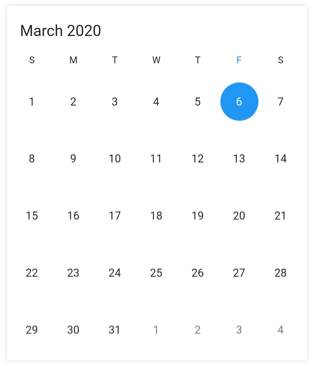
Month view
This view displays the entire dates of a particular month. By default, the current month will be displayed on loading. The current date is provided with a separate color different from the rest of the dates color in month view.
@override
  Widget build(BuildContext context) {
    return Scaffold(
      body: SfDateRangePicker(
        view: DateRangePickerView.month
      )
    );
  }
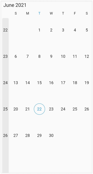
Week number
Display the Week number of the year in the MonthView by setting the showWeekNumber property of the DateRangePickerMonthViewSettings as true, and by default it is false. Week numbers will be displayed based on the ISO standard.
@override
  Widget build(BuildContext context) {
    return MaterialApp(
      home: Scaffold(
        body: SfDateRangePicker(
          view: DateRangePickerView.month,
          monthViewSettings: const DateRangePickerMonthViewSettings(
            showWeekNumber: true,
          ),
        ),
      ),
    );
  }
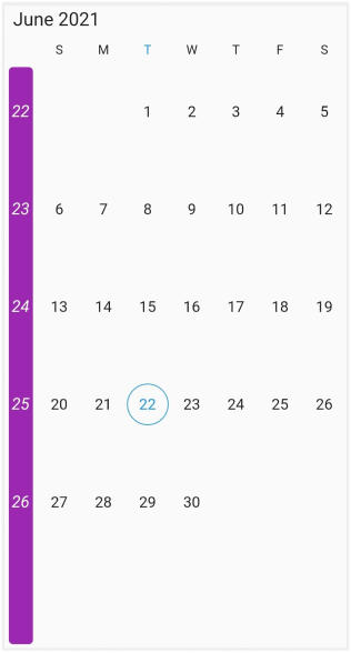
Week number appearance
Customize the Week number style by using the textStyle and the backgroundColor properties of the DateRangePickerWeekNumberStyle.
@override
  Widget build(BuildContext context) {
    return MaterialApp(
      home: Scaffold(
        body: SfDateRangePicker(
          view: DateRangePickerView.month,
          monthViewSettings: const DateRangePickerMonthViewSettings(
            showWeekNumber: true,
            weekNumberStyle: DateRangePickerWeekNumberStyle(
              textStyle: TextStyle(fontStyle: FontStyle.italic),
              backgroundColor: Colors.purple,
            ),
          ),
        ),
      ),
    );
  }
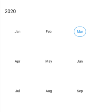
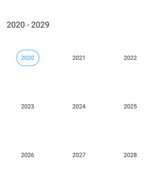
Year view
This displays the entire month of a particular year. By default, the current year will be displayed on loading. Navigate between the months quickly by selecting the particular month in a year view.
@override
  Widget build(BuildContext context) {
    return Scaffold(
      body: SfDateRangePicker(
        view: DateRangePickerView.year
      )
    );
  }
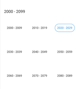
Decade view
This view displays the period of 10 years. By default, the current year range of 10 years will be displayed on loading. You can easily navigate between month/year view to decade view by tapping the calendar header. The year can be navigated quickly by selecting a particular year from a decade view.
@override
  Widget build(BuildContext context) {
    return Scaffold(
      body: SfDateRangePicker(
        view: DateRangePickerView.decade
      )
    );
  }
Century view
This view displays the period of 100 years. By default, the current year range of 100 years will be displayed on loading. You can easily navigate between month/year/decade view to century view by tapping the calendar header. You can easily navigate to a decade view by selecting decade years in century view.
@override
  Widget build(BuildContext context) {
    return Scaffold(
      body: SfDateRangePicker(
        view: DateRangePickerView.century
      )
    );
  }
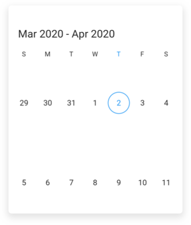
Week view
The number of weeks in the month view can be customized by setting the numberOfWeeksInView property of DateRangePickerMonthViewSettings.
@override
  Widget build(BuildContext context) {
    return Scaffold(
      body: SfDateRangePicker(
        view: DateRangePickerView.month,
        monthViewSettings: DateRangePickerMonthViewSettings(
          numberOfWeeksInView: 2,
        ),
      ),
    );
  }
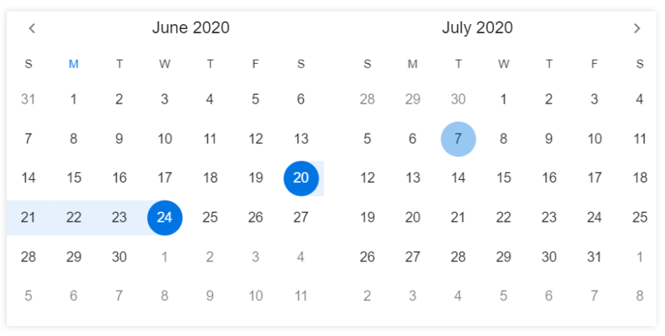
Multi-date picker view
You can enable a multi-date range picker by using the enableMultiView property of SfDateRangePicker, which displays two date range pickers side by side, the space between the two date-range picker can be customized by using the viewSpacing property of SfDateRangePicker.
@override
  Widget build(BuildContext context) {
    return MaterialApp(
      home: Scaffold(
        body: SfDateRangePicker(
          enableMultiView: true,
          viewSpacing: 20,
          headerStyle: DateRangePickerHeaderStyle(
            textAlign: TextAlign.center
          ),
        ),
      ),
    );
  }
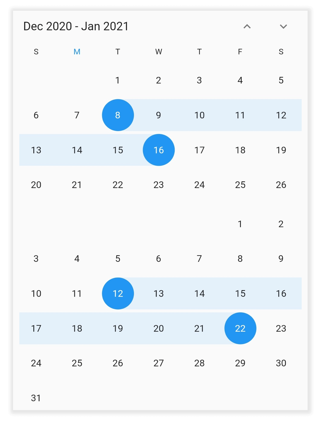
Vertical picker
You can arrange the two date range picker views in the vertical direction by setting the navigationDirection as DateRangePickerNavigationDirection.vertical in the SfDateRangePicker.`
@override
  Widget build(BuildContext context) {
    return MaterialApp(
      home: Scaffold(
        body: SfDateRangePicker(
          enableMultiView: true,
          navigationDirection: DateRangePickerNavigationDirection.vertical,
          viewSpacing: 10,
        ),
      ),
    );
  }
See also
- How to switch between the date range picker views in the Flutter date range picker (SfDateRangePicker)?
- How to get the current view dates in Flutter date range picker (SfDateRangePicker)?
- How to show two pickers vertically in the Flutter date range picker (SfDateRangePicker)
- How to change the number of weeks in the Flutter date range picker (SfDateRangePicker)