Flutter Date Range Picker Getting Started (SfDateRangePicker)
16 Apr 20268 minutes to read
This section explains the steps required to add the date range picker widget. This section covers only basic features needed to get started with Syncfusion® date range picker widget.
To get start quickly with our Flutter date range picker widget, you can check on this video.
Add Flutter Date Range Picker to an application
Create a simple project using the instructions given in the Getting Started with your first Flutter app documentation.
Add dependency
Add the Syncfusion® Flutter date range picker dependency to your pubspec.yaml file.
dependencies:

syncfusion_flutter_datepicker: ^xx.x.xx
NOTE
Here xx.x.xx denotes the current version of
Syncfusion Flutter Date Pickerpackage.
Get packages
Run the following command to get the required packages.
$ flutter pub getImport package
Import the following package in your Dart code.
import 'package:syncfusion_flutter_datepicker/datepicker.dart';Initialize date range picker
After importing the package, initialize the date range picker widget as a child of any widget. Here, the date range picker widget is added as a child of the scaffold widget.
@override
  Widget build(BuildContext context) {
    return Scaffold(
      body: Container(
        child: SfDateRangePicker()
      )
    );
  }
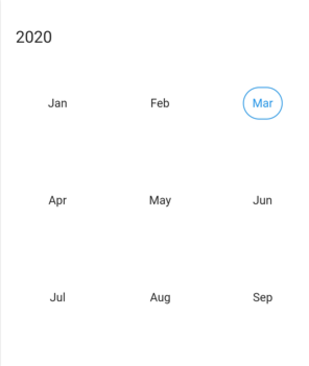
Multiple picker views
The SfDateRangePicker widget provides four different types of views to display. It can be assigned to the widget constructor by using the view property. Default view of the widget is month view. By default the current date will be displayed initially for all the date range picker views.
@override
  Widget build(BuildContext context) {
    return Scaffold(
      body: SfDateRangePicker(
        view: DateRangePickerView.year
      )
    );
  }
Change first day of week
The SfDateRangePicker widget will be rendered with Sunday as the first day of the week, but you can customize it to any day by using the firstDayOfWeek property.
@override
  Widget build(BuildContext context) {
    return Scaffold(
      body: SfDateRangePicker(
        view: DateRangePickerView.month,
        monthViewSettings: DateRangePickerMonthViewSettings(
          firstDayOfWeek: 1
        ),
      ),
    );
  }
Date selection
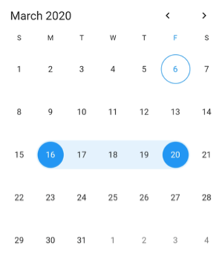
The SfDateRangePicker supports selecting single, multiple, and range of dates. It also supports programmatic selection.
The selected date or range details can be obtained using the onSelectionChanged callback of date range picker. The callback will return the DateRangePickerSelectionChangedArgs which contains the selected date or range details.
void _onSelectionChanged(DateRangePickerSelectionChangedArgs args) {
    // TODO: implement your code here
  }

  @override
  Widget build(BuildContext context) {
    return MaterialApp(
      home: Scaffold(
        body: Container(
          child: SfDateRangePicker(
            onSelectionChanged: _onSelectionChanged,
            selectionMode: DateRangePickerSelectionMode.range,
          ),
        ),
      ),
    );
  }
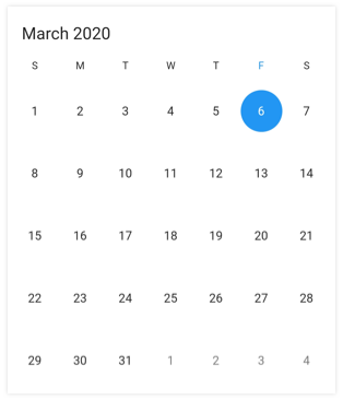
Today highlight color
You can highlight the today’s date by customizing its color in the date range picker by using the todayHighlightColor property. This allows you to make today’s date stand out in all views such as month, year, decade, and century.
@override
Widget build(BuildContext context) {
return Scaffold(
body: SfDateRangePicker(
view: DateRangePickerView.month,
todayHighlightColor: Colors.green,
),
);
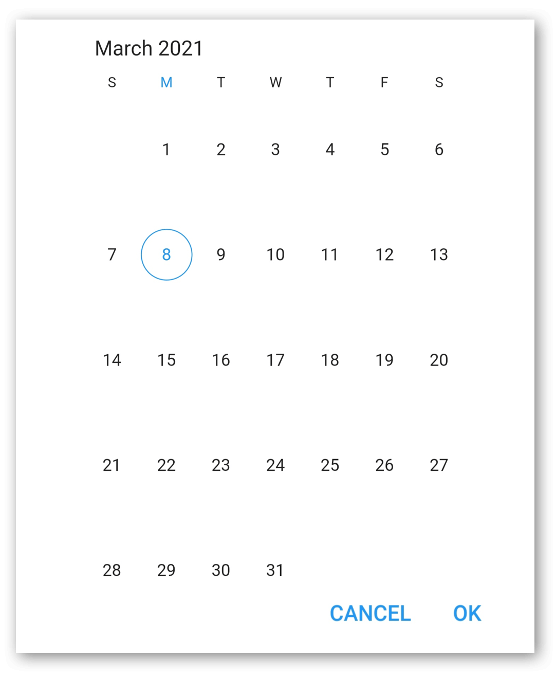
}Action buttons
You can display action buttons at the bottom of the date range picker by using the showActionButtons property of SfDateRangePicker.
-
confirmText - Customizes the text that display on the confirm button.
-
cancelText - Customizes the text that display on the cancel button.
-
onCancel - Callback function that is triggered when the cancel button is tapped within a date range picker.
-
onSubmit - Callback function that is triggered when the confirm button is tapped within a date range picker.
@override
  Widget build(BuildContext context) {
    return Scaffold(
      body: TextButton(
        child: Text('Show picker'),
        onPressed: () {
          showDialog<Widget>(
            context: context,
            builder: (BuildContext context) {
              return SfDateRangePicker(
                showActionButtons: true,
                onSubmit: (Object value) {
                  Navigator.pop(context);
                },
                onCancel: () {
                  Navigator.pop(context);
                },
              );
            },
          );
        },
      ),
    );
  }
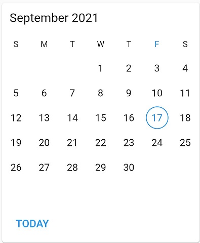
Today button
The today button can be displayed at the bottom of the date range picker by using the showTodayButton property of the SfDateRangePicker. It easily moves to the current date of the picker view.
@override
  Widget build(BuildContext context) {
    return Scaffold(
      body: SfDateRangePicker(
        view: DateRangePickerView.month,
        showTodayButton: true,
      ),
    );
  }