Flutter Event Calendar Resource View (SfCalendar)
16 Apr 20269 minutes to read
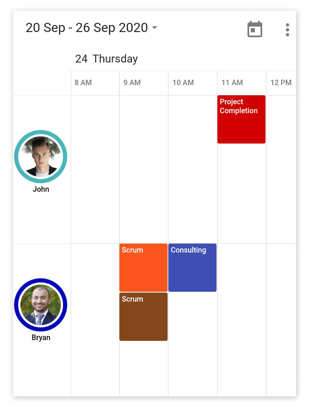
The timeline resource grouping is a discrete view integrated into our Event calendar widget that allows you to group the appointments based on the available resource in timeline views of the calendar. Using this feature, you can group the appointments and time regions arranged in a row-wise order based on the allocated resource in the timeline views. This rich feature set includes customization and you can assign unique styles to the available resource view.
You can create a resource view by setting the displayName, color, id, and image property of the CalendarResource.
List<CalendarResource> resourceColl = <CalendarResource>[];
    resourceColl.add(CalendarResource(
      displayName: 'John',
      id: '0001',
      color: Colors.red,
    ));
You can add resources that can be assigned to the appointments and time regions using the resources property of CalendarDataSource.
class _AppointmentDataSource extends CalendarDataSource {
  _AppointmentDataSource(
      List<Appointment> source, List<CalendarResource> resourceColl) {
    appointments = source;
    resources = resourceColl;
  }
}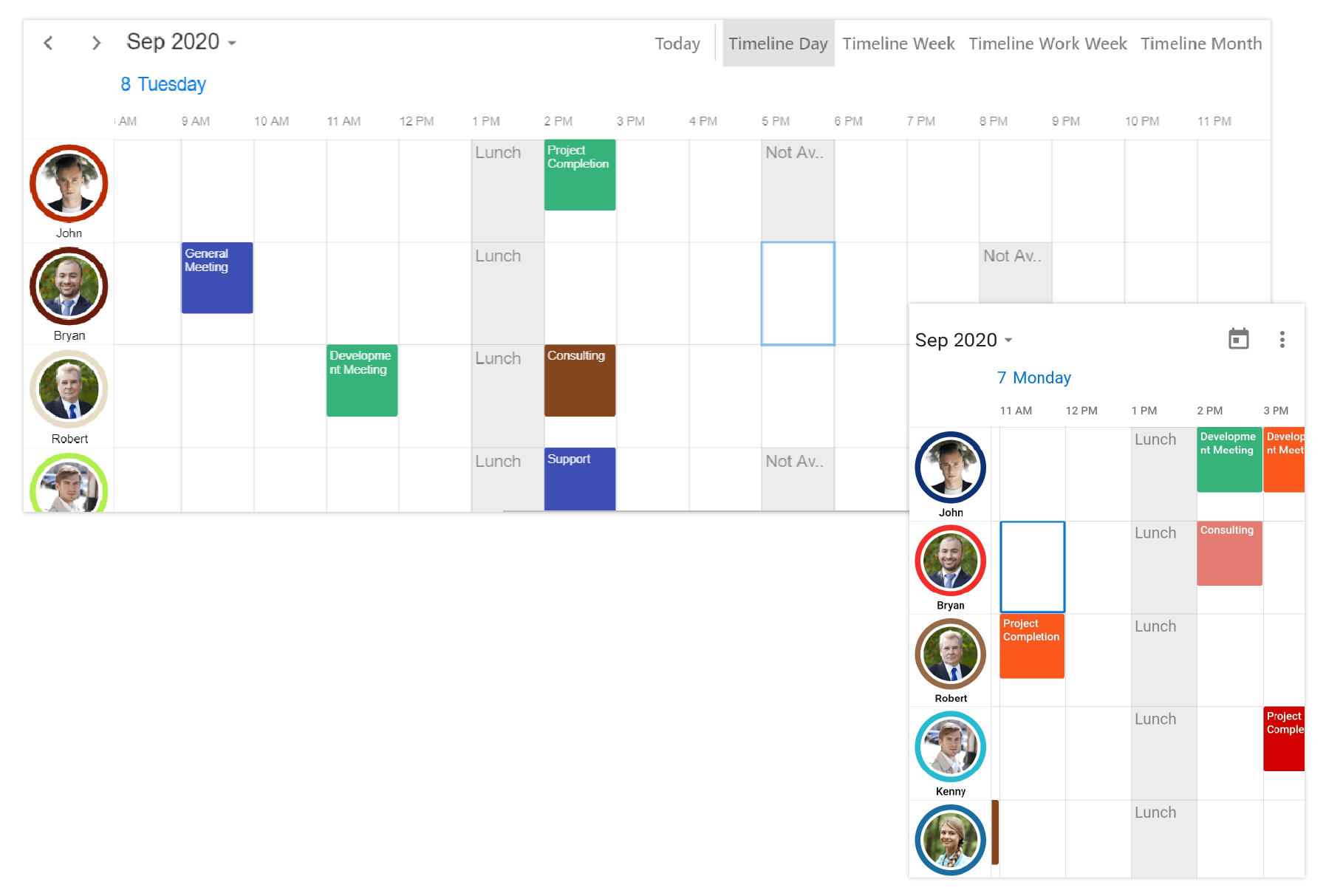
Assigning events for resources
You can associate resources to the appointments by adding id of a resource to the resourceIds property of Appointment. The appointments will be displayed in the row associates with the resource in the event calendar timeline views.
appointments.add(Appointment(
      startTime: DateTime(2020, 08, 25, 14, 0, 0),
      endTime: DateTime(2020, 08, 25, 14, 30, 0),
      subject: 'General Meeting',
      color: Colors.red,
      resourceIds: ['0000', '0001'],
    ));
Assigning custom business objects for resources
You can associate resources to custom business objects using the equivalent field of resourceIds in the custom business object class.
class _AppointmentDataSource extends CalendarDataSource {
  _AppointmentDataSource(
      List<Appointment> source, List<CalendarResource> resourceColl) {
    appointments = source;
    resources = resourceColl;
  }

  @override
  List<Object> getResourceIds(int index) {
    return appointments![index].ids;
  }
}
For more about custom appointments, refer to this link.
Assigning time regions for resources
You can add time regions to the resources by adding id of the resource in the resourceIds property of TimeRegion.
List<TimeRegion> _specialTimeRegions = <TimeRegion>[];
    _specialTimeRegions.add(TimeRegion(
        startTime: DateTime(2020, 08, 20, 13, 0, 0),
        endTime: DateTime(2020, 08, 20, 14, 0, 0),
        text: 'Lunch',
        color: Colors.green.withOpacity(0.2),
        recurrenceRule: 'FREQ=DAILY;INTERVAL=1',
        resourceIds: <Object>['0001', '0001']));
Visible resource count
You can customize the number of visible resources in the current view using the visibleResourceCount property of ResourceViewSettings in the SfCalendar. By default, the value of this property is set to ‘-1.’
@override
Widget build(BuildContext context) {
    return MaterialApp(
      home: Scaffold(
          body: SfCalendar(
        dataSource: _dataSource,
        resourceViewSettings: ResourceViewSettings(
          visibleResourceCount: 2,
        ),
    )),
  );
}
Height and Width
You can customize the height or width of the resource view individually using the height and width properties of ResourceViewSettings in the SfCalendar.
- height — Sets the height of each individual resource item. Use this when you want fixed control over row height.
- width — Sets the total width of the entire resource view panel. Use this when you want fixed control over panel width.
-
size — Applies the same value to both the height and width of resource view. The
heightorwidthproperty takes first precedence oversizeproperty when given explicitly. -
visibleResourceCount — When
visibleResourceCountis set (> 0), the calendar automatically calculates the height of each resource item based on the available space and the number of visible resources. In this case, an explicitly setheightvalue is ignored.
@override
Widget build(BuildContext context) {
    return MaterialApp(
      home: Scaffold(
          body: SfCalendar(
        dataSource: _dataSource,
        resourceViewSettings: ResourceViewSettings(
          height: 100,
          width: 250,
          // size: 120,          // used only when `width` is not provided
          // visibleResourceCount: 2, // when set, determines row height instead of `height`
        ),
    )),
  );
}
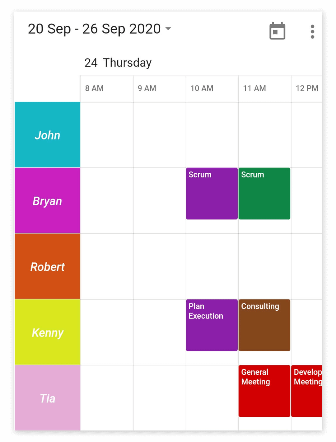
Customization
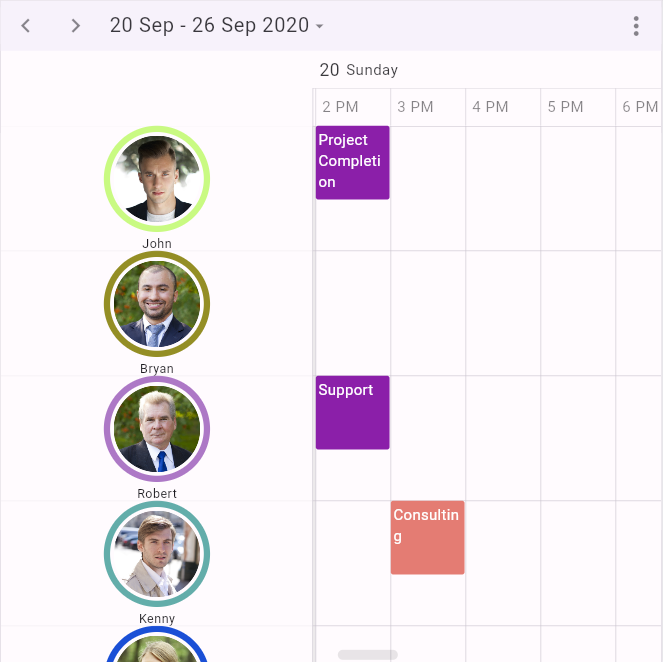
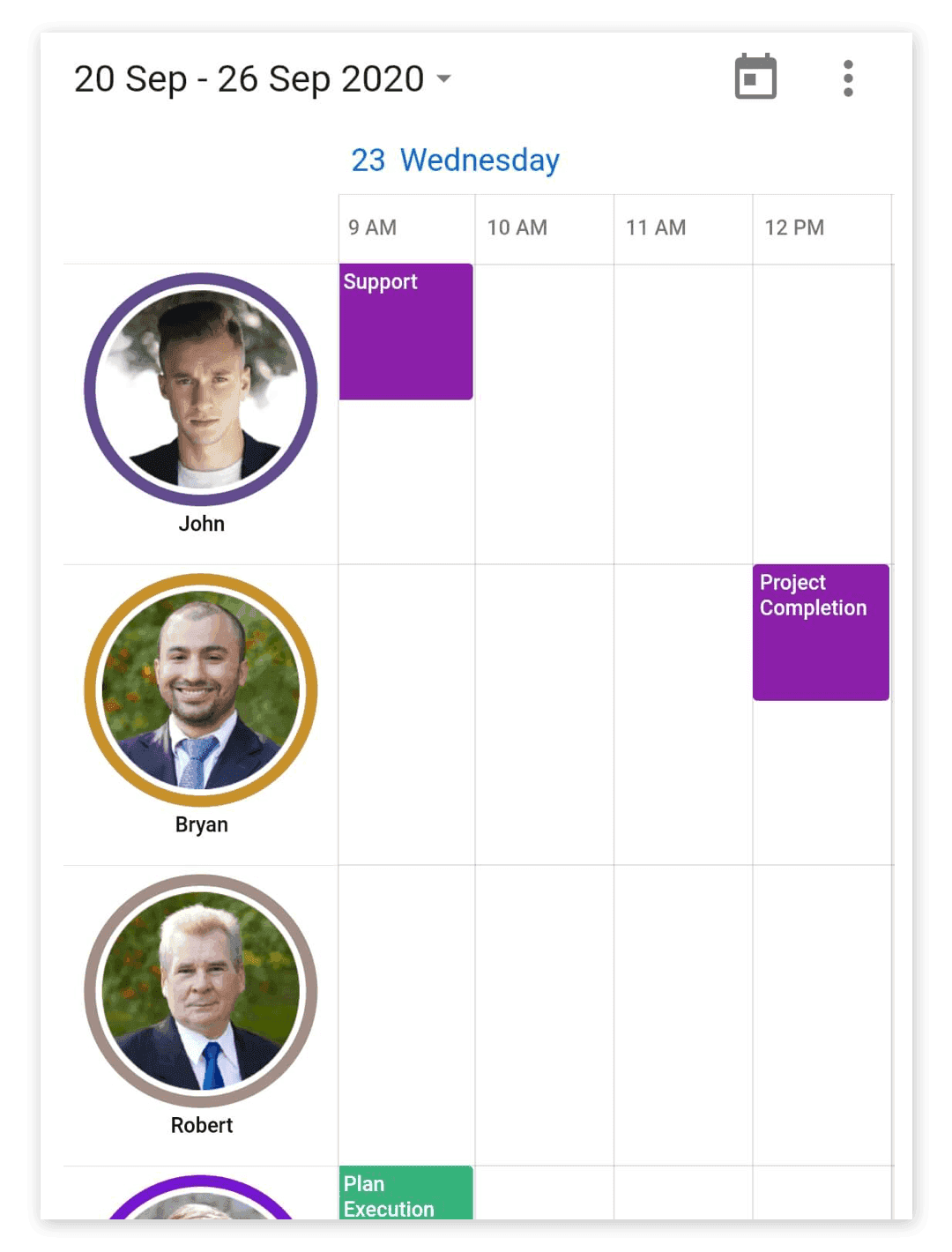
Show avatar
You can disable the user profile image and the circle representation of the resource by setting false to the showAvatar property available in the ResourceViewSettings. This will display each resource with a resource name and the color assigned to the resource.
@override
Widget build(BuildContext context) {
  return MaterialApp(
    home: Scaffold(
      body: SfCalendar(
        dataSource: _dataSource,
        resourceViewSettings: ResourceViewSettings(showAvatar: false),
    )),
  );
}
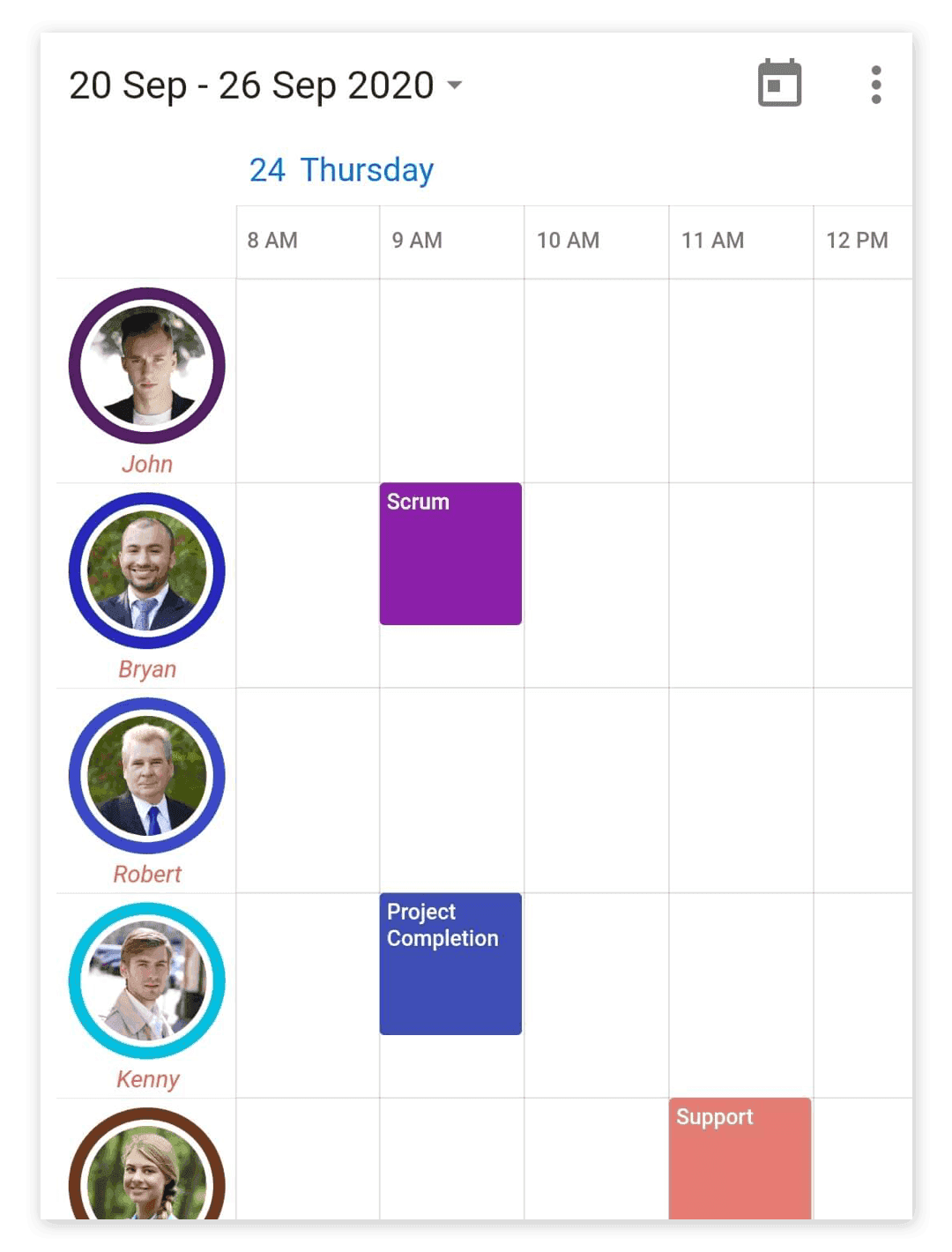
Display name text style
The display name text style for the resource view can be customized by setting an appropriate text style to the displayNameTextStyle property available in the ResourceViewSettings.
@override
Widget build(BuildContext context) {
  return MaterialApp(
    home: Scaffold(
      body: SfCalendar(
        dataSource: _dataSource,
        resourceViewSettings: ResourceViewSettings(
            displayNameTextStyle: TextStyle(
                fontSize: 11,
                color: Colors.redAccent,
                fontStyle: FontStyle.italic)),
      )),
    );
}
Resource panel size
You can customize the size of the panel that displays the resource views in the calendar by setting an appropriate value to the size property available in the ResourceViewSettings.
@override
Widget build(BuildContext context) {
  return MaterialApp(
    home: Scaffold(
      body: SfCalendar(
		dataSource: _dataSource,
        resourceViewSettings: ResourceViewSettings(size: 120),
      )),
    );
}
When
widthis specified along with size,widthtakes precedence.