Flutter Event Calendar Time Zone (SfCalendar)
16 Apr 202617 minutes to read
The month view of Flutter Event Calendar (SfCalendar) used to display entire dates of the specific month and current month by default initially. Current date color is differentiated with other dates of the current month, also the color differentiation for dates will be applicable for previous and next month dates.
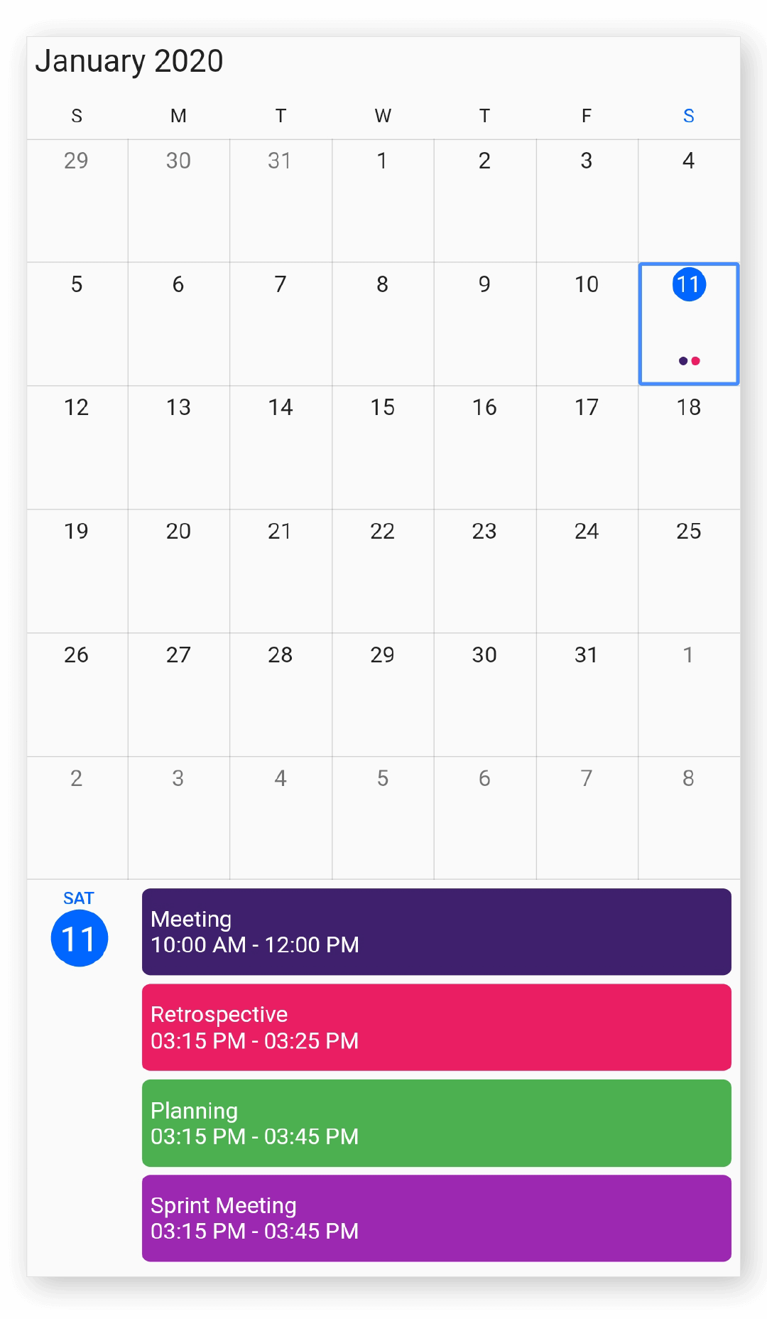
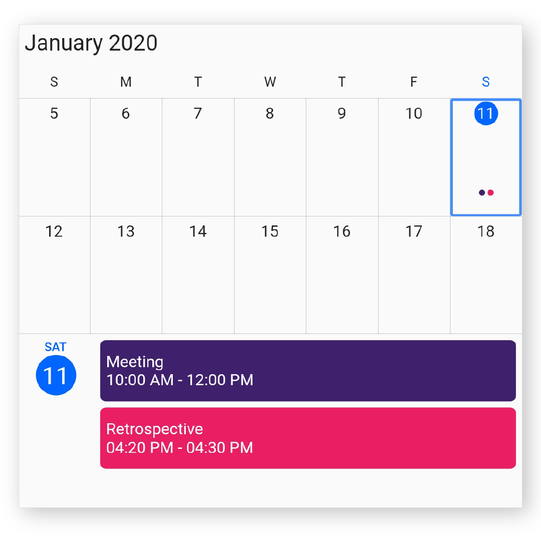
Month agenda view
The calendar month view displays a divided agenda view that is used to show the selected date’s appointments below the month. You can show the agenda view by setting the showAgenda property to true in MonthViewSettings.
@override
Widget build(BuildContext context) {
  return Scaffold(
      body: SfCalendar(
    view: CalendarView.month,
    monthViewSettings: MonthViewSettings(showAgenda: true),
  ));
}
NOTE
- An agenda view displays text as
No Selected Dateuntil no date is selected.- If there is no appointment in a selected day, agenda view displays the text as
No Events.
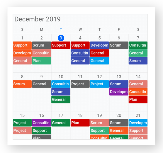
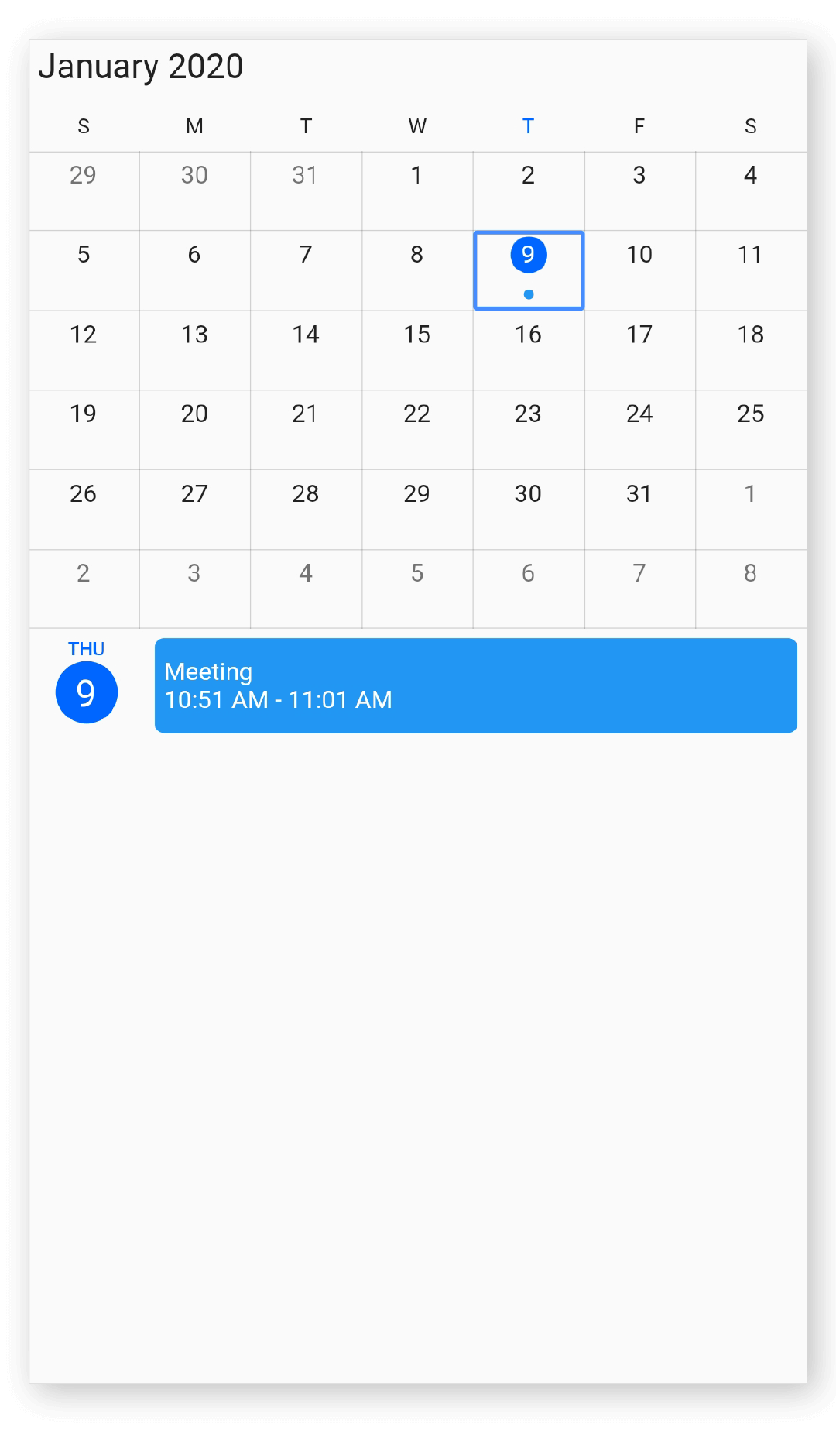
Month appointment display mode
You can handle the calendar month view appointment display by using the appointmentDisplayMode property of MonthViewSettings. By default, appointmentDisplayMode is set to Indicator, using the appointmentDisplayMode you can set the month view appointments display as follows.
- indicator - appointment will be denoted as the circle.
- appointment - appointment subject will be displayed in month cell.
- none - appointment will not be displayed.
@override
Widget build(BuildContext context) {
  return MaterialApp(
    home: Scaffold(
      body: Container(
        child: SfCalendar(
          view: CalendarView.month,
          monthViewSettings: MonthViewSettings(
              appointmentDisplayMode: MonthAppointmentDisplayMode.appointment),
        ),
      ),
    ),
  );
}
Agenda view height
You can customize the month agenda view height from calendar by using the agendaViewHeight property of MonthViewSettings. By default, the agenda view will occupy the 30% height of the calendar height.
@override
Widget build(BuildContext context) {
  return MaterialApp(
    home: Scaffold(
      body: Container(
        child: SfCalendar(
          view: CalendarView.month,
          monthViewSettings: MonthViewSettings(
            showAgenda: true,
            agendaViewHeight: 400,
          ),
        ),
      ),
    ),
  );
}
Agenda item height
You can customize the height of an appointment in agenda view by using the agendaItemHeight property of MonthViewSettings.
@override
Widget build(BuildContext context) {
  return MaterialApp(
    home: Scaffold(
      body: Container(
        child: SfCalendar(
          view: CalendarView.month,
          monthViewSettings: MonthViewSettings(
            showAgenda: true,
            agendaItemHeight: 70,
          ),
        ),
      ),
    ),
  );
}
Appointment display count
You can customize the number of appointments displayed in month cell using the appointmentDisplayCount property of MonthViewSettings in SfCalendar, by default Appointment display count is 3.
@override
Widget build(BuildContext context) {
  return MaterialApp(
    home: Scaffold(
      body: Container(
        child: SfCalendar(
          view: CalendarView.month,
          monthViewSettings: MonthViewSettings(appointmentDisplayCount: 2),
        ),
      ),
    ),
  );
}
NOTE
- If appointments count is lesser than the appointmentDisplayCount value in the particular day, then according to the number of appointments available, appointment will be displayed in the month cell.
- Appointment indicator will be shown on the basis of date meetings, usable month cell size and indicator count. For eg, if the month cell size is less (available for only 4 dots) and the indicator count is 10, then 4 indicators will be shown.
Month navigation direction
MonthView of calendar can be navigated in both horizontal and vertical direction. You can change the direction of navigation using the navigationDirection property of MonthViewSettings, by default Month navigation direction is Horizontal.
@override
Widget build(BuildContext context) {
  return MaterialApp(
    home: Scaffold(
      body: Container(
        child: SfCalendar(
          view: CalendarView.month,
          monthViewSettings: MonthViewSettings(
              navigationDirection: MonthNavigationDirection.horizontal),
        ),
      ),
    ),
  );
}
Blackout dates
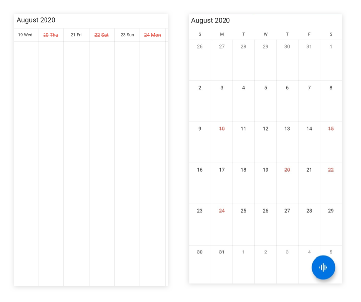
You can disable the interaction for a certain date in the month view and timeline month view by using the blackoutDates property of SfCalendar. Using this, you can restrict user interaction for specific dates.
You can customize the text style of blackout dates by using the blackoutDatesTextStyle property from the SfCalendar.
@override
Widget build(BuildContext context) {
  return SfCalendar(
    view: CalendarView.month,
    blackoutDates: <DateTime>[
        DateTime(2020, 08, 10),
        DateTime(2020, 08, 15),
        DateTime(2020, 08, 20),
        DateTime(2020, 08, 22),
        DateTime(2020, 08, 24)
      ],
    blackoutDatesTextStyle: TextStyle(
        fontWeight: FontWeight.w400,
        fontSize: 13,
        color: Colors.red,
        decoration: TextDecoration.lineThrough));
}
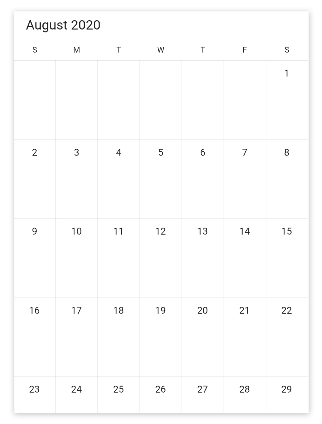
Hide leading and trailing dates
You can hide the previous and next month dates of a calendar month view by using the showTrailingAndLeadingDates property in the MonthViewSettings of the calendar.
@override
Widget build(BuildContext context) {
  return SfCalendar(
      view: CalendarView.month,
      monthViewSettings: MonthViewSettings(
        showTrailingAndLeadingDates: false,
      ));
}
Customize number of month rows
The number of weeks in the month view can be changed by setting the numberOfWeeksInView property in MonthViewSettings. By default, numberOfWeeksInView starts from current week, and this can be modified using the initialDisplayDate property of calendar, the two weeks calendar can be achieved by setting the numberOfWeeksInView property with the value 2.
@override
Widget build(BuildContext context) {
  return MaterialApp(
    home: Scaffold(
      body: Container(
        child: SfCalendar(
          view: CalendarView.month,
          monthViewSettings: MonthViewSettings(numberOfWeeksInView: 2),
        ),
      ),
    ),
  );
}
NOTE
- Week number ranges from 1 to 6. If lesser or greater than these range is considered, numberOfWeeksInView will be displayed as 6.
- Dynamically changing numberOfWeeksInView shows the first row of month view dates. It can be handled using the initialDisplayDate property of calendar.
View header DayFormat
You can customize the day format of SfCalendar ViewHeader by using the dayFormat property of MonthViewSettings.
@override
Widget build(BuildContext context) {
  return MaterialApp(
    home: Scaffold(
      body: Container(
        child: SfCalendar(
          view: CalendarView.month,
          monthViewSettings: MonthViewSettings(dayFormat: 'EEE'),
        ),
      ),
    ),
  );
}
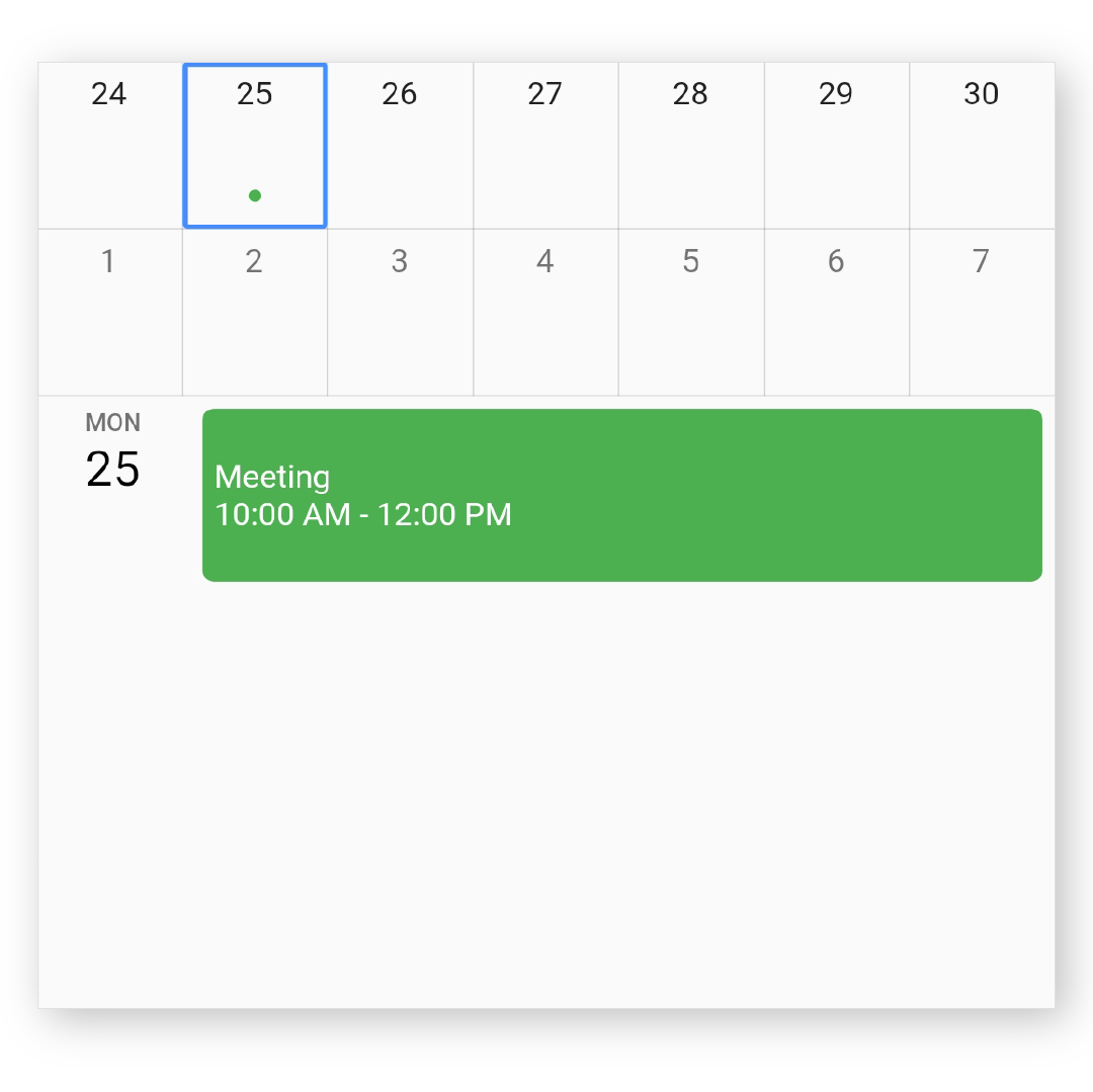
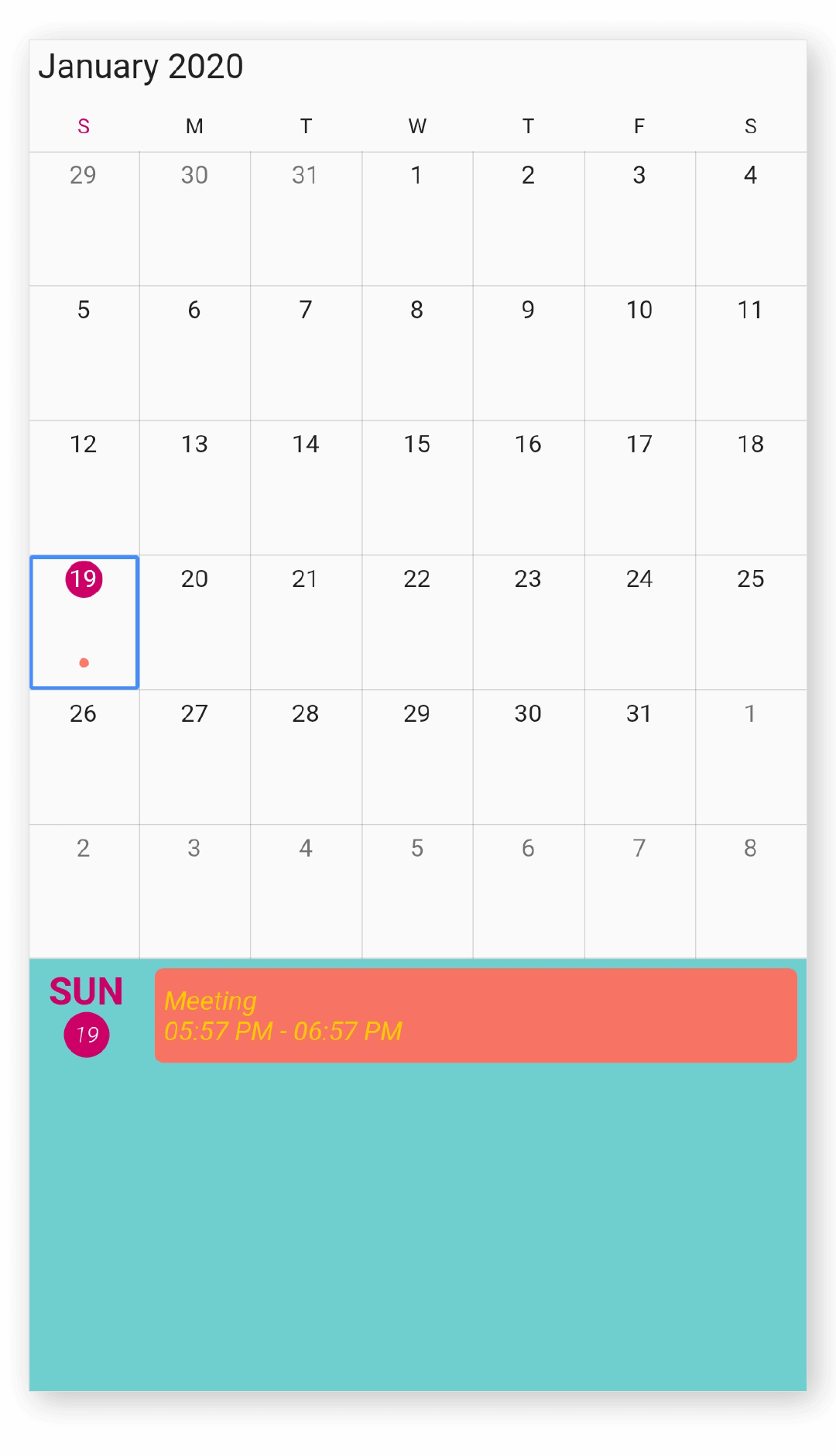
Agenda view appearance
You can customize the agenda view appointment and the selected date text style by using the agendaStyle property of MonthViewSettings. Agenda view appointmentTextStyle, dayTextStyle, dateTextStyle, and backgroundColor can be customized using AgendaStyle properties.
@override
Widget build(BuildContext context) {
  return MaterialApp(
    home: Scaffold(
      body: Container(
        child: SfCalendar(
          view: CalendarView.month,
		  todayHighlightColor: Color(0xFFcc0066),
          monthViewSettings: MonthViewSettings(
              showAgenda: true,
              agendaStyle: AgendaStyle(
                backgroundColor: Color(0xFF066cccc),
                appointmentTextStyle: TextStyle(
                    fontSize: 14,
                    fontStyle: FontStyle.italic,
                    color: Color(0xFF0ffcc00)),
                dateTextStyle: TextStyle(
                    fontStyle: FontStyle.italic,
                    fontSize: 12,
                    fontWeight: FontWeight.w300,
                    color: Colors.black),
                dayTextStyle: TextStyle(
                    fontStyle: FontStyle.normal,
                    fontSize: 20,
                    fontWeight: FontWeight.w700,
                    color: Colors.black),
              )),
        ),
      ),
    ),
  );
}
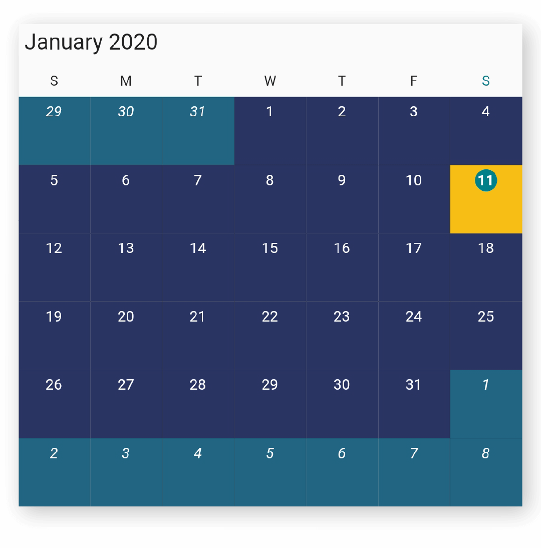
Month cell appearance
By using the monthCellStyle property of MonthViewSettings, you can customize the month properties such as backgroundColor, todayBackgroundColor, trailingDatesBackgroundColor, leadingDatesBackgroundColor, textStyle, todayTextStyle, trailingDatesTextStyle, and leadingDatesTextStyle from MonthCellStyle.
@override
Widget build(BuildContext context) {
  return MaterialApp(
    home: Scaffold(
      body: Container(
        child: SfCalendar(
          view: CalendarView.month,
          monthViewSettings: MonthViewSettings(
              monthCellStyle: MonthCellStyle(
                  backgroundColor: Color(0xFF293462),
                  trailingDatesBackgroundColor: Color(0xff216583),
                  leadingDatesBackgroundColor: Color(0xff216583),
                  todayBackgroundColor: Color(0xFFf7be16),
                  textStyle: TextStyle(
                      fontSize: 12,
                      fontFamily: 'Arial'),
                  todayTextStyle: TextStyle(
                      fontSize: 12,
                      fontWeight: FontWeight.bold,
                      fontFamily: 'Arial'),
                  trailingDatesTextStyle: TextStyle(
                      fontStyle: FontStyle.italic,
                      fontSize: 12,
                      fontFamily: 'Arial'),
                  leadingDatesTextStyle: TextStyle(
                      fontStyle: FontStyle.italic,
                      fontSize: 12,
                      fontFamily: 'Arial'))),
        ),
      ),
    ),
  );
}
See also
- How to show a custom agenda view in the Flutter event calendar widget?
- How to customize the agenda item height in the flutter event calendar (SfCalendar)
- How to customize agenda view height based on the Flutter event calendar widget height
- How to change the number of weeks in the Flutter event calendar (SfCalendar)
- How to display two month view Calendar in a screen using Flutter event calendar (SfCalendar)
- How to style the month cell in the Flutter event calendar (SfCalendar)
- How to clear the appointments in month agenda view using onViewChange callback in Flutter event calendar (SfCalendar)
- How to customize the leading and trailing dates of the month cells in the Flutter event calendar (SfCalendar)?
- How to customize the month cells of the Flutter event calendar (SfCalendar)?
- How to customize the agenda view appointment using the style properties in Flutter event calendar (SfCalendar)
- How to get the month and year of month view in the Flutter event calendar (SfCalendar)
- How to handle the appointment display mode in the Flutter event calendar (SfCalendar)