- How to configure flat table data to date picker?
- Before Resizing
- After Resizing
- How to configure the SSAS data to date picker?
- Before Resizing
- After Resizing
- How to configure relative dates to date picker?
- How to configure custom relative dates to date picker?
- How to customize date format in date picker?
- How to format date picker?
Contact Support
Date Picker
Date Picker enables you to filter based on the single or range of date selection.
How to configure flat table data to date picker?
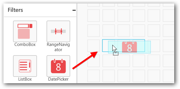
Drag and drop the Date Picker from toolbox at left into design canvas and resize it to your required size.
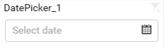
Before Resizing
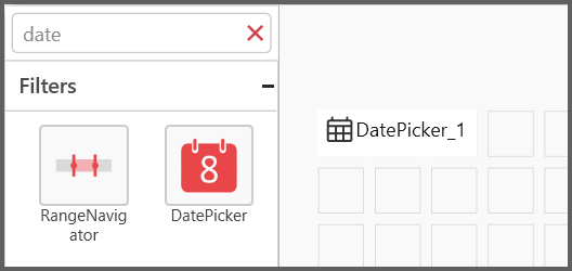
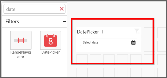
After Resizing
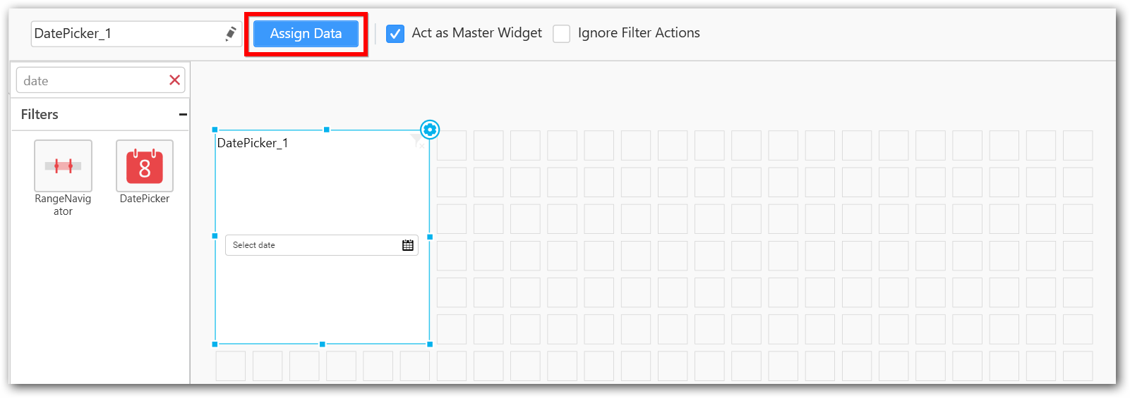
Keep the selection focus on the dropped date picker widget.
Click on Assign Data button in the tool bar.
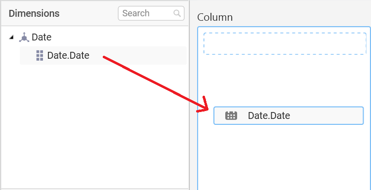
Now, the Data window will be opened with available date fields in Dimension from the connected data source.
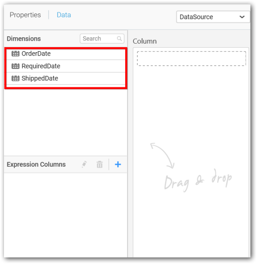
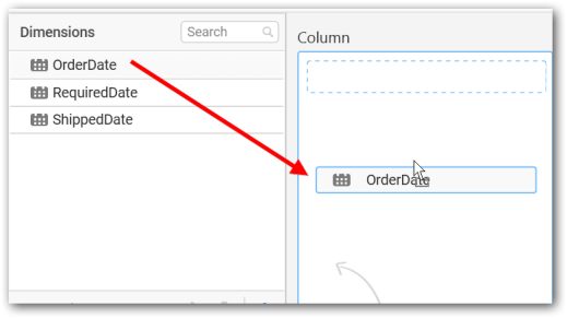
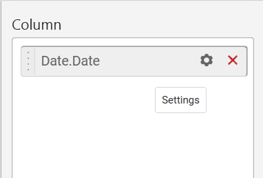
Drag and drop a date field from Dimensions into Column section.
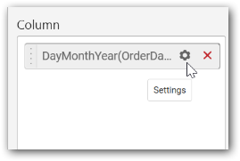
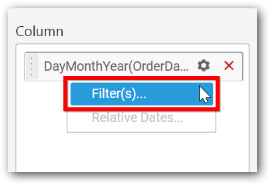
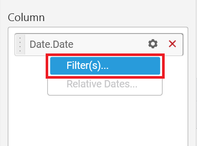
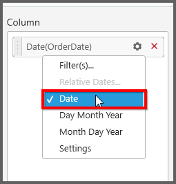
To filter out a specific range of dates, click the Settings icon in the dropped column and select Filter(s)... in the drop down menu.
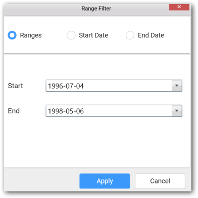
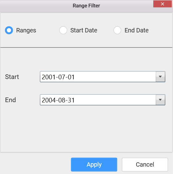
Now the Range Filter window get displayed. Configure the date range to be filtered out and click Apply.
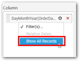
To clear the filter applied, click on Show All Records item in the drop down menu.
How to configure the SSAS data to date picker?
Following steps illustrates configuration of SSAS data to Date Picker.
Drag and drop the Date Picker from toolbox at left into design canvas and resize it to your required size.

Before Resizing
After Resizing
Select the dropped widget using mouse.
Click on Assign Data button in the tool bar.
A Data pane will be opened with available date Dimensions.
Drag and drop a column under Dimensions category into Column.
Define filter with specific range of dates by click the Settings icon in the dropped column and select Filter(s)... in the drop down menu.
Define the date range in Range Filter dialog and click Apply.
To show all records again click on Show All Records.
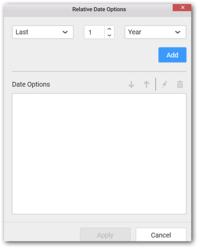
How to configure relative dates to date picker?
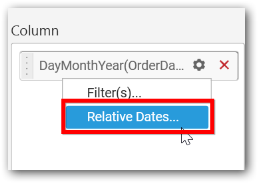
Switch to the Properties pane; Set the Selection Type as Range; Switch back to Data pane; Click the Settings icon in the dropped date column and select Relative Dates... in the drop down menu.
In the launched Relative Date Options window, configure the relative date and click Add. Repeat the same till the required set of relative dates added.
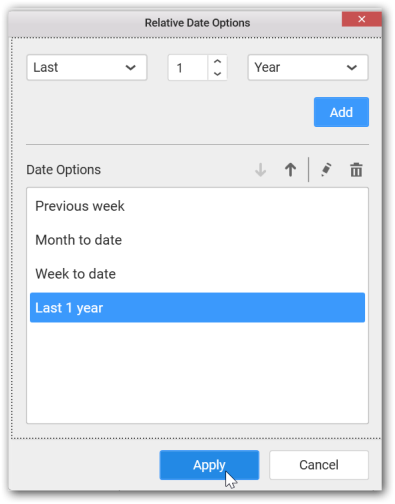
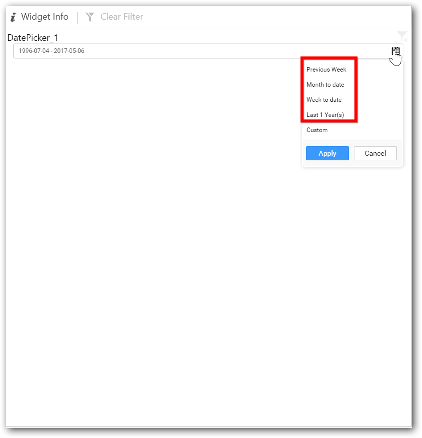
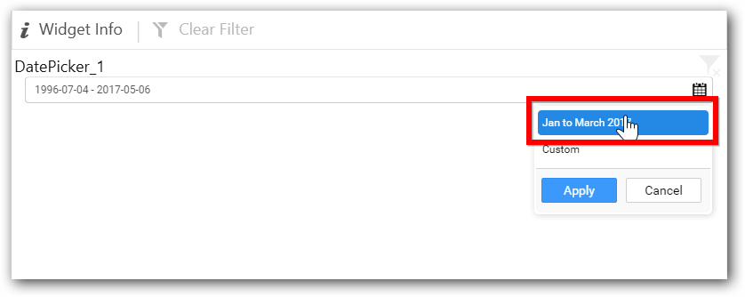
You can see the added relative dates in date picker like below.
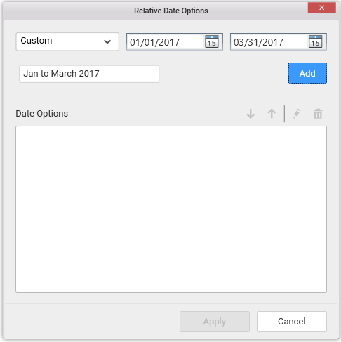
How to configure custom relative dates to date picker?
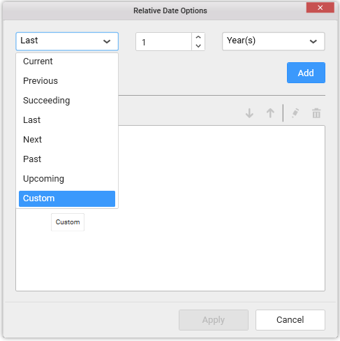
Switch to the Properties pane; Set the Selection Type as Range; Switch back to Data pane; Click the Settings icon in the dropped date column and select Relative Dates... in the drop down menu.
In the launched Relative Date Options window, select Custom option from DropDownList.
Choose the start and end dates which you like to set as custom range, also set the name for the custom range and click Add. Repeat the same till the required set of custom relative dates added.
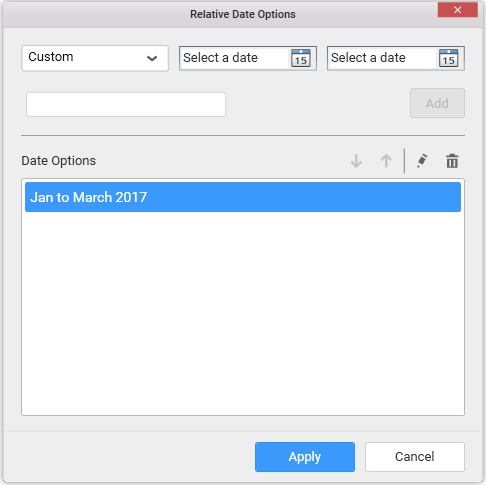
You can see the added custom relative dates in date picker like below.
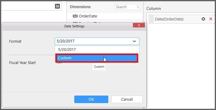
How to customize date format in date picker?
This helps you to set your own custom date formats only for “Date” format. Switch to the Properties pane and select date format.
You can see the “Settings” option in the dropdown, after enabling “Date” format.

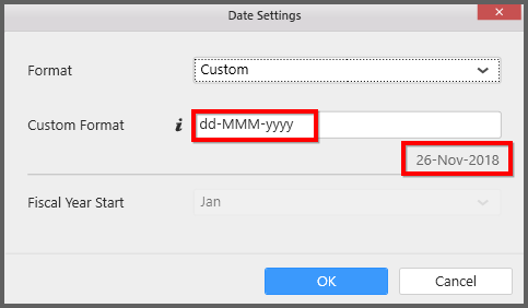
Select “Custom” option to customize the date format.
You can see the list of standard format to customize your date in Date picker control.
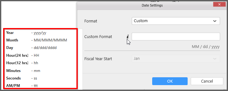
you can use the standard format as below.
How to format date picker?
Keep the selection focus on the date picker and Click on Widget Settings icon.
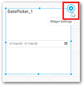
The property window will be opened like below.
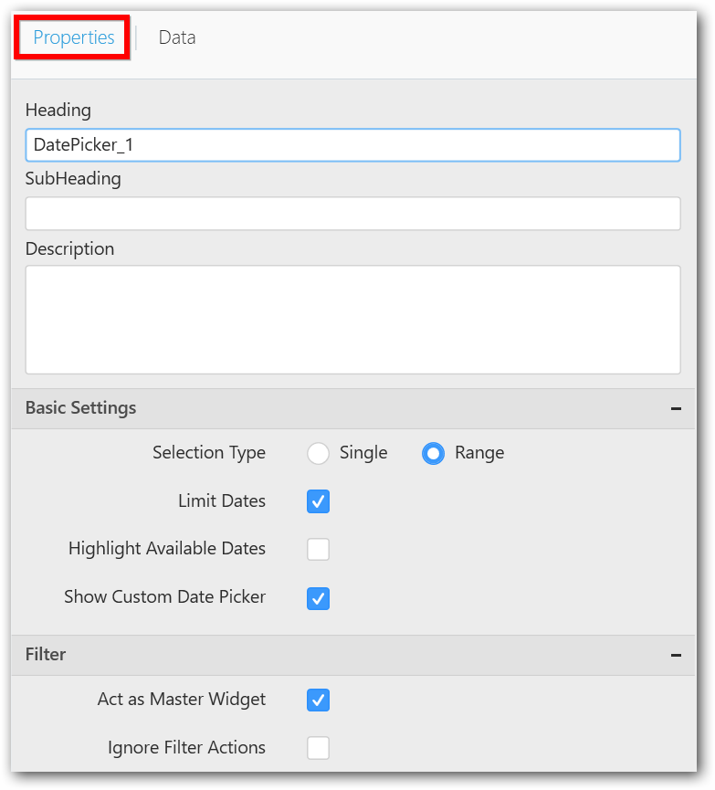
You can see the list of properties available for the widget with default value.
General Settings
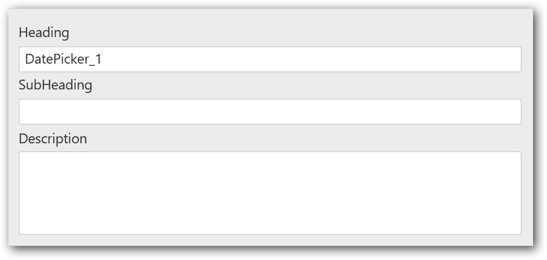
Header
This allows you to set title for this Date Picker widget.
SubHeading
This allows you to set sub-title for this Date Picker widget.
Description
This allows you to set description for this Date Picker widget, whose visibility will be denoted by i icon, hovering which will display this description in tooltip.
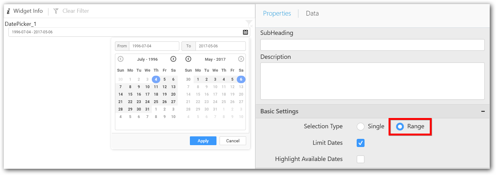
Basic Settings
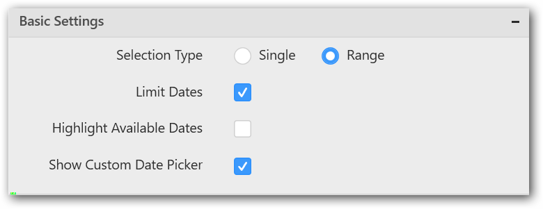
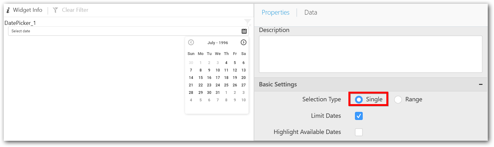
Selection Type
Single – Single date can be bounded.
Range – A range of dates (two dates) can be bounded.
Highlight Available Dates
This allows you to enable the highlighting of available dates in date picker.
Filter Settings
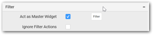
Act as Master Widget
This allows you to define this date picker widget as a master widget such that its filter action can be made to listen by other widgets in the dashboard.
Ignore Filter Actions
This allows you to define this date picker widget to ignore responding to the filter actions applied on other widgets in dashboard.
Container Settings
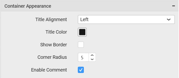
Title Alignment
This allows you to handle the alignment of widget title to either left, center or right.
Title Color
This allows you to apply text color to the widget title.
Show Border
This allows you to toggle the visibility of border surrounding the widget.
Corner Radius
This allows you to apply the specified radius to the widget corners. Value can be between 0 and 10.
Enable Comment
This allows you to enable/disable comment for dashboard widget. For more details refer here
