Getting Started with Dashboard Designer
This is a simple walkthrough to get you started with Dashboard Designer application. Throughout this walkthrough, the Northwind database is used to demonstrate each feature of the Dashboard Designer.
Running Dashboard Designer
Launch the Dashboard Designer application by double-clicking the shortcut icon in the desktop.
Alternatively, you can launch the Dashboard Designer application from the Apps list.
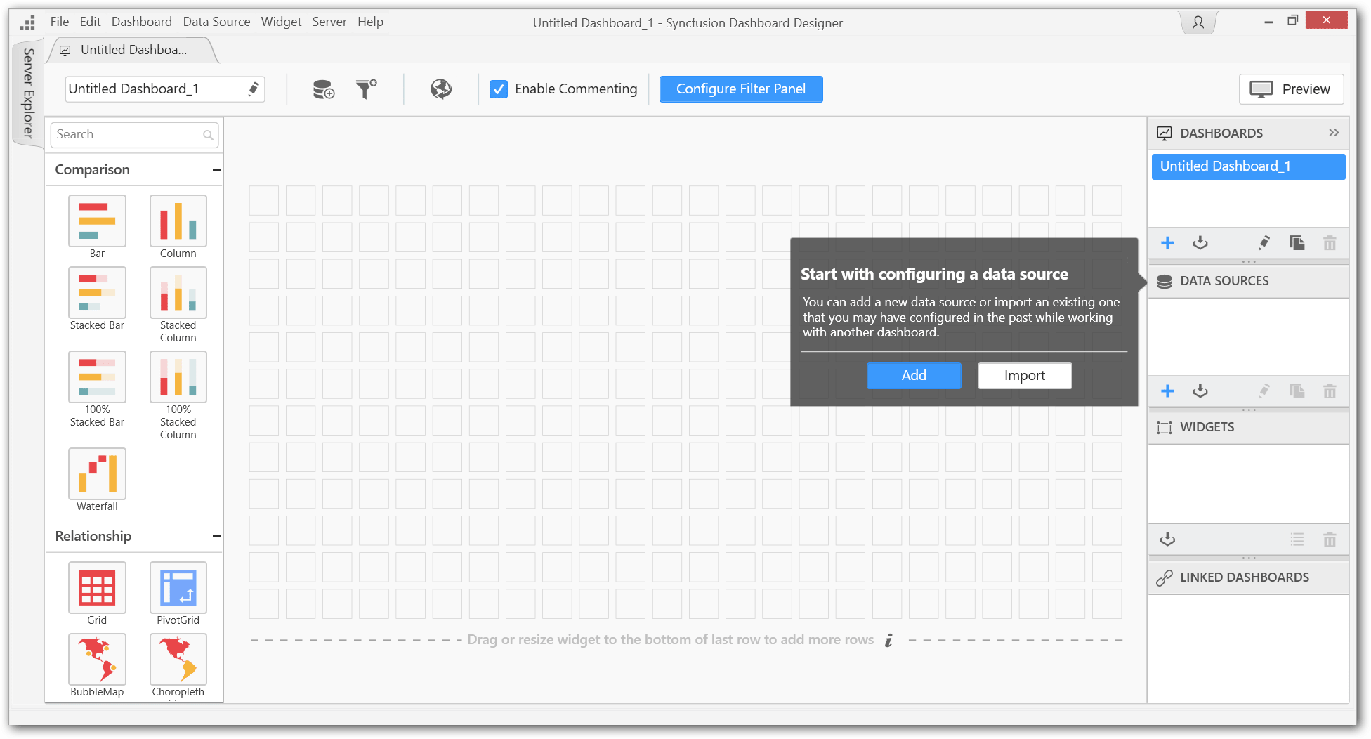
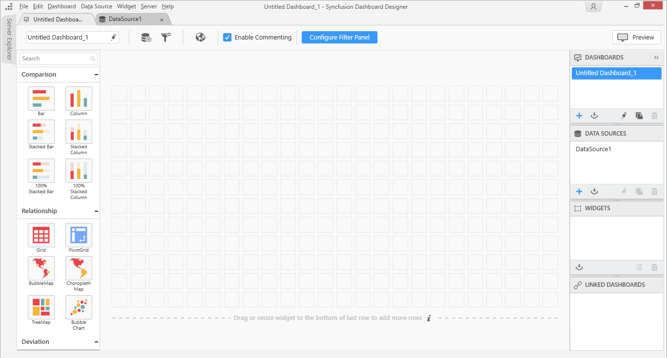
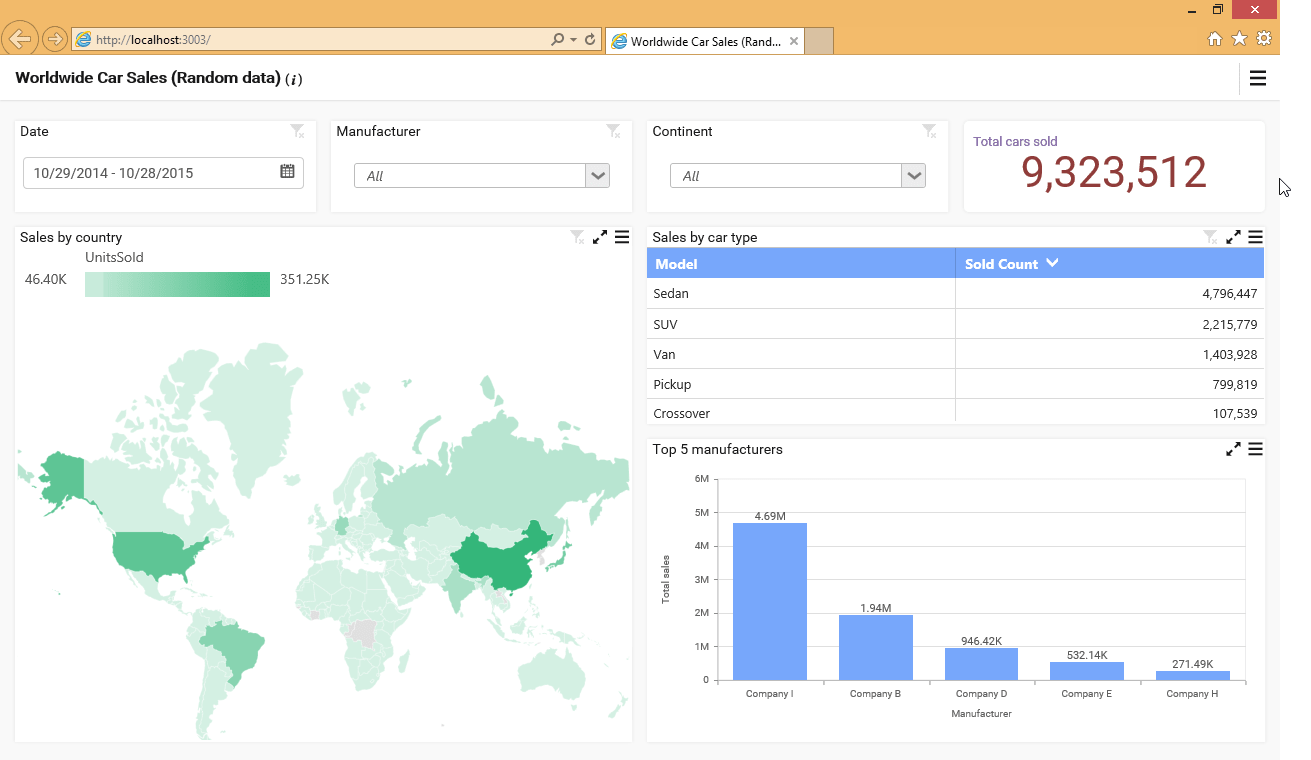
After launching, the Dashboard Designer application opens with the following view.
Connecting to data
Now, add a new data source after establishing a data connection with one of the supported data connection types as follows.
Setting up connection
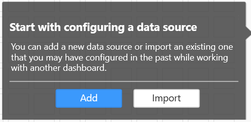
Click Add in the data source configuration smart screen window to launch a New Connection configuration dialog.
Configuring tables and views
In the New Connection configuration dialog, fill the connection type and required details.
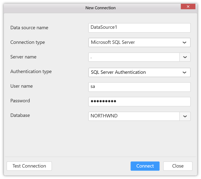
Test the connection for its validity by clicking the Test Connection button. The following confirmation message will be displayed.
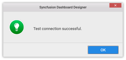
Click OK to close the confirmation message, and then click Connect in the New Connection dialog. The following view will be displayed.
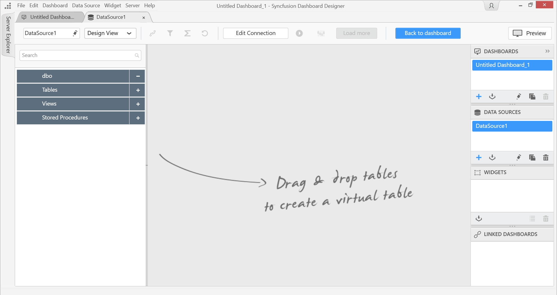
The left pane holds the tables and views associated with the connected database. Drag your preferred table or view from the left pane and drop into the center pane labeled Drag & drop tables to create a virtual table as follows.

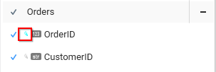
The dropped tables will be remarked by a tick mark before the name of both table and its columns in the left pane as follows.
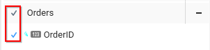
The primary key defined in the table in the connected database will also be remarked.
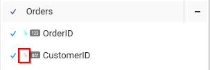
Similarly, the foreign key will be checked as follows.
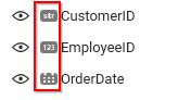
The data type of each column will be represented nearby as follows.
Add more than one table, if you prefer, through the following same drag n drop operation. This is subjected to joining of tables.
Transforming data
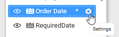
Rename the column as required, either by selecting the options in the Settings drop-down menu or double-clicking the column to enable the edit mode.
Remove the unwanted column by clicking the icon at the left of the respective column.
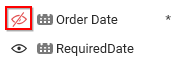
The removed column will be represented with the red colored icon as above. Clicking the same, will re-include the removed column.
Handle column type conversion, if required, by clicking the Settings icon of the respective column and navigate to Change Column Type option. Select the preferred type to convert as shown in the following.
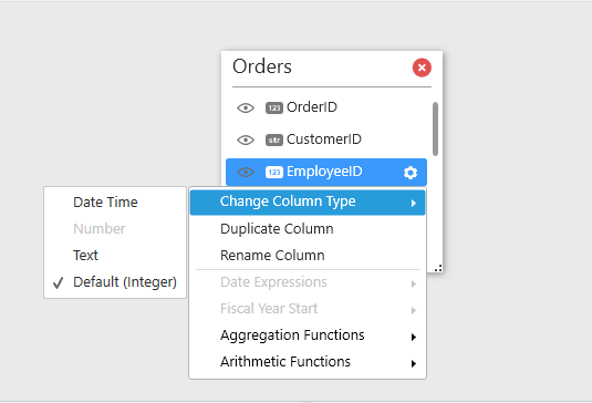
For supported column types and their equivalent convertible types, refer to Formatting Columns.
Add the desired expression columns by creating it using the built-in functions and existing columns.
Filter the data that is not required in the dashboard using the data filters option in the tools pane in data design view as highlighted below.

Creating Dashboard
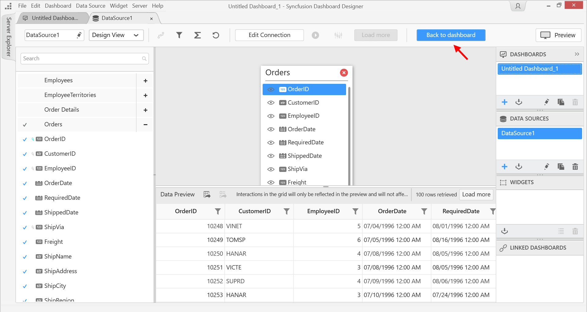
To create a Dashboard, click Back to dashboard and navigate to the dashboard design view.
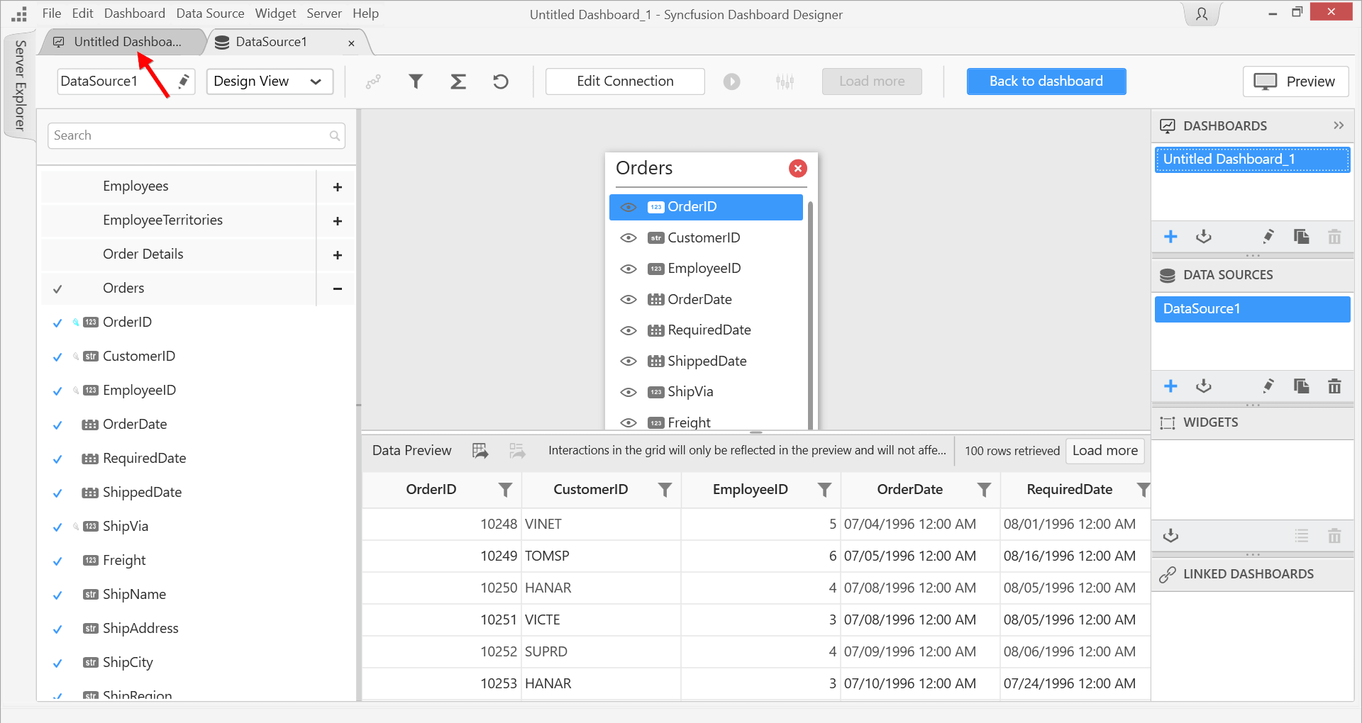
You can also click the respective dashboard tab directly to navigate to its design view.
Now, the dashboard designer tab will open as follows.
Adding a widget to design view
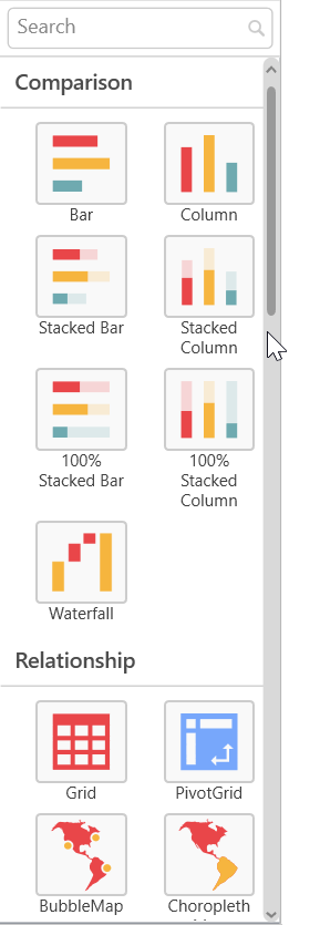
The left toolbox pane consists of data visualization, filter, and miscellaneous widgets to design an interactive dashboard.
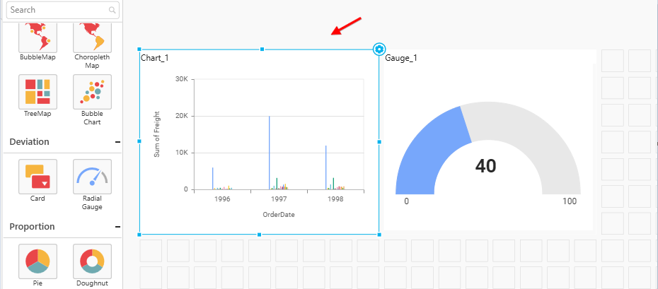
Click and drag the preferred widget from toolbox and drop it in the available space of the design area.
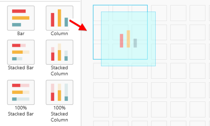
The widget drop will happen only when you drop it in the appropriate region. In the above image, the blue border of the cell indicates that the targeted region is valid to drop.
The invalid region will be represented by a red border. This happens when you drop over a region where a widget or its part already exists.
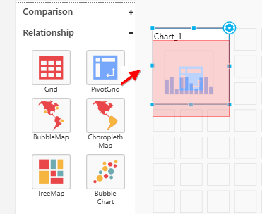
You can resize the dropped widget by placing the focus over the widget and dragging the widget corner as follows.
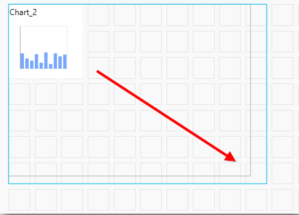
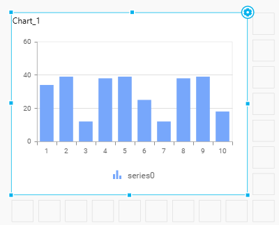
Doing so will render the widget to the size you dragged. Here, the blue border indicates the occupied cell range of widget after resizing.
Assigning data to widget
NOTE
This step is applicable only for widgets that do not belong to miscellaneous category.
To bind data to a widget placed in the design area, focus that widget.
Click the Assign Data button in the design tools pane.
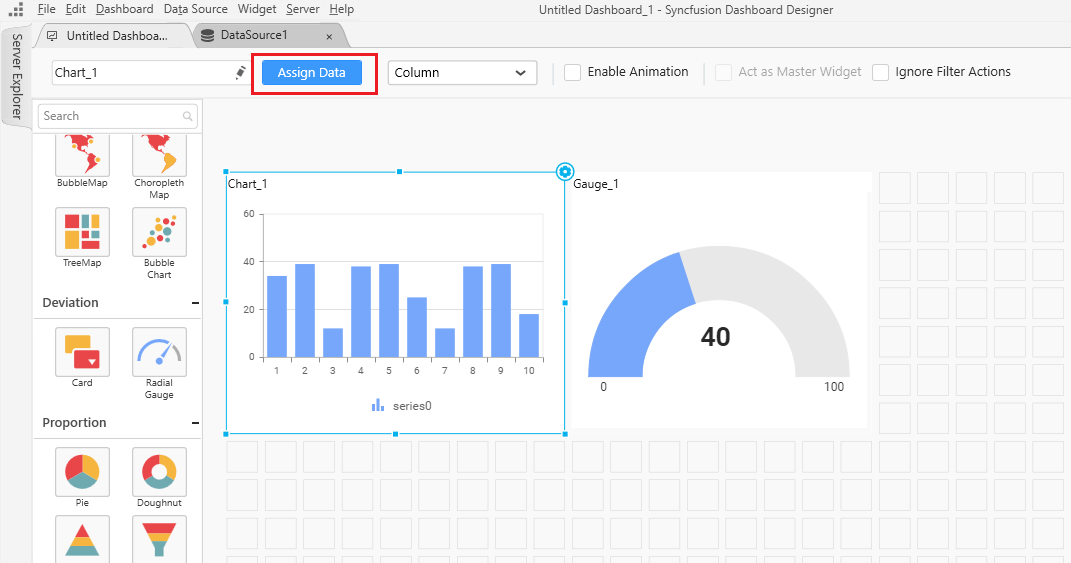
Now, the widget view opens in a new tab.
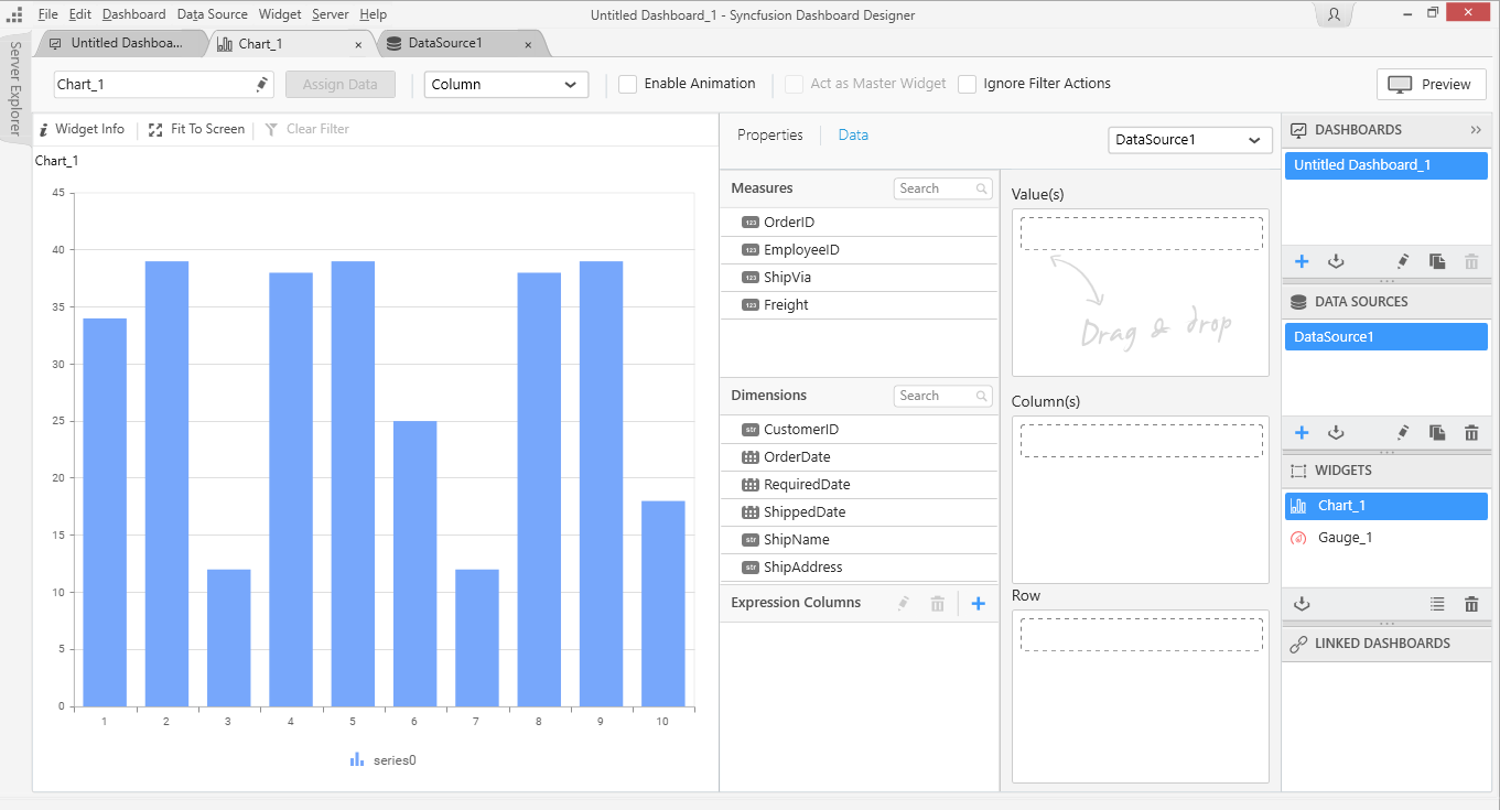
Here, the left pane holds the widget preview that reflects the configuration changes made to the widget.
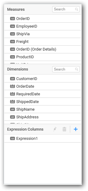
Right pane holds data configuration view. The numeric columns get listed under the Measures section; other type columns are listed under the Dimensions section; the expression columns are created dynamically and listed under Expression Columns section.
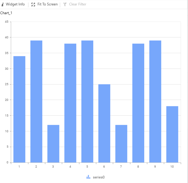
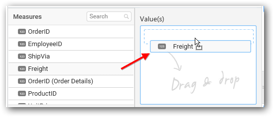
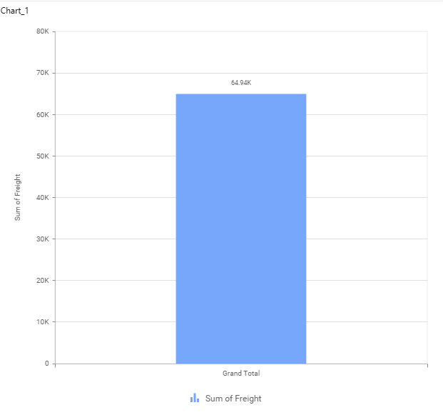
Select and drag the numeric column (measure element) from the measures section or the expression column (from Expression Columns section) to be measured and drop it to the Value(s) section.
Now, the widget preview will be as follows.
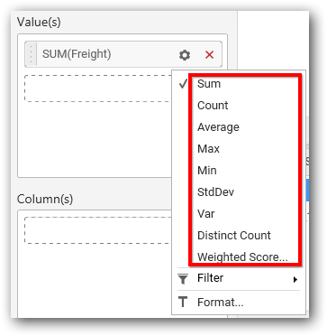
Click the Settings icon (highlighted) to open the aggregation type drop-down list.
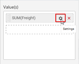
Set the preferred aggregation type to compute the dropped measure column.
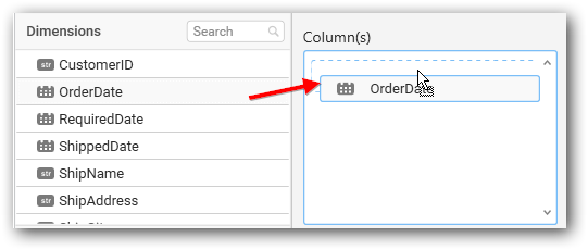
Select and drag the non-numeric column (dimension element) from the Dimensions section against which you need to measure the numeric column(s) dropped, and drop it to the Column(s) section.
Now, the widget preview will be as follows.
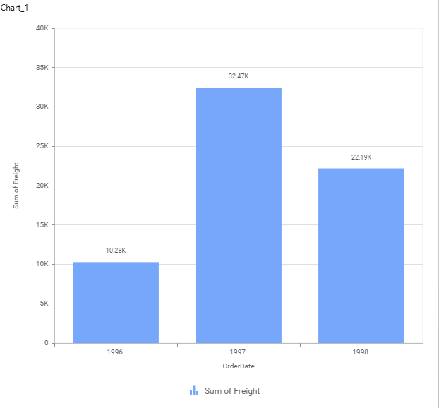
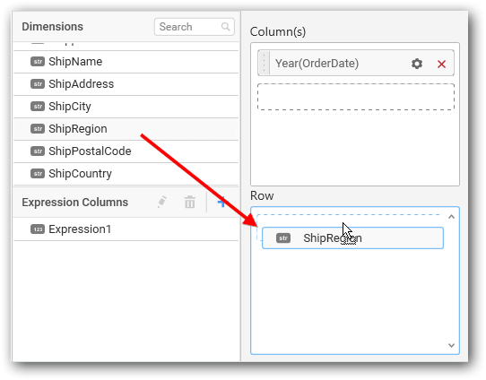
To group the added column elements by a column, add the respective non-numeric column (dimension element) into Row(s) section.
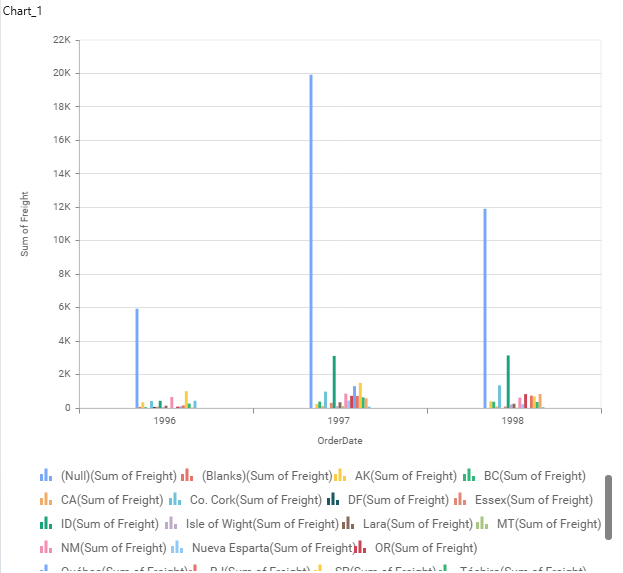
After the above, the widget preview will be as follows.
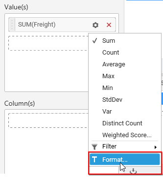
To format the measure column values, click the Settings icon to open the drop-down list and select the Filter option to open the Measure Formatting dialog.
Measure Formatting dialog:
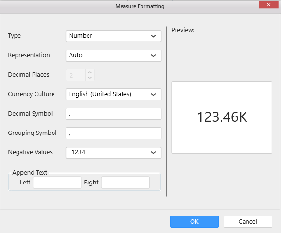
Make necessary changes and click OK to save pending changes. Click Cancel to cancel the unsaved changes and close the dialog.
If required, apply filter to the dropped measure type or dimension type column(s) through Measure Filter and Filters dialogs respectively. This filters widget data (from getting bound to widget) that does not meet filter criteria.
Configuring properties to widget
NOTE
This step is applicable only for widgets that do not belong to miscellaneous category.
Navigate to the Properties pane in the data design view tab.
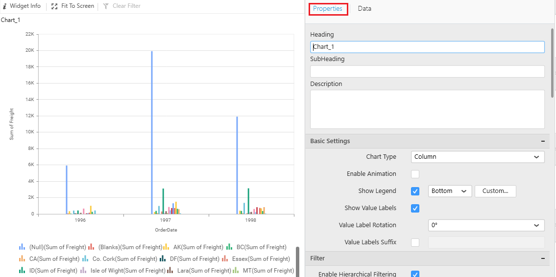
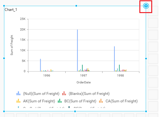
From the dashboard design tab, you can navigate to the Properties pane by placing the focus in the widget as follows.
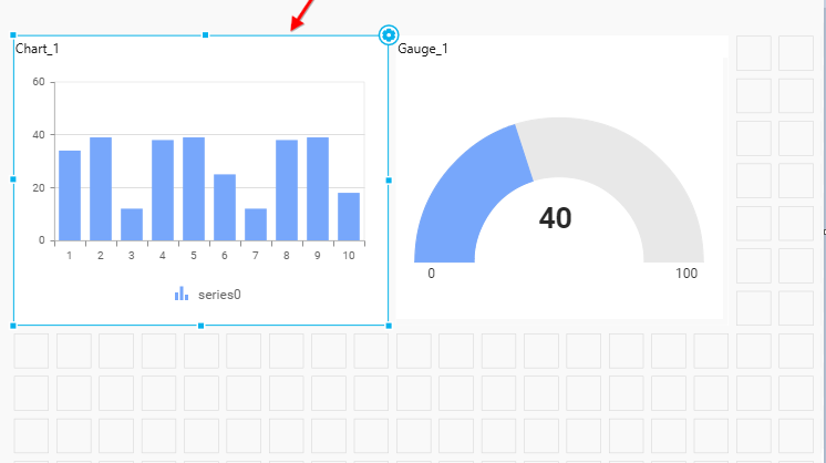
Click the Settings icon at the top-right corner of the widget. Focus moves to the data design view tab and opens the Properties pane.
This pane holds some general settings and some specific to the widget. You can configure the desired settings. Refer to the Properties Configuration widget-wise for more details.
You can add more widgets by following the same procedure.
Once you are done with the dashboard, save the dashboard in local as SYDX formatted file.
Click Preview at the top right of tools pane to see the dashboard preview launched in the web browser page.

Now, the dashboard preview can be visualized through the built-in dashboard viewer in web browser page.
Sharing Dashboard
Publish the created dashboard to the Dashboard Server through authorized publish access from the Dashboard Designer.
