- Overview
- Creating new widget
- Configuring widget using manifest file
- Setting name for the widget
- Setting display name for the widget
- Setting IFrame for the widget
- Setting category for the widget
- Setting description for the widget
- Setting source file location
- API version
- Setting GUID for the widget
- Setting dependency files for the widget
- Specifying data fields
- Adding functionalities
- Various control type sample
- Filter settings
- To configure Linking for the widget
- Link settings
- Packing the widget
- Unpacking the widget
- Importing widget in designer
- Debug the widget through HTML file
- Rendering widget through the source file
- Formatting widget data
- Configuring widget for interaction
- Configuring widget for linking
- Samples
- Adding Syncfusion ejSunburstChart as custom widget
- Adding C3 chart as custom widget
Contact Support
Syncfusion Custom Widget Authoring
Overview
The Syncfusion Dashboard custom widget allows you to add any user-defined widget, d3 controls, Syncfusion controls, or any JS widgets in a dashboard, and it can perform like the normal widget.
You can download the Syncfusion controls source files from the following links
To learn more about the custom widget creation, refer the video link.
Prerequisites and knowledge required for handling the custom widget authoring
This section covers the mandatory requirements to develop the custom widget.
| Development Environment |
Dashboard Designer and any web browser as mentioned in the
|
| Knowledge Required | Basic knowledge about the HTML and JavaScript |
Syncfusion ships the following custom widgets along with the Syncfusion Dashboard Designer.
And these custom widgets are available in the below location also.
Location: C:\ProgramData\Syncfusion\DashboardDesigner\Custom Widgets
Creating new widget
Syncfusion Custom Widget Utility (sycw.exe) is used to create and manage the custom widget and it will be shipped along with the Dashboard Designer setup installation in the following location.
Location: [Local drive installation location]\ Syncfusion\Dashboard Designer\DashboardDesigner\sycw.exe

Create command is used to create the widget in the specified path with provided name along with its unique GUID.
Format
create [widget creation path]
Example
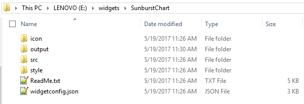
create e:\widgets\sunburstchart

After the create command execution, you can see the widget named folder that is created as below:

Rules
- If you need to modify the widget name, display name, or GUID, it should be modified in both the widget configuration file(widgetconfig.json) and the source file(sourcefile.js) without mismatching. But modifying the GUID is not recommended.
Configuring widget using manifest file
After creating the widget, you can configure the widget by using the manifest file.
The manifest file is used to specify the widget’s configuration. This file has to be placed in the custom widgets root directory with the name widgetconfig.json.

Custom widget can be configured using the following settings. Refer the structure of widgetconfig.json
{
	"widgetName" : "Name of the widget.",

	"displayName" : "Display name of the widget to be displayed in designer toolbox.",

	"enableIFrame" : "Used to render the widget within IFrame tag",

	"guid": "Unique GUID for the widget.",

	"category" : "Category in which the widget should be displayed in the designer.",

	"description" : "Description of the widget.",

	"srcFile"  : "Path of the source file through which widget can be embedded to
 		       dashboard",

	"dependencies" : "Specify the dependency scripts and CSS files to be referred for
                                              the widget",

	"dataFields" : " Specifies the widget fields required for binding data from a data
                                          source. Each field can be bound to single or multiple
                                          measure/dimension fields in a data source. When dataFields is not
                                          specified, this widget acts as a non-data bound widget. ",

             "functionalities" : " Custom properties for the widget can be specified through the
                                               functionalities API. ",

	"filterSettings": "Filter settings are used to configure whether the widget can take
                                           part in filter interactions between the widgets.",

	"enableLinking": "Used to enable or disable the linking support for the widget",

	"linkSettings": "Used to configure linking related settings for the widget"
}
This file contains the data necessary for the designer to import the custom widget and serialize the custom widget into *.sydx package while publishing the dashboard.
Setting name for the widget
Name for the widget can be set and specified through the widgetName API.
Format
widgetName: “name of widget”
Example
widgetName: “sunburst”
Rules
- It is a mandatory field for the widget.
- It should not contain any special characters and wide spaces.
Setting display name for the widget
Display name for the widget in the designer toolbar can be set through the displayName API.

Format
displayName: “display name of the widget in designer toolbar”
Example
displayName: “Sunburst Chart”
Rules
- It is not a mandatory field for the custom widget.
- It can contain special character and wide spaces.
Setting IFrame for the widget
Enable IFrame is used to specify whether the custom widget should be render within the IFrame tag or directly within the DashboardViewer. This support is used to resolve Scripts and CSS conflicts that occurs between the DashboardViewer and the custom widget. Currently exporting to image and PDF options are not provided for IFrame widgets.
Format
enableIFrame: “IFrame can be enabled or disabled for the widget”
Example
enableIFrame: “true”
Rules
- It is not a mandatory field for the custom widget.
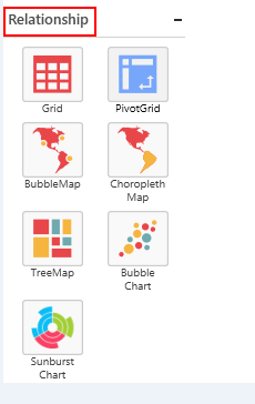
Setting category for the widget
This allows you to specify the category in which widget should be displayed. If the specified category name is not exist, then a new category will be created on the provided name and the widget will be added under the new category.
If the name of the category is not provided for the widget, then it will be added under the miscellaneous category (default category).
Format
category: “name of the category in which the widget should be displayed”
Example
category: “Relationship”
Rules
- It is not a mandatory field for the custom widget.
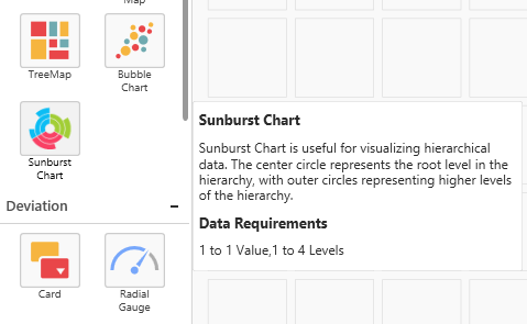
Setting description for the widget
You can describe the widget. The following message will be shown on hovering the widget icon in the expander toolbox of the designer.
Format
description: “description about the widget”
Example
description: “Sunburst Chart is used to visualize the hierarchical data. The center circle represents the root level of the hierarchy and outer circles represents higher levels of the hierarchy.”
Rules
- It is not a mandatory field for the custom widget.
Setting source file location
Source file location should be specified here. Refer the use of source file in its module.
Format
srcFile: “location of the source file”
Example
srcFile: “src/sunburst.js”
Rules
- It is a mandatory field for the widget.
API version
Version is used to denote the current API version of the created widget and this value should not be modified.
Setting GUID for the widget
GUID is used to set unique identification for the custom widget, and it can be set through the guid API.
Format
guid: “used for unique identify the widget”
Example
guid: “74926583-8493-3333-6382-863428678492”
Rules:
- It is a mandatory API for the widget.
- Should satisfy the GUID format.
Setting dependency files for the widget
Dependency script and CSS files, which have to be referred for the widget, and should be specified in the dependencies section.
Format
"dependencies": {
    "scripts": [
      "src/dependency1.js",
      "src/ dependency2.js",
      ….
      ….
    ],
    "styles": [
      "style/ dependency1.css",
      " style / dependency2.css",
      ….
      ….
    ]
  }
Example
"dependencies": {
    "scripts": [
      "src/ej.sunburstchart.js",
      "src/ej.helper.js"
    ],
    "styles": [
      "style/ej.sunburstchart.css"
    ]
  }
Rules
- It is not the mandatory API for the widget.
- Files should be specified in the reference order.
Limitation
jQuery reference (“jquery-1.10.2.min.js”) will be added as built-in reference for the custom widget when the IFrame is disabled, So that you are not allowed to specify the jQuery files in dependencies. If you want to add any specific version of jQuery, then you should enable the IFrame for the custom widget. For more information refer the link.
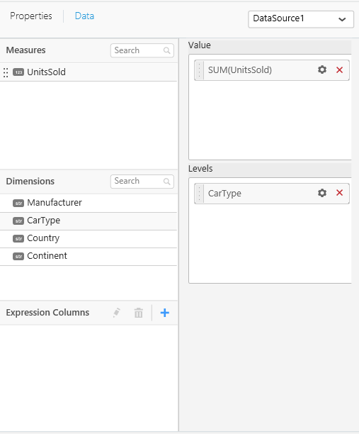
Specifying data fields
This allows you to specify the data fields with its type for custom widgets.
dataFields:[
{
"displayName" : "display name of the data field1",
"valueType" : "type of the data field1, can be measure or dimension",
"name" :  "name of the data field1",
"min" : "minimum number of block which has to be dropped for the datafield1",
"max" : "maximum number of block can be dropped for the datafield2",
"optional" : "specify whether it is mandatory data field"
},
{
"displayName" : " display name of the data field2",
"valueType" :" type of the data field2, can be measure or dimension",
"name" : " name of the data field2",
"min" : "minimum number of block which has to be dropped for the datafield2",
"max": "maximum number of block can be dropped for the datafield2",
"optional" : "specify whether it is mandatory data field"
}
…
]
Example
dataFields:[
{
"displayName" : "Value",
"valueType" : "measure",
"name" :  "Value",
"min" : 1,
"max" : 1,
"optional" :false
},
{
"displayName" : "Levels",
"valueType" : "dimension",
"name" : "Levels",
"min" : 1,
"max":4,
"optional" : false
}]
Rules
- It is not the mandatory API for the widget.
Adding functionalities
Custom properties for the widget can be set and specified through the functionalities API.
Format
"functionalities": [
		{
			"header": "name of the header",
			"properties": [
				{
					"displayName": "display name of the properties",
					"controlType": "type of control to be created in
properties window under this group",
					"name": "name of property",
					"defaultValue": "default value of the property",
					"listItems": "list of items if the control type have list."
				},
				{
					"displayName": " display name of the properties ",
					"controlType": " type of control to be created in
properties window under this group ",
					"name": " name of property ",
					"defaultValue": " default value of the property "
				}
				………
				………
			]
		},
{
			"header": "name of the header",
			"properties": [
				{
					"displayName": "display name of the properties",
					"controlType": "type of control to be created in
properties window under this group",
					"name": "name of property",
					"defaultValue": "default value of the property",
					"listItems": "list of items if the control type have list."
				},
				{
					"displayName": " display name of the properties ",
					"controlType": " type of control to be created in
properties window under this group ",
					"name": " name of property ",
                    			"defaultValue": " default value of the property "
				}
				………
				………
			]
		}
		……..
		……..
	]
Various control type sample
- Checkbox

Format
{
	"displayName": "display name for the checkbox",
	"controlType": "checkbox",
	"name": "name of the property",
	"defaultValue": "either true or false"
Example
{
	"displayName": "Enable Animation",
	"controlType": "checkbox",
	"name": "enableAnimation",
	"defaultValue": "true"
}- Textbox

Format
{
	"displayName": " display name for the textbox ",
	"controlType": "textbox",
	"name": "name of property",
	"defaultValue": "default text to be displayed in the textbox"
}
Example
{
	"displayName": "Control Text",
	"controlType": "textbox",
	"name": " subtitle ",
	"defaultValue": "My first widget"
}- Combobox
Format
{
   "displayName": "display name of the property",
   "controlType": "combobox",
   "name": "name of property",
   "listItems": ["listitem1"," listitem2"…],
   "defaultValue": " listitem2"
}
Example
{
	"displayName": "Legend Position",
	"controlType": "combobox",
	"name": "legendPosition",
    "listItems": ["top", "bottom", "left", "right"],
	"defaultValue": "left"
}- ColorPicker
Format
{
	"displayName": "display name of the property ",
	"controlType": "colorpicker",
	"name": "name of property",
	"defaultValue": "default color code"
}
Example
{
	"displayName": "label Color",
	"controlType": "colorpicker",
	"name": "labelColor",
	"defaultValue": "#463859"
}- Updown

Format
{
	"displayName": " display name of the property ",
	"controlType": "updown",
	"name": " name of property ",
	"defaultValue": "10",
    "min" : "minimum value can be set",
	"max" : "maximum value can be set"
}
Example
{
	"displayName": "Text Size",
	"controlType": " updown ",
	"name": "textSize",
	"defaultValue": "10",
    "min" : "1",
	"max" : "50"
}
Filter settings
If the widget should take part in filter interactions that occur between the widgets, then the filter settings can be used.
Format
"filterSettings": {
		"masterFilter": {
			"visible": "boolean value to specify whether can be act as master ",
			"defaultValue": " boolean value to specify whether widget is master by default"
		},
		"ignoreMasterFilter": {
			"visible": " boolean value to specify whether can be updated on
       interaction from other widgets",
			"defaultValue": " boolean value to specify whether widget ignore master
      action by default "
		}
	}
Example
"filterSettings": {
		"masterFilter": {
			"visible": "true",
			"defaultValue": "true"
		},
		"ignoreMasterFilter": {
			"visible": "true",
			"defaultValue": "false"
		}
	}
Rules:
- It is not a mandatory field for the widget.
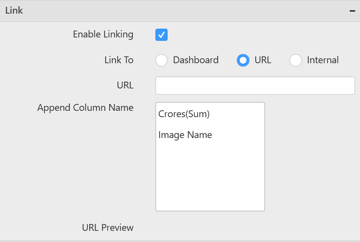
To configure Linking for the widget
If the widget need to configured with navigation support, then linking can be used.
Format
enableLinking: “Linking can be enabled or disabled for the widget”
Example
enableLinking: “true”
Rules
It is not a mandatory field for custom widget
Link settings
If you need to configure each bounded column with unique links, then enableTabularUrlLinking of linkSettings can be used.
Format
"linkSettings": {
		enableTabularUrlLinking: "tabular url linking can be enabled or disabled"
 }
Example
"linkSettings": {
	 enableTabularUrlLinking: "true"
 }
Rules
- It is not a mandatory field for custom widget.
Packing the widget
After configuring the widget, you can pack the widget by using pack comments.
To import the custom widget in the dashboard designer, you should pack the widget in the .sycw format. The pack command is used to pack the widget which can be imported.
Format
pack [path of the widget to be packed]
Example
Specify the root path of the widget to be packed in the pack command.
SunburstChart.sycw file will be created in the output folder as below:

Rules
- If you need to modify the widget, you can modify the widget and import it again in the dashboard designer to reflect the changes.
Unpacking the widget
To modify or to reconfigure the custom widget, you should unpack the custom widget which is in the .sycw format.
Steps to unpack the custom widget
- Rename the extension of the provided ‘.sycw’ into ‘.zip’ extension as shown in the below image.

- Now right click on the renamed widget as in the image. Click ‘Extract All’ to view the source file.

- You can find the unpacked Organization chart custom widget and it’s source file as in the below image.

Rules
- If you need to modify the widget, you can modify the widget and import it again in the dashboard designer to reflect the changes.
Importing widget in designer
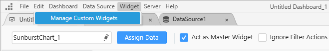
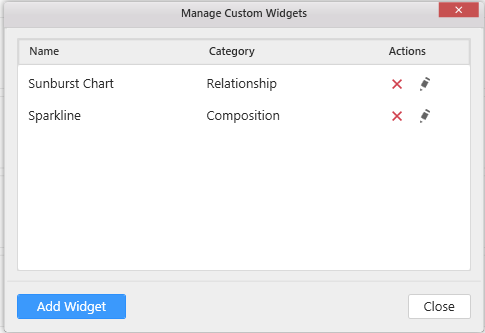
From the ‘Widget’ menu in the designer, select ‘Manage Custom Widgets’ to import, rename, and delete the widgets. You can import the custom widget file with the extension *.sycw through the add widget option.
Debug the widget through HTML file
After importing the custom widget in the designer, you can debug the widget in following cases:
- At initial rendering through the init method.
- Updation request through update method.
Render initially through the init method
Update widget through update method
Update request for the widget will be triggered in the following cases.
- On widget container resizing.
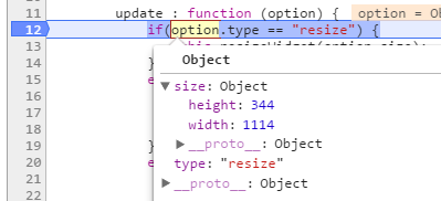
- On datasource update
- On property change
After initial rendering of the widget, you can debug the property through the browser. Use the following steps for debugging:
-
Drag and drop the imported widget in the designer canvas, after this HTML file will be created at the location %appdata%\Syncfusion\DashboardDesigner\versionnumber\Html[custom widget report_id].html
-
Run the custom widget HTML file.
-
Change the needed property like in the below specified format.
-
You can debug the changed property in the custom widget source file.
Format
ej.dashboard.setProperty(document.getElementById("container"),{ "name": "name of the property to be changed", "value": "value of the property" });document.getElementById(“container”) – widget container element.
name - name of the property specified in the widgetconfig.json under functionalities properties.
value – depends on the control type specified in the widgetconfig.json under functionalities properties.
Example
ej.dashboard.setProperty (document.getElementById("container"),{ ‘name’: ‘showTitle, ‘value’: true});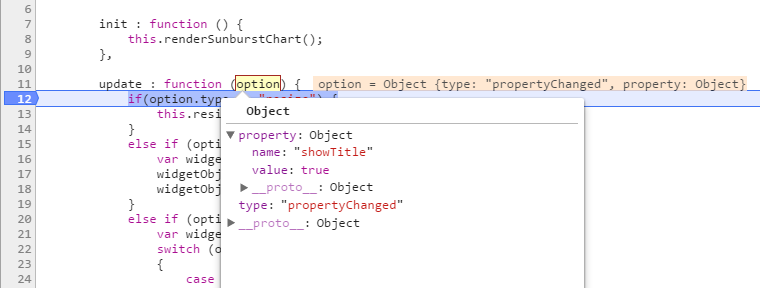
Rendering widget through the source file
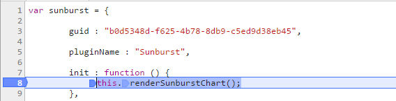
Source file is used to embed the user defined widget within the dashboard. Refer the below API available in the source file.
Format
ej.dashboard.registerWidget(
{
guid : "Specifies the GUID used in widgetconfig.json",
widgetName : "Specifies the name of the widget used in widgetconfig.json",
init : function () {
/* init method will be called when the widget is initialized. */
},
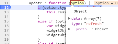
update : function (option) {
update method will be called when any update needs to be performed in the widget. */
if (option.type == "resize") {
/* update type will be 'resize' if the widget is being resized. */
}
else if (option.type == "refresh") {
/* update type will be 'refresh' when the data is refreshed. */
}
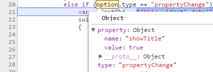
else if (option.type == "propertyChange") {
update type will be 'propertyChange' when any property value is changed in the designer. */
}
}
});Example
ej.dashboard.registerWidget(
         {

guid : "b0d5348d-f625-4b78-8db9-c5ed9d38eb45",

widgetName : "SunburstChart",

init : function () {
var widget =  document.createElement("div").setAttribute("id", this.element.getAttribute("id") + "_widget");
widget.innerHTML = "Widget is created successfully";
this.element.appendChild(widget);
},

update : function (option) {

var widget = document.getElementById(this.element.getAttribute("id") + "_widget");
if(option.type == "resize") {
 widget.innerHtml = "Widget is resized."
}
else if (option.type == "refresh") {
 	widget.innerHtml = "Widget data need to be refreshed."
}
else if (option.type == "propertyChange") {
 	widget.innerHtml = "Widget property have been changed."
}
}
   }
);
The following information will be available in this scope.
| Syntax | Uses |
|---|---|
| this.element | this.element Container div element in which the custom widget should be embedded. |
| this.model.dataSource | Holds the datasource for the custom widget in JSON format |
|
this.model.boundColumns
this.model.boundColumns.datafield[columnIndex].columnName this.model.boundColumns.datafield[columnIndex].uniqueColumnName this.model.boundColumns.datafield[columnIndex].dataType this.model.boundColumns.datafield[columnIndex].valueType this.model.boundColumns.datafield[columnIndex].dateTimeFormat this.model.boundColumns.datafield[columnIndex].dateTimeComponent this.model.boundColumns.datafield[columnIndex].culture this.model.boundColumns.datafield[columnIndex].currencyCode this.model.boundColumns.datafield[columnIndex].decimalPoints this.model.boundColumns.datafield[columnIndex].decimalSeparator this.model.boundColumns.datafield[columnIndex].groupSeparator this.model.boundColumns.datafield[columnIndex].measureType this.model.boundColumns.datafield[columnIndex].negativeValueFormat this.model.boundColumns.datafield[columnIndex].prefix this.model.boundColumns.datafield[columnIndex].suffix this.model.boundColumns.datafield[columnIndex].summaryType this.model.boundColumns.datafield[columnIndex].unit |
Holds the information about the bounded column to the control.
|
| this.model.properties | Holds the properties window properties. |
| this.model.baseURL | this.model.baseURL Holds the base url of custom widget package, used to fetch the asserts (images etc..) in the custom widget folder.. |
| this.model.initMode | this.model.initMode Value will be set according to the rendering mode. (designtime - when rendering in designer, runtime -when render in viewer, export – When the widget rendered for export.) |
| this.model.isDataBound | this.model.isDataBound Boolean value will be set as true when the widget satisfies the Min Max condition in data fields. |
Rules:
- Widget API’s should be in JSON format and need to pass as parameter for ej.dashboard.registerWidget method.
- The following are the mandatory API’s (guid, widgetName, init, update) for the custom widget.
Formatting widget data
The custom widget data can be formatted as like built-in widgets.
Measure Format
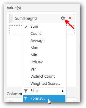
Click on the Settings icon and then select Format option to format the measure values.
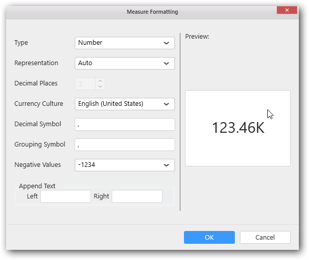
The values chosen in the formatting window will be stored in the respective column of this.model.boundColumns. Refer the above table for API reference.
Measure value can be formatted in two ways.
- formatNumberThroughSchema() - to format the value based on the options selected in the formatting window
- formatNumber() - to format the value based on custom parameters.
formatNumberThroughSchema()
To invoke this method, instance for Internationalization() should be created with the selected culture.
var instance = new ej.dashboard.Internationalization(this.model.boundColumns.columnName[index].culture);formatNumberThroughSchema() should be invoked using created instance with value to be formatted and the corresponding column information as a method parameter.
instance.formatNumberThroughSchema(value, this.model.boundColumns.columnName[index]);It will return the formatted value based on the options selected in the measure formatting window.
formatNumber()
If we want to format the number with custom parameters then we can make use of formatNumber()
instance.formatNumber(value, {format:measureType, currency:currencyCode, unit:unitValue, decimal:decimalSeparatorValue, group:groupSeparatorValue, negative:negativeValueFormat, prefix:prefixValue, suffix:suffixValue});value - Number which we need to format.
currencyCode: Specifies the currency code (used only when the format is set as currency)
decimalSeparatorValue: Specifies the decimal separator.
groupSeparatorValue: Specifies the group separator.
measureType: Specifies the type of the measure like Number, Decimal, Percentage.
Examples: “N0”, “C0”, “P0” where N, C, P represents Number, Currency and Percentage respectively and “0” represents the number of decimal points.
negativeValueFormat: Specifies the negative value format.
Examples: 0 -> -1234, 1 -> (1234) 2 -> 1234-
prefixValue: Specifies the prefix value.
suffixValue: Specifies the suffix value.
unitValue: Specifies the representation of the value
Possible values: “auto”, “ones”, “thousands”, “millions”, “billions” etc.
Examples:
var instance = new ej.dashboard.Internationalization("en-US");
instance.formatNumber(123456,  {format:"N2", unit:"ones", decimal:"&", group:" ", negative:0, prefix:"s", suffix:"Unit(s)"});

// this will return "s123 456&00Unit(s)"

instance.formatNumber(123456,  {format:"C2", currency:"USD", unit:"ones", decimal:"&", group:" ", negative:0});

// this will return "$123 456&00"

instance.formatNumber(123456,  {format:"P2", unit:"ones", decimal:"&", group:" ", negative:0});
"
// this will return "12 345 600&00%"
Date Formats
Click on the Settings icon and select Settings option to format the date values
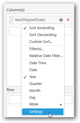
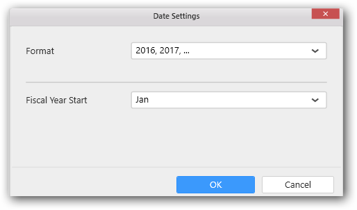
The values chosen in the formatting window will be stored in the respective column of this.model.boundColumns. Refer the above table for API reference.
Date values can be formatted in two ways.
- formatDateThroughSchema() - to format the date value based on the options selected in the date settings window
- formatDate() - to format the date value value based on custom format.
formatDateThroughSchema()
To invoke this method, instance for Internationalization() should be created.
var instance = new ej.dashboard.Internationalization();formatDateThroughSchema() should be invoked using created instance with value to be formatted and the corresponding column information as a method parameter.
instance.formatDateThroughSchema(dateValue.toString(), this.model.boundColumns.columnName[index]);It will return the formatted date value with the based on option selected in the date settings window.
formatDate()
In case if we format the date with a custom format then we can make use of formatDate()
instance.formatDate(dateObj,{format:dateFormat});Examples:
var date = new Date();
date.setYear(2016);
instance.formatDate(date,{format:"yy"});

// this will return "16"

date.setMonth(2);
instance.formatDate(date,{format:"MMMM"});

// this will return "March"

date.setDate(27);
this.formatDate(date,{format:"dddd"});

// this will return "Tuesday"
Configuring widget for interaction
The custom widget can take part in the filter interaction like existing widgets. Refer the following API’s to perform the communication between the widgets.
Format
var selectedColumnsFilter = [];
var filterColumn = new ej.dashboard.selectedColumnInfo();
filterColumn.condition = "condition";
filterColumn.uniqueColumnName = "unique column name";
filterColumn.values =["value1", "value2", "value3"…] ;
selectedColumnsFilter.push(filterinfo);
……..
……..
ej.dashboard.filterData(this, selectedColumnsQuery); /* selectedColumnsFilter is the list of selected column queries send from custom widget for interaction. */
Various types of column
- Dimension type column
Values in the dimension column will be a string, date related, or boolean format.
- Measure type column
Values in the measure column will be in number format.
Date type of column
Data type of a bounded column can be obtained through the below API.
Format
this.element.boundColumns.[data field name][index].dateTypeExample
this.element.boundColumns.Levels.[0].dateTypeDimension type column
Various conditions available for the dimension type column other than the DateTime data type:
- include
- exclude
- startswith
- endswith
- contains
- equal
- notequal
Example
The below highlighted code will return the values which starts with ‘i’.
var selectedFilterInfos = [];
var filterinfo = new ej.dashboard.selectedColumnInfo();
filterinfo.condition = "startswith";
filterinfo.values = ["i"];
filterColumn.uniqueColumnName = "unique column name";
selectedFilterInfos.push(filterinfo);
ej.dashboard.filterData(that, selectedFilterInfos);
Various conditions available for the dimension type column with the DateTime data type:
- range
- include
- exclude
- relative
NOTE
If the widget has only one data field block and its limit is one, the Relative Dates will be enabled. Or else Relative Date Filter will be enabled in Dashboard Designer.
Relative Dates:
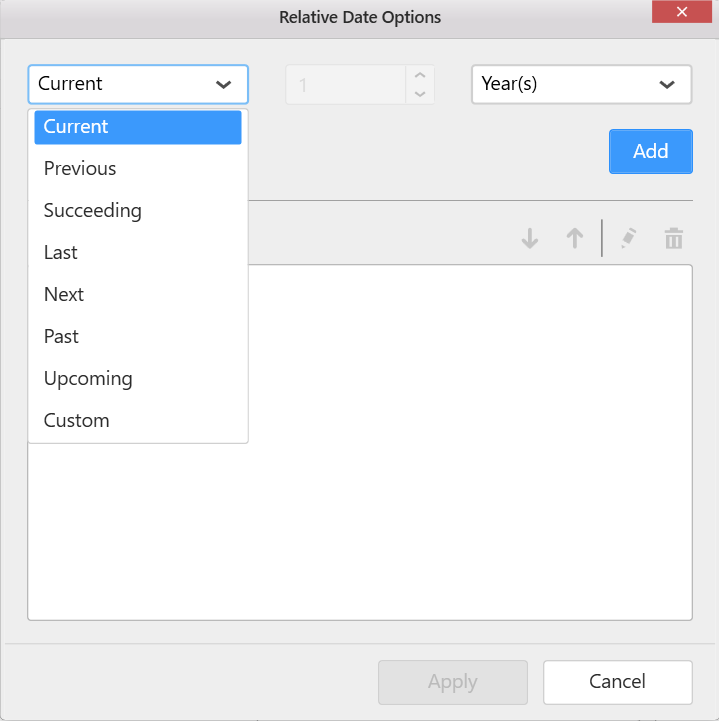
Relative Date Filter:

Example for dimension to filter the selected value.
var selectedColumnsFilter = [];
var filterColumn = new ej.dashboard.selectedColumnInfo();
filterinfo.condition = "include";
filterinfo.values =["india", "china"] ;
selectedColumnsFilter.push(filterColumn);
ej.dashboard.filterData(this, selectedColumnsFilter);
Measure type column
Various condition types for measure type
- equals
- notequals
- lessthan
- greaterthan
- lessthanorequals
- greaterthanorequals
- isbetween
- isnotbetween
Example for measure to specify the in-between condition.
var selectedColumnsFilter = [];

var filterColumn = new ej.dashboard.selectedColumnInfo();
filterColumn.condition = "isbetween";
filterColumn.uniqueColumnName = this.model.boundColumns.Value[0].uniqueColumnName;
filterColumn.values =[12,100] ;
selectedColumnsFilter.push(filterColumn);
ej.dashboard.filterData(this, selectedColumnsFilter);
Configuring widget for linking
You can configure to navigate either to a published dashboard or to a general URL with or without parameters. For more information, Linking.
Format
// Following code should be implemented in sourcefile.js.

ej.dashboard.navigateThroughLinking(this, selectedColumnsInfo); /* selectedColumnsInfo is the list of selected column queries send from custom widget for linking. */

For more information about selectedColumnsInfo, Refer [FilterInteraction](#configuring-widget-for-interaction).
Example
var selectedColumnsFilter = [];
var filterColumn = new ej.dashboard.selectedColumnInfo();
filterinfo.condition = "include";
filterinfo.values =["india", "china"] ;
selectedColumnsFilter.push(filterColumn);
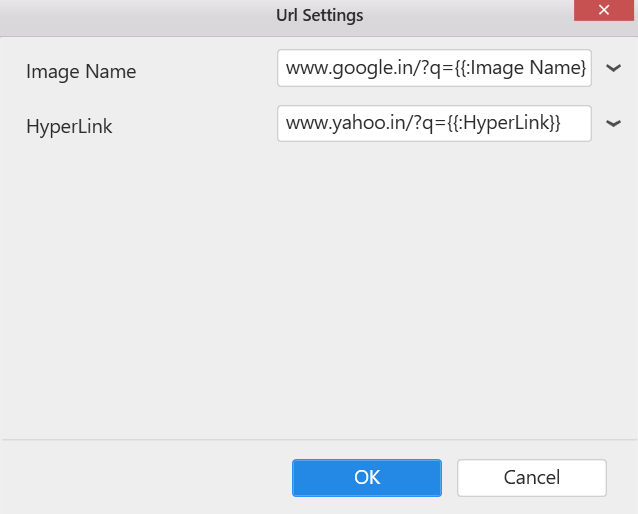
ej.dashboard.navigateThroughLinking(this, selectedColumnsFilter);Configuring widget for tabular url linking
By using tabular linking, we can configure unique links to each bounded columns of widget.
Example
/* Code to find the unique link configured with selected value
and it should be implemented in sourcefile.js file*/

    if (this.model.linkSettings.enableTabularUrlLinking) {
					for (var i = 0; i < this.model.linkSettings.urlPatterns.length; i++) { // urlPatterns contains bounded column details along with configured links.
						if (this.model.linkSettings.urlPatterns[i].uniqueColumnName ===    selectedFilterInfos[0].uniqueColumnName ) {
							configuredUrl = this.model.linkSettings.urlPatterns[i].urlLink;
						}
					}
	}
    ej.dashboard.navigateThroughLinking(this,selectedFilterInfos,configuredUrl); /* configuredUrl is link configured to selected column in widget */
Samples
We have created the following custom widgets from Syncfusion controls. You can download the sample custom widgets from below links:
Adding Syncfusion ejSunburstChart as custom widget
Follow the below steps to add the sunburst chart as custom widget for the dashboard. You can download the actual widget from this link.
- Refer the commands to create new custom widget files.
-
Configure the widget through the widgetconfig.json file.
-
Description - You can provide the Description about the Sunburst chart.
-
SrcFile - Path of the source file which is required for the Sunburst Chart.
-
Dependencies - Dependency script and CSS files should be specified in the dependencies section.
"description": "Sunburst Chart is useful for visualizing hierarchical data.",
    "srcFile": "src/sunburst.js",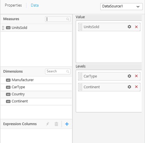
"dependencies": {"scripts": [ "src/ej.sunburstchart.js"] },- As sunburst chart requires two data fields, we have configured values and levels as shown below and the properties section contains the properties related to the sunburst chart. Refer this link for configuring widgetconfig.json.
"dataFields": [
        {
            "displayName": "Value",
            "valueType": "measure",
            "name": "Value",
            "min": 1,
            "max": 1,
            "optional": false
        },
        {
            "displayName": "Levels",
            "valueType": "dimension",
            "name": "Levels",
            "min": 1,
            "max": 4,
            "optional": false
        }
],-
ej.sunburstchart.js dependency file can be downloaded from this link.
-
Then, configure the widget with the necessary data.
- Run the sunburstchart_xx.html (%appdata%\Syncfusion\DashboardDesigner\versionnumber\Html) generated in the location, and then you can start rendering sunburst through the init method in the source file.

-
this.element is the container(div) provided to render our actual widget.
-
So, we are creating our sunburst chart in this.element by using the data in this.model.datasource.
-
In renderSunburstChart(), We are creating a new space (div) for rendering our sunburst chart custom widget and appending into the container as you can see in the below code.
renderSunburstChart : function () {
			this.widget = document.createElement("div");
			this.widget.setAttribute("id", this.element.getAttribute("id") + "_widget");
this.element.appendChild(this.widget);- The width and height of the widget is assigned from the container’s width and height respectively.
$(this.widget).css({"width":$(this.element).width(), "height":$(this.element).height()});- Configure the datasource with some default values for initial rendering of sunburst Chart. groupMemberPath and levels are the API’s of ejSunburstChart where we have to configure the uniqueColumnName of the columns that we bind in the levels section.
var dataSource = [{ Item: "Item1", Value: 50 },{ Item: "Item2", Value: 60 },{ Item: "Item3", Value: 70 },{ Item: "Item4", Value: 80 },{ Item: "Item5", Value: 90 },{ Item: "Item6", Value: 90 },{ Item: "Item7", Value: 90 },{ Item: "Item8", Value: 90 },{ Item: "Item9", Value: 90 },{ Item: "Item10", Value: 90 },{ Item: "Item11", Value: 90 }];
			var levels = [];
			var valueMember = "Value";
levels = [ { groupMemberPath: "Item" }];-
this.model.boundColumns.value and this.model.boundColumns.length contains the columns bounded in the values and levels respectively. By checking the below condition, we can find whether the widget is configured with columns or not.
-
Using for loop, the groupMemberPath value for each levels is assigned.
if (this.model.boundColumns.Value.length > 0 && this.model.boundColumns.Levels.length > 0) {
				levels = [];
				dataSource = this.model.dataSource;
				valueMember = this.model.boundColumns.Value[0].uniqueColumnName;
				for (var level = 0; level < this.model.boundColumns.Levels.length; level++) {
					levels.push({ groupMemberPath : this.model.boundColumns.Levels[level].uniqueColumnName });
				}
}-
Properties for the custom widget will be available in this.model.properties. For example showLegend, titleText, animationType, etc.
-
sunburst chart is rendered by configuring the required API’S and assign the values from the this.model.properties
$(this.widget).ejSunburstChart({
							dataSource: dataSource,
							valueMemberPath: valueMember, levels: levels,
							tooltip: { visible: true},
							margin: (this.marginVisibility())? { left: 10, top: 10, bottom: 10, right: 10} :{ left: 0, top: 0, bottom: 0, right: 0} ,
							border: { width: (this.marginVisibility())? 2:0 },
							load: $.proxy(this.sunburstChartLoad),
							enableAnimation: (this.model.initMode === "export") ? false : this.model.properties.enableAnimation,
							animationType: this.getAnimationType(this.model.properties.animationType),
							innerRadius: 0.2,
							title: { text:  this.model.properties.titleText , visible: this.model.properties.showTitle},
							zoomSettings:{enable:this.model.properties.enablezoom, zoomOnClick: this.model.properties.enablezoom  },
							dataLabelSettings:{visible:this.dataLabelVisibility(),labelRotationMode: this.getRotationMode(this.model.properties.dataLabelRotationMode), labelOverflowMode : "hide", font: { size: "10px" }},
							size: { height: $(this.element).height(), width: $(this.element).width()},
							legend: { visible:  (this.legendVisibility()) , position: this.legendPosition() },
							pointRegionClick : $.proxy(this.selectionChange,this),
							highlightSettings: {enable: true},
							selectionSettings: {enable: true, mode : "parent"},
							dataLabelRendering : $.proxy(this.dataLabelFormat, this),
							legendItemRendering : $.proxy(this.legendFormat, this),
							tooltipInitialize : $.proxy(this.tooltipFormat,this)
							});
});- For ejSunburstChart related API references, refer the link.
marginVisibility()
- marginVisibility function controls the visibility of the margins by returning a boolean value based on the widget and height of the container.
marginVisibility : function () {
			return ($(this.widget).width() > 200 && $(this.widget).height() > 200);
}
getAnimationType()
- getAnimationType function returns the type of animation based on the type we select in the widget property window.
dataLabelVisibility()
- dataLabelVisibility function controls the visibility of the data labels by returning a boolean value based on the width and height of the container.
dataLabelVisibility : function (e) {
	return !($(this.element).width() < 300 || $(this.element).height() < 300);
	}
getRotationMode
- getRotationMode function returns the type based on the type we selected in the widget properties window.
getRotationMode : function(rotationMode) {
			if (rotationMode === "Normal")
				return "normal";
			else if(rotationMode === "Angle")
				return "angle";
		}
legendVisibility()
- legendVisibility function controls the visibility of the data labels by returning a boolean value based on the width and height of the container.
legendVisibility : function (e) {
			return ($(this.element).width() > 300 && $(this.element).height() > 300 && this.model.properties.showLegend);
		}
legendPosition()
- legendPosition function is used to place the legend position based on the condition if ( $(this.element).width() > $(this.element).height()). (i.e) If the the size of the container width is greater than the length then the legend displays on right. Otherwise, it will display on left of the widget.
legendPosition : function (e) {
				if ( $(this.element).width() > $(this.element).height())
				return "right";
			else
				return "top";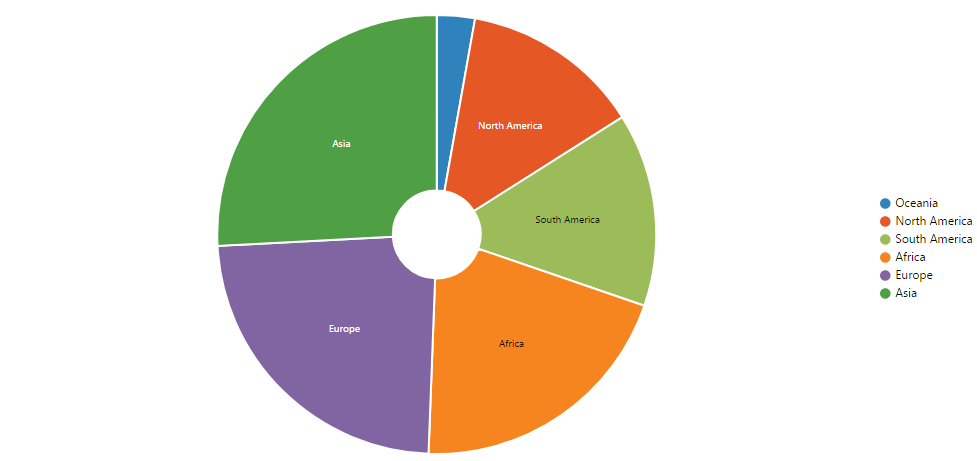
}- Sunburst widget will be rendered as follows:
selectionChange
-
Other widgets in the dashboard that are configured as a slave for sunburst chart can be updated based on the selected data in the sunburst chart by using below code. ej.dashboard.filterData(this, selectedFilterInfos) is used to send filter data request.
-
On triggering pointRegionClick the selectionChange will gets invoked. In selectionChange(), we get the chart data and get the parent element using findSelectionParent method and push the parent element into data[]. Then create a selectedFilterInfos object of ej.dashboard.selectedColumnInfo() type with the information present in the data[] and pass the selectedFilterInfos into the ej.dashboard.filterData(this,selectedFilterInfos).
Note: findSelectionParent is a internal API of ejSunburstChart, which is used to get the parent element. It not exposed in the sunburst chart documentation.
dataLabelFormat()
- dataLabelFormat() is used to customize the data label based on the formatting options.
dataLabelFormat : function(e){
if(this.model.boundColumns.Levels.length > 0 && this.model.boundColumns.Value.length > 0 && !ej.isNullOrUndefined(e.data.Text)){
	var instance = new ej.dashboard.Internationalization();
	e.data.Text = this.model.boundColumns.Levels[e.data.level - 1].dataType == "datetime" ? instance.formatDateThroughSchema(e.data.Text.toString(), this.model.boundColumns.Levels[e.data.level - 1]) : e.data.Text ;
	}
}
legendFormat()
- legendFormat() is used to customize the legend text based on the formatting options.
legendFormat : function(e){
if(this.model.boundColumns.Levels.length > 0 && this.model.boundColumns.Value.length > 0 && !ej.isNullOrUndefined(e.data.text)){
  	var instance = new ej.dashboard.Internationalization();
   	e.data.text = this.model.boundColumns.Levels[e.data.level - 1].dataType == "datetime" ? instance.formatDateThroughSchema(e.data.text.toString(), this.model.boundColumns.Levels[e.data.level - 1]) : e.data.text ;
	}
}
tooltipFormat()
- tooltipFormat is used to customize the tooltip text based on the formatting options.
tooltipFormat : function (e){
if(this.model.boundColumns.Levels.length > 0 && this.model.boundColumns.Value.length > 0 && !ej.isNullOrUndefined(e.data.currentText)){
	var instance = new ej.dashboard.Internationalization(this.model.boundColumns.Value[0].culture);
	e.data.currentText = this.model.boundColumns.Levels[e.data.level - 1].columnName + " : " + (this.model.boundColumns.Levels[e.data.level - 1].dataType == "datetime" ?
	instance.formatDateThroughSchema(e.data.currentText.split(": ")[0],this.model.boundColumns.Levels[e.data.level - 1]) : e.data.currentText.split(": ")[0] )  + "<br>" + this.model.boundColumns.Value[0].summaryType + " of " + this.model.boundColumns.Value[0].columnName + " : " + instance.formatNumberThroughSchema(e.data.currentText.split(": ")[1]*1,this.model.boundColumns.Value[0]);
	}
}-
Update method will be triggered for below operations and we have to do the required changes by checking the update types(resize, refresh, propertyChange) and widget will be updated accordingly by invoking the respective API of the widget.
1) Resize
2) Refresh
3) property change
update : function (option) {
	if(option.type == "resize") {  // option type will be resize when the browser is resized
		this.resizeWidget(option.size);  // widget will be resized through this method
	}
	else if (option.type == "refresh") {  // option type will be refresh when the widget data gets modified
		var widgetObj = $(this.element).data("ejSunburstChart");
		widgetObj.model.dataSource = this.model.dataSource;  // updating new data to the control
		widgetObj.redraw();
	}
	else if (option.type == "propertyChange") {  // option type will be propertyChange when widget properties changed in the Dashboard Designer
		var widgetObj = $(this.element).data("ejSunburstChart");
		switch (option.property.name)  // option.property contains the property name and value of the modified property.
		{
			case "enableAnimation":
				widgetObj.model.enableAnimation = option.property.value;
			break;
			case "animationType":
				widgetObj.model.animationType = option.property.value;
				break;
			case "titleText":
				widgetObj.model.title.text =  option.property.value;
			case "showTitle":
				widgetObj.model.title.visible =  option.property.value;
				break;
			case "enablezoom":
				widgetObj.model.zoomSettings.enable =  option.property.value;
			case "showLegend":
				widgetObj.model.legend.visible = option.property.value;
				break;
		}
		widgetObj.redraw(); // widget will be updated based on the property changes.
			}
		}
Note: Find the sample sunburst chart widget from the location C:\ProgramData\Syncfusion\DashboardDesigner\Custom Widgets.
Adding C3 chart as custom widget
Here we are creating C3 Chart using D3 Library.
Note: C3 Chart is an open source and it is under MIT licensed.
Follow the below steps to add the third party widget(C3 Chart)as custom widget for the dashboard.
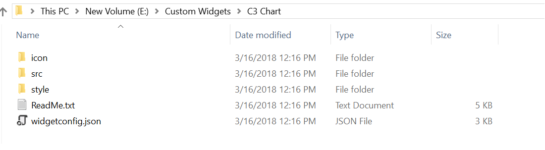
- Refer the commands to create new custom widget files.
-
Configure the widget through the widgetconfig.json file.
-
As C3 Chart requires two data fields, we have configured column and values as shown below and the properties section contains the properties related to the C3 Chart. Refer this link for configuring widgetconfig.json.
"widgetName": "C3Chart",
    "displayName": "C3 Chart",
    "guid": "b0d5348d-f625-4b78-8db9-c5ed9d38eb45",
    "category": "Comparison",
    "description": "Compare values for a set of unordered items across categories",
    "srcFile": "src/sourcefile.js",
    "dependencies": {
	"scripts": [
	     "src/d3.js",
	     "src/c3.js"
		 ]
		 },
    "dataFields": [
        {
            "displayName": "Value",
            "valueType": "measure",
            "name": "Value",
            "min": 1,
            "max": 1,
            "optional": false
        },
        {
            "displayName": "Column",
            "valueType": "dimension",
            "name": "Column",
            "min": 1,
            "max": 1,
            "optional": false
        }
    ],
    "functionalities": [
        {
            "header": "Basic Settings",
            "properties": [
                {
                    "displayName": "Show Tooltip",
                    "controlType": "checkbox",
                    "name": "showTooltip",
                    "defaultValue": "true"
                },
				{
                    "displayName": "Show Label",
                    "controlType": "checkbox",
                    "name": "showLabel",
                    "defaultValue": "true"
                },
                {
                    "displayName": "Color",
                    "controlType": "colorpicker",
                    "name": "barColor",
                    "defaultValue": "#2196F3"
                }
            ]
        },
      ],
    "filterSettings": {
        "masterFilter": {
            "visible": true,
            "defaultValue": true

        },
        "ignoreMasterFilter": {
            "visible": true,
            "defaultValue": false
        }
}-
d3.js dependency file can be downloaded from D3 website.
-
c3.js dependency file can be downloaded from C3 website.
-
Then, configure the widget with the necessary data.

- Run the C3Chart_xx.html (%appdata%\Syncfusion\DashboardDesigner\versionnumber\Html) generated in the location, and place the break point in the init method in the source file of the widget.

-
this.element is the container(div) provided to render our actual widget.
-
So, we are creating our C3 Chart in this.element by using the data in this.model.datasource.
-
In Init(), We are creating a new space (div) for rendering our C3 Chart custom widget and appending into the container as you can see in the below code.
-
The width and height of the widget is assigned from the container’s width and height respectively.
init: function () { /* init method will be called when the widget is initialized */
	 this.widget = document.createElement("div");
	 this.widget.setAttribute('id', 'chart');
	 var width = document.getElementById('container').style.width;
	 var height = document.getElementById('container').style.height;
	 this.element.appendChild(this.widget);
var that = this;- Configure the datasource with some default values for initial rendering of C3 Chart.
var columns =[];
columns =[{column:'Item1',values: '50'},{column:'Item2',values: '20'},{column:'Item3',values: '30'}];-
this.model.boundColumns.Value and this.model.boundColumns.length contains the columns bounded in the columns and values respectively. By checking the below condition, we can find whether the widget is configured with columns or not.
-
Converting datasource structure required by C3 Chart.
if (this.model.boundColumns.Value.length > zero) {
     for (var i = 0; i < this.model.dataSource.length; i++) {
	  columns.push({column: this.model.dataSource[i][this.model.boundColumns.Column[0].uniqueColumnName], values: this.model.dataSource[i][this.model.boundColumns.Value[0].uniqueColumnName]});
}- To render the C3 Chart, configure the required API’s and assign the data to it.
var chart = c3.generate({
		data:
		{
		  type: 'bar',
		  json: columns,
		  keys:
			{
			 x: 'column',
			 value: ['values']
			},
			labels: true,
			selection:
			{
			 enabled: true,
			 multiple: false,
			 draggable: true
			},
			onclick: function(d) {
								that.selectionChange(d)
							},
		},
		axis:
		{
		 x:
		  {
		   type: 'category'
		  }
		},
		grid:
		{
		   x: {show: false},
		   y: {show: true}
		},
		bar:
	      {
		  width:
		   {
			ratio: 0.5
		   }
	      },
		interaction: {enabled: true}
	   });
this.widget = chart;- C3 Chart widget will be rendered as follows:

selectionChange
-
Other widgets in the dashboard that are configured as a slave for C3 Chart can be updated based on the selected data in the C3 Chart by using below code. ej.dashboard.filterData(this, selectedFilterInfos) is used to send filter data request.
-
On triggering onclick the selectionChange will gets invoked. In selectionChange(), we get the chart data and push the selected value into data[]. Then create a selectedFilterInfos object of ej.dashboard.selectedColumnInfo() type with the information present in the data[] and pass the selectedFilterInfos into the ej.dashboard.filterData(this,selectedFilterInfos).
selectionChange: function (e) {
	     var data = [];
	     data.push(this.model.dataSource[e.x][this.model.boundColumns.Column[0].uniqueColumnName]);
	     var zero = 0;
		 var selectedFilterInfos = [];
		 if (data.length > zero)
		    {
		    var filterinfo = new ej.dashboard.selectedColumnInfo();
			filterinfo.condition = "include";
			filterinfo.uniqueColumnName = this.model.boundColumns.Column[0].uniqueColumnName;
			filterinfo.values.push(data[0]);
			selectedFilterInfos.push(filterinfo);
			}
			ej.dashboard.filterData(this, selectedFilterInfos);
},-
Update method will be triggered for below operations and we have to do the required changes by checking the update types(resize, refresh, propertyChange) and widget will be updated accordingly by invoking the respective API of the widget.
1) Resize
2) Refresh
3) property change
update: function (option) {
        var widget = this.widget;

        /* update method will be called when any update needs to be performed in the widget. */

        if (option.type == "resize") {
            /* update type will be 'resize' if the widget is being resized. */
			widget.resize(option.size);
        }
        else if (option.type == "refresh") {
            /* update type will be 'refresh' when the data is refreshed. */
			this.refreshChart();
        }
        else if (option.type == "propertyChange") {
            /* update type will be 'propertyChange' when any property value is changed in the designer. */

            switch (option.property.name) {
                case "showTooltip":
                    widget.internal.config.tooltip_show = option.property.value;
                    break;
                case "showLabel":
                    widget.internal.config.data_labels = option.property.value;
					widget.flush();
                    break;
                case "barColor":
                    widget.internal.config.data_colors.values = option.property.value;
					widget.flush();
                    break;
                }
        }
}refreshChart : function (e) {
var columns =[];
if (this.model.boundColumns.Value.length > 0)
{
for( var i=0; i< this.model.dataSource.length; i++)
{
columns.push({column:this.model.dataSource[i][this.model.boundColumns.Column[0].uniqueColumnName],values:this.model.dataSource[i][this.model.boundColumns.Value[0].uniqueColumnName]});
}
} else {
columns =[{column:'A',values: '50'},{column:'B',values: '20'},{column:'C',values: '30'}];
}
var chart = c3.generate({
data: {
type : 'bar',
json: columns,
keys: {
x: 'column',
value: ['values']
},
labels:this.model.properties.show label,
selection:
{
enabled: true,
multiple: false,
draggable:true
},
onclick: function(d) {
that.selectionChange(d)
},
},
axis:
{
x: {
type: 'category'
}
},
grid:
{
x:{ show : true},
y:{show: false}
},
bar:
{
width: { ratio: 0.5 }
},
interaction: {enabled: true}
});
this.widget = chart;
},