Appearance in WPF TreeView (SfTreeView)
27 Feb 202520 minutes to read
The TreeView allows customizing appearance of the underlying data, and provides different functionalities to the end-user.
ItemTemplate
The WPF TreeView allows you to customize the appearance of content view and expander view by setting the ItemTemplate and ExpanderTemplate properties.
<Window x:Class="NodeWithImageDemo.MainWindow"
        xmlns="http://schemas.microsoft.com/winfx/2006/xaml/presentation"
        xmlns:x="http://schemas.microsoft.com/winfx/2006/xaml"
        xmlns:d="http://schemas.microsoft.com/expression/blend/2008"
        xmlns:mc="http://schemas.openxmlformats.org/markup-compatibility/2006"
        xmlns:local="clr-namespace:NodeWithImageDemo"
        xmlns:syncfusion="http://schemas.syncfusion.com/wpf"
        mc:Ignorable="d">

    <Window.DataContext>
        <local:FileManagerViewModel/>
    </Window.DataContext>

    <Grid>
        <Grid.RowDefinitions>
            <RowDefinition Height="Auto"/>
            <RowDefinition/>
        </Grid.RowDefinitions>

        <syncfusion:SfTreeView x:Name="sfTreeView" Grid.Row="1"
                               ChildPropertyName="SubFiles"
                               FullRowSelect="True"
                               ItemsSource="{Binding ImageNodeInfo}" >

            <syncfusion:SfTreeView.ItemTemplate>
                <DataTemplate>
                    <Grid x:Name="grid">
                        <Grid Grid.Row="0">
                            <Grid.ColumnDefinitions>
                                <ColumnDefinition Width="20" />
                                <ColumnDefinition Width="*" />
                            </Grid.ColumnDefinitions>
                            <Grid>
                                <Image Source="{Binding ImageIcon}"
                                               VerticalAlignment="Center"
                                               HorizontalAlignment="Center"
                                               Height="16"
                                               Width="16"/>
                            </Grid>
                            <Grid Grid.Column="1"
                                              Margin="1,0,0,0"
                                              VerticalAlignment="Center">
                                <Label Content="{Binding ItemName}"
                                                   Foreground="Black"
                                                   FontSize="11"
                                                   VerticalContentAlignment="Center" />
                            </Grid>
                        </Grid>
                    </Grid>
                </DataTemplate>
            </syncfusion:SfTreeView.ItemTemplate>
        </syncfusion:SfTreeView>
    </Grid>
</Window>
BindingContext for ItemTemplate
By default, the binding context of tree view item will be the data model object for Bound Mode and TreeViewNode for Unbound Mode.
For Bound Mode, you can change the binding context of the treeview items by using ItemTemplateContextType property.
<Window x:Class="NodeWithImageDemo.MainWindow"
xmlns="http://schemas.microsoft.com/winfx/2006/xaml/presentation"
xmlns:x="http://schemas.microsoft.com/winfx/2006/xaml"
xmlns:d="http://schemas.microsoft.com/expression/blend/2008"
xmlns:mc="http://schemas.openxmlformats.org/markup-compatibility/2006"
xmlns:local="clr-namespace:NodeWithImageDemo"
xmlns:syncfusion="http://schemas.syncfusion.com/wpf"
mc:Ignorable="d">
<Window.DataContext>
<local:FileManagerViewModel/>
</Window.DataContext>
<Grid>
<Grid.RowDefinitions>
<RowDefinition Height="Auto"/>
<RowDefinition/>
</Grid.RowDefinitions>
<TextBlock VerticalAlignment="Center"
TextWrapping="Wrap"
Padding="5,0,0,0"
FontSize="14"
Margin="5,5,5,20">
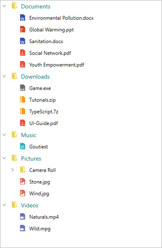
<Run Text="This sample demonstrates the default functionalities to include images in SfTreeView."/>
</TextBlock>
<syncfusion:SfTreeView x:Name="sfTreeView" Grid.Row="1"
ChildPropertyName="SubFiles"
FullRowSelect="True"
ItemTemplateDataContextType="Node"
ItemsSource="{Binding ImageNodeInfo}" >
<syncfusion:SfTreeView.ItemTemplate>
<DataTemplate>
<Grid x:Name="grid">
<Grid Grid.Row="0">
<Grid.ColumnDefinitions>
<ColumnDefinition Width="20" />
<ColumnDefinition Width="*" />
</Grid.ColumnDefinitions>
<Grid>
<Image Source="{Binding Content.ImageIcon}"
VerticalAlignment="Center"
HorizontalAlignment="Center"
Height="16"
Width="16"/>
</Grid>
<Grid Grid.Column="1"
Margin="1,0,0,0"
VerticalAlignment="Center">
<Label Content="{Binding Content.ItemName}"
Foreground="Black"
FontSize="11"
VerticalContentAlignment="Center" />
</Grid>
</Grid>
</Grid>
</DataTemplate>
</syncfusion:SfTreeView.ItemTemplate>
</syncfusion:SfTreeView>
</Grid>
</Window>ItemTemplate Selector
The TreeView allows you to customize the appearance of each item with different templates based on specific constraints by using the ItemTemplateSelector. You can choose a DataTemplate for each item at runtime based on the value of data-bound property using ItemTemplateSelector.
<Window x:Class="NodeWithImageDemo.MainWindow"
        xmlns="http://schemas.microsoft.com/winfx/2006/xaml/presentation"
        xmlns:x="http://schemas.microsoft.com/winfx/2006/xaml"
        xmlns:d="http://schemas.microsoft.com/expression/blend/2008"
        xmlns:mc="http://schemas.openxmlformats.org/markup-compatibility/2006"
        xmlns:local="clr-namespace:NodeWithImageDemo"
        xmlns:syncfusion="http://schemas.syncfusion.com/wpf"
        mc:Ignorable="d">

    <Window.DataContext>
        <local:FileManagerViewModel/>
    </Window.DataContext>
    <Window.Resources>
        <local:ItemTemplateSelector x:Key="itemTemplateSelector"/>
    </Window.Resources>
    <Grid>
        <Grid.RowDefinitions>
            <RowDefinition Height="Auto"/>
            <RowDefinition/>
        </Grid.RowDefinitions>

        <syncfusion:SfTreeView x:Name="sfTreeView"
		                       Grid.Row="1"
                               ChildPropertyName="SubFiles"
                               FullRowSelect="True"
                               ItemTemplateDataContextType="Node"
                               ItemsSource="{Binding ImageNodeInfo}"
							   ItemTemplateSelector="{StaticResource itemTemplateSelector}" >
        </syncfusion:SfTreeView>
    </Grid>
</Window>
class ItemTemplateSelector : DataTemplateSelector
{
public override DataTemplate SelectTemplate(object item, DependencyObject container)
{
var treeviewNode = item as TreeViewNode;
if (treeviewNode == null)
return null;
if (treeviewNode.Level == 0)
return Application.Current.MainWindow.FindResource("RootTemplate") as DataTemplate;
else
return Application.Current.MainWindow.FindResource("ChildTemplate") as DataTemplate;
}
}
NOTE
View sample in GitHub
Indentation
The TreeView allows customizing the indent spacing of items by setting the Indentation property. The default value of this property is 20. This property can be customized at runtime.
<Syncfusion:SfTreeView x:Name="sfTreeView" Indentation="40" />SfTreeView sfTreeView = new SfTreeView();
sfTreeView.Indentation = 40;ExpanderWidth
The TreeView allows customizing the width of expander view by setting the ExpanderWidth property. The default value of this property is 20. This property can be customized at runtime.
<Syncfusion:SfTreeView x:Name="sfTreeView" ExpanderWidth="40" />SfTreeView sfTreeView = new SfTreeView();
sfTreeView.ExpanderWidth = "40";ExpanderPosition
The TreeView allows you change the position of expander view by setting the ExpanderPosition property. The default value of this property is Start. This property has following two positions:
Start: Allows displaying the expander view at the start position.
End: Allows displaying the expander view at the end position.
<Syncfusion:SfTreeView x:Name="sfTreeView" ExpanderPosition="End">SfTreeView sfTreeView = new SfTreeView();
sfTreeView.ExpanderPosition = ExpanderPosition.End;Level based styling
The TreeView allows you to customize the style of TreeViewItem based on different levels by using IValueConverter.
<Window.Resources>
    <local:FontAttributeConverter x:Key="FontAttributeConverter"/>
</Window.Resources>
<Window.DataContext>
    <local:MailFolderViewModel x:Name="viewModel"/>
</Window.DataContext>

<Grid>
    <Syncfusion:SfTreeView HorizontalAlignment="Left" ItemTemplateDataContextType="Node"  ItemsSource="{Binding Folders}"  ChildPropertyName="SubFolder" >
        <Syncfusion:SfTreeView.ItemTemplate>
            <DataTemplate>
                <Label  Content="{Binding Content.FolderName}" FontWeight="{Binding Level, Converter={StaticResource FontAttributeConverter}}"
                FontSize="14"/>
            </DataTemplate>
        </Syncfusion:SfTreeView.ItemTemplate>
    </Syncfusion:SfTreeView>
</Grid>
public class FontAttributeConverter : IValueConverter
{
public object Convert(object value, Type targetType, object parameter, CultureInfo culture)
{
var level = (int)value;
return level == 0 ? FontWeights.Bold : FontWeights.Regular;
}
public object ConvertBack(object value, Type targetType, object parameter, CultureInfo culture)
{
throw new NotImplementedException();
}
}
NOTE
View sample in GitHub
Animation
The SfTreeView supports to animate expanding or collapsing the TreeViewNode. To enable/disable the animation use IsAnimationEnabled property of SfTreeView.
<Syncfusion:SfTreeView x:Name="sfTreeView" IsAnimationEnabled="true">SfTreeView sfTreeView = new SfTreeView();
sfTreeView.IsAnimationEnabled = true;
NOTE
You can also explore our WPF TreeView example to knows how to represents hierarchical data in a tree-like structure with expand and collapse node options.