WPF Navigation Pane (GroupBar) Overview
20 Jun 20231 minute to read
The GroupBar control implements list-type controls in the UI, similar to the Microsoft Outlook Bar. It has a container to host controls within it. Use it to host a categorized collection of command items and custom controls wired to execute custom commands. It includes several customizable features which can be easily implemented in WPF applications.
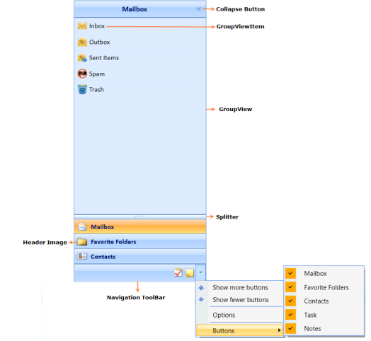
Control Structure
Features
- Vertical and Horizontal layouts and orientation of GroupBar items.
- Alignment and Orientation of GroupView Items.
- Built-in visual styles - Default, Office 2003, Office 2007 Blue, Office 2007 Silver, Office 2007 Black and Blend are available for the control.
- It supports expansion of multiple tabs.
- ToolTip support for GroupView items.
- Built-In context menu that provides the user access to functionalities to customize the GroupBar items just like in VS 2005 Toolbox context menu.
- Various types of visual modes such as Multiple Expansion (VS 2005 Toolbox) and Stack Mode.
- Dynamically sort tabs / items alphabetically in ascending / descending order through context menu or programmatically.
- Dynamically add new tabs / items through context menu or programmatically.
- Dynamically alter the tab header text or item header text using context menu or programmatically.
- Dynamically move a selected tab up / down one step in the GroupBar using context menu.
- Tabs can toggle between expanded and collapsed state. Can expand multiple tabs at the same time.
- Dynamically move a selected item up / down one step in the GroupBar using context menu or programmatically.
Navigation Pane Features
- Resize the Pop up.
- Expand / Collapse the Navigation Pane.
- Set the height of Tool bar.