How can I help you?
Interactive Features in Windows Forms GroupView
28 Apr 20211 minute to read
User can determine whether the particular GroupView Item is selected or not using the ButtonView and ClipSelectionBounds properties. ButtonView displays the selected GroupView Item in the pressed state.
ButtonView can be enabled in the GroupView control at design-time by setting the SelectedItem property to integer values which in turn represents the GroupView Item. ClipSelectionBounds displays a white border around the selected GroupView Item.
this.groupView1.ButtonView = true;

this.groupView1.ClipSelectionBounds = true;Me.groupView1.ButtonView = True
Me.groupView1.ClipSelectionBounds = True
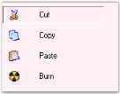
ButtonView of the ‘Cut’ Item
ToolTips
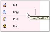
The ToolTipText property of the GroupView control can be used to set the text of the tooltip. The ShowToolTips property must be set to true in order to make the tooltip visible.
// Set the tooltip text for the GroupView Item.

this.groupView1.GroupViewItems[0].ToolTipText = "GroupViewItem1";

this.groupView1.ShowToolTips = true;
' Set the tooltip text for the GroupView Item.
Me.groupView1.GroupViewItems(0).ToolTipText = "GroupViewItem1"
Me.groupView1.ShowToolTips = True