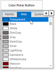
Customization in WinForms Color Picker DropDown
18 Nov 20181 minute to read
WinForms Color Picker DropDown displays the ColorUIControl as its dropdown. It has properties to customize the ColorUIControl. Refer the User Guide for ColorUIControl. The size for the dropdown, i.e, ColorUIControl can be set using ColorUISize property.
this.colorPickerButton1.ColorUISize = new System.Drawing.Size(250, 280);Me.colorPickerButton1.ColorUISize = New System.Drawing.Size(250, 280)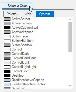
ColorPicker Appearance
The appearance and behavior of the WinForms Color Picker DropDown can be controlled using the below properties.
| WinForms Color Picker DropDown Properties | Description |
|---|---|
| SelectedAsBackColor | Specifies whether the SelectedColor is set as the button backcolor. |
| SelectedAsText | Specifies whether the SelectedColor is set as the button text value. |
this.colorPickerButton1.SelectedAsBackcolor = true;
this.colorPickerButton1.SelectedAsText = true;Me.colorPickerButton1.SelectedAsBackcolor = True
Me.colorPickerButton1.SelectedAsText = True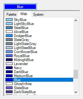
Visual Style
The WinForms Color Picker DropDown control supports visual style such as Office2016White,Office2016Black,Office2016DarkGray,Office2016Colorful,Default and Metro. This style can be set using Appearance property.
this.colorPickerButton1.Appearance = Syncfusion.Windows.Forms.ButtonAppearance.Colorful;Me.colorPickerButton1.Appearance = Syncfusion.Windows.Forms.ButtonAppearance.Colorful;