How can I help you?
Card View Layout in Windows Forms GridDataBoundGrid(Classic)
26 Apr 20212 minutes to read
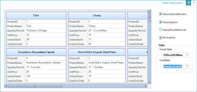
The card view displays records as separate cards arranged in a grid-like layout. It is implemented similar to binding GridDataBoundGrid control to GridCardView object.
Tables for Properties, Methods, and Events
| PROPERTIES | DESCRIPTION | TYPE | DATA TYPE |
|---|---|---|---|
| CaptionField | Sets or gets caption of each card. Users can set a column name to this. | string | string |
| CardStyle | Applies a card model such as standard, merged, variable, or compressed styles. | CardStyle | enum |
| VisualStyle | Applies the visual style of the cards in the grid. The new GridVisualStyles are applied to this. | CardVisualStyle | enum |
| CardSpacingWidth | Gets or sets the width of the spacing between each card. | int | int |
| CardSpacingHeight | Gets or sets the height of the spacing between each card. | int | int |
| MaxCardCols | Gets or sets the maximum number of cards in the column area. MaxCardRows will be automatically calculated. | int | int |
| MaxCardRows | Gets or sets the maximum number of cards in the row area. MaxCardCol will be automatically calculated if it is not set. | int | int |
| ShowCaption | Shows or hides the caption of each card. | bool | bool |
| ShowCardCellBorders | Shows or hides the cell borders. | bool | bool |
| AllowResizing | Allows or prevents the card resizing. | bool | bool |
| CaptionHeight | Gets or sets the height of the caption row. | bool | bool |
| ActivateCurrentCellBehavior | Specifies current cell activation behavior when moving the current cell or clicking inside a cell. | GridCellActivateAction | enum |
| HighlightActiveCard | Gets or sets the highlight of the active card. | bool | bool |
| METHODS | DESCRIPTION | PARAMETERS | TYPE | RETURN TYPE |
|---|---|---|---|---|
| WireGrid | Gets the GridDataBoundGrid and changes it to Card View Style. | GridDataBoundGrid boundGrid | Method | void |
| UnWireGrid | Unhooks all the events hooked in the WireGrid() method. | N/A | Method | Void |
| IsActiveCard | Indicates the state of the card if active. | rowIndex, ColIndex | Method | bool |
| IsHeaderCell | Indicates if the cell is a header column cell. | rowIndex, ColIndex | Method | bool |
| IsRecordCell | Indicates if the cell is a record cell. | rowIndex,colIndex. | Method | bool |
| IsValueCell | Indicates if the cell is a value cell. | rowIndex,colIndex. | Method | bool |
| IsCardCaption | Indicates if the cell is a caption cell. | rowIndex,colIndex. | Method | bool |
| GetCardCellTypeGetCardCellType | Specifies the type of the card cell. | rowIndex,colIndex. | Method | CardCellType |
| EVENTS | DESCRIPTION | ARGUMENTS | TYPE |
|---|---|---|---|
| QueryCardCellInfo | Occurs when the card model queries for style information about a specific cell. | public QueryCardCellInfoEventArgs(GridQueryCellInfoEventArgs e, GridCardView cardView) | Event |
| CellClick | Occurs when the user clicks inside a cell. | public CardCellClickEventArgs(GridCellClickEventArgs e, GridCardView cardView) | Event |
| SaveCardCellInfo | Occurs when the card model is about to save style information about a specific cell. | public SaveCardCellInfoEventArgs(GridSaveCellInfoEventArgs e, GridCardView cardView) | Event |
| PushButtonClick | Occurs when the user clicks a push button. | public CardCellPushButtonClickEventArgs(GridCellPushButtonClickEventArgs e, GridCardView cardView) | Event |
Sample Link
**_
Enable the Card View Layout
The following code is used to enable card view layout in GridDataBoundGrid control.
GridCardView card = new GridCardView();
card.CaptionField = "ProductName";
card.WireGrid(this.gridDataBoundGrid1);
Private card As New GridCardView()
card.CaptionField = "ProductName"
card.WireGrid(Me.gridDataBoundGrid1)