How can I help you?
ButtonAdvAppearance in Windows Forms ButtonAdv(Classic)
26 Apr 20215 minutes to read
This section will walk you through the below topics which discusses the properties that controls the appearance of the ButtonAdv.
Button Types
ButtonAdv control supports different button types in terms of its appearance. It is specified using the ButtonType property.
| Property | Description |
|---|---|
| ButtonType |
Specifies the button type to be used in the ButtonAdv control. The options are as follows. Normal - Normal button. (user can specify the image with this ButtonType). Calculator - Calculator image is used. Currency - Currency image is used. Down - Down image is used. ComboXPDown - Down image like in a Windows XP combo box. Up - Up image is used. Left - Left image is used. Right - Right image is used. Redo - Redo image is used. Undo - Undo image is used. Check - Check image is used. Browse - Browse image is used. LeftEnd - Left end image is used. RightEnd - Right end image is used. |
NOTE
You can also specify your own image for the ButtonAdv using Image property and this will effect only when ButtonType is set to Normal. See Image Settings to know more.
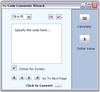
//Setting Calculator button type
this.ButtonAdvControl.ButtonType=Syncfusion.Windows.Forms.Tools.ButtonTypes.Calculator;
'Setting Calculator button type
Me.ButtonAdvControl.ButtonType = Syncfusion.Windows.Forms.Tools.ButtonTypes.Calculator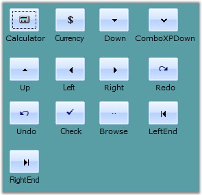
NOTE
The ButtonTypes are only provided for ease of use and do not in any way change the functionality of the buttons.
Example - A sample image which uses most of the button types in a single application is as follows. User will have to add respective functionalities for each button type.
Border Styles
Border style for the ButtonAdv control is specified in the below property.
| Property | Description |
|---|---|
| BorderStyleAdv |
Specifies the border style for ButtonAdv control. The styles are, None, Default, Dashed, Dotted, Inset, Outset, Solid, Bump, Etched, Flat, Raised, RaisedInner, RaisedOuter, Sunken, SunkenInner and SunkenOuter |
NOTE
This setting will be effective only for Office2003, OfficeXP and WindowsXP styles set through ButtonAdv.Appearance property. See Visual Styles.
//Sample code for setting "SunkenOuter" Border Style using BorderStyleAdv
this.buttonAdv13.BorderStyleAdv = Syncfusion.Windows.Forms.ButtonAdvBorderStyle.SunkenOuter;//Sample code for setting "SunkenOuter" Border Style using BorderStyleAdv
Me.buttonAdv13.BorderStyleAdv = Syncfusion.Windows.Forms.ButtonAdvBorderStyle.SunkenOuter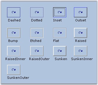
See Also
Visual Styles
Visual Styles for the ButtonAdv control can be enabled by using the UseVisualStyle property. The different visual style are specified through Appearance.
| Property | Description |
|---|---|
| Appearance |
Sets the visual styles for the control when UseVisualStyle property is true. The styles are,
|
|
UseVisualStyle |
Indicates whether Visual Styles must be enabled for the button. Set value to True when you want to apply settings of the properties: Appearance, BorderStyleAdv, ButtonType and etc. on current button. |
| MetroColor | Gets or sets the metro color of the control.(Applicable for metro style only) |
Office Color Themes
//Sample code for setting “Office2016 Colorful” color scheme for ButtonAdv
this.buttonAdv1.Appearance = Syncfusion.Windows.Forms.ButtonAppearance.Office2016Colorful;Me.buttonAdv1.Appearance = Syncfusion.Windows.Forms.ButtonAppearance.Office2016Colorful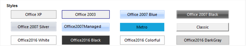
Custom Colors
We can also apply custom colors to the ButtonAdv control by setting Office2007ColorScheme to “Managed” and specifying the custom color through the ApplyManagedColors method as follows.
this.buttonAdv1.Office2007ColorScheme = Syncfusion.Windows.Forms.Office2007Theme.Managed;
Office2007Colors.ApplyManagedColors(this, Color.LightGreen);Me.buttonAdv1.Office2007ColorScheme = Syncfusion.Windows.Forms.Office2007Theme.Managed
Office2007Colors.ApplyManagedColors(this, Color.LightGreen)
See Also
Foreground Settings
Text for the ButtonAdv can be customized using the below properties.
| Properties | Description |
|---|---|
| Text | Sets the text for the ButtonAdv control. |
| TextAlign |
Sets the alignment of the text in the control. The options are, TopLeft, TopCenter, TopRight, MiddleLeft, MiddleCenter, MiddleRight, BottomLeft, BottomCenter and BottomRight. |
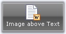
| TextImageRelation | Sets the relative location of the image to the text. The options are, Overlay, ImageBeforeText, TextBeforeImage, ImageAboveText and TextAboveImage. |
| Font | Sets the font style for the control's text. |
| ForeColor | Sets the fore color for the control's text. |
this.buttonAdv1.Text = "Image above Text";
this.buttonAdv4.TextAlign = System.Drawing.ContentAlignment.BottomCenter;
this.buttonAdv4.TextImageRelation = TextImageRelation.ImageAboveText;

this.buttonAdv1.Font = new System.Drawing.Font("Verdana", 8.25F, System.Drawing.FontStyle.Regular);
this.buttonAdv1.ForeColor = System.Drawing.Color.White;Me.buttonAdv4.Text = "Image above Text"
Me.buttonAdv4.TextAlign = System.Drawing.ContentAlignment.BottomCenter
Me.buttonAdv4.TextImageRelation = TextImageRelation.ImageAboveText
Me.buttonAdv1.Font = New System.Drawing.Font("Verdana", 8.25F, System.Drawing.FontStyle.Regular)
Me.buttonAdv1.ForeColor = System.Drawing.Color.White