How can I help you?
Getting Started
For common getting started of typescript , you can refer here.
The default type definition file ej.web.all.d.ts needs to include the support for type-checking while initializing any of the Syncfusion widgets.
The important step you need to do is to copy the ej.web.all.d.ts file into your project and then need to refer it in your TypeScript application (app.ts file), so that you will get the intelliSense support and also the compile time type-checking.
You can find the ej.web.all.d.ts file in the following location,
(installed location)\Syncfusion\Essential Studio\33.1.44\JavaScript\assets\typescript
Apart from ej.web.all.d.ts file, it is also necessary to make use of the jquery.d.ts file in your TypeScript application, which can be downloaded from here.
Adding Script Reference
Create an HTML page and add the scripts references in the order mentioned in the following code example.
<!DOCTYPE html>
<html>
<head>
        <link href="http://cdn.syncfusion.com/33.1.44/js/web/bootstrap-theme/ej.web.all.min.css" rel="stylesheet" />
        <script src="https://code.jquery.com/jquery-3.0.0.min.js"></script>
        <script src="http://cdn.syncfusion.com/33.1.44/js/web/ej.web.all.min.js" type="text/javascript"></script>
        <script src="app.js"></script>
</head>
<body>
</body>
</html>
In the above code, ej.web.all.min.js script reference has been added for demonstration purpose. It is not recommended to use this for deployment purpose, as its file size is larger since it contains all the widgets. Instead, you can use [CSG](http://csg.syncfusion.com/# “”) utility to generate a custom script file with the required widgets for deployment purpose.
Create your chart
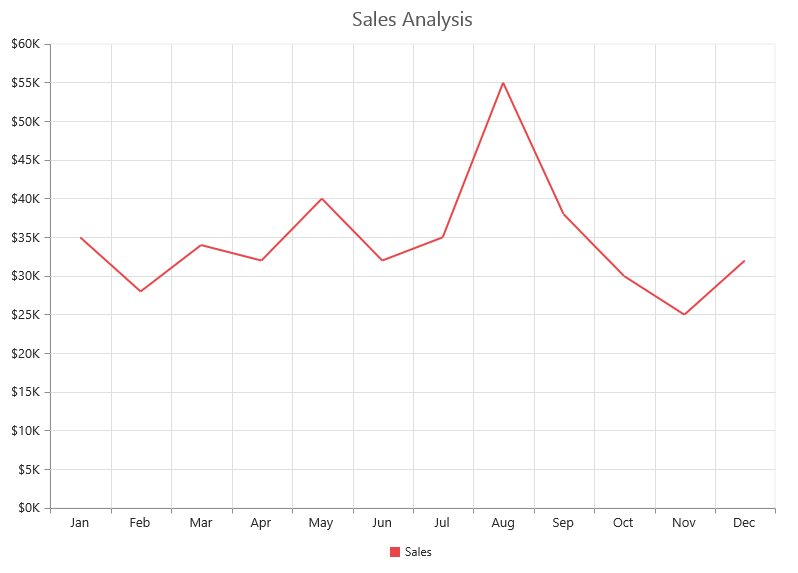
In this tutorial, you will learn how to create a simple chart.The following screen shot displays the output after completing this tutorial.

1.Create a <div> tag.
<html> <body> <div id="Chart"></div> </body> </html>2.Initialize the Chart in ts file by using the ej.Chart method.
/// <reference path="tsfiles/jquery.d.ts" />
/// <reference path="tsfiles/ej.web.all.d.ts" />
module ChartComponent {
    $(function () {
        var chartsample = new ej.datavisualization.Chart($("#Chart"));
    });
}
Now, the Chart is rendered with some auto-generated random values and with default Column chart type.
Initialize the chart by using the ejChart method. The chart is rendered to the size of its container, by default. You can also customize the chart dimension either by setting the width and height of the container element as in the above code example or by using the Size option of the Chart.
Populate chart with data
Now, this section explains how to plot JSON data to the Chart. First, let us prepare a sample JSON data with each object containing following fields – month and sales.
var chartData = [
      { month: 'Jan', sales: 35 },
      { month: 'Feb', sales: 28 },
      { month: 'Mar', sales: 34 },
      { month: 'Apr', sales: 32 },
      { month: 'May', sales: 40 },
      { month: 'Jun', sales: 32 },
      { month: 'Jul', sales: 35 },
      { month: 'Aug', sales: 55 },
      { month: 'Sep', sales: 38 },
      { month: 'Oct', sales: 30 },
      { month: 'Nov', sales: 25 },
      { month: 'Dec', sales: 32 }];
Add a Series to the Chart using Series option and set the chart type as Line using type option.
$(function () {
        var chartsample = new ej.datavisualization.Chart($("#Chart"), {
              series:
			[
			   {
                   type:"line"

               }
            ]
            });
            });
You can also add multiple series tags based on your requirement.
Next, map the Month and Sales values in the data source to the Line series by setting XName and YName with the field names respectively, and then set the actual data using DataSource option.

Since the data is related to Sales, format the vertical axis labels by adding ‘$’ as a prefix and ‘K’ as a suffix to each label. This can be achieved by setting the “${value}K” to the labelFormat option of the axis. Here, {value} acts as a placeholder for each axis label, “$” and “K” are the actual prefix and suffix added to each axis label.
The following code example illustrates this,
$(function () {
        var chartsample = new ej.datavisualization.Chart($("#Chart"), {
            primaryYAxis: {
                      labelFormat: "{value}k"

            }        ]
            });
            });
Add Data Labels
You can add data labels to improve the readability of the chart. This can be achieved by enabling the Visible option in the dataLabel option. Now, the data labels are rendered at the top of all the data points.
The following code example illustrates this,
$(function () {
        var chartsample = new ej.datavisualization.Chart($("#Chart"), {
              series:
			[
			   {
                  marker: {
                         dataLabel: {
                                //Enable data label in the chart
                                visible: true
                   } }

               }
             ]
            });
            });
There are situations where the default label content is not sufficient to the user. In this case, you can use the template option to format the label content with some additional information.
<!DOCTYPE html>
<html>
<body>
      <div id="dataLabelTemplate" style="display:none; padding:3px;background-color:#B9C5C9; opacity:0.8;">
         <div id="point">#point.x#:$#point.y#K</div>
      </div>
</body>
</html>
The above HTML template is used as a template for each data label. Here, “point.x” and “point.y” are the placeholder text used to display the corresponding data point’s x & y value.
The following code example shows how to set the id of the above template to dataLabel template option,
$(function () {
        var chartsample = new ej.datavisualization.Chart($("#Chart"), {
              series:
			[
			   {
                  marker: {
                         dataLabel: {
                                  visible: true,
                                 //Set the id of HTML template to the chart series
                                  template: "dataLabelTemplate"

                   } }

               }
             ]
            });
            });
Enable Legend
You can enable or disable the legend by using the Visible option in the legend option. It is enabled in the chart, by default.
$(function () {
        var chartsample = new ej.datavisualization.Chart($("#Chart"), {

            //Initializing Series
            series: [{

                //Add series name to display on the legend item
                name: "Sales"
            }],

           legend: {
                //Enable chart legend
                visible: true
           }
            });
            });
Enable Tooltip
The Tooltip is useful when you cannot display information by using the dataLabel due to the space constraints. You can enable tooltip by using the Visible option of the tooltip option in the specific series.
The following code example illustrates this,
$(function () {
        var chartsample = new ej.datavisualization.Chart($("#Chart"), {

            //Initializing Series
            series: [{
                  //Enable tooltip in chart area
                   tooltip: {visible: true}
            }],
            });
            });
Add Chart Title
You need to add a title to the chart to provide quick information to the user about the data being plotted in the chart. You can add it by using the text option of the title option.
$(function () {
        var chartsample = new ej.datavisualization.Chart($("#Chart"), {


            title: {
	           //Add chart title
               text: 'Sales Analysis'
	        },

            });
            });