How can I help you?
Filtering support in Angular Grid
Filtering helps to view particular or related records from dataSource which meets a given filtering criteria. To enable filter, set allowFiltering as true.
The Grid supports three types of filter, they are
- Filter bar
- Menu
- Excel
And also four types of filter menu is available in all filter types, they are
- String
- Numeric
- Date
- Boolean
The corresponding filter menu is opened based on the column type.
NOTE
- Need to specify the
typeof column, when first record data value is empty or null otherwise the filter menu is not opened.- The default filter type is Filter bar, when
allowFilteringis enabled andfilterTypeis not set.
The following code example describes the above behavior.
<ej-grid id="Grid" [dataSource]="gridData" [allowPaging]="true" [allowFiltering]="true" >
    <e-columns>
        <e-column field="OrderID"  headerText="OrderID"></e-column>
        <e-column field="EmployeeID" headerText="EmployeeID"></e-column>
        <e-column field="CustomerID" headerText="CustomerID"></e-column>
        <e-column field="ShipCountry" headerText="ShipCountry"></e-column>
        <e-column field="Freight" headerText="Freight"></e-column>
    </e-columns>
</ej-grid>import {Component, ViewEncapsulation} from '@angular/core';
@Component({
selector: 'ej-app',
templateUrl: 'app/app.component.html', //give the path file for Grid control html file.
})
export class AppComponent {
public gridData;
constructor()
{
//The datasource "window.gridData" is referred from 'http://js.syncfusion.com/demos/web/scripts/jsondata.min.js'
this.gridData = window.gridData;
}
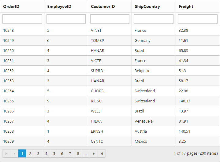
}The following output is displayed as a result of the above code example.
Menu filter
You can enable menu filter by setting filterSettings.filterType property as menu.
There is an option to show or hide the additional filter options in the menu by setting showPredicate of filterSettings property as true or false respectively.
NOTE
For
filterTypeproperty you can assign eitherstringvalue (“menu”) orenumvalue (ej.Grid.FilterType.Menu).
The following code example describes the above behavior.
<ej-grid id="Grid" [dataSource]="gridData" [allowPaging]="true" [allowFiltering]="true" [filterSettings]="filterType" >
    <e-columns>
        <e-column field="OrderID"  headerText="OrderID" ></e-column>
        <e-column field="EmployeeID" headerText="EmployeeID"></e-column>
        <e-column field="CustomerID" headerText="CustomerID"></e-column>
        <e-column field="OrderDate" headerText="OrderDate"  format="{0:dd/MM/yyyy}"></e-column>
        <e-column field="Verified" headerText="Verified" ></e-column>
    </e-columns>
</ej-grid>import {Component, ViewEncapsulation} from '@angular/core';
@Component({
selector: 'ej-app',
templateUrl: 'app/app.component.html', //give the path file for Grid control html file.
})
export class AppComponent {
public gridData;
public filterType;
constructor()
{
//The datasource "window.gridData" is referred from 'http://js.syncfusion.com/demos/web/scripts/jsondata.min.js'
this.gridData = window.gridData;
this.filterType={filterType:"menu"};
}
}The following output is displayed as a result of the above code example.
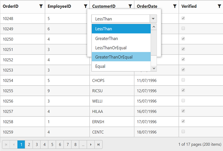
Numeric Filter
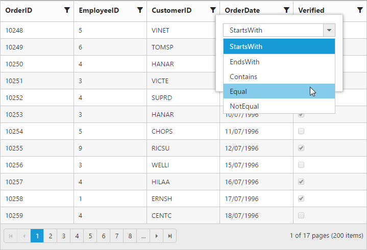
String Filter
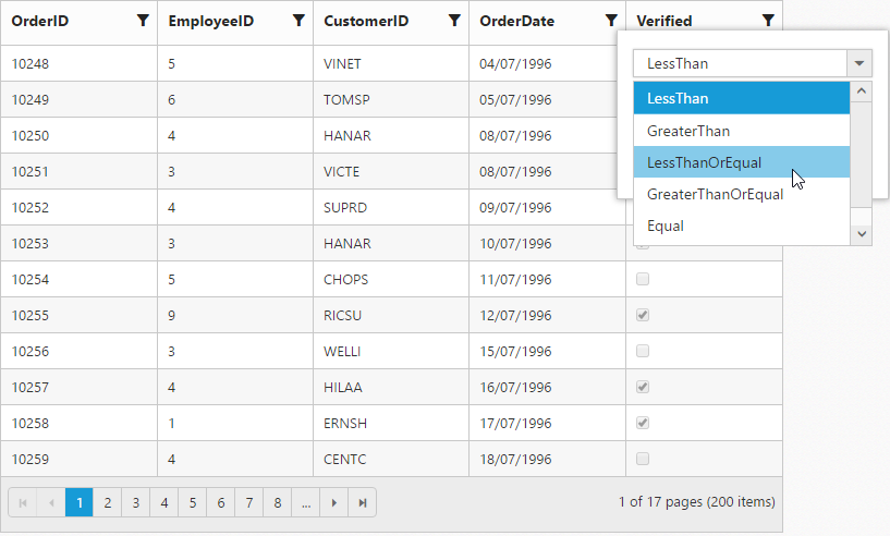
Date Filter
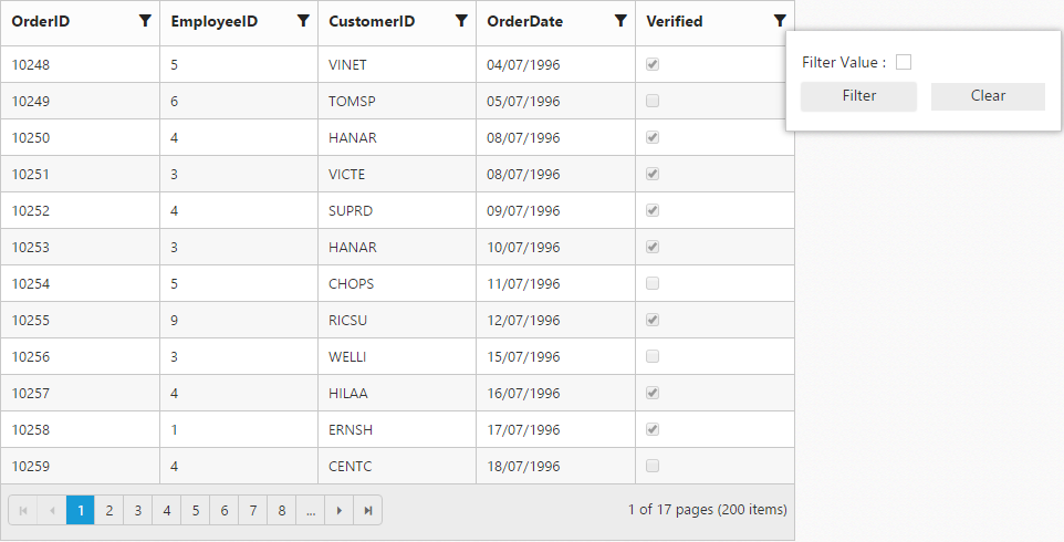
Boolean Filter
Excel-like filter
You can enable excel menu by setting filterSettings.filterType as excel. The excel menu contains an option such as Sorting, Clear filter, submenu for advanced filtering.
The following code example describes the above behavior.
<ej-grid id="Grid" [dataSource]="gridData" [allowPaging]="true" [allowFiltering]="true" [filterSettings]="filterType" >
    <e-columns>
        <e-column field="OrderID"  headerText="OrderID" ></e-column>
        <e-column field="EmployeeID" headerText="EmployeeID"></e-column>
        <e-column field="CustomerID" headerText="CustomerID"></e-column>
        <e-column field="ShipCountry" headerText="ShipCountry"></e-column>
        <e-column field="Freight" headerText="Freight"></e-column>
    </e-columns>
</ej-grid>import {Component, ViewEncapsulation} from '@angular/core';
@Component({
selector: 'ej-app',
templateUrl: 'app/app.component.html', //give the path file for Grid control html file.
})
export class AppComponent {
public gridData;
public filterType;
constructor()
{
//The datasource "window.gridData" is referred from 'http://js.syncfusion.com/demos/web/scripts/jsondata.min.js'
this.gridData = window.gridData;
this.filterType={filterType:"excel"};
}
}The following output is displayed as a result of the above code example.
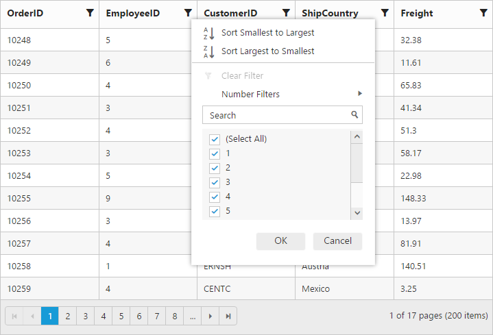
Checkbox list generation:
By default, the checkbox list is generated from distinct values of the filter column from dataSource which gives an option to search and select the required items.
Also on checkbox list generation, if the number of distinct values are greater than 1000, then the excel filter will display only first 1000 values to ensure the best performance on rendering and searching. However this limit has been customized according to your requirement by setting filterSettings.maxFilterChoices property with required limit in integer.
NOTE
- Using excel filter events you can change the dataSource of the checkbox list.
ej.Queryof checkbox list can also be changed using excel filter events.
The following code example describes the above behavior.
<ej-grid id="Grid" [dataSource]="gridData" [allowPaging]="true" [allowFiltering]="true" [filterSettings]="filterType" >
    <e-columns>
        <e-column field="OrderID"  headerText="OrderID"></e-column>
        <e-column field="EmployeeID" headerText="EmployeeID"></e-column>
        <e-column field="CustomerID" headerText="CustomerID"></e-column>
        <e-column field="ShipCountry" headerText="ShipCountry"></e-column>
        <e-column field="Freight" headerText="Freight"></e-column>
    </e-columns>
</ej-grid>import {Component, ViewEncapsulation} from '@angular/core';
@Component({
selector: 'ej-app',
templateUrl: 'app/app.component.html', //give the path file for Grid control html file.
})
export class AppComponent {
public gridData;
public filterType;
constructor()
{
//The datasource "window.gridData" is referred from 'http://js.syncfusion.com/demos/web/scripts/jsondata.min.js'
this.gridData = window.gridData;
this.filterType={filterType:"excel",maxFilterChoices:"4"};
}
}The following output is displayed as a result of the above code example.
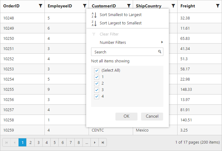
Add current selection to filter checkbox:
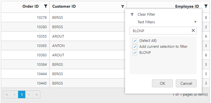
When filtering is done multiple times on the same column then the previously filtered values on the column will be cleared. So, to retain the old values Add current selection to filter checkbox can be used which is displayed when data is searched in the search bar.
The following image describes the above mentioned behavior.
Case Sensitivity
To perform filter operation with case sensitive in excel styled filter menu mode by setting enableCaseSensitivity as true.
The following code example describes the above behavior.
<ej-grid id="Grid" [dataSource]="gridData" [allowPaging]="true" [allowFiltering]="true" [filterSettings]="filterType" >
    <e-columns>
        <e-column field="OrderID"  headerText="OrderID"></e-column>
        <e-column field="EmployeeID" headerText="EmployeeID"></e-column>
        <e-column field="CustomerID" headerText="CustomerID"></e-column>
        <e-column field="ShipCountry" headerText="ShipCountry"></e-column>
        <e-column field="Freight" headerText="Freight"></e-column>
    </e-columns>
</ej-grid>import {Component, ViewEncapsulation} from '@angular/core';
@Component({
selector: 'ej-app',
templateUrl: 'app/app.component.html', //give the path file for Grid control html file.
})
export class AppComponent {
public gridData
public filterType;
constructor()
{
//The datasource "window.gridData" is referred from 'http://js.syncfusion.com/demos/web/scripts/jsondata.min.js'
this.gridData = window.gridData;
this.filterType={filterType:"excel",enableCaseSensitivity : true};
}
}The following output is displayed as a result of the above code example.
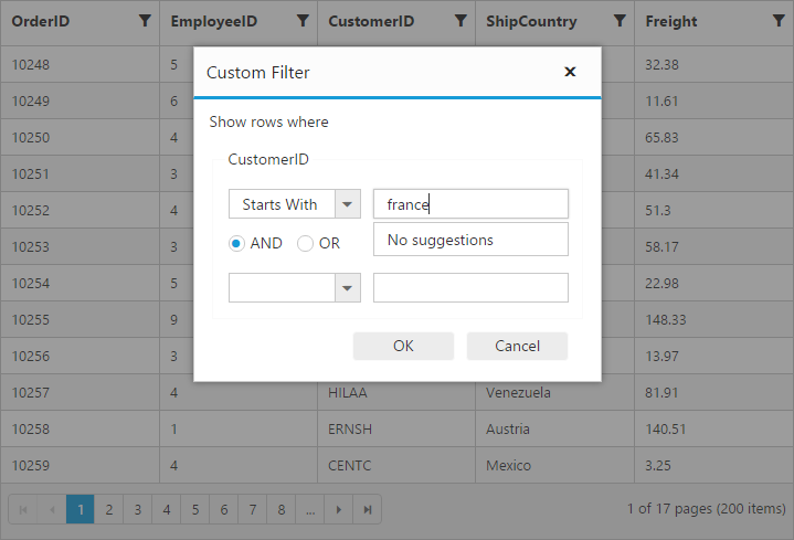
Filter bar
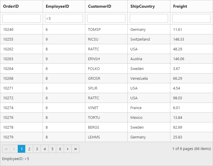
Filter bar row is located next to column header of grid. You can filter the records with different expressions depending upon the column type. To show the filter bar row, set the filterType as filterbar.
List of Filter bar Expressions:
You can enter the below filter expressions manually in the filter bar.
| Expression | Example | Description | Column Type |
|---|---|---|---|
| = | = value | Equal | Numeric |
| != | != value | Not equal | |
| > | > value | Greater than | |
| < | < value | Less than | |
| >= | >= value | Greater than or equal | >|
| <= | <= value | Less than or equal | |
| N/A | N/A | Always `startswith` operator will be used for string filter | String |
| N/A | N/A | Always `equal` operator will be used for Date filter | Date |
| N/A | N/A | Always `equal` operator will be used for Boolean filter | Boolean |
The following code example describes the above behavior.
<ej-grid id="Grid" [dataSource]="gridData" [allowPaging]="true" [allowFiltering]="true" [filterSettings]="filterType" >
    <e-columns>
        <e-column field="OrderID"  headerText="OrderID"></e-column>
        <e-column field="EmployeeID" headerText="EmployeeID"></e-column>
        <e-column field="CustomerID" headerText="CustomerID"></e-column>
        <e-column field="ShipCountry" headerText="ShipCountry"></e-column>
        <e-column field="Freight" headerText="Freight"></e-column>
    </e-columns>
</ej-grid>import {Component, ViewEncapsulation} from '@angular/core';
@Component({
selector: 'ej-app',
templateUrl: 'app/app.component.html', //give the path file for Grid control html file.
})
export class AppComponent {
public gridData;
public filterType;
constructor()
{
//The datasource "window.gridData" is referred from 'http://js.syncfusion.com/demos/web/scripts/jsondata.min.js'
this.gridData = window.gridData;
this.filterType={filterType:"filterbar"};
}
}The following output is displayed as a result of the above code example.
Filter bar modes:
This specifies the grid to start the filter action while typing in the filter bar or after pressing the enter key based on filterBarMode.There are two types of filterBarMode, they are
- OnEnter
- Immediate
NOTE
For
filterBarModeproperty you can assign eitherstringvalue (onenter) orenumvalue (ej.Grid.FilterBarMode.OnEnter).
Filter bar message:
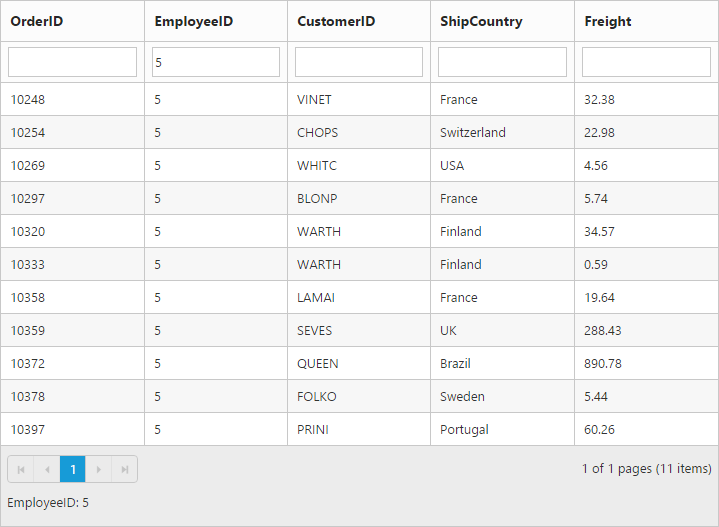
The filter bar message is supported only for the filterType as “filterbar”. The filtered data with column name is displayed in the grid pager itself. By default showFilterBarMessage is true.
The following code example describes the above behavior.
<ej-grid id="Grid" [dataSource]="gridData" [allowPaging]="true" [allowFiltering]="true" [filterSettings]="filterType" >
    <e-columns>
        <e-column field="OrderID"  headerText="OrderID"></e-column>
        <e-column field="EmployeeID" headerText="EmployeeID"></e-column>
        <e-column field="CustomerID" headerText="CustomerID"></e-column>
        <e-column field="ShipCountry" headerText="ShipCountry"></e-column>
        <e-column field="Freight" headerText="Freight"></e-column>
    </e-columns>
</ej-grid>import {Component, ViewEncapsulation} from '@angular/core';
@Component({
selector: 'ej-app',
templateUrl: 'app/app.component.html', //give the path file for Grid control html file.
})
export class AppComponent {
public gridData;
public filterType;
constructor()
{
//The datasource "window.gridData" is referred from 'http://js.syncfusion.com/demos/web/scripts/jsondata.min.js'
this.gridData = window.gridData;
this.filterType={ showFilterBarStatus: true };
}
}The following output is displayed as a result of the above code example.
Filter Operators
The grid controls uses filter operators from ej.DataManager, which are used at the time of filtering.
List of Column type and Filter operators
| Column Type | Filter Operators |
|---|---|
| Number | ej.FilterOperators.greaterThan |
| ej.FilterOperators.greaterThanOrEqual | |
| ej.FilterOperators.lessThan | |
| ej.FilterOperators.lessThanOrEqual | |
| ej.FilterOperators.equal | |
| ej.FilterOperators.notEqual | |
| String | ej.FilterOperators.startsWith |
| ej.FilterOperators.endsWith | |
| ej.FilterOperators.contains | |
| ej.FilterOperators.equal | |
| ej.FilterOperators.notEqual | |
| Boolean | ej.FilterOperators.equal |
| ej.FilterOperators.notEqual | |
| Date | ej.FilterOperators.greaterThan |
| ej.FilterOperators.greaterThanOrEqual | |
| ej.FilterOperators.lessThan | |
| ej.FilterOperators.lessThanOrEqual | |
| ej.FilterOperators.equal | |
| ej.FilterOperators.notEqual |
FilterBar Template
Usually enabling allowFiltering, will create default textbox in Grid Filter Bar. So, Using filterBarTemplate property of columns we can render any other controls like AutoComplete, DropDownList etc in filterbar to filter the grid data for the particular column.
It has three functions. They are
-
create- It is used to create the control at time of initialize. -
read- It is used to read the Filter value selected. -
write- It is used to render the control and assign the value selected for filtering.
The following code example describes the above behavior.
<ej-grid id="Grid" [dataSource]="gridData" [allowPaging]="true" [allowFiltering]="true" >
    <e-columns>
        <e-column field="Order ID" headerText="OrderID" width="75"></e-column>
        <e-column field="CustomerID" headerText="CustomerID" [filterBarTemplate]="CustomerIDFilterBarTemp" width="100"></e-column>
        <e-column field="EmployeeID" headerText="EmployeeID"  width="100"></e-column>
        <e-column field="Freight" headerText="Freight" [filterBarTemplate]="FreightFilterBarTemp" width="100" ></e-column>
        <e-column field="ShipCountry" headerText="Ship Country" width="100"></e-column>
        <e-column field="Verified" headerText="Verified" [filterBarTemplate]="VerifiedFilterBarTemp" width="90"></e-column>
    </e-columns>
</ej-grid>import {Component, ViewEncapsulation} from '@angular/core';
@Component({
selector: 'ej-app',
templateUrl: 'app/app.component.html', //give the path file for Grid control html file.
})
export class AppComponent {
public gridData;
public CustomerIDFilterBarTemp;
public FreightFilterBarTemp;
public VerifiedFilterBarTemp;
constructor()
{
//The datasource "window.gridData" is referred from 'http://js.syncfusion.com/demos/web/scripts/jsondata.min.js'
this.gridData = window.gridData;
this.FreightFilterBarTemp = {
write: function (args) {
args.element.ejNumericTextbox({ width: "100%",decimalPlaces: 2, focusOut: ej.proxy(args.column.filterBarTemplate.read, this, args) });
},
read: function (args) {
this.filterColumn(args.column.field, "equal", args.element.val(), "and", true)
}
};
this.CustomerIDFilterBarTemp = {
create: function (args) {
return "<input>"
},
write: function (args) {
var data = new ej.DataManager(this.gridData).executeLocal(new ej.Query().select("CustomerID"));
args.element.ejAutocomplete({ width: "100%", dataSource: data, enableDistinct: true, focusOut: ej.proxy(args.column.filterBarTemplate.read, this, args) });
},
read: function (args) {
this.filterColumn(args.column.field, "equal", args.element.val(), "and", true)
}
};
this.VerifiedFilterBarTemp = {
write: function (args) {
args.element.ejCheckBox({ change: ej.proxy(args.column.filterBarTemplate.read, this, args) });
},
read: function (args) {
this.filterColumn(args.column.field, "equal", args.element.parent().attr('aria-checked'), "and", true)
}
};
}
}The following output is displayed as a result of the above code example.

After Filtering