How can I help you?
Columns
Column definitions are used as the dataSource schema in Grid and it plays vital role in rendering column values in required format. Grid operations such as sorting, filtering, editing would be performed based on the column definitions. The field property of the e-column is necessary to map the datasource values in Grid columns.
NOTE
- If the column with
fieldis not in the datasource, then the column values will be displayed as empty.- If the
fieldname contains “dot” operator then it is considered as complex binding.
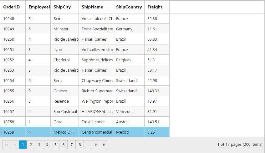
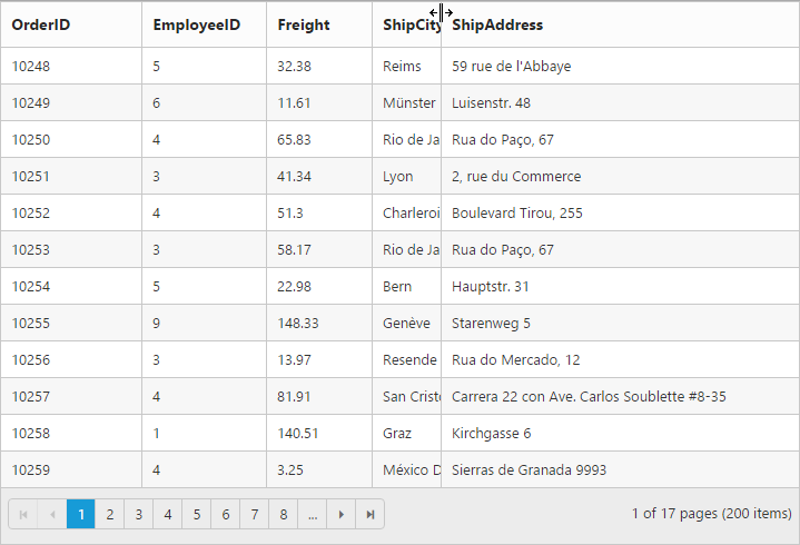
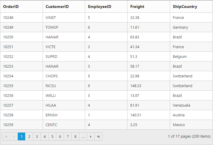
Auto generation
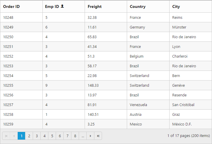
The columns are automatically generated when columns declaration is empty or undefined while initializing the Grid. Also, all the columns which are in dataSource are bound as a Grid columns.
The following code example shows auto-generate columns behavior.
<ej-grid id="Grid" [dataSource]="gridData" [allowPaging]="true">
</ej-grid>import {Component, ViewEncapsulation} from '@angular/core';
@Component({
selector: 'ej-app',
templateUrl: 'app/app.component.html', //give the path file for Grid control html file.
})
export class AppComponent {
public gridData;
constructor()
{
//The datasource "(window as any).gridData" is referred from 'http://js.syncfusion.com/demos/web/scripts/jsondata.min.js'
this.gridData = (window as any).gridData;
}
}The following output is displayed as a result of the above code example.
Headers
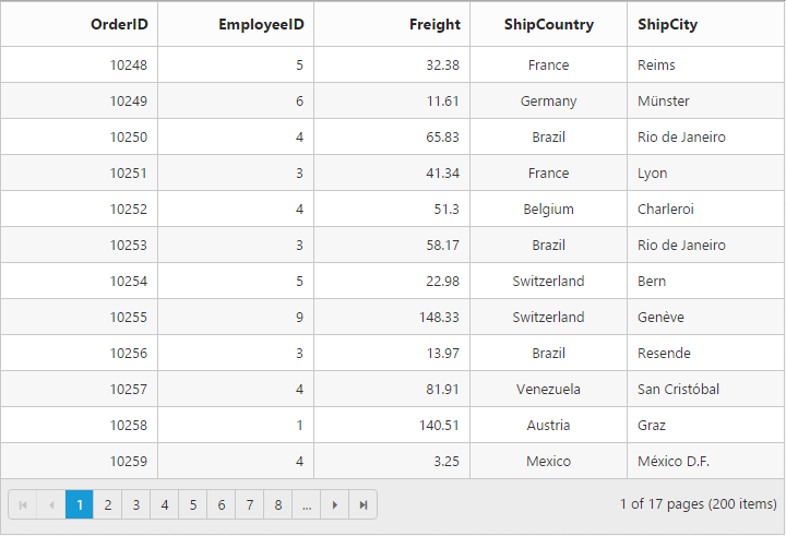
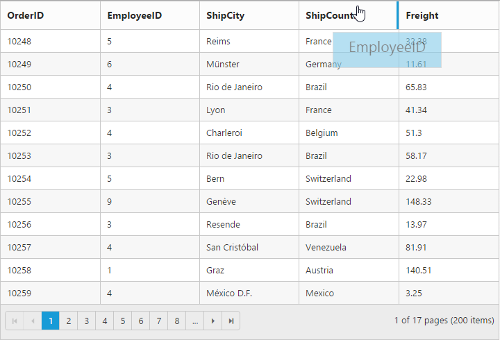
HeaderText
It represents the title for particular column. To enable header text, set headerText property of columns. The following code example describes the above behavior.
NOTE
If
headerTextis not defined then thefieldname is considered as header text for that particular column. If bothfieldname andheaderTextare not defined then the column is rendered with “empty” header text.
The following code example describes the above behavior.
<ej-grid id="Grid" [dataSource]="gridData" >
    <e-columns>
       <e-column field="OrderID"  headerText="OrderID"></e-column>
       <e-column field="EmployeeID" headerText="Emp ID"></e-column>
       <e-column field="Freight"  headerText="Freight"></e-column>
       <e-column field="ShipCountry" headerText="Country"></e-column>
       <e-column field="ShipCity"  headerText="City"></e-column>
    </e-columns>
</ej-grid>import {Component, ViewEncapsulation} from '@angular/core';
@Component({
selector: 'ej-app',
templateUrl: 'app/app.component.html', //give the path file for Grid control html file.
})
export class AppComponent {
public gridData;
constructor()
{
//The datasource "(window as any).gridData" is referred from 'http://js.syncfusion.com/demos/web/scripts/jsondata.min.js'
this.gridData = (window as any).gridData;
}
}The following output is displayed as a result of the above code example.
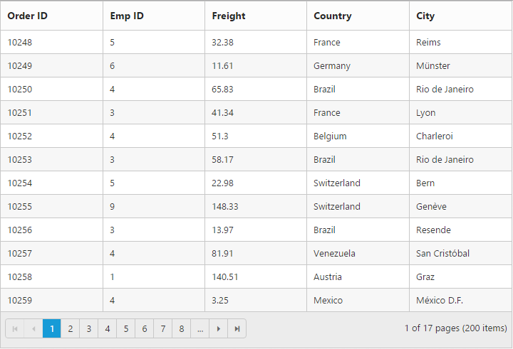
Header Text alignment
Align the header text of column header using headerTextAlign property of columns. There are four possible ways to align header text, they are
- Right
- Left
- Center
- Justify
NOTE
For
headerTextAlignproperty you can assign eitherstringvalue (“right”) orenumvalue (ej.TextAlign.Right).
The following code example describes the above behavior.
<ej-grid id="Grid" [dataSource]="gridData">
    <e-columns>
       <e-column field="OrderID"  headerText="OrderID"></e-column>
       <e-column field="EmployeeID" headerText="Emp ID" headerTextAlign="right"></e-column>
       <e-column field="Freight"  headerText="Freight"></e-column>
       <e-column field="ShipCountry" headerText="Country" headerTextAlign="center"></e-column>
       <e-column field="ShipCity"  headerText="City" headerTextAlign="right"></e-column>
    </e-columns>
</ej-grid>import {Component, ViewEncapsulation} from '@angular/core';
@Component({
selector: 'ej-app',
templateUrl: 'app/app.component.html', //give the path file for Grid control html file.
})
export class AppComponent {
public gridData;
public right;
constructor()
{
//The datasource "(window as any).gridData" is referred from 'http://js.syncfusion.com/demos/web/scripts/jsondata.min.js'
this.gridData = (window as any).gridData;
this.right = ej.TextAlign.Right;
}
}The following output is displayed as a result of the above code example.
Header Template
The template design that applies on for the column header. To render template, set headerTemplateID property of the columns.
NOTE
It’s a standard way to enclose the
templatewithin thescripttag withtypeastext/x-jsrender.
The following code example describes the above behavior.
<div id="customerTemplate">
<span class="e-userlogin e-icon headericon"></span>
 CUS ID
</div>
<ej-grid id="Grid" [dataSource]="gridData" >
    <e-columns>
       <e-column field="OrderID"  headerText="OrderID"></e-column>
       <e-column field="EmployeeID" headerText="Emp ID" headerTemplateID= "#customerTemplate"></e-column>
       <e-column field="Freight"  headerText="Freight"></e-column>
       <e-column field="ShipCountry" headerText="Country"></e-column>
       <e-column field="ShipCity"  headerText="City"></e-column>
    </e-columns>
</ej-grid>import {Component, ViewEncapsulation} from '@angular/core';
@Component({
selector: 'ej-app',
templateUrl: 'app/app.component.html', //give the path file for Grid control html file.
})
export class AppComponent {
public gridData;
constructor()
{
//The datasource "(window as any).gridData" is referred from 'http://js.syncfusion.com/demos/web/scripts/jsondata.min.js'
this.gridData = (window as any).gridData;
}
}The following output is displayed as a result of the above code example.
Text alignment
You can align both content and header text of particular column using textAlign property of columns. There are four possible ways to align content and header text of column, they are
- Right
- Left
- Center
- Justify
NOTE
The following code example describes the above behavior.
<ej-grid id="Grid" [dataSource]="gridData" >
    <e-columns>
       <e-column field="OrderID" textAlign="right"></e-column>
       <e-column field="EmployeeID" textAlign="right"></e-column>
       <e-column field="Freight" textAlign="right"></e-column>
       <e-column field="ShipCountry" textAlign="center"></e-column>
       <e-column field="ShipCity" textAlign="justify"></e-column>
    </e-columns>
</ej-grid>import {Component, ViewEncapsulation} from '@angular/core';
@Component({
selector: 'ej-app',
templateUrl: 'app/app.component.html', //give the path file for Grid control html file.
})
export class AppComponent {
public gridData;
constructor()
{
//The datasource "(window as any).gridData" is referred from 'http://js.syncfusion.com/demos/web/scripts/jsondata.min.js'
this.gridData = (window as any).gridData;
this.right=ej.TextAlign.Right;
}
}The following output is displayed as a result of the above code example.
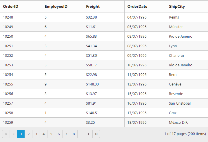
Format
Format is the process of customizing the particular column data with specified jQuery recognized globalize formats, such as currency, numeric, decimal, percentage or dates. The globalize format can be specified by using format property of columns.
The format value should be wrapped within “{0:” and “}”. (For ex: “{0:C3}”). The data format strings are available for the Date and Number types.
The following code example describes the above behavior.
<ej-grid id="Grid" [dataSource]="gridData">
    <e-columns>
       <e-column field="OrderID"></e-column>
       <e-column field="EmployeeID"></e-column>
       <e-column field="Freight" format="{0:C2}"></e-column>
       <e-column field="OrderDate" format="{0:dd/MM/yyyy}"></e-column>
       <e-column field="ShipCity"></e-column>
    </e-columns>
</ej-grid>import {Component, ViewEncapsulation} from '@angular/core';
@Component({
selector: 'ej-app',
templateUrl: 'app/app.component.html', //give the path file for Grid control html file.
})
export class AppComponent {
public gridData;
constructor()
{
//The datasource "(window as any).gridData" is referred from 'http://js.syncfusion.com/demos/web/scripts/jsondata.min.js'
this.gridData = (window as any).gridData;
}
}The following output is displayed as a result of the above code example.
Width
You can specify the width for particular column by setting width property of columns as in pixel (ex: 100) or in percentage (ex: 40%).
The following code example describes the above behavior.
<ej-grid id="Grid" [dataSource]="gridData" >
    <e-columns>
        <e-column field="OrderID" width="110"></e-column>
        <e-column field="EmployeeID" width="110"></e-column>
        <e-column field="Freight" width="100"></e-column>
        <e-column field="ShipCountry" width="150"></e-column>
        <e-column field="ShipCity" width="100"></e-column>
    </e-columns>
</ej-grid>import {Component, ViewEncapsulation} from '@angular/core';
@Component({
selector: 'ej-app',
templateUrl: 'app/app.component.html', //give the path file for Grid control html file.
})
export class AppComponent {
public gridData;
constructor()
{
//The datasource "(window as any).gridData" is referred from 'http://js.syncfusion.com/demos/web/scripts/jsondata.min.js'
this.gridData = (window as any).gridData;
}
}The following output is displayed as a result of the above code example.
Resizing
The allowResizing property enables the grid to set the width to columns based on resizing the grid column manually.
Resizing modes
resizeSettings.resizeMode mode is used to change the resizing modes. It indicates whether to define mode of resizing.
| Name | Description |
|---|---|
| normal | New column size will be adjusted by all other Columns |
| nextColumn | New column Size will be adjusted using next column. |
| control | New column Size will be adjusted using entire control |
The following code example describes the above behavior.
<ej-grid id= "Grid"[dataSource] = "gridData"[allowResizing] = "true" [resizeSettings] = "resizeSettings">
    <e-columns>
        <e-column field="OrderID" width="100"></e-column>
        <e-column field="EmployeeID"></e-column>
        <e-column field="Freight" width="75"></e-column>
        <e-column field="ShipCountry" width="50"></e-column>
        <e-column field="ShipCity"></e-column>
    </e-columns>
</ej-grid>import { Component, ViewEncapsulation } from '@angular/core';
@Component({
selector: 'ej-app',
templateUrl: 'app/app.component.html', //give the path file for Grid control html file.
})
export class AppComponent {
public gridData;
public resizeSettings;
constructor()
{
//The datasource "window.gridData" is referred from 'http://js.syncfusion.com/demos/web/scripts/jsondata.min.js'
this.gridData = window.gridData;
this.resizeSettings = { allowResizing: true, resizeMode:"nextcolumn"};
}
}Resize to fit
The allowResizeToFit property enable the Grid to set width to columns based on maximum width of the particular column’s content to facilitate full visibility of data in all the grid rows. This automatic behavior is applicable only for the columns which does not have width specified.
On columns where “width is defined”, double click on the particular column header’s resizer symbol to resize the column to show the whole text. For example, refer the “ShipCity” column in the below code snippet and output screen shot.
The following code example describes the above behavior.
<ej-grid id="Grid" [dataSource]="gridData" [allowResizeToFit]="true">
    <e-columns>
        <e-column field="OrderID" width="100"></e-column>
        <e-column field="EmployeeID"></e-column>
        <e-column field="Freight" width="75"></e-column>
        <e-column field="ShipCountry" width="50"></e-column>
        <e-column field="ShipCity"></e-column>
    </e-columns>
</ej-grid>import {Component, ViewEncapsulation} from '@angular/core';
@Component({
selector: 'ej-app',
templateUrl: 'app/app.component.html', //give the path file for Grid control html file.
})
export class AppComponent {
public gridData;
constructor()
{
//The datasource "(window as any).gridData" is referred from 'http://js.syncfusion.com/demos/web/scripts/jsondata.min.js'
this.gridData = (window as any).gridData;
}
}The following output is displayed as a result of the above code example.
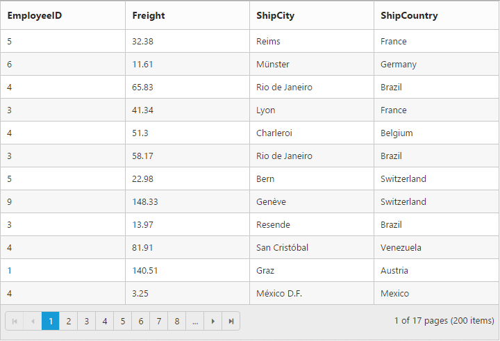
Reorder
Reordering can be done by drag and drop on the particular column header from one index to another index within the Grid. Reordering can be enabled by setting allowReordering property as true.
The following code example describes the above behavior.
<ej-grid id="Grid" [dataSource]="gridData" [allowReordering]="true">
    <e-columns>
        <e-column field="OrderID"></e-column>
        <e-column field="EmployeeID"></e-column>
        <e-column field="ShipCountry"></e-column>
        <e-column field="ShipCity"></e-column>
        <e-column field="Freight"></e-column>
    </e-columns>
</ej-grid>import {Component, ViewEncapsulation} from '@angular/core';
@Component({
selector: 'ej-app',
templateUrl: 'app/app.component.html', //give the path file for Grid control html file.
})
export class AppComponent {
public gridData;
constructor()
{
//The datasource "(window as any).gridData" is referred from 'http://js.syncfusion.com/demos/web/scripts/jsondata.min.js'
this.gridData = (window as any).gridData;
}
}The following output is displayed as a result of the above code example.
Visibility
You can hide particular column in Grid view by setting visible property of it as false.
The following code example describes the above behavior.
<ej-grid id="Grid" [dataSource]="gridData" >
    <e-columns>
        <e-column field="EmployeeID"></e-column>
        <e-column field="OrderID" [visible]="false"></e-column>
        <e-column field="Freight"></e-column>
        <e-column field="ShipCountry"></e-column>
        <e-column field="ShipCity"></e-column>
    </e-columns>
</ej-grid>import {Component, ViewEncapsulation} from '@angular/core';
@Component({
selector: 'ej-app',
templateUrl: 'app/app.component.html', //give the path file for Grid control html file.
})
export class AppComponent {
public gridData;
constructor()
{
//The datasource "(window as any).gridData" is referred from 'http://js.syncfusion.com/demos/web/scripts/jsondata.min.js'
this.gridData = (window as any).gridData;
}
}The following output is displayed as a result of the above code example.
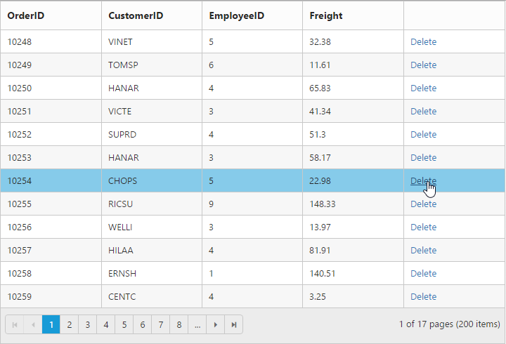
Unbound Column
You can define the unbound columns in Grid by not defining field property for that particular column. Value for these columns can be populated either manually using queryCellInfo event or by using column template or by column format property.
NOTE
Editing, grouping, filtering, sorting, summary and searching support are not available for unbound columns.
The following code example describes the above behavior.
<ej-grid id="Grid" [dataSource]="gridData" [allowPaging]="true" [editSettings]="editSettings" >
    <e-columns>
        <e-column field= "OrderID" [isPrimaryKey]="true"></e-column>
        <e-column field= "CustomerID"></e-column>
        <e-column field= "EmployeeID"></e-column>
        <e-column field= "Freight"></e-column>
        <e-column headerText="">
            <ng-template e-template let-data>
                <a (click)="Click($event)" href=#>Delete</a>
            </ng-template>
        </e-column>
    </e-columns>
</ej-grid>import {Component, ViewEncapsulation} from '@angular/core';
@Component({
selector: 'ej-app',
templateUrl: 'app/app.component.html', //give the path file for Grid control html file.
})
export class AppComponent {
public gridData;
public editSettings;
constructor()
{
//The datasource "(window as any).gridData" is referred from 'http://js.syncfusion.com/demos/web/scripts/jsondata.min.js'
this.gridData = (window as any).gridData;
this.editSettings = {allowDeleting: true};
}
Click(){
this.Grid.widget.deleteRecord("OrderID", this.Grid.widget.getSelectedRecords()[0]);
}
}The following output is displayed as a result of the above code example.
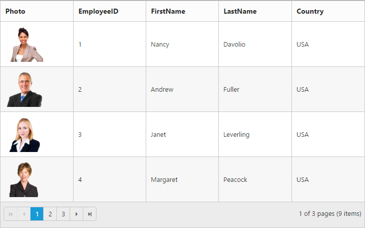
Column Template
HTML templates can be specified in the template property of the particular column as a string (HTML element) or ID of the template’s HTML element.
NOTE
If
fieldis not specified, you will not able to perform editing, grouping, filtering, sorting, search and summary functionalities in particular column.
The following code example describes the above behavior.
<ej-grid id="Grid" [dataSource]="gridData" [allowPaging]="true" [pageSettings]="pageSettings">
    <e-columns>
        <e-column headerText="Photo">
             <ng-template e-template let-data>
                <div *ngIf="data.EmployeeID">
                <img style="width: 75px; height: 70px" [attr.src]="'app/Content/images/grid/Employees/' + data.EmployeeID + '.png' " [alt]="data.EmployeeID" />
                </div>
            </ng-template>
         </e-column>
        <e-column field="EmployeeID" headerText="EmployeeID"></e-column>
        <e-column field="FirstName" headerText="FirstName"></e-column>
        <e-column field="LastName" headerText="LastName"></e-column>
        <e-column field="Country" headerText="Country"></e-column>
    </e-columns>
</ej-grid>import {Component, ViewEncapsulation} from '@angular/core';
@Component({
selector: 'ej-app',
templateUrl: 'app/app.component.html', //give the path file for Grid control html file.
})
export class AppComponent {
public gridData;
public pageSettings;
constructor()
{
//The datasource "window.employeeView" is referred from 'http://js.syncfusion.com/demos/web/scripts/jsondata.min.js'
this.gridData = window.employeeView;
this.pageSettings = { pageSize:"4" };
}
}The following output is displayed as a result of the above code example.
Controlling Grid actions
You can control the Grid actions of a particular column by setting allowSorting, allowGrouping, allowFiltering, allowResizing and allowEditing properties.
The following code example describes the above behavior.
<ej-grid #Grid [dataSource]="gridData" [allowPaging]="true" [allowFiltering]="true" [allowGrouping]="true" [allowSorting]="true" [allowResizing]="true" [editSettings]="editSettings" >
    <e-columns>
        <e-column field= "OrderID"></e-column>
        <e-column field= "EmployeeID" [allowFiltering]=false [allowGrouping]=false [allowSorting]=false [allowResizing]=false [allowEditing]="false"></e-column>
        <e-column field= "Freight"></e-column>
        <e-column field= "ShipCountry"></e-column>
        <e-column field= "ShipCity"></e-column>
    </e-columns>
</ej-grid>import {Component, ViewEncapsulation} from '@angular/core';
@Component({
selector: 'ej-app',
templateUrl: 'app/app.component.html', //give the path file for Grid control html file.
})
export class AppComponent {
public gridData;
public editSettings;
constructor()
{
//The datasource "(window as any).gridData" is referred from 'http://js.syncfusion.com/demos/web/scripts/jsondata.min.js'
this.gridData = (window as any).gridData;
this.editSettings = {allowEditing:true};
}
}Read only
To make a column as “read-only” then set allowEditing property of columns as false.
The following code example describes the above behavior.
<ej-grid id="Grid" [dataSource]="gridData" [editSettings]="editSettings">
    <e-columns>
        <e-column field="OrderID" [isPrimaryKey]="true"></e-column>
        <e-column field="EmployeeID" [allowEditing]="false"></e-column>
        <e-column field="Freight"></e-column>
        <e-column field="ShipCountry"></e-column>
        <e-column field="ShipCity"></e-column>
    </e-columns>
</ej-grid>import {Component, ViewEncapsulation} from '@angular/core';
@Component({
selector: 'ej-app',
templateUrl: 'app/app.component.html', //give the path file for Grid control html file.
})
export class AppComponent {
public gridData;
public editSettings;
constructor()
{
//The datasource "(window as any).gridData" is referred from 'http://js.syncfusion.com/demos/web/scripts/jsondata.min.js'
this.gridData = (window as any).gridData;
this.editSettings={allowEditing:true};
}
}The following output is displayed as a result of the above code example.
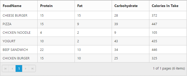
Expression Column
Expression column is possible only for template column.
You can use JsRender syntax in the template.For more information about JsRender syntax, please refer the link.
NOTE
This expression column is supported at read only mode.
The following code example describes the above behavior.
<ej-grid id="Grid" [dataSource]="gridData" [allowPaging]="true">
    <e-columns>
        <e-column field="FoodName" ></e-column>
        <e-column field="Protein" ></e-column>
        <e-column field="Fat" ></e-column>
        <e-column field="Carbohydrate" ></e-column>
        <e-column headerText="Calories In Take">
             <ng-template e-template let-data>
                <span></span>
            </ng-template>
        </e-column>
    </e-columns>
</ej-grid>import {Component, ViewEncapsulation} from '@angular/core';
@Component({
selector: 'ej-app',
templateUrl: 'app/app.component.html', //give the path file for Grid control html file.
})
export class AppComponent {
public gridData;
constructor()
{
//The datasource "window.FoodInformation" is referred from 'http://js.syncfusion.com/demos/web/scripts/jsondata.min.js'
this.gridData = window.FoodInformation;
}
}The following output is displayed as a result of the above code example.
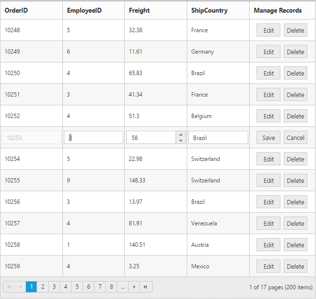
Command Column
Default action buttons
Using command column, you can add CRUD action buttons as one of the Grid column, through type property of commands. The type property supports the below default UnboundType buttons.
- edit
- save
- delete
- cancel
Through buttonOptions property of commands, you can specify all the button options which are supported by Essential Studio JavaScript Button control.
The following code example describes the above behavior.
<ej-grid id="Grid" [dataSource]="gridData" [editSettings]="editSettings">
    <e-columns>
        <e-column field="OrderID" [isPrimaryKey]="true"></e-column>
        <e-column field="EmployeeID"></e-column>
        <e-column field="Freight"></e-column>
        <e-column field="ShipCountry"></e-column>
        <e-column  headerText= "Manage Records" [commands]="buttons"></e-column>
    </e-columns>
</ej-grid>import {Component, ViewEncapsulation} from '@angular/core';
@Component({
selector: 'ej-app',
templateUrl: 'app/app.component.html', //give the path file for Grid control html file.
})
export class AppComponent {
public gridData;
constructor()
{
//The datasource "(window as any).gridData" is referred from 'http://js.syncfusion.com/demos/web/scripts/jsondata.min.js'
this.gridData = (window as any).gridData;
this.editSettings={allowEditing:true,allowAdding:true,allowDeleting:true};
this.buttons=[ { type: "edit", buttonOptions: { text: "Edit" } },
{ type: "delete", buttonOptions: { text: "Delete" } },
{ type: "save", buttonOptions: { text: "Save" } },
{ type: "cancel", buttonOptions: { text: "Cancel" } }
];
}
}The following output is displayed as a result of the above code example.
Custom buttons
You can add custom button in the command column by specifying the type property of commands as “empty” or any other string which does not corresponds to default UnboundType buttons.
NOTE
- For
typeproperty you can assign eitherstringvalue (“edit”) orenumvalue (ej.Grid.UnboundType.Edit).- In command column you can add only buttons.
The following code example describes the above behavior.
<ej-grid id="Grid" [dataSource]="gridData" [editSettings]="editSettings">
    <e-columns>
        <e-column field= "EmployeeID"></e-column>
        <e-column  headerText= "Employee Details" [commands]="buttons"></e-column>
    </e-columns>
</ej-grid>import {Component, ViewEncapsulation} from '@angular/core';
@Component({
selector: 'ej-app',
templateUrl: 'app/app.component.html', //give the path file for Grid control html file.
})
export class AppComponent {
public gridData;
public editSettings;
public buttons;
constructor()
{
//The datasource "(window as any).gridData" is referred from 'http://js.syncfusion.com/demos/web/scripts/jsondata.min.js'
this.gridData = (window as any).gridData;
this.editSettings={allowEditing:true };
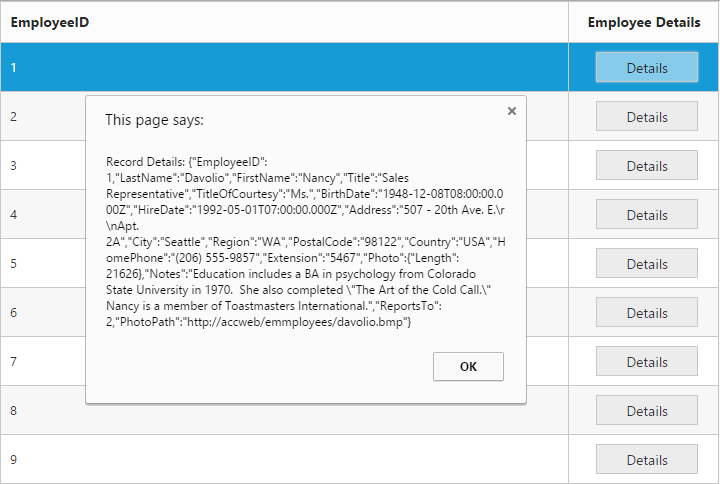
this.buttons=[{ type: "details", buttonOptions: { text: "Edit",
click: function(){
var grid = $("#Grid").ejGrid("instance");
var index = this.element.closest("tr").index();
var record = grid.getCurrentViewData()[index];
alert("Record Details: " + JSON.stringify(record));
}
}
}];
}
}The following output is displayed as a result of the above code example.
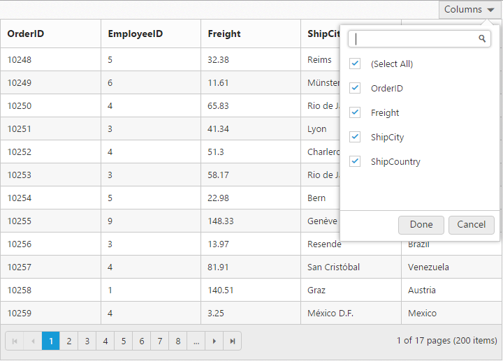
Column Chooser
Column chooser contains the list of all the columns which are defined in the columns property. Using this you can control the visibility of columns in Grid. You can prevent to show the particular column name in column chooser by setting showInColumnChooser property of columns as false.
Column Chooser would be shown in the top right corner of Grid. To enable column chooser, set showColumnChooser property as true.
The following code example describes the above behavior.
<ej-grid id="Grid" [dataSource]="gridData" [showColumnChooser]="true">
    <e-columns>
        <e-column field="OrderID"></e-column>
        <e-column field="EmployeeID" [showInColumnChooser]="false"></e-column>
        <e-column field="Freight"></e-column>
        <e-column field="ShipCountry"></e-column>
        <e-column field="ShipCity"></e-column>
    </e-columns>
</ej-grid>import {Component, ViewEncapsulation} from '@angular/core';
@Component({
selector: 'ej-app',
templateUrl: 'app/app.component.html', //give the path file for Grid control html file.
})
export class AppComponent {
public gridData;
constructor()
{
//The datasource "(window as any).gridData" is referred from 'http://js.syncfusion.com/demos/web/scripts/jsondata.min.js'
this.gridData = (window as any).gridData;
}
}The following output is displayed as a result of the above code example.
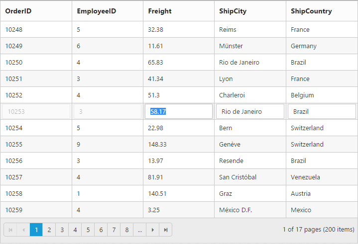
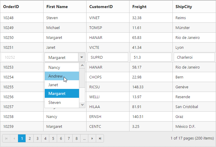
Foreign Key Column
Lookup data source can be bound to dataSource property of columns. Data field and text can be set using foreignKeyField and foreignKeyValue property of columns.
In the dataSource property, we can bound local and remote data.
IMPORTANT
For foreign key column the sorting and grouping is based on
foreignKeyFieldinstead offoreignKeyValue.
NOTE
In remote data, server should be configured to perform select and filter operations since the Grid will try to fetch required columns using select operation and required data using filter operation.
NOTE
To render a Hierarchy Grid with different
foreignKeyFieldin parent and child table, clickhere.
The following code example describes the above behavior.
<ej-grid id="Grid" [dataSource]="gridData" [editSettings]="editSettings">
    <e-columns>
        <e-column field="OrderID" [isPrimaryKey]="true"></e-column>
        <e-column field="EmployeeID" foreignKeyField= "EmployeeID" foreignKeyValue= "FirstName" [dataSource]= "employeedata" headerText= "FirstName" ></e-column>
        <e-column field="CustomerID"></e-column>
        <e-column field="Freight"></e-column>
        <e-column field="ShipCity"></e-column>
    </e-columns>
</ej-grid>import {Component, ViewEncapsulation} from '@angular/core';
@Component({
selector: 'ej-app',
templateUrl: 'app/app.component.html', //give the path file for Grid control html file.
})
export class AppComponent {
public gridData;
constructor()
{
//The datasource "(window as any).gridData" and "window.employeeView" is referred from 'http://js.syncfusion.com/demos/web/scripts/jsondata.min.js'
this.gridData = (window as any).gridData;
this.employee = (window as any).employeeView;
this.editSettings={allowAdding:true, allowEditing:true, allowDeleting:true, };
}
}The following output is displayed as a result of the above code example.
Customize column
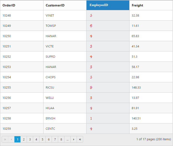
You can customize the header and content of the particular column by cssClass property of the column.
The following code example describes the above behavior.
<ej-grid id="Grid" [dataSource]="gridData">
    <e-columns>
        <e-column field= "OrderID"></e-column>
        <e-column field= "CustomerID"></e-column>
        <e-column field= "EmployeeID" cssClass="customCSS"></e-column>
        <e-column field= "Freight"></e-column>
    </e-columns>
</ej-grid>import {Component, ViewEncapsulation} from '@angular/core';
@Component({
selector: 'ej-app',
templateUrl: 'app/app.component.html', //give the path file for Grid control html file.
encapsulation: ViewEncapsulation.None,
styles:[`.customCSS.e-headercell {
background-color: #2382c3;
color: white;
font-family: 'Bell MT';
font-size: 20px;
}
.customCSS.e-rowcell {
background-color: #ecedee;
font-family: 'Bell MT';
color: red;
font-size: 20px;
}`]
})
export class AppComponent {
public gridData;
constructor()
{
//The datasource "(window as any).gridData" is referred from 'http://js.syncfusion.com/demos/web/scripts/jsondata.min.js'
this.gridData = (window as any).gridData;
}
}The following output is displayed as a result of the above code example.
Type
Used to define the type of the particular column data. If the type property of columns is not specified then its type is automatically defined based on the first row data of that column.
NOTE
The
typeis needed for filtering feature when first row of the data is “null” or “empty”.
The available column data type is tabulated as follows.
| Type | Description |
|---|---|
| string | Gets or sets the type of the column value as string |
| number | Gets or sets the type of the column value as number |
| date | Gets or sets the type of the column value as date |
| datetime | Gets or sets the type of the column value as datetime |
| boolean | Gets or sets the type of the column value as true or false |
| guid | Gets or sets the type of the column value as guid |
| checkbox | Gets or sets the type of the column value as checkbox for row selection |
The following code example describes the above behavior.
<ej-grid id="Grid" [dataSource]="gridData" >
    <e-columns>
        <e-column field="OrderID"></e-column>
        <e-column field="CustomerID" type="string"></e-column>
        <e-column field="EmployeeID" type="number"></e-column>
        <e-column field="Freight"></e-column>
        <e-column field="ShipCountry"></e-column>
    </e-columns>
</ej-grid>import {Component, ViewEncapsulation} from '@angular/core';
@Component({
selector: 'ej-app',
templateUrl: 'app/app.component.html', //give the path file for Grid control html file.
})
export class AppComponent {
public gridData;
constructor()
{
//The datasource "(window as any).gridData" is referred from 'http://js.syncfusion.com/demos/web/scripts/jsondata.min.js'
this.gridData = (window as any).gridData;
}
}The following output is displayed as a result of the above code example.
Column Layout
You can set the Grid’s columns layout based on either Grid width or its columns width using columnLayout property of Grid. There are two ways to set the column layout, they are
- Auto
- Fixed
NOTE
- For
columnLayoutproperty you can assign eitherstringvalue (“fixed”) orenumvalue (ej.Grid.ColumnLayout.Fixed).- Default
columnLayoutisautowhich is set the columns layout based on the Grid’s width.
The following code example describes the above behavior.
<ej-grid id="Grid" [dataSource]="gridData" [columnLayout]="fixed">
    <e-columns>
        <e-column field="OrderID" width= "80"></e-column>
        <e-column field="EmployeeID" width= "80"></e-column>
        <e-column field="ShipCity" width= "90"></e-column>
        <e-column field="ShipName" width= "110"></e-column>
        <e-column field="ShipCountry" width= "100"></e-column>
        <e-column field="Freight" width= "80"></e-column>
    </e-columns>
</ej-grid>import {Component, ViewEncapsulation} from '@angular/core';
@Component({
selector: 'ej-app',
templateUrl: 'app/app.component.html', //give the path file for Grid control html file.
})
export class AppComponent {
public gridData;
constructor()
{
//The datasource "(window as any).gridData" is referred from 'http://js.syncfusion.com/demos/web/scripts/jsondata.min.js'
this.gridData = (window as any).gridData;
this.fixed = ej.Grid.ColumnLayout.Fixed;
}
}The following output is displayed as a result of the above code example.