How can I help you?
Editing in Essential Angular Grid
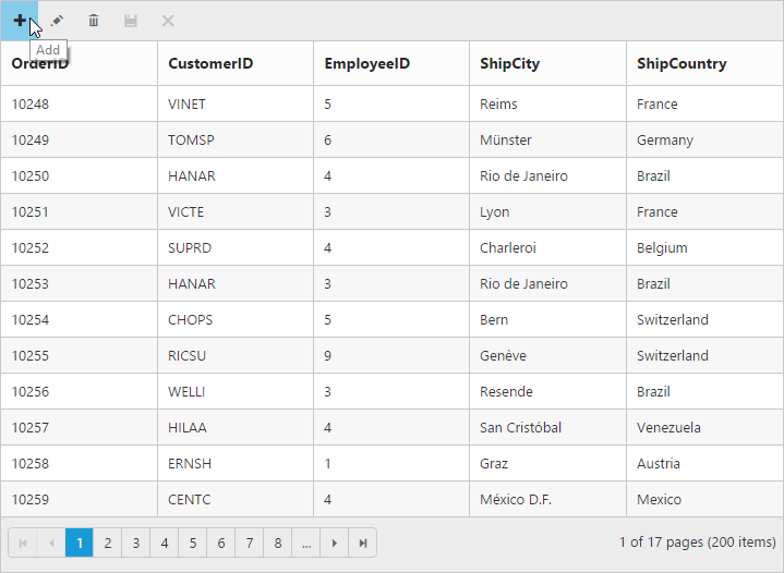
The grid control has support for dynamic insertion, updating and deletion of records. You can start the edit action either by double clicking the particular row or by selecting the required row and clicking on Edit icon in toolbar. Similarly, you can add new record to grid either by clicking on insert icon in toolbar or on an external button which is bound to call addRecord method of grid. Save and Cancel while on edit mode is possible using respective toolbar icon in grid.
Deletion of the record is possible by selecting the required row and clicking on Delete icon in toolbar.
The primary key for the data source should be defined in columns definition, for editing to work properly. In columns definition, particular primary column’s isPrimaryKey property should be set to true. Refer the Knowledge base link for more information.
NOTE
- In grid, the primary key column will be automatically set to read only while editing the row, but you can specify primary key column value while adding a new record.
- The column which is specified as
isIdentitywill be in readonly mode both while editing and adding a record. Also, auto incremented value is assigned to thatisIdentitycolumn.
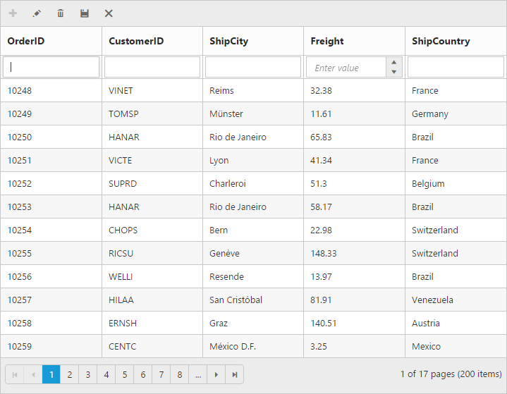
Toolbar with edit option
Using toolbar which is rendered at the top of the grid header, you can show all the CRUD related action. To enable toolbar and toolbar items, set showToolbar property as true and toolbarItems. The default toolbar items are Add, Edit, Delete, Update and Cancel.
NOTE
For
toolbarItemsproperty you can assign eitherstringvalue (“add”) orenumvalue (ej.Grid.ToolBarItems.Add).
<ej-grid id="Grid" [dataSource]="gridData" allowPaging="true" [toolbarSettings]="toolbarItems" [editSettings]="editSettings" >
    <e-columns>
        <e-column field="OrderID" [isPrimaryKey]="true" headerText="OrderID"></e-column>
        <e-column field="CustomerID" headerText="CustomerID"></e-column>
        <e-column field="EmployeeID" headerText="EmployeeID"></e-column>
        <e-column field="ShipCity" headerText="ShipCity"></e-column>
        <e-column field="ShipCountry" headerText="ShipCountry"></e-column>
    </e-columns>
</ej-grid>import {Component, ViewEncapsulation} from '@angular/core';
@Component({
selector: 'ej-app',
templateUrl: 'app/app.component.html', //give the path file for Grid control html file.
})
export class AppComponent {
public gridData;
public editSettings;
public toolbarItems;
constructor()
{
//The datasource "window.gridData" is referred from 'http://js.syncfusion.com/demos/web/scripts/jsondata.min.js'
this.gridData = window.gridData;
this.editSettings = { allowEditing: true, allowAdding: true, allowDeleting: true};
this.toolbarItems = { showToolbar : true, toolbarItems : ["add", "edit", "delete", "update", "cancel"]};
}
}The following output is displayed as a result of the above code example.
Cell edit type and its params
The edit type of bound column can be customized using editType property of columns. The following Essential JavaScript controls are supported built-in by editType. You can set the editType based on specific data type of the column.
-
CheckBoxcontrol for boolean data type. -
NumericTextBoxcontrol for integers, double, and decimal data types. -
InputTextBoxcontrol for string data type. -
DatePickercontrol for date data type. -
DateTimePickercontrol for date-time data type. -
DropDownListcontrol for list of data type.
And also you can define the model for all the editTypes controls while editing through editParams property of columns.
The following table describes editType and their corresponding editParams of the specific data type of the column.
| EditType | EditParams | Example |
|---|---|---|
| CheckBox |
[ejCheckBox] |
editParams: { checked: true } |
| NumericTextBox |
[ejTextBoxes] |
editParams: { decimalPlaces: 2, value:5 } |
| InputTextBox | - | - |
| DatePicker |
[ejDatePicker] |
editParams: { buttonText : "Now" } |
| DateTimePicker |
[ejDateTimePicker] |
editParams: { enabled: true } |
| DropDownList |
[ejDropDownList] |
editParams: { allowGrouping: true } |
NOTE
The following code example describes the above behavior.
<ej-grid id="Grid" [dataSource]="gridData" allowPaging="true" [toolbarSettings]="toolbarItems" [editSettings]="editSettings" >
    <e-columns>
        <e-column field="OrderID" [isPrimaryKey]="true"  headerText="OrderID"></e-column>
        <e-column field="CustomerID" headerText="CustomerID"></e-column>
	    <e-column field="Freight" headerText="Freight" editType="numericedit" [editParams]="{ decimalPlaces: 2}"></e-column>
        <e-column field="ShipCountry" headerText="ShipCountry" editType="dropdownedit" [editParams] ="{enableAnimation: true}"></e-column>
        <e-column field="ShipCity" headerText="ShipCity"></e-column>
		<e-column field="OrderDate" headerText="OrderDate" editType="datepicker" format="{0:dd/MM/yyyy}"></e-column>
        <e-column field="Verified" headerText="Verified" editType="booleanedit" [editParams] ="{showRoundedCorner: true}"></e-column>
    </e-columns>
</ej-grid>import {Component, ViewEncapsulation} from '@angular/core';
@Component({
selector: 'ej-app',
templateUrl: 'app/app.component.html', //give the path file for Grid control html file.
})
export class AppComponent {
public gridData;
public editSettings;
public toolbarItems;
constructor()
{
//The datasource "window.gridData" is referred from 'http://js.syncfusion.com/demos/web/scripts/jsondata.min.js'
this.gridData = window.gridData;
this.editSettings = { allowEditing: true, allowAdding: true, allowDeleting: true};
this.toolbarItems={ showToolbar : true, toolbarItems : ["add", "edit", "delete", "update", "cancel"]};
}
}The following output is displayed as a result of the above code example.
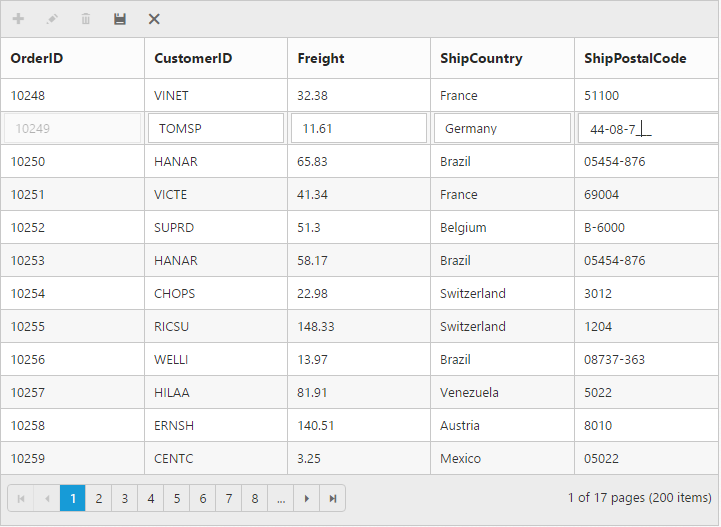
Cell Edit Template
On editing the column values, custom editor can be created by using editTemplate property of columns. It has three functions, they are
-
create- It is used to create the control at time of initialize. -
read- It is used to read the input value at time of save. -
write- It is used to assign the value to control at time of editing.
The following code example describes the above behavior.
<ej-grid id="Grid" [dataSource]="gridData" allowPaging="true" [toolbarSettings]="toolbarItems" [editSettings]="editSettings" >
    <e-columns>
        <e-column field="OrderID" [isPrimaryKey]="true" headerText="OrderID"></e-column>
        <e-column field="CustomerID" headerText="CustomerID"></e-column>
	    <e-column field="Freight" headerText="Freight" editType="numericedit"></e-column>
        <e-column field="ShipCity" headerText="ShipCity" editType="dropdownedit" ></e-column>
        <e-column field="ShipPostalCode" headerText="ShipPostalCode" [editTemplate]="editTemp"></e-column>
	</e-columns>
</ej-grid>import {Component, ViewEncapsulation} from '@angular/core';
@Component({
selector: 'ej-app',
templateUrl: 'app/app.component.html', //give the path file for Grid control html file.
providers:[NorthwindService]
})
export class AppComponent {
public gridData;
public editTemp;
public editSettings;
public toolbarItems;
constructor()
{
//The datasource "window.gridData" is referred from 'http://js.syncfusion.com/demos/web/scripts/jsondata.min.js'
this.gridData = window.gridData;
this.editTemp = {
create : function () {
return "<input>";
},
read : function (args) {
return args.ejMaskEdit("get_UnstrippedValue");
},
write : function (args) {
args.element.ejMaskEdit({
maskFormat : "99-99-9999",
value : args.rowdata["ShipPostalCode"]
});
}
}
this.editSettings = { allowEditing: true, allowAdding: true, allowDeleting: true};
this.toolbarItems={ showToolbar : true, toolbarItems : ["add", "edit", "delete", "update", "cancel"]};
}
}The following output is displayed as a result of the above code example.
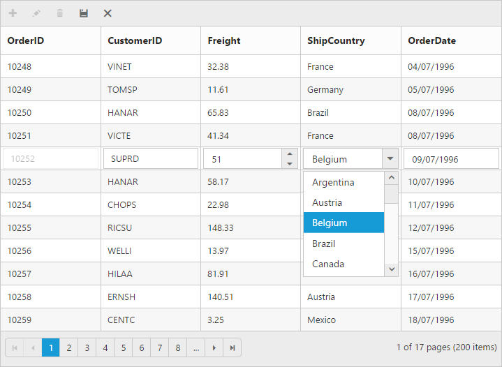
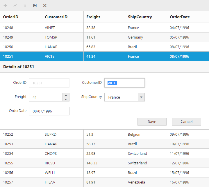
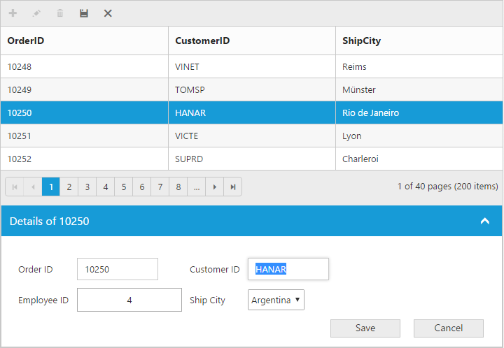
Edit Modes
Inline
Set editMode as normal, then the row itself is changed as edited row.
NOTE
For
editModeproperty you can assign eitherstringvalue (“normal”) orenumvalue (ej.Grid.EditMode.Normal).
The following code example describes the above behavior.
<ej-grid id="Grid" [dataSource]="gridData" allowPaging="true" [toolbarSettings]="toolbarItems" [editSettings]="editSettings" >
    <e-columns>
        <e-column field="OrderID" [isPrimaryKey]="true" headerText="OrderID"></e-column>
        <e-column field="CustomerID" headerText="CustomerID"></e-column>
	    <e-column field="Freight" headerText="Freight" editType="numericedit"></e-column>
        <e-column field="ShipCountry" headerText="ShipCountry" editType="dropdownedit"></e-column>
		<e-column field="OrderDate" headerText="OrderDate" editType="datepicker" format="{0:dd/MM/yyyy}"></e-column>
     </e-columns>
</ej-grid>import {Component, ViewEncapsulation} from '@angular/core';
@Component({
selector: 'ej-app',
templateUrl: 'app/app.component.html', //give the path file for Grid control html file.
})
export class AppComponent {
public gridData;
public editSettings;
public toolbarItems;
constructor()
{
//The datasource "window.gridData" is referred from 'http://js.syncfusion.com/demos/web/scripts/jsondata.min.js'
this.gridData = window.gridData;
this.editSettings = { allowEditing: true, allowAdding: true, allowDeleting: true,editMode : "normal" };
this.toolbarItems={ showToolbar : true, toolbarItems : ["add", "edit", "delete", "update", "cancel"]};
}
}The following output is displayed as a result of the above code example.
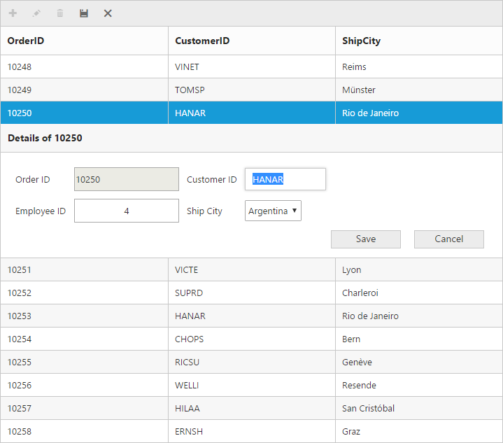
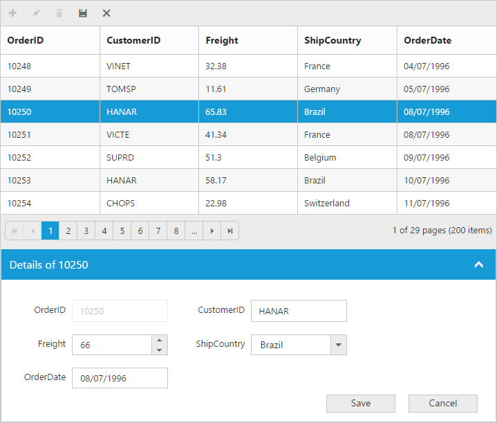
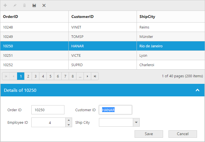
Inline Form
Set editMode as inlineform, then edit form will be inserted next to the row which is to be edited.
The following code example describes the above behavior.
<ej-grid id="Grid" [dataSource]="gridData" allowPaging="true" [toolbarSettings]="toolbarItems" [editSettings]="editSettings" >
    <e-columns>
        <e-column field="OrderID" [isPrimaryKey]="true" headerText="OrderID"></e-column>
        <e-column field="CustomerID" headerText="CustomerID"></e-column>
	    <e-column field="Freight" headerText="Freight" editType="numericedit"></e-column>
        <e-column field="ShipCountry" headerText="ShipCountry" editType="dropdownedit"></e-column>
		<e-column field="OrderDate" headerText="OrderDate" editType="datepicker" format="{0:dd/MM/yyyy}"></e-column>
     </e-columns>
</ej-grid>import {Component, ViewEncapsulation} from '@angular/core';
@Component({
selector: 'ej-app',
templateUrl: 'app/app.component.html', //give the path file for Grid control html file.
})
export class AppComponent {
public gridData;
public editSettings;
public toolbarItems;
constructor()
{
//The datasource "window.gridData" is referred from 'http://js.syncfusion.com/demos/web/scripts/jsondata.min.js'
this.gridData = window.gridData;
this.editSettings = { allowEditing: true, allowAdding: true, allowDeleting: true,editMode : "inlineform" };
this.toolbarItems={ showToolbar : true, toolbarItems : ["add", "edit", "delete", "update", "cancel"]};
}
}The following output is displayed as a result of the above code example.
The following output is displayed as a result of the above code example.
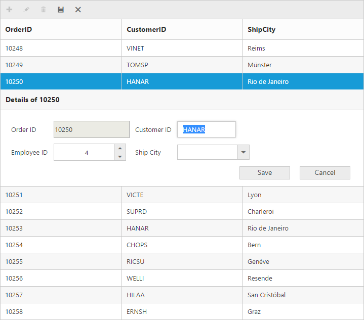
Inline Template Form
You can edit any of the fields pertaining to a single record of data and apply it to a template so that the same format is applied to all the other records that you may edit later.
Using this template support, you can edit the fields that are not bound to grid columns.
To edit the records using Inline template form, set editMode as inlineformtemplateand specify the template ID to inlineFormTemplateID of editSettings property.
While using template form, you can change the HTML elements to appropriate JS controls based on the column type. This can be achieved by using actionComplete event of grid.
NOTE
valueattribute is used to bind the corresponding field value while editing.nameattribute is used to get the changed field values while saving the edited record.- It’s a standard way to enclose the
templatewithin thescripttag withtypeas “text/ng-template”.- For
editModeproperty you can assign eitherstringvalue (“inlineformtemplate”) orenumvalue (ej.Grid.EditMode.InlineTemplateForm)
The following code example describes the above behavior.
Place the ng-template in the “index.html” page.
<script id="template" type="text/ng-template">
        <table cellspacing="10">
            <tr>
                <td>Order ID</td>
                <td>
                    <input id="OrderID" name="OrderID" disabled="disabled" ngModel="{{:OrderID}}" value="{{:OrderID}}"/>
                </td>
                <td>Customer ID</td>
                <td>
                    <input id="CustomerID" name="CustomerID" ngModel="{{:CustomerID}}" value="{{:CustomerID}}" class="e-field e-ejinputtext" style="width: 116px; height: 28px" />
                </td>
            </tr>
            <tr>
                <td>Employee ID</td>
                <td>
                    <input type="text" id="EmployeeID" name="EmployeeID" ngModel="{{:EmployeeID}}" value="{{:EmployeeID}}"/>
                </td>
                <td>Ship City</td>
                <td>
                    <select id="ShipCity" name="ShipCity">
                        <option value="Argentina">Argentina</option>
                        <option value="Austria">Austria</option>
                        <option value="Belgium">Belgium</option>
                        <option value="Brazil">Brazil</option>
                        <option value="Canada">Canada</option>
                        <option value="Denmark">Denmark</option>
                    </select>
                </td>
            </tr>
        </table>
</script><ej-grid id="Grid" [dataSource]="gridData" allowPaging="true" [toolbarSettings]="toolbarItems" [editSettings]="editSettings" (actionComplete)="onActionComplete($event)" >
<e-columns>
<e-column field="OrderID" [isPrimaryKey]="true" headerText="OrderID" ></e-column>
<e-column field="CustomerID" headerText="CustomerID"></e-column>
<e-column field="ShipCity" headerText="ShipCity" ></e-column>
</e-columns>
</ej-grid>import {Component, ViewEncapsulation} from '@angular/core';
@Component({
selector: 'ej-app',
templateUrl: 'app/app.component.html', //give the path file for Grid control html file.
})
export class AppComponent {
public gridData;
public editSettings;
public toolbarItems;
constructor()
{
//The datasource "window.gridData" is referred from 'http://js.syncfusion.com/demos/web/scripts/jsondata.min.js'
this.gridData = window.gridData;
this.editSettings = { allowEditing: true, allowAdding: true, allowDeleting: true, editMode: "inlineformtemplate", inlineFormTemplateID: "#template"};
this.toolbarItems={ showToolbar : true, toolbarItems : ["add", "edit", "delete", "update", "cancel"]};
onActionComplete(e: any){
$("#OrderDate").ejNumericTextbox();
$("#Freight").ejNumericTextbox();
$("#ShipCity").ejDropDownList();
}
}
}The following output is displayed as a result of the above code example.
Before the template elements are converted to JS controls
After the template elements are converted to JS controls using actionComplete event
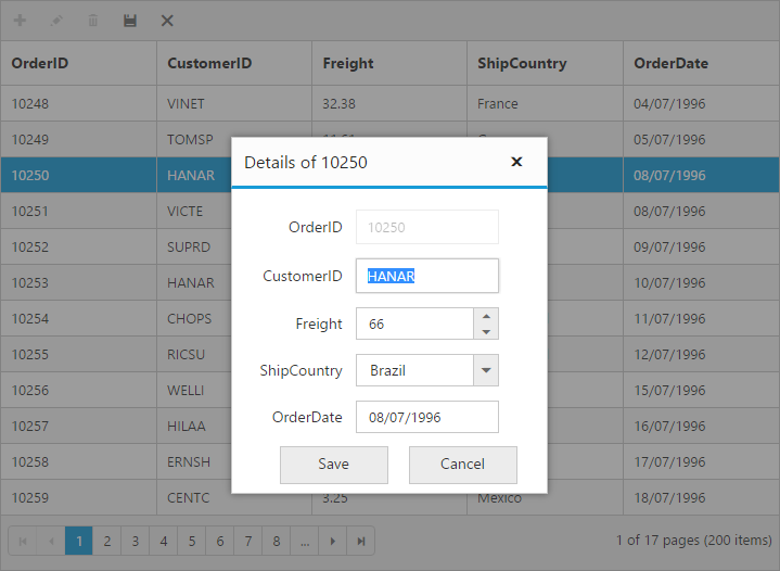
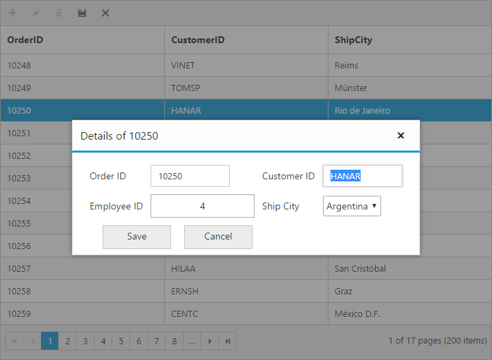
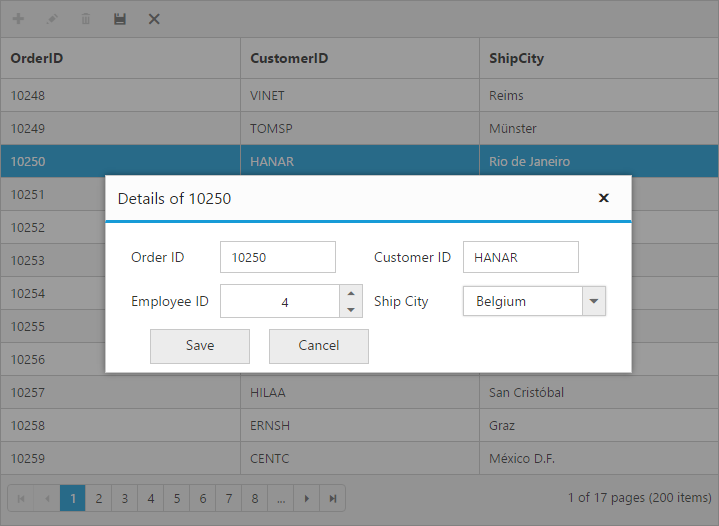
Dialog
Set editMode as dialog to edit data using a dialog box, which displays the fields associated with the data record being edited.
The following code example describes the above behavior.
<ej-grid id="Grid" [dataSource]="gridData" allowPaging="true" [toolbarSettings]="toolbarItems" [editSettings]="editSettings" >
    <e-columns>
        <e-column field="OrderID" [isPrimaryKey]="true" headerText="OrderID"></e-column>
        <e-column field="CustomerID" headerText="CustomerID"></e-column>
	    <e-column field="Freight" headerText="Freight" editType="numericedit"></e-column>
        <e-column field="ShipCountry" headerText="ShipCountry" editType="dropdownedit"></e-column>
		<e-column field="OrderDate" headerText="OrderDate" editType="datepicker" format="{0:dd/MM/yyyy}"></e-column>
     </e-columns>
</ej-grid>import {Component, ViewEncapsulation} from '@angular/core';
@Component({
selector: 'ej-app',
templateUrl: 'app/app.component.html', //give the path file for Grid control html file.
})
export class AppComponent {
public gridData;
public editSettings;
public toolbarItems;
constructor()
{
//The datasource "window.gridData" is referred from 'http://js.syncfusion.com/demos/web/scripts/jsondata.min.js'
this.gridData = window.gridData;
this.editSettings = { allowEditing: true, allowAdding: true, allowDeleting: true,editMode : "dialog" };
this.toolbarItems={ showToolbar : true, toolbarItems : ["add", "edit", "delete", "update", "cancel"]};
}
}The following output is displayed as a result of the above code example.
Dialog Template Form
You can edit any of the fields pertaining to a single record of data and apply it to a template so that the same format is applied to all the other records that you may edit later.
Using this template support, you can edit the fields that are not bound to grid columns.
To edit the records using Inline template form, set editMode as dialogtemplate and specify the template id to dialogEditorTemplateID property of editSettings.
While using template, you can change the elements that are defined in the template, to appropriate JS controls based on the column type. This can be achieved by using actionCompleteevent of grid.
NOTE
valueattribute is used to bind the corresponding field value while editing.nameattribute is used to get the changed field values while save the edited record.- For
editModeproperty you can assign eitherstringvalue (“dialogtemplate”) orenumvalue (ej.Grid.EditMode.DialogTemplate).
The following code example describes the above behavior.
Place the ng-template in the “index.html” page.
<script id="template" type="text/ng-template">
        <table cellspacing="10">
            <tr>
                <td>Order ID</td>
                <td>
                    <input id="OrderID" name="OrderID" disabled="disabled" ngModel="{{:OrderID}}" value="{{:OrderID}}"/>
                </td>
                <td>Customer ID</td>
                <td>
                    <input id="CustomerID" name="CustomerID" ngModel="{{:CustomerID}}" value="{{:CustomerID}}" class="e-field e-ejinputtext" style="width: 116px; height: 28px" />
                </td>
            </tr>
            <tr>
                <td>Employee ID</td>
                <td>
                    <input type="text" id="EmployeeID" name="EmployeeID" ngModel="{{:EmployeeID}}" value="{{:EmployeeID}}"/>
                </td>
                <td>Ship City</td>
                <td>
                    <select id="ShipCity" name="ShipCity">
                        <option value="Argentina">Argentina</option>
                        <option value="Austria">Austria</option>
                        <option value="Belgium">Belgium</option>
                        <option value="Brazil">Brazil</option>
                        <option value="Canada">Canada</option>
                        <option value="Denmark">Denmark</option>
                    </select>
                </td>
            </tr>
        </table>
</script><ej-grid id="Grid" [dataSource]="gridData" allowPaging="true" [toolbarSettings]="toolbarItems" [editSettings]="editSettings" (actionComplete)="onActionComplete($event)" >
<e-columns>
<e-column field="OrderID" [isPrimaryKey]="true" headerText="OrderID"></e-column>
<e-column field="CustomerID" headerText="CustomerID"></e-column>
<e-column field="ShipCity" headerText="ShipCity" ></e-column>
</e-columns>
</ej-grid>import {Component, ViewEncapsulation} from '@angular/core';
@Component({
selector: 'ej-app',
templateUrl: 'app/app.component.html', //give the path file for Grid control html file.
})
export class AppComponent {
public gridData;
public editSettings;
public toolbarItems;
constructor()
{
//The datasource "window.gridData" is referred from 'http://js.syncfusion.com/demos/web/scripts/jsondata.min.js'
this.gridData = window.gridData;
this.editSettings = { allowEditing: true, allowAdding: true, allowDeleting: true, editMode: "dialogtemplate", dialogEditorTemplateID : "#template"};
this.toolbarItems={ showToolbar : true, toolbarItems : ["add", "edit", "delete", "update", "cancel"]};
onActionComplete(e: any){
$("#OrderDate").ejNumericTextbox();
$("#Freight").ejNumericTextbox();
$("#ShipCity").ejDropDownList();
}
}
}The following output is displayed as a result of the above code example.
Before the template elements are converted to JS controls
After the template elements are converted to JS controls using actionComplete event
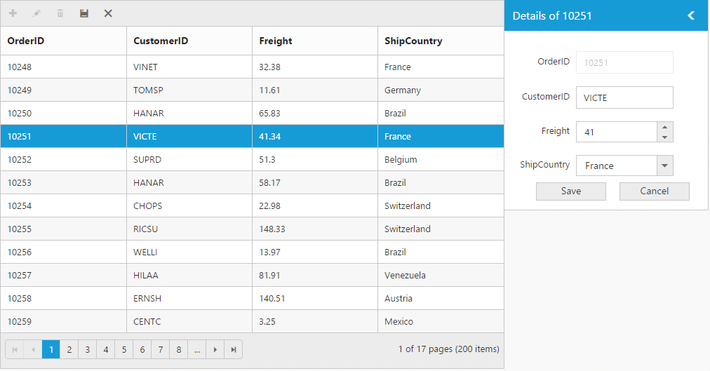
External Form
By setting the editMode as externalform, the edit form is opened outside the grid content.
The following code example describes the above behavior.
<ej-grid id="Grid" [dataSource]="gridData" allowPaging="true" [toolbarSettings]="toolbarItems" [editSettings]="editSettings" [pageSettings]="pageSize">
    <e-columns>
        <e-column field="OrderID" [isPrimaryKey]="true" headerText="OrderID"></e-column>
        <e-column field="CustomerID" headerText="CustomerID"></e-column>
	    <e-column field="Freight" headerText="Freight" editType="numericedit"></e-column>
        <e-column field="ShipCountry" headerText="ShipCountry" editType="dropdownedit"></e-column>
		<e-column field="OrderDate" headerText="OrderDate" editType="datepicker" format="{0:dd/MM/yyyy}"></e-column>
     </e-columns>
</ej-grid>import {Component, ViewEncapsulation} from '@angular/core';
@Component({
selector: 'ej-app',
templateUrl: 'app/app.component.html', //give the path file for Grid control html file.
})
export class AppComponent {
public gridData;
public pageSize;
public editSettings;
public toolbarItems;
constructor()
{
//The datasource "window.gridData" is referred from 'http://js.syncfusion.com/demos/web/scripts/jsondata.min.js'
this.gridData = window.gridData;
this.pageSize = { pageSize:"7"};
this.editSettings = { allowEditing: true, allowAdding: true, allowDeleting: true,editMode : "externalform" };
this.toolbarItems={ showToolbar : true, toolbarItems : ["add", "edit", "delete", "update", "cancel"]};
}
}The following output is displayed as a result of the above code example.
Form Position:
You can position an external edit form in the following two ways.
- Top-right
- Bottom left
This can be achieved by setting the formPosition property of editSettings as “topright” or “bottomleft”.
The following code example describes the above behavior.
<ej-grid id="Grid" [dataSource]="gridData" allowPaging="true" [toolbarSettings]="toolbarItems" [editSettings]="editSettings" [pageSettings]="pageSize">
    <e-columns>
        <e-column field="OrderID" [isPrimaryKey]="true" headerText="OrderID"></e-column>
        <e-column field="CustomerID" headerText="CustomerID"></e-column>
	    <e-column field="Freight" headerText="Freight" editType="numericedit"></e-column>
        <e-column field="ShipCountry" headerText="ShipCountry" editType="dropdownedit"></e-column>
   </e-columns>
</ej-grid>import {Component, ViewEncapsulation} from '@angular/core';
@Component({
selector: 'ej-app',
templateUrl: 'app/app.component.html', //give the path file for Grid control html file.
})
export class AppComponent {
public gridData;
public pageSize;
public editSettings;
public toolbarItems;
constructor()
{
//The datasource "window.gridData" is referred from 'http://js.syncfusion.com/demos/web/scripts/jsondata.min.js'
this.gridData = window.gridData;
this.pageSize = { pageSize:"7"};
this.editSettings = { allowEditing: true, allowAdding: true, allowDeleting: true,editMode : "externalform",formPosition : "topright" };
this.toolbarItems={ showToolbar : true, toolbarItems : ["add", "edit", "delete", "update", "cancel"]};
}
}The following output is displayed as a result of the above code example.
External Template Form
You can edit any of the fields pertaining to a single record of data and apply it to a template so that the same format is applied to all the other records that you may edit later.
Using this template support, you can edit the fields that are not bound to grid columns.
To edit the records using External template form, set editMode as externalformtemplate and specify the template id to externalFormTemplateID property of editSettings.
While using template, you can change the elements that are defined in the template, to appropriate JS controls based on the column type. This can be achieved by using actionComplete event of grid.
NOTE
valueattribute is used to bind the corresponding field value while editing.nameattribute is used to get the changed field values while save the edited record.- For
editModeproperty you can assign eitherstringvalue (“externalformtemplate”) orenumvalue (ej.Grid.EditMode.ExternalFormTemplate).
The following code example describes the above behavior.
Place the ng-template in the “index.html” page.
<script id="template" type="text/ng-template">
        <table cellspacing="10">
            <td>Order ID</td>
                <td>
                    <input id="OrderID" name="OrderID" disabled="disabled" ngModel="{{:OrderID}}" value="{{:OrderID}}"/>
                </td>
                <td>Customer ID</td>
                <td>
                    <input id="CustomerID" name="CustomerID" ngModel="{{:CustomerID}}" value="{{:CustomerID}}" class="e-field e-ejinputtext" style="width: 116px; height: 28px" />
                </td>
            </tr>
            <tr>
                <td>Employee ID</td>
                <td>
                    <input type="text" id="EmployeeID" name="EmployeeID" ngModel="{{:EmployeeID}}" value="{{:EmployeeID}}"/>
                </td>
                <td>Ship City</td>
                <td>
                    <select id="ShipCity" name="ShipCity">
                        <option value="Argentina">Argentina</option>
                        <option value="Austria">Austria</option>
                        <option value="Belgium">Belgium</option>
                        <option value="Brazil">Brazil</option>
                        <option value="Canada">Canada</option>
                        <option value="Denmark">Denmark</option>
                    </select>
                </td>
            </tr>
        </table>
</script><ej-grid id="Grid" [dataSource]="gridData" allowPaging="true" [toolbarSettings]="toolbarItems" [editSettings]="editSettings" (actionComplete)="onActionComplete($event)" [pageSettings]="pageSize">
<e-columns>
<e-column field="OrderID" [isPrimaryKey]="true" headerText="OrderID"></e-column>
<e-column field="CustomerID" headerText="CustomerID"></e-column>
<e-column field="ShipCity" headerText="ShipCity" ></e-column>
</e-columns>
</ej-grid>import {Component, ViewEncapsulation} from '@angular/core';
@Component({
selector: 'ej-app',
templateUrl: 'app/app.component.html', //give the path file for Grid control html file.
})
export class AppComponent {
public gridData;
public pageSize;
public editSettings;
public toolbarItems;
constructor()
{
//The datasource "window.gridData" is referred from 'http://js.syncfusion.com/demos/web/scripts/jsondata.min.js'
this.gridData = window.gridData;
this.editSettings = { allowEditing: true, allowAdding: true, allowDeleting: true, editMode: "externalformtemplate",externalFormTemplateID : "#template"};
this.toolbarItems={ showToolbar : true, toolbarItems : ["add", "edit", "delete", "update", "cancel"]};
this.pageSize = { pageSize:"5"};
onActionComplete(e: any){
$("#OrderDate").ejNumericTextbox();
$("#Freight").ejNumericTextbox();
$("#ShipCity").ejDropDownList();
}
}
}The following output is displayed as a result of the above code example.
Before the template elements are converted to JS controls
After the template elements are converted to JS controls using actionComplete event
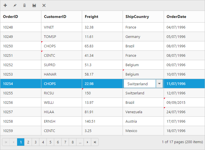
Batch / Excel-like
Users can start editing by clicking a cell and typing data into it. Edited cell will be marked while navigating to next cell or any other row, so that you know which fields or cells has been edited. Set editMode as batch to enable batch editing.
NOTE
getBatchChangesmethod of grid holds the unsaved record changes.
Refer the KB link for “How to suppress grid confirmation messages” in batch mode.
The following code example describes the above behavior.
<ej-grid id="Grid" [dataSource]="gridData" allowPaging="true" [toolbarSettings]="toolbarItems" [editSettings]="editSettings" >
    <e-columns>
        <e-column field="OrderID" [isPrimaryKey]="true" headerText="OrderID"></e-column>
        <e-column field="CustomerID" headerText="CustomerID"></e-column>
	    <e-column field="Freight" headerText="Freight" editType="numericedit"></e-column>
        <e-column field="ShipCountry" headerText="ShipCountry" editType="dropdownedit"></e-column>
		<e-column field="OrderDate" headerText="OrderDate" editType="datepicker" format="{0:dd/MM/yyyy}"></e-column>
     </e-columns>
</ej-grid>import {Component, ViewEncapsulation} from '@angular/core';
@Component({
selector: 'ej-app',
templateUrl: 'app/app.component.html', //give the path file for Grid control html file.
})
export class AppComponent {
public gridData;
public editSettings;
public toolbarItems;
constructor()
{
//The datasource "window.gridData" is referred from 'http://js.syncfusion.com/demos/web/scripts/jsondata.min.js'
this.gridData = window.gridData;
this.editSettings = { allowEditing: true, allowAdding: true, allowDeleting: true, editMode : "batch" };
this.toolbarItems={ showToolbar : true, toolbarItems : ["add", "edit", "delete", "update", "cancel"]};
}
}The following output is displayed as a result of the above code example.
Confirmation messages
To show the confirm dialog while saving or discarding the batch changes (discarding during the grid action like filtering, sorting and paging), set showConfirmDialog as true.
NOTE
showConfirmDialogproperty is only for batch editing mode.
The following code example describes the above behavior.
<ej-grid id="Grid" [dataSource]="gridData" allowPaging="true" [toolbarSettings]="toolbarItems" [editSettings]="editSettings" >
    <e-columns>
        <e-column field="OrderID" [isPrimaryKey]="true" headerText="OrderID"></e-column>
        <e-column field="CustomerID" headerText="CustomerID"></e-column>
	    <e-column field="Freight" headerText="Freight" editType="numericedit"></e-column>
        <e-column field="ShipCountry" headerText="ShipCountry" editType="dropdownedit"></e-column>
		<e-column field="OrderDate" headerText="OrderDate" editType="datepicker" format="{0:dd/MM/yyyy}"></e-column>
     </e-columns>
</ej-grid>import {Component, ViewEncapsulation} from '@angular/core';
@Component({
selector: 'ej-app',
templateUrl: 'app/app.component.html', //give the path file for Grid control html file.
})
export class AppComponent {
public gridData;
public editSettings;
public toolbarItems;
constructor()
{
//The datasource "window.gridData" is referred from 'http://js.syncfusion.com/demos/web/scripts/jsondata.min.js'
this.gridData = window.gridData;
this.editSettings = { allowEditing: true, allowAdding: true, allowDeleting: true,editMode : "batch",showConfirmDialog:true };
this.toolbarItems={ showToolbar : true, toolbarItems : ["add", "edit", "delete", "update", "cancel"]};
}
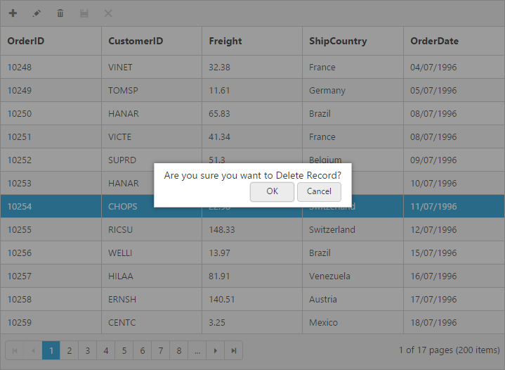
}To show delete confirm dialog while deleting a record, set showDeleteConfirmDialog as true.
NOTE
showDeleteConfirmDialogproperty is for all type ofeditMode.
The following code example describes the above behavior.
<ej-grid id="Grid" [dataSource]="gridData" allowPaging="true" [toolbarSettings]="toolbarItems" [editSettings]="editSettings" >
    <e-columns>
        <e-column field="OrderID" [isPrimaryKey]="true" headerText="OrderID"></e-column>
        <e-column field="CustomerID" headerText="CustomerID"></e-column>
	    <e-column field="Freight" headerText="Freight" editType="numericedit"></e-column>
        <e-column field="ShipCountry" headerText="ShipCountry" editType="dropdownedit"></e-column>
		<e-column field="OrderDate" headerText="OrderDate" editType="datepicker" format="{0:dd/MM/yyyy}"></e-column>
     </e-columns>
</ej-grid>import {Component, ViewEncapsulation} from '@angular/core';
@Component({
selector: 'ej-app',
templateUrl: 'app/app.component.html', //give the path file for Grid control html file.
})
export class AppComponent {
public gridData;
public editSettings;
public toolbarItems;
constructor()
{
//The datasource "window.gridData" is referred from 'http://js.syncfusion.com/demos/web/scripts/jsondata.min.js'
this.gridData = window.gridData;
this.editSettings = { allowEditing: true, allowAdding: true, allowDeleting: true,editMode : "batch", showDeleteConfirmDialog:true };
this.toolbarItems={ showToolbar : true, toolbarItems : ["add", "edit", "delete", "update", "cancel"]};
}
}The following output is displayed as a result of the above code example.
Column Validation
We can validate the value of the added or edited record cell before saving.
The below validation script files are needed when editing is enabled with validation.
- jquery.validate.min.js
- jquery.validate.unobtrusive.min.js
jQuery Validation
You can set validation rules using validationRules property of columns. The following are jQuery validation methods.
List of Jquery validation methods
| Rules | Description |
|---|---|
| required | Requires an element. |
| remote | Requests a resource to check the element for validity. |
| minlength | Requires the element to be of given minimum length. |
| maxlength | Requires the element to be of given maximum length. |
| range | Requires the element to be in given value range. |
| min | The element requires a given minimum. |
| max | The element requires a given maximum. |
| range | Requires the element to be in a given value range. |
| The element requires a valid email. | |
| url | The element requires a valid URL |
| date | Requires the element to be a date. |
| dateISO | The element requires an ISO date. |
| number | The element requires a decimal number. |
| digits | The element requires digits only. |
| creditcard | Requires the element to be a credit card number. |
| equalTo | Requires the element to be the same as another. |
Grid supports all the standard validation methods of jQuery, please refer the jQuery validation documentation link for more information.
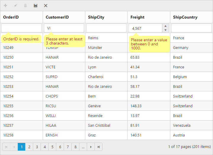
The following code example describes the above behavior.
<ej-grid id="Grid" [dataSource]="gridData" allowPaging="true" [toolbarSettings]="toolbarItems" [editSettings]="editSettings" >
    <e-columns>
        <e-column field="OrderID" [isPrimaryKey]="true" headerText="OrderID" [validationRules]= "{required: true, number: true }"></e-column>
        <e-column field="CustomerID" headerText="CustomerID" [validationRules]= "{ required: true, minlength: 3 }"></e-column>
        <e-column field="ShipCity" headerText="ShipCity"></e-column>
	    <e-column field="Freight" headerText="Freight" editType="numericedit" [validationRules]= "{ range: [0, 1000]  }" ></e-column>
        <e-column field="ShipCountry" headerText="ShipCountry" ></e-column>
   </e-columns>
</ej-grid>import {Component, ViewEncapsulation} from '@angular/core';
@Component({
selector: 'ej-app',
templateUrl: 'app/app.component.html', //give the path file for Grid control html file.
})
export class AppComponent {
public gridData;
public editSettings;
public toolbarItems;
constructor()
{
//The datasource "window.gridData" is referred from 'http://js.syncfusion.com/demos/web/scripts/jsondata.min.js'
this.gridData = window.gridData;
this.editSettings = { allowEditing: true, allowAdding: true, allowDeleting: true };
this.toolbarItems={ showToolbar : true, toolbarItems : ["add", "edit", "delete", "update", "cancel"]};
}
}The following output is displayed as a result of the above code example.
Persisting data in Server
Edited data can be persisted in database using RESTful web services.
All the CRUD operations in grid are done through DataManager. DataManager have an option to bind all the CRUD related data in server side. Please refer the ‘link’ to know about the DataManager.
For you information ODataAdaptor persist data in server as per OData protocol.
In the below section, we have explained how to get the edited data details at the server side using URLAdaptor.
URL Adaptor
You can use the UrlAdaptor of ejDataManger when binding datasource from remote data. At initial load of Grid, using URL property of DataManager, data are fetched from remote data and bound to Grid. You can map CRUD operation in Grid to Server-Side Controller action using the properties insertUrl, removeUrl, updateUrl, crudUrl and batchUrl.
The following code example describes the above behavior.
<ej-grid id="Grid" [dataSource]="gridData" allowPaging="true" [toolbarSettings]="toolbarItems" [editSettings]="editSettings" >
    <e-columns>
        <e-column field="OrderID" [isPrimaryKey]="true" headerText="OrderID"></e-column>
        <e-column field="CustomerID" headerText="CustomerID"></e-column>
        <e-column field="EmployeeID" headerText="EmployeeID"></e-column>
	    <e-column field="Freight" headerText="Freight" editType="numericedit" format="{0:C}" ></e-column>
        <e-column field="ShipName" headerText="ShipName"></e-column>
        <e-column field="ShipCountry" headerText="ShipCountry"></e-column>
    </e-columns>
</ej-grid>import {Component, ViewEncapsulation} from '@angular/core';
@Component({
selector: 'ej-app',
templateUrl: 'app/app.component.html', //give the path file for Grid control html file.
})
export class AppComponent {
public editSettings;
public toolbarItems;
constructor()
{
public gridData = ej.DataManager({
url : "Home/DataSource",
adaptor : "UrlAdaptor",
updateUrl : "Home/Update",
insertUrl : "Home/Insert",
removeUrl : "Home/Delete",
});
this.editSettings = { allowEditing: true, allowAdding: true, allowDeleting: true };
this.toolbarItems={ showToolbar : true, toolbarItems : ["add", "edit", "delete", "update", "cancel"]};
}
}Also when you use UrlAdaptor, you need to return the data as JSON and the JSON object must contain a property as result with dataSource as its value and one more property count with the dataSource total records count as its value.
The following code example describes the above behavior.
public ActionResult DataSource(DataManager dataManager)
{
	IEnumerable DataSource = OrderRepository.GetAllRecords();
	DataResult result = new DataResult();
	DataOperations operation = new DataOperations();
	result.result = DataSource;
	result.count = result.result.AsQueryable().Count();
	if (dataManager.Skip > 0)
		result.result = operation.PerformSkip(result.result, dataManager.Skip);
	if (dataManager.Take > 0)
		result.result = operation.PerformTake(result.result, dataManager.Take);
	return Json(result, JsonRequestBehavior.AllowGet);
}
public class DataResult
{
	public IEnumerable result { get; set; }
	public int count { get; set; }
}
The grid actions (sorting, filtering, paging, searching, and aggregates) details are obtained in the ‘DataManager’ class. While initializing the grid, paging only enabled hence in the below screen shot paging details are bound to the DataManager class.
Please refer the below screen shot.
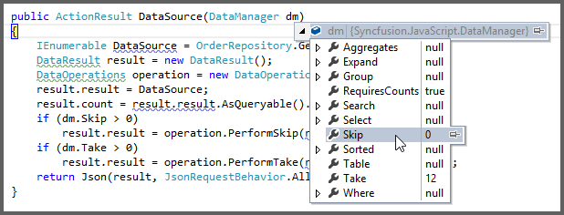
Also, using ‘DataOperations’ helper class you can perform grid action at server side. The in-built methods that we have provided in the DataOperations class are listed below.
- PerformSorting
- PerformFiltering
- PerformSearching
- PerformSkip
- PerformTake
- PerformWhereFilter
- PerformSelect
- Execute
RemoteSaveAdaptor:
RemoteSaveAdaptor is used for binding local data and performs all data operations in client-side. It interacts with server-side only for CRUD operations to pass the modified records.
Refer the following code example
<ej-grid id = "Grid" [dataSource] = "gridData" allowPaging = "true" [toolbarSettings] = "toolbarItems" [editSettings] = "editSettings" >
    <e-columns>
        <e-column field="OrderID" [isPrimaryKey]="true" headerText="OrderID"></e-column>
        <e-column field="CustomerID" headerText="CustomerID"></e-column>
        <e-column field="EmployeeID" headerText="EmployeeID"></e-column>
	    <e-column field="Freight" headerText="Freight" editType="numericedit" format="{0:C}" ></e-column>
        <e-column field="ShipName" headerText="ShipName"></e-column>
        <e-column field="ShipCountry" headerText="ShipCountry"></e-column>
    </e-columns>
</ej-grid>import {Component, ViewEncapsulation} from '@angular/core';
@Component({
selector: 'ej-app',
templateUrl: 'app/app.component.html', //give the path file for Grid control html file.
})
export class AppComponent {
public editSettings;
public toolbarItems;
constructor()
{
public gridData = ej.DataManager({
json : "(IEnumerable<object>)ViewBag.datasource",
adaptor : "remoteSaveAdaptor",
updateUrl : "Home/Update",
insertUrl : "Home/Insert",
removeUrl : "Home/Delete",
});
this.editSettings = { allowEditing: true, allowAdding: true, allowDeleting: true };
this.toolbarItems={ showToolbar : true, toolbarItems : ["add", "edit", "delete", "update", "cancel"]};
}
}Accessing CRUD action request details in server side:
The ‘Server-Side’ function must be declared with the following parameter name for each editing functionality.
Parameters Table
| Action | Parameter Name | Example |
|---|---|---|
| Update,Insert | value | public ActionResult Update(EditableOrder value){ } |
| public ActionResult Insert(EditableOrder value){ } | ||
| Remove | key | public ActionResult Remove(int key){ } |
| Batch Add | added | public ActionResult BatchUpdate(string action, List <EditableOrder> added, List <EditableOrder> changed, List <EditableOrder> deleted, int? key){ } |
| Batch Update | changed | |
| Batch Delete | deleted | |
| Crud Update,Crud Insert | value, action | public ActionResult CrudUrl(EditableOrder value, string action){ } |
| Crud Remove | action, key, keyColumn | public ActionResult CrudUrl(string action, int? key, string keyColumn){ } |
| Crud Remove - Multi Delete | action, key, deleted | public ActionResult CrudUrl(string action, string key, List <EditableOrder> deleted){ } |
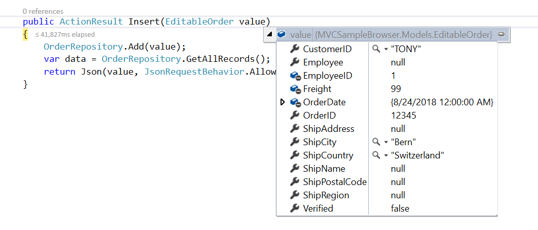
Insert Record:
Using insertUrl property, you can specify the controller action mapping URL to perform insert operation at server side.
The following code example describes the above behavior.
public ActionResult Insert(EditableOrder value)
{
    OrderRepository.Add(value);
    var data = OrderRepository.GetAllRecords();
    return Json(value, JsonRequestBehavior.AllowGet);
}
The newly added record details are bound to the ‘value’ parameter. Please refer the below image.
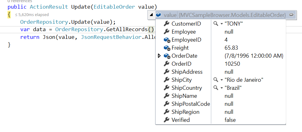
Update Record:
Using updateUrl property, you can specify the controller action mapping URL to perform save/update operation at server side.
The following code example describes the above behavior.
public ActionResult Update(EditableOrder value)
{
	OrderRepository.Update(value);
    var data = OrderRepository.GetAllRecords();
    return Json(value, JsonRequestBehavior.AllowGet);
}
The updated record details are bound to the ‘value’ parameter. Please refer the below image.
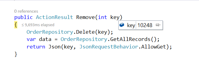
Delete Record:
Using removeUrl property, you can specify the controller action mapping URL to perform delete operation at server side.
The following code example describes the above behavior.
public ActionResult Remove(int key)
{
    OrderRepository.Delete(key);
    var data = OrderRepository.GetAllRecords();
    return Json(key, JsonRequestBehavior.AllowGet);
}
The deleted record primary key value is bound to the ‘key’ parameter. Please refer the below image.
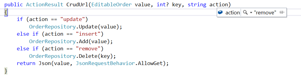
CRUD URL:
Instead of specifying separate controller action method for CRUD (insert, update and delete)operation, using crudUrl property you can specify the controller action mapping URL to perform all the CRUD operation at server side using single method.
The action parameter of crudUrl is used to get the corresponding CRUD action.
The following code example describes the above behavior.
<ej-grid id="Grid" [dataSource]="gridData" allowPaging="true" [toolbarSettings]="toolbarItems" [editSettings]="editSettings" >
    <e-columns>
        <e-column field="OrderID" [isPrimaryKey]="true" headerText="OrderID"></e-column>
        <e-column field="CustomerID" headerText="CustomerID"></e-column>
        <e-column field="EmployeeID" headerText="EmployeeID"></e-column>
	    <e-column field="Freight" headerText="Freight" editType="numericedit" format="{0:C}" ></e-column>
        <e-column field="ShipName" headerText="ShipName"></e-column>
        <e-column field="ShipCountry" headerText="ShipCountry"></e-column>
     </e-columns>
</ej-grid>import {Component, ViewEncapsulation} from '@angular/core';
@Component({
selector: 'ej-app',
templateUrl: 'app/app.component.html', //give the path file for Grid control html file.
})
export class AppComponent {
public editSettings;
public toolbarItems;
constructor()
{
public gridData = ej.DataManager({
url : "Home/DataSource",
crudUrl : "Home/CrudUpdate",
adaptor : "UrlAdaptor"
});
this.editSettings = { allowEditing: true, allowAdding: true, allowDeleting: true s};
this.toolbarItems={ showToolbar : true, toolbarItems : ["add", "edit", "delete", "update", "cancel"]};
}
}public ActionResult CrudUpdate(EditableOrder value, string action, int key)
{
if (action == "update")
OrderRepository.Update(value);
else if (action == "insert")
OrderRepository.Add(value);
else if (action == "remove")
OrderRepository.Delete(key);
return Json(value, JsonRequestBehavior.AllowGet);
}Please refer the below image to know about the action parameter
NOTE
If you specify
insertUrlalong withCrudUrlthen while addinginsertUrlonly called.
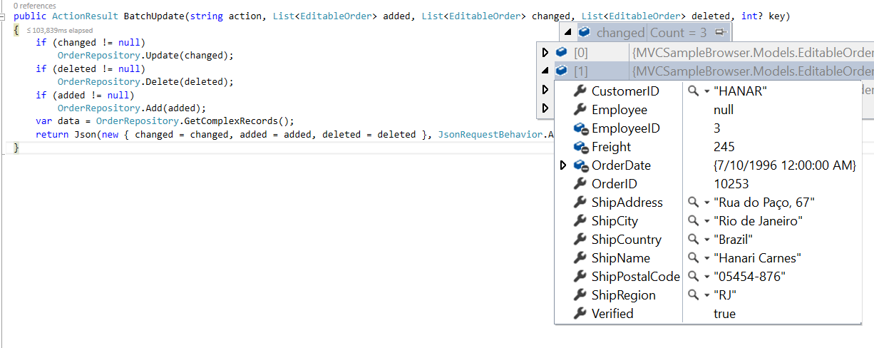
Batch URL:
The batchUrl property supports only for batch editing mode. You can specify the controller action mapping URL to perform Batch operation at server side.
The following code example describes the above behavior.
<ej-grid id="Grid" [dataSource]="gridData" allowPaging="true" [toolbarSettings]="toolbarItems" [editSettings]="editSettings" >
    <e-columns>
        <e-column field="OrderID" [isPrimaryKey]="true" headerText="OrderID"></e-column>
        <e-column field="CustomerID" headerText="CustomerID"></e-column>
        <e-column field="EmployeeID" headerText="EmployeeID"></e-column>
	    <e-column field="Freight" headerText="Freight" editType="numericedit" format="{0:C}" ></e-column>
        <e-column field="ShipName" headerText="ShipName"></e-column>
        <e-column field="ShipCountry" headerText="ShipCountry"></e-column>
     </e-columns>
</ej-grid>import {Component, ViewEncapsulation} from '@angular/core';
@Component({
selector: 'ej-app',
templateUrl: 'app/app.component.html', //give the path file for Grid control html file.
})
export class AppComponent {
public editSettings;
public toolbarItems;
constructor()
{
public gridData = ej.DataManager({
url : "Home/DataSource",
batchUrl : "Home/BatchUpdate",
adaptor : "UrlAdaptor"
});
this.editSettings = { allowEditing: true, allowAdding: true, allowDeleting: true, editMode:"batch" };
this.toolbarItems={ showToolbar : true, toolbarItems : ["add", "edit", "delete", "update", "cancel"]};
}
}public ActionResult BatchUpdate(string action, List<EditableOrder> added, List<EditableOrder> changed, List<EditableOrder> deleted, int? key)
{
if (changed != null)
OrderRepository.Update(changed);
if (deleted != null)
OrderRepository.Delete(deleted);
if (added != null)
OrderRepository.Add(added);
var data = OrderRepository.GetComplexRecords();
return Json(new { changed = changed, added = added, deleted = deleted }, JsonRequestBehavior.AllowGet);
}Please refer the below image for more information about batch parameters
Adding New Row Position
To add new row in the top or bottom position of grid content, set rowPosition property of editSettings depending on the requirement.
The following code example describes the above behavior.
<ej-grid id="Grid" [dataSource]="gridData" allowPaging="true" [toolbarSettings]="toolbarItems" [editSettings]="editSettings" >
    <e-columns>
        <e-column field="OrderID" [isPrimaryKey]="true"  headerText="OrderID"></e-column>
        <e-column field="CustomerID" headerText="CustomerID"></e-column>
        <e-column field="ShipCity" headerText="ShipCity"></e-column>
	    <e-column field="Freight" headerText="Freight" editType="numericedit"></e-column>
        <e-column field="ShipCountry" headerText="ShipCountry"></e-column>
    </e-columns>
</ej-grid>import {Component, ViewEncapsulation} from '@angular/core';
@Component({
selector: 'ej-app',
templateUrl: 'app/app.component.html', //give the path file for Grid control html file.
})
export class AppComponent {
public gridData;
public editSettings;
public toolbarItems;
constructor()
{
//The datasource "window.gridData" is referred from 'http://js.syncfusion.com/demos/web/scripts/jsondata.min.js'
this.gridData = window.gridData;
this.editSettings = { allowEditing: true, allowAdding: true, allowDeleting: true,rowPosition : "bottom" };
this.toolbarItems={ showToolbar : true, toolbarItems : ["add", "edit", "delete", "update", "cancel"]};
}
}The following output is displayed as a result of the above code example.
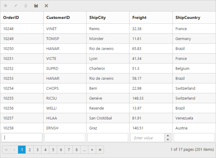
Render with blank row for easy add new
The blank add new row is displayed in the grid content during grid initialization itself to add a new record easily. To enable show add new row by default, set showAddNewRow property of editSettings as true.
The blank add new row is displayed either in the top or bottom of the corresponding page, its position is based on the rowPosition property of editSettings.
The following code example describes the above behavior.
<ej-grid id="Grid" [dataSource]="gridData" allowPaging="true" [toolbarSettings]="toolbarItems" [editSettings]="editSettings" >
    <e-columns>
        <e-column field="OrderID" [isPrimaryKey]="true" headerText="OrderID"></e-column>
        <e-column field="CustomerID" headerText="CustomerID"></e-column>
        <e-column field="ShipCity" headerText="ShipCity"></e-column>
	    <e-column field="Freight" headerText="Freight" editType="numericedit"></e-column>
        <e-column field="ShipCountry" headerText="ShipCountry"></e-column>
    </e-columns>
</ej-grid>import {Component, ViewEncapsulation} from '@angular/core';
@Component({
selector: 'ej-app',
templateUrl: 'app/app.component.html', //give the path file for Grid control html file.
})
export class AppComponent {
public gridData;
public editSettings;
public toolbarItems;
constructor()
{
//The datasource "window.gridData" is referred from 'http://js.syncfusion.com/demos/web/scripts/jsondata.min.js'
this.gridData = window.gridData;
this.editSettings = { allowEditing: true, allowAdding: true, allowDeleting: true,showAddNewRow : true };
this.toolbarItems={ showToolbar : true, toolbarItems : ["add", "edit", "delete", "update", "cancel"]};
}
}The following output is displayed as a result of the above code example.
NOTE
- If it is remote, then the newly added record is placed based on the index from current view data.
- If it is local, then the newly added record is added at the top of the page even if the added new
rowPositionis mentioned as “bottom”.
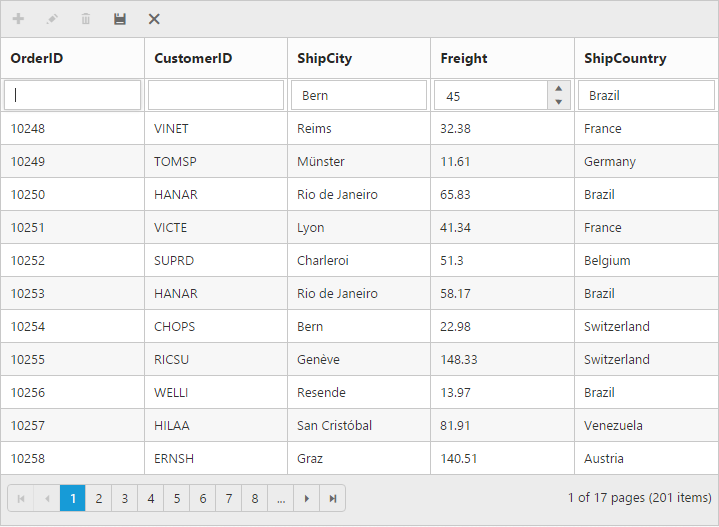
Default column values on add new
While adding new record in grid, there is an option to set the default value for the columns. Using defaultValue property of columns you can set the default values for that particular column while editing or adding a new row.
The following code example describes the above behavior.
<ej-grid id="Grid" [dataSource]="gridData" allowPaging="true" [toolbarSettings]="toolbarItems" [editSettings]="editSettings" >
    <e-columns>
        <e-column field="OrderID" [isPrimaryKey]="true" headerText="OrderID"></e-column>
        <e-column field="CustomerID" headerText="CustomerID"></e-column>
        <e-column field="ShipCity" headerText="ShipCity" defaultValue="Bern"></e-column>
	    <e-column field="Freight" headerText="Freight" editType="numericedit" defaultValue="45"></e-column>
        <e-column field="ShipCountry" headerText="ShipCountry"  defaultValue="Brazil"></e-column>
    </e-columns>
</ej-grid>import {Component, ViewEncapsulation} from '@angular/core';
@Component({
selector: 'ej-app',
templateUrl: 'app/app.component.html', //give the path file for Grid control html file.
})
export class AppComponent {
public gridData;
public editSettings;
public toolbarItems;
constructor()
{
//The datasource "window.gridData" is referred from 'http://js.syncfusion.com/demos/web/scripts/jsondata.min.js'
this.gridData = window.gridData;
this.editSettings = { allowEditing: true, allowAdding: true, allowDeleting: true};
this.toolbarItems={ showToolbar : true, toolbarItems : ["add", "edit", "delete", "update", "cancel"]};
}
}The following output is displayed as a result of the above code example.