Toolbar Customization in Xamarin Image Editor (SfImageEditor)
8 Jan 202516 minutes to read
You can customize the color palette, visibility, and appearance of each toolbar item.
Customize toolbar items
The image editor control provides support to customize and configure the appearance of toolbar menu. You can customize the toolbar by adding respective FooterToolbarItem and HeaderToolbarItem.
Toolbar item
You can customize each toolbar item using the Text and Icon properties.
Name
You can get or set the names of built-in toolbar and dynamically added toolbar items using the Name property.
public MainPage()
            {
                InitializeComponent();
                SfImageEditor editor = new SfImageEditor();
                var itemName = editor.ToolbarSettings.ToolbarItems[2].Name;
            }
NOTE
The following built-in toolbar item names are available in image editor:
Back,Text,Add,TextColor,FontFamily,Arial,Noteworthy,Marker Felt,Bradley Hand,SignPainter,Opacity,Path,StrokeThickness,Colors,Opacity,Shape,Rectangle,StrokeThickness,Circle,Arrow,Transform,Crop,free,original,square,3:1,3:2,4:3,5:4,16:9,Rotate,Flip,Reset,Undo,Redo,Save,Effects,Hue,Saturation,Brightness,Contrast,BlurandSharpen.
NOTE
You cannot modify the names of existing built-in toolbar items and cannot create toolbar item with these list.
The toolbar menu contains a set of header and footer menu items that help to perform editing actions. This can be categorized into the following types:
- HeaderToolbarItem
- FooterToolbarItem
- SubItems
Adding HeaderToolbarItem
The HeaderToolbarItem is placed on the top of the image editor, and you can customize the header toolbar item using the Icon and Text properties:
editor.ToolbarSettings.ToolbarItems.Add(new HeaderToolbarItem() { Icon = ImageSource.FromResource("ImageEditor.share.png"), Text="Share" });Adding FooterToolbarItem
The FooterToolbarItem is placed on the bottom of the image editor, and you can customize the footer toolbar item using the Icon and Text properties.
Refer to the following code snippet to customize footer toolbar item.
editor.ToolbarSettings.ToolbarItems.Add(new FooterToolbarItem() { Icon = ImageSource.FromResource("ImageEditor.delete.png"), Text="Delete" });
            editor.ToolbarSettings.ToolbarItems.Add(new FooterToolbarItem() { Icon = ImageSource.FromResource("ImageEditor.more.png"), Text="More" });
Adding SubItems to the FooterToolbarItem
The SubItems is only applicable for FooterToolbarItem, and it represents grouped action of respective footer toolbar item. The SubItems will be placed above the footer toolbar item layout, and you can also customize the appearance of sub items as main toolbar items.
Refer to the following code snippet to customize sub items of footer toolbar item.
editor.ToolbarSettings.ToolbarItems.Add(new FooterToolbarItem()
            {
                Text = "More",
                Icon = ImageSource.FromResource("ImageEditor.Image.more.png"),
                SubItems = new ObservableCollection<ToolbarItem>()
                {
                   new ToolbarItem() {
                Icon = ImageSource.FromResource("ImageEditor.Image.download.png")
                },
                   new ToolbarItem() {
                Icon = ImageSource.FromResource("ImageEditor.Image.share.png")
                } }
            });
NOTE
You can remove the existing toolbar items names from image editor toolbarItems collection based on the index value and change the icon and text values dynamically for any of the already added toolbar item based on the index as shown in the following code snippet.
editor.ToolbarSettings.ToolbarItems[5].Text = "new item";
editor.ToolbarSettings.ToolbarItems[3].Icon = ImageSource.FromResource("ImageEditor.Image.jpg");
ToolbarItemSelected event
Whenever you tap the toolbar menu item, the ToolbarItemSelected event will be triggered, and you can get the respective tapped toolbar item as an argument as shown in the following code snippet.
public MainPage()
        {
            editor.ToolbarSettings.ToolbarItemSelected += ToolbarSettings_ToolbarItemSelected;
        }

        private void ToolbarSettings_ToolbarItemSelected(object sender, ToolbarItemSelectedEventArgs e)
        {
           DisplayAlert("Selected ToolbarItem is  " + e.ToolbarItem.Text, "Ok", "Cancel");
        }
MoveSubItemsToFooterToolbar
The MoveSubItemsToFooterToolbar is boolean property of the ToolbarItemSelected event argument; it decides the placement of each sub items of respective footer toolbar item.
If you set the value to true, the respective sub items of footer item will be placed on footer toolbar layout. If you set false, then the sub items will be placed above the footer toolbar layout.
public MainPage()
            {
                        . . .

                SfImageEditor edit = new SfImageEditor();
                edit.ToolbarSettings.ToolbarItems.Add(new FooterToolbarItem()
                    {
                        Text = "NewFooterItem",
                        SubItems = new ObservableCollection<ToolbarItem>()
                        {
                            new ToolbarItem(){ Text= "Subitem1"},
                            new ToolbarItem(){ Text= "Subitem2"},
                            new ToolbarItem(){ Text= "Subitem3"},
                        }
                    });
                edit.ToolbarSettings.ToolbarItemSelected += ToolbarSettings_ToolbarItemSelected;

                        . . .
            }


    private void ToolbarSettings_ToolbarItemSelected(object sender, ToolbarItemSelectedEventArgs e)
            {
                if(e.ToolbarItem != null && e.ToolbarItem is FooterToolbarItem)
                {
                    if(e.ToolbarItem.Text == "NewFooterItem")
                    {
                        e.MoveSubItemsToFooterToolbar = false;
                    }
                }
            }
NOTE
This is not applicable for built-in footer toolbar items.
To hide/show toolbar
To show or hide the toolbar, set the IsVisible property of toolbar to either true or false. By default, the IsVisible property is set to true.
<imageeditor:SfImageEditor.ToolbarSettings>
			<imageeditor:ToolbarSettings IsVisible="false" />
</imageeditor:SfImageEditor.ToolbarSettings>editor.ToolbarSettings.IsVisible = false;
To hide/show the toolbar item
You can hide or show the toolbar items by specifying their icon names and setting the boolean values to true or false.
NOTE
You can customize an icon by specifying its names.
editor.SetToolbarItemVisibility("text,save", false);
To hide or show the delete button
You can show or hide the delete button, which employed in deleting the selected shapes added in image editor with the help of IsDeleteButtonVisible property in ToolbarSettings.
Setting false for this property will never show the delete button. On setting true, delete button will get enabled by selecting the shapes.
<editor:SfImageEditor Source="{Binding Image}">
                <editor:SfImageEditor.ToolbarSettings>
                    <editor:ToolbarSettings IsDeleteButtonVisible="True"></editor:ToolbarSettings>
                </editor:SfImageEditor.ToolbarSettings>
            </editor:SfImageEditor>
SfImageEditor editor = new SfImageEditor();
editor.Source = ImageSource.FromResource("XFormsUG.RoadView.jpeg");
editor.ToolbarSettings = new ToolbarSettings()
{
IsDeleteButtonVisible = true,
};
this.Content = editor;
To customize the ColorPalette
You can change the default colors of the ColorPalette in toolbar.
<imageeditor:SfImageEditor.ColorPalette>
			<Color>Yellow</Color>
			<Color>Pink</Color>
			<Color>Violet</Color>
</imageeditor:SfImageEditor.ColorPalette>ObservableCollection<Color> CustomColorPalette = new ObservableCollection<Color>()
{
Color.Yellow,
Color.Pink,
Color.Violet
};
editor.ColorPalette = CustomColorPalette;Default Color Selected Index
You can change the default index of the color palette in toolbar. By default, color palette index value is 2.
<imageeditor:SfImageEditor x:Name="editor" DefaultSelectedColorIndex="0"/>editor.DefaultSelectedColorIndex = 0;
ToolbarHeight Customization
You can customize height of the toolbar and toolbar items icon and text.
Customize toolbar height
The image editor control supports to customize the default height of the Header, Footer, and Sub item using the following properties:
The toolbar items will be resized based on the height. To change the height of the toolbar, refer to the following code snippet.
<imageeditor:SfImageEditor.ToolbarSettings>
                    <imageeditor:ToolbarSettings
                        HeaderToolbarHeight="70"
                        FooterToolbarHeight="70"
                        SubItemToolbarHeight="70"/>
</imageeditor:SfImageEditor.ToolbarSettings>editor.ToolbarSettings.HeaderToolbarHeight = 70;
editor.ToolbarSettings.FooterToolbarHeight = 70;
editor.ToolbarSettings.SubItemToolbarHeight = 70;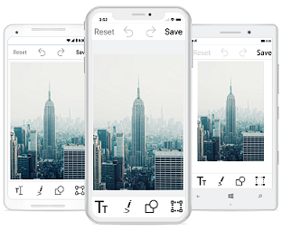
Individual toolbar item height customization
You can arrange the toolbar items based on the toolbar height using the following properties:
To change the toolbar item Text and Icon height, refer to the following code snippet.
FooterToolbarItem footerItem = new FooterToolbarItem()
            {
                IconHeight=40,
                TextHeight=20,
                Icon = ImageSource.FromResource("ImageEditor.share.png"),
                Text = "Share"
            };

            editor.ToolbarSettings.ToolbarItems.Add(footerItem);
Toolbar color customization
Border color of the toolbar can be customized with the help of BorderColor property in ToolbarSettings.
<editor:SfImageEditor x:Name="editor" Source="{Binding Image}" >
                <editor:SfImageEditor.ToolbarSettings>
                    <editor:ToolbarSettings BorderColor="Red"></editor:ToolbarSettings>
                </editor:SfImageEditor.ToolbarSettings>
            </editor:SfImageEditor>
SfImageEditor editor = new SfImageEditor();
editor.Source = ImageSource.FromResource("XFormsUG.RoadView.jpeg");
editor.ToolbarSettings = new ToolbarSettings()
{
BorderColor = Color.Red,
};
this.Content = editor;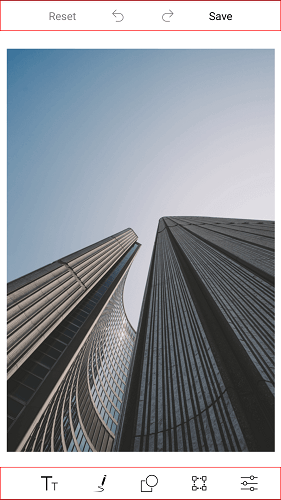
See also
How to add custom toolbar to add shapes or text dynamically in SfImageEditor
How to get toolbar item and change icon using name in SfImageEditor