Shapes in Xamarin Image Editor (SfImageEditor)
8 Jan 20255 minutes to read
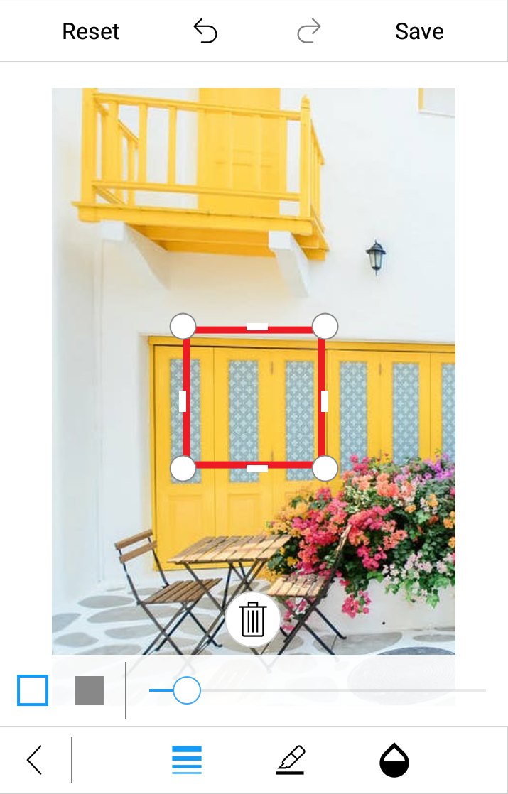
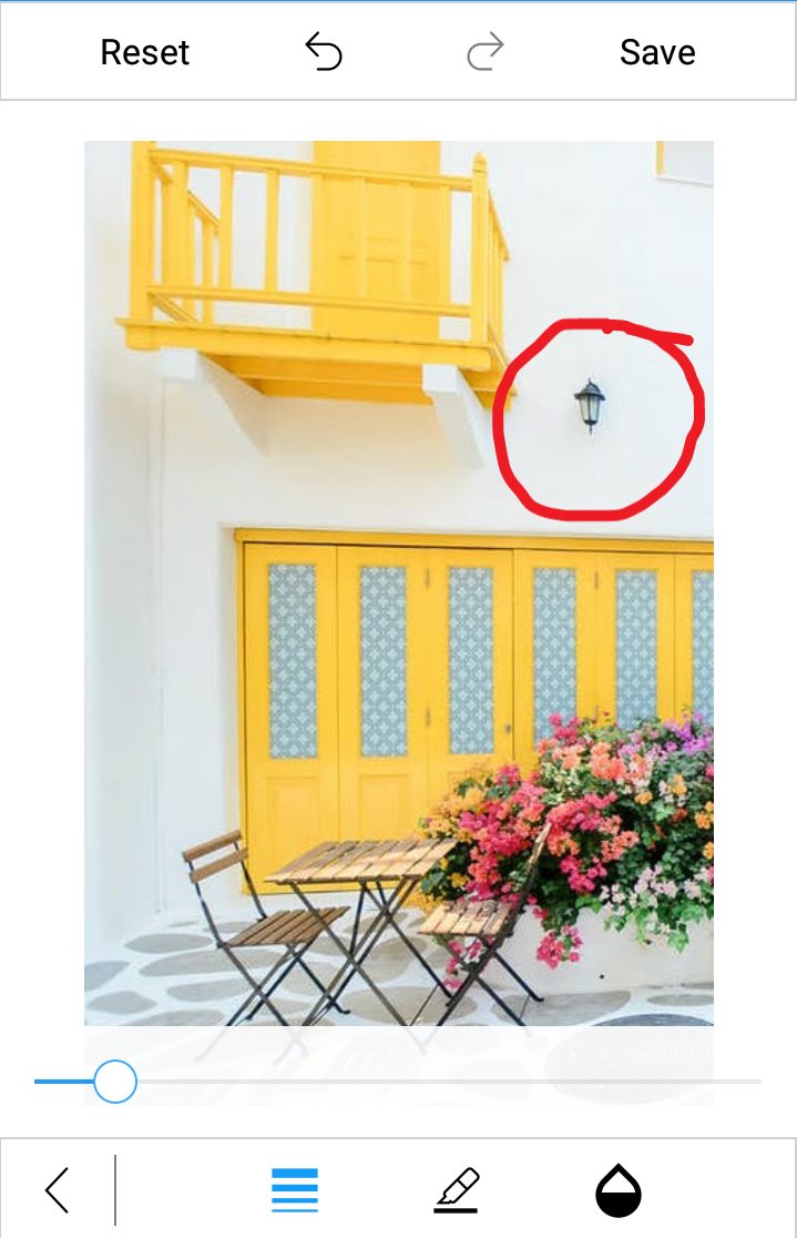
You can annotate any shapes over an image using the AddShape method. The following shapes are available in image editor:
- Circle
- Rectangle
- Arrow
- Path
- Line
- Dotted
- DoubleArrow
- DottedArrow
- DottedDoubleArrow
Selecting a shape type
The ShapeType is an enum property with values of Rectangle, Circle, Arrow, Path, Line, Dotted, DoubleArrow, DottedArrow, and DottedDoubleArrow. You can give the desired shape type as an argument to the AddShape method.
editor.AddShape(ShapeType.Circle);By default, the toolbar contains the Rectangle, Circle, Arrow shapes. You can add other shapes to the toolbar items by using the VisibleShapesItems in ToolbarSettings.
VisibleShapesItems is a flagged enum property with values of Rectangle, Circle, Arrow, Line, Dotted, DoubleArrow, DottedArrow, and DottedDoubleArrow. You can specify one or more shapes in the property to add shapes into the toolbar.
<editor:SfImageEditor.ToolbarSettings>
               <editor:ToolbarSettings VisibleShapesItems="Line,Dotted,DottedArrow,DottedDoubleArrow,DoubleArrow">
               </editor:ToolbarSettings>
</editor:SfImageEditor.ToolbarSettings>editor.ToolbarSettings.VisibleShapesItems = ImageEditorShapes.Line | ImageEditorShapes.Dotted | ImageEditorShapes.DottedArrow | ImageEditorShapes.DottedDoubleArrow | ImageEditorShapes.DoubleArrow;
NOTE
If you add the shape when the SfImageEditor loaded in a view without image, then you need to call the
AddShapemethod after some time delay. If you add the shape when the SfImageEditor loaded in a view with image, then you need to call theAddShapemethod in theImageLoadedevent as shown in the following code sample.
editor.ImageLoaded += (Object sender, ImageLoadedEventArgs args) =>
            {
                editor.AddShape(ShapeType.Circle);
            };
Customizing a shape with pen settings
You can customize the appearance of each shape using the PenSettings property:
PenSettings
The PenSettings property consists of the following properties:
-
Color: Specifies the desired stroke color to a shape. -
FillColor: Specifies the desired fill color to a shape. -
StrokeWidth: Allows to denote the stroke width for the desired shape. -
Mode: Determines whether the shape color mode isFillorStroke. It is an enum value. -
Opacity: Denotes opacity for the desired shapes. -
Bounds: Allows to set frame for the newly added shapes (rectangle and circle). You can position the shapes wherever you want on the image.In percentage, the value of the shape frame should fall between 0 and 100. -
EnableDrag- Controls the dragging of selected shape over the image.
NOTE
The
FillColorproperty is applicable only if the ShapeType isRectangleorCircle.
-
To add a
Rectangle,Circle, orArrowover an image, specify theShapeTypeand the desiredPenSettingsas shown in the following code snippet.editor.AddShape(ShapeType.Circle, new PenSettings() {Color = Color.Red, Mode= Mode.Stroke, Opacity=1f, Bounds = new Rectangle(20,20,35,35)});
-
You can annotate any path on an image using free hand drawing as shown in the following code snippet.
editor.AddShape(ShapeType.Path, new PenSettings() { StrokeWidth = 10 });
Deleting a shape or text from view
You can delete the selected shape by using the Delete method as shown in the following code snippet.
editor.Delete();NOTE
You cannot delete the path.
Restricting the shape resize
You can restrict the shape resizing using the IsResizable property. By default, the value of the IsResizable property is true, so you can resize the shape added on an image. When the IsResizable property is disabled, shape added on an image cannot be resized and you can only drag the shape over an image as shown in the following code sample.
editor.AddShape(ShapeType.Circle, new PenSettings() { IsResizable=false });See also
How to add shapes to the image editor on initial loading
How to add custom toolbar to add shapes or text dynamically in Xamarin.Forms SfImageEditor
How to show dimension of shapes while resizing
How to update the color, stroke thickness for selected shape programmatically