How can I help you?
Appearance in Windows Forms Scroll Frame (SfScrollFrame)
21 Jan 202511 minutes to read
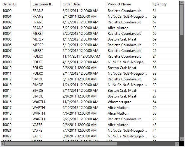
This section explains how to customize the default appearance of the scrollbars using the style properties. By default, the SfScrollFrame loads the scrollbars with default appearance.
Scrollbar appearance
The inner elements of the scrollbar can be customized by using the ScrollBarStyleInfo property, that allows changing the appearance of the horizontal and vertical scrollbars separately.
The horizontal scrollbar appearance can be customized by using the HorizontalScrollBar.Style property. The ScrollBarStyleInfo contains all the settings that controls the appearance of the scrollbar.
//Sets the back color of the horizontal scrollbar arrow button.
this.sfScrollFrame1.HorizontalScrollBar.Style.ArrowButtonBackColor = Color.Gray;
this.sfScrollFrame1.HorizontalScrollBar.Style.ArrowButtonHoverBackColor = Color.White;
this.sfScrollFrame1.HorizontalScrollBar.Style.ArrowButtonPressedBackColor = Color.Blue;

//Sets the fore color of the horizontal scrollbar arrow button.
this.sfScrollFrame1.HorizontalScrollBar.Style.ArrowButtonForeColor = Color.Black;
this.sfScrollFrame1.HorizontalScrollBar.Style.ArrowButtonHoverForeColor = Color.Black;
this.sfScrollFrame1.HorizontalScrollBar.Style.ArrowButtonPressedForeColor = Color.Gray;
this.sfScrollFrame1.HorizontalScrollBar.Style.ArrowButtonBorderColor = Color.Black;

// Specify the border style properties
this.sfScrollFrame1.HorizontalScrollBar.Style.ThumbColor = Color.Gray;
this.sfScrollFrame1.HorizontalScrollBar.Style.ThumbHoverColor = Color.Black;
this.sfScrollFrame1.HorizontalScrollBar.Style.ThumbPressedColor = Color.Blue;
this.sfScrollFrame1.HorizontalScrollBar.Style.ThumbBorderColor = Color.Black;

// Sets the back color of the horizontal scrollbar.
this.sfScrollFrame1.HorizontalScrollBar.Style.ScrollBarBackColor = Color.LightGray;
The vertical scroll bar appearance can be customized by using the VerticalScrollBar.Style property.
//Sets the back color of the vertical scrollbar arrow button.
this.sfScrollFrame1.VerticalScrollBar.Style.ArrowButtonBackColor = Color.Gray;
this.sfScrollFrame1.VerticalScrollBar.Style.ArrowButtonHoverBackColor = Color.White;
this.sfScrollFrame1.VerticalScrollBar.Style.ArrowButtonPressedBackColor = Color.Blue;

//Sets the fore color of the vertical scrollbar arrow button.
this.sfScrollFrame1.VerticalScrollBar.Style.ArrowButtonForeColor = Color.Black;
this.sfScrollFrame1.VerticalScrollBar.Style.ArrowButtonHoverForeColor = Color.Black;
this.sfScrollFrame1.VerticalScrollBar.Style.ArrowButtonPressedForeColor = Color.Gray;
this.sfScrollFrame1.VerticalScrollBar.Style.ArrowButtonBorderColor = Color.Black;

// Sets the style properties of the thumb.
this.sfScrollFrame1.VerticalScrollBar.Style.ThumbColor = Color.Gray;
this.sfScrollFrame1.VerticalScrollBar.Style.ThumbHoverColor = Color.Black;
this.sfScrollFrame1.VerticalScrollBar.Style.ThumbPressedColor = Color.Blue;
this.sfScrollFrame1.VerticalScrollBar.Style.ThumbBorderColor = Color.Black;

// Sets the back color of the vertical scrollbar.
this.sfScrollFrame1.VerticalScrollBar.Style.ScrollBarBackColor = Color.LightGray;
Changing the Scrollbar thumb width
The size of the scrollbar thumb can be changed by using the ThumbWidth property of the corresponding Style property.
// To set the height of the horizontal scrollbar thumb.
this.sfScrollFrame1.HorizontalScrollBar.Style.ThumbWidth = 8;

// To set the width of the vertical scrollbar thumb.
this.sfScrollFrame1.VerticalScrollBar.Style.ThumbWidth = 8;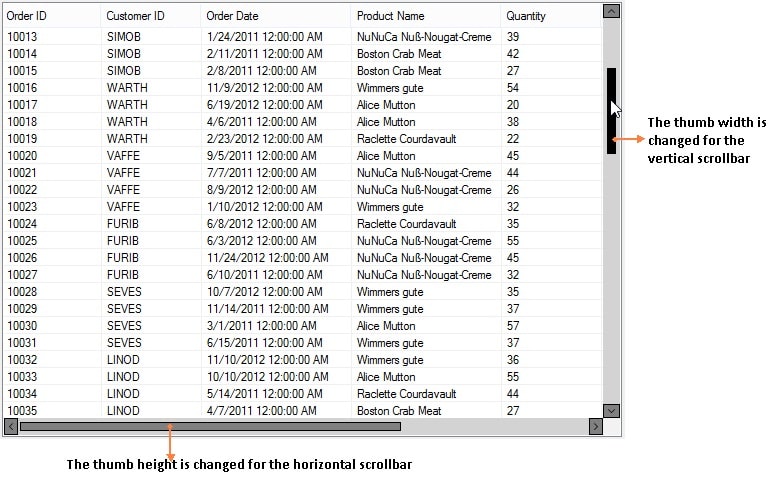
NOTE
This width can be set maximum to the width and height of the vertical and horizontal scrollbars respectively.
Disabling the maximum and minimum buttons
The minimum and maximum arrow buttons of the scrollbar can be disabled by setting the EnableMaximumArrow and EnableMinimumArrow properties to false. The default value is true.
If you disable the max or min button, the scrollbar cannot be scrolled using those buttons.
//Disable the maximum and minimum arrows of the vertical scrollbar.
this.sfScrollFrame1.VerticalScrollBar.EnableMaximumArrow = false;
this.sfScrollFrame1.VerticalScrollBar.EnableMinimumArrow = false;

//Disable the maximum and minimum arrows of the horizontal scrollbar.
this.sfScrollFrame1.HorizontalScrollBar.EnableMaximumArrow = false;
this.sfScrollFrame1.HorizontalScrollBar.EnableMinimumArrow = false;
The color of the disabled arrow button can also be specified by using ArrowButtonDisabledBackColor and ArrowButtonDisabledForeColor of the corresponding scrollbar.
//Set the arrow button disabled back color
this.sfScrollFrame1.VerticalScrollBar.Style.ArrowButtonDisabledBackColor = Color.Silver;
this.sfScrollFrame1.HorizontalScrollBar.Style.ArrowButtonDisabledBackColor = Color.Silver;

//Sets the arrow button disabled fore color
this.sfScrollFrame1.VerticalScrollBar.Style.ArrowButtonDisabledForeColor = Color.Gray;
this.sfScrollFrame1.HorizontalScrollBar.Style.ArrowButtonDisabledForeColor = Color.Gray;
Disabling the Scrollbar Thumb
The scrollbar thumb can be disabled by setting the EnableThumb property to false. The default value is true.
//Disables the thumb for vertical and horizontal scrollbar.
this.sfScrollFrame1.HorizontalScrollBar.EnableThumb = false;
this.sfScrollFrame1.VerticalScrollBar.EnableThumb = false;
The disabled state thumb color can also be specified by using the ThumbDisabledColor property of the corresponding scrollbar style info.
// Sets the disabled thumb color of the scrollbar.
this.sfScrollFrame1.VerticalScrollBar.Style.ThumbDisabledColor = Color.Indigo;
this.sfScrollFrame1.HorizontalScrollBar.Style.ThumbDisabledColor = Color.Indigo;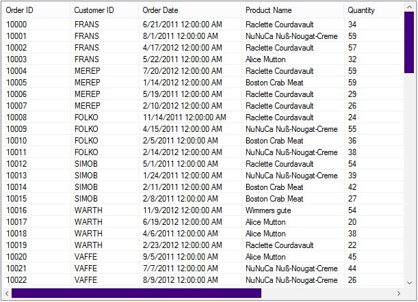
Themes
The SfScrollFrame offers six built-in themes for professional representation as follows:
- Office2016Colorful
- Office2016White
- Office2016DarkGray
- Office2016Black
- Office2019Colorful
- HighContrastBlack
Themes can be applied to the SfScrollFrame by using the following steps:
Load theme assembly
To set theme to SfScrollFrame, the following assemblies should be added as reference in any application.
|
Assemblies |
Themes |
| Syncfusion.Office2016Theme.WinForms |
Office2016Colorful Office2016White Office2016DarkGray Office2016Black |
| Syncfusion.Office2019Theme.WinForms | Office2019Colorful |
| Syncfusion.HighContrastTheme.WinForms | HighContrastBlack |
Before applying theme to SfScrollFrame, required theme assembly should be loaded.
using Syncfusion.WinForms.Controls;

         static class Program
    {
        /// <summary>
        /// The main entry point for the application.
        /// </summary>

        static void Main()
        {
            Syncfusion.Licensing.SyncfusionLicenseProvider.RegisterLicense(DemoCommon.FindLicenseKey());
            SfSkinManager.LoadAssembly(typeof(Syncfusion.WinForms.Themes.Office2016Theme).Assembly);
            SfSkinManager.LoadAssembly(typeof(Syncfusion.WinForms.Themes.Office2019Theme).Assembly);
            SfSkinManager.LoadAssembly(typeof(Syncfusion.HighContrastTheme.WinForms.HighContrastTheme).Assembly);
            Application.EnableVisualStyles();
            Application.SetCompatibleTextRenderingDefault(false);
            Application.Run(new Form1());
        }
    }
Imports Syncfusion.WinForms.Controls
Friend Module Program
''' <summary>
''' The main entry point for the application.
''' </summary>
Sub Main()
Syncfusion.Licensing.SyncfusionLicenseProvider.RegisterLicense(DemoCommon.FindLicenseKey())
SfSkinManager.LoadAssembly(GetType(Syncfusion.WinForms.Themes.Office2016Theme).Assembly)
SfSkinManager.LoadAssembly(GetType(Syncfusion.WinForms.Themes.Office2019Theme).Assembly)
SfSkinManager.LoadAssembly(GetType(Syncfusion.HighContrastTheme.WinForms.HighContrastTheme).Assembly)
Application.EnableVisualStyles()
Application.SetCompatibleTextRenderingDefault(False)
Application.Run(New Form1())
End Sub
End ModuleApply theme
Appearance of the SfScrollFrame can be changed by using the ThemeName.
Office2016Colorful
This option helps to set the Office2016Colorful Theme.
// Office2016Colorful

 this.SfScrollFrame.ThemeName = "Office2016Colorful";
' Office2016Colorful
Me.SfScrollFrame.ThemeName = "Office2016Colorful"
Office2016White
This option helps to set the Office2016White Theme.
// Office2016White

 this.SfScrollFrame.ThemeName = "Office2016White";
' Office2016White
Me.SfScrollFrame.ThemeName = "Office2016White"
Office2016DarkGray
This option helps to set the Office2016DarkGray Theme.
// Office2016DarkGray

 this.SfScrollFrame.ThemeName = "Office2016DarkGray";
' Office2016DarkGray
Me.SfScrollFrame.ThemeName = "Office2016DarkGray"
Office2016Black
This option helps to set the Office2016Black Theme.
// Office2016Black

 this.SfScrollFrame.ThemeName = "Office2016Black";
' Office2016Black
Me.SfScrollFrame.ThemeName = "Office2016Black"
Office2019Colorful
This option helps to set the Office2019Colorful Theme.
// Office2019Colorful

 this.SfScrollFrame.ThemeName = "Office2019Colorful";
' Office2019Colorful
Me.SfScrollFrame.ThemeName = "Office2019Colorful"
HighContrastBlack
This option helps to set the HighContrastBlack Theme.
// HighContrastBlack

 this.SfScrollFrame.ThemeName = "HighContrastBlack";
' HighContrastBlack
Me.SfScrollFrame.ThemeName = "HighContrastBlack"