How can I help you?
Shape Element in Windows Forms Rating Control (Rating)
29 Apr 20211 minute to read
It acts like a core element in RatingControl, to illustrate rating values through visual representation.
Built-in
There are six predefined shapes available for customization. All these shapes support the VisualStyles, Orientation and other customized settings.
- Star
- Circle
- Triangle
- Heart
- Diamond
- Kite
this.ratingControl4.Shape = Syncfusion.Windows.Forms.Tools.Shapes.Heart;Me.ratingControl4.Shape = Syncfusion.Windows.Forms.Tools.Shapes.Heart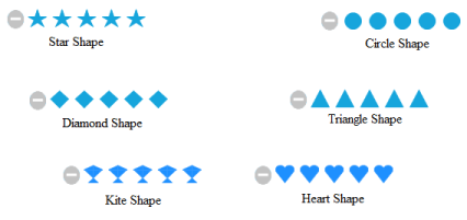
Custom
User-defined shapes can be used in the form of images.
this.ratingControl4.Shape = Syncfusion.Windows.Forms.Tools.Shapes.CustomImages;
customImageCollection1.NormalImage = global::WindowsFormsApplication20.Properties.Resources.file;
this.ratingControl1.Images = customImageCollection1;Me.ratingControl4.Shape = Syncfusion.Windows.Forms.Tools.Shapes.CustomImages
customImageCollection1.NormalImage = Global.WindowsFormsApplication20.Properties.Resources.file
Me.ratingControl1.Images = customImageCollection1In Rating control, the working is based on the following criteria for CustomImages.
- If the Shape property is set to CustomImages and the images are null, then Rating control resets the shape as Star.
- If the HoverImage and SelectedImage are null, Rating control makes use of the ItemHighlightColor and ItemSelectionColor for Hover and Selected state.
- If the HoverHalfImage and SelectedHalfImage are null, Rating control Precision is set to Standard.