How can I help you?
Appearance in Windows Forms Calendar (SfCalendar)
7 Dec 202320 minutes to read
This section explains how to customize the appearance of header, footer, and cells in the calendar by using style properties.
Customize header appearance
The BackColor and ForeColor of each part in the calendar header can be customized. The height of the calendar header can be customized by using the HeaderHeight property, and the width of header can be updated automatically from the calendar width.
Customize header text
The header text in the calendar control displays the month and year of the selected date. The calendar header color can be customized by using the following style properties:
- BackColor: Changes the background color of header in the calendar.
- ForeColor: Changes the foreground color of the text, which displays month and year in the calendar header.
- HoverForeColor: Changes the foreground color of the header text on mouse hover.
- Font: Changes the font that is used to draw the header text in the calendar.
Customize day names
The calendar header contains day names of week for the month view. Day names of the calendar header can be customized by using the following properties:
- DayNamesBackColor: Changes the background color of day names in the calendar header.
- DayNamesForeColor: Changes the foreground color of day names in the calendar header.
- DayNamesFont: Changes the font that is used to draw the day names text in the calendar.
The following code example illustrates how to customize appearances of the calendar header:
// Header customizations

// Setting header BackColor

calendar.Style.Header.BackColor = Color.Red;

// Setting header ForeColor

calendar.Style.Header.ForeColor = Color.Yellow;

// Setting header DayNames BackColor

calendar.Style.Header.DayNamesBackColor = Color.Green;

// Setting header DayNames ForeColor

calendar.Style.Header.DayNamesForeColor = Color.WhiteSmoke;

// Setting header DayNames Font

calendar.Style.Header.DayNamesFont = new System.Drawing.Font("Calibri", 11.25F, System.Drawing.FontStyle.Regular);
' Header customizations
' Setting header BackColor
calendar.Style.Header.BackColor = Color.LightGray
' Setting header ForeColor
calendar.Style.Header.ForeColor = Color.Blue
' Setting header DayNames BackColor
calendar.Style.Header.DayNamesBackColor = Color.LightSeaGreen
' Setting header DayNames ForeColor
calendar.Style.Header.DayNamesForeColor = Color.AliceBlue
' Setting header DayNames Font
calendar.Style.Header.DayNamesFont = New System.Drawing.Font("Calibri", 11.25!, System.Drawing.FontStyle.Regular)
Customize navigation buttons
Navigation buttons in the calendar header can be customized by changing the up and down icons. Icons used for navigation buttons can be changed by UpArrowImage and DownArrowImage properties of the SfCalendar. The color used to draw the default icons for up and down navigation buttons can be customized by the following properties:
- NavigationButtonForeColor: Changes the foreground color of up and down navigation buttons.
- NavigationButtonHoverForeColor: Changes the foreground color of up and down navigation buttons on mouse hover.
- NavigationButtonDisabledForeColor: Changes the foreground color of up and down navigation buttons in disabled state.
The following code example illustrates the same:
// set the Navigation Button ForeColor

calendar.Style.Header.NavigationButtonForeColor = Color.HotPink;

// set the Navigation Button Hover ForeColor

calendar.Style.Header.NavigationButtonHoverForeColor = Color.Indigo;

// set the Navigation Button disabled ForeColor

calendar.Style.Header.NavigationButtonDisabledForeColor = Color.LightGray;
' set the Navigation Button ForeColor
calendar.Style.Header.NavigationButtonForeColor = Color.HotPink
' set the Navigation Button Hover ForeColor
calendar.Style.Header.NavigationButtonHoverForeColor = Color.Indigo
' set the Navigation Button disabled ForeColor
calendar.Style.Header.NavigationButtonDisabledForeColor = Color.LightGray
The visibility and alignment of navigation buttons can also be customized.
Visibility of navigation buttons
Navigation buttons are used to move between views in the SfCalendar. The visibility of navigation buttons can be customized by the ShowNavigationButton property. The following code example illustrates the same:
// Indicating whether show the navigation buttons which used to move between views.

calendar.ShowNavigationButton = false;
' Indicating whether show the navigation buttons which used to move between views.
calendar.ShowNavigationButton = false
Navigation buttons alignment
Navigation buttons can be aligned in different sides relative to the calendar header. The alignment of navigation buttons can be customized by the NavigationButtonAlignment. The following code example illustrates the same:
// Indicating how the navigation buttons should align relative to the Calendar Header. Setting Left alignment.

calendar.NavigationButtonAlignment = Syncfusion.WinForms.Input.Enums.NavigationButtonAlignment.Left;
' Indicating how the navigation buttons should align relative to the Calendar Header. Setting Left alignment.
calendar.NavigationButtonAlignment = Syncfusion.WinForms.Input.Enums.NavigationButtonAlignment.Left
// Indicating how the navigation buttons should align relative to the Calendar Header. Setting Both alignment.

calendar.NavigationButtonAlignment = Syncfusion.WinForms.Input.Enums.NavigationButtonAlignment.Both;
' Indicating how the navigation buttons should align relative to the Calendar Header. Setting Both alignment.
calendar.NavigationButtonAlignment = Syncfusion.WinForms.Input.Enums.NavigationButtonAlignment.Both
Customize footer appearance
The BackColor and ForeColor of each part in the calendar footer can be customized. The height of the calendar footer can be customized by using the FooterHeight property, and the width of the footer can be updated automatically from the calendar width. The calendar control footer color can be customized by the following style properties:
- BackColor: Changes the background color of footer in the calendar.
- ForeColor: Changes the foreground color of footer in the calendar.
- HoverBackColor: Changes the background color of footer on mouse hover.
- HoverForeColor: Changes the foreground color of footer text on mouse hover.
The following code example illustrates how to change the background and foreground of the calendar footer:
// Footer customizations

// Setting Footer BackColor

calendar.Style.Footer.BackColor = Color.LightGreen;

// Setting Footer ForeColor

calendar.Style.Footer.ForeColor = Color.Green;

// Setting Footer HoverBackColor

calendar.Style.Footer.HoverBackColor = Color.Yellow;

// Setting Footer HoverForeColor

calendar.Style.Footer.HoverForeColor = Color.SpringGreen;
' Footer customizations
' Setting Footer BackColor
calendar.Style.Footer.BackColor = Color.LightGreen
' Setting Footer ForeColor
calendar.Style.Footer.ForeColor = Color.Green
' Setting Footer HoverBackColor
calendar.Style.Footer.HoverBackColor = Color.Yellow
' Setting Footer HoverForeColor
calendar.Style.Footer.HoverForeColor = Color.SpringGreen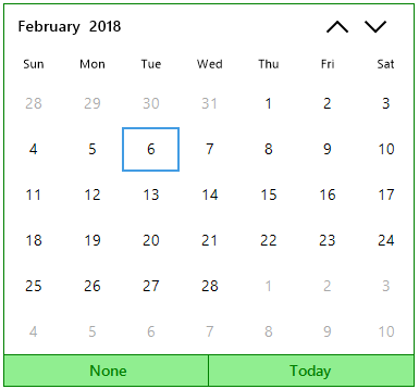
Customize cell appearance
BackColor, ForeColor, and BorderColor of each date cells in the calendar can be customized. Date cells in the calendar control can be customized by the following style properties:
- CellBackColor: Changes the background color of date cells in the calendar.
- CellForeColor: Changes the foreground color of date cells in the calendar.
- CellHoverBorderColor: Changes the border color of date cells in the calendar.
- CellFont: Changes the font that is used to draw the date text of cell in the calendar.
Customize trailing date appearance
Calendar control trailing (next or previous month) cells can be customized by the following properties:
- TrailingCellBackColor: Changes the background color of the previous and following month cells that are shown in the current view of the calendar.
- TrailingCellForeColor: Changes the foreground color of the previous and following month cells that are shown in the current view of the calendar.
- TrailingCellFont: Changes the font that is used to draw the date text for the previous and following month cells that are shown in the current view of the calendar.
Customize selected date appearance
The BackColor and ForeColor of the selected date cell in the calendar can customized. The following code illustrates how to customize the selected date cell appearance:
- SelectedCellBackColor: Changes the background color of the selected date cell in the calendar.
- SelectedCellForeColor: Changes the foreground color of the selected date cell in the calendar.
- SelectedCellBorderColor: Changes the border color of the selected date cell in the calendar.
- SelectedCellHoverBorderColor: Changes the border color of the selected date cell on mouse hover.
- SelectedCellFont: Changes the font that is used to draw the date text of the selected date cell in the calendar.
The following code example illustrates the customization of calendar cells:
// Setting CellBackColor

calendarr.Style.Cell.CellBackColor = Color.LightBlue;

// Setting CellForeColor

calendar.Style.Cell.CellForeColor = Color.Red;

// Setting CellHoverBorderColor

calendar.Style.Cell.CellHoverBorderColor = Color.LightCyan;

// Setting SelectedCellBackColor

calendar.Style.Cell.SelectedCellBackColor = Color.Blue;

// Setting SelectedCellForeColor

calendar.Style.Cell.SelectedCellForeColor = Color.White;

// Setting SelectedCellBorderColor

calendar.Style.Cell.SelectedCellBorderColor = Color.Tomato;

// Setting SelectedCellHoverBorderColor

calendar.Style.Cell.SelectedCellHoverBorderColor = Color.Yellow;

// Setting TrailingCellBackColor

calendar.Style.Cell.TrailingCellBackColor = Color.LightGray;

// Setting TrailingCellForeColor

calendar.Style.Cell.TrailingCellForeColor = Color.Black;

// Setting TrailingCellFont

calendar.Style.Cell.TrailingCellFont = new System.Drawing.Font("Calibri", 11.25F, System.Drawing.FontStyle.Bold);

// Setting CellFont

calendar.Style.Cell.CellFont = new System.Drawing.Font("Calibri", 11.25F, System.Drawing.FontStyle.Bold);

// Setting selected CellFont

calendar.Style.Cell.SelectedCellFont = new System.Drawing.Font("Calibri", 11.25F, System.Drawing.FontStyle.Regular);
' Setting CellBackColor
calendar.Style.Cell.CellBackColor = Color.LightBlue
' Setting CellForeColor
calendar.Style.Cell.CellForeColor = Color.Red
' Setting CellHoverBorderColor
calendar.Style.Cell.CellHoverBorderColor = Color.LightCyan
' Setting SelectedCellBackColor
calendar.Style.Cell.SelectedCellBackColor = Color.Blue
' Setting SelectedCellForeColor
calendar.Style.Cell.SelectedCellForeColor = Color.White
' Setting SelectedCellBorderColor
calendar.Style.Cell.SelectedCellBorderColor = Color.Tomato
' Setting SelectedCellHoverBorderColor
calendar.Style.Cell.SelectedCellHoverBorderColor = Color.Yellow
' Setting TrailingCellBackColor
calendar.Style.Cell.TrailingCellBackColor = Color.LightGray
' Setting TrailingCellForeColor
calendar.Style.Cell.TrailingCellForeColor = Color.Black
' Setting TrailingCellFont
calendar.Style.Cell.TrailingCellFont = New System.Drawing.Font("Calibri", 11.25!, System.Drawing.FontStyle.Bold)
' Setting CellFont
calendar.Style.Cell.CellFont = New System.Drawing.Font("Calibri", 11.25!, System.Drawing.FontStyle.Bold)
' Setting selected CellFont
calendar.Style.Cell.SelectedCellFont = New System.Drawing.Font("Calibri", 11.25!, System.Drawing.FontStyle.Regular)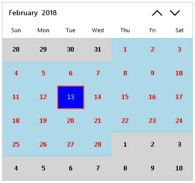
Themes
SfCalendar offers four built in themes for professional representation as follows.
- Office2016Colorful
- Office2016White
- Office2016DarkGray
- Office2016Black
Theme can be applied to SfCalendar by following the below steps:
Load theme assembly
Syncfusion.Office2016Theme.WinForms assembly should be added as reference to set theme for SfCalendar in any application:
Before apply theme to SfCalendar, required theme assembly should be loaded as follows.
using Syncfusion.WinForms.Core.Events;

         static class Program
    {
        /// <summary>
        /// The main entry point for the application.
        /// </summary>

        static void Main()
        {
            SfSkinManager.LoadAssembly(typeof(Office2016Theme).Assembly);
            Application.EnableVisualStyles();
            Application.SetCompatibleTextRenderingDefault(false);
            Application.Run(new Form1());
        }
    }
Imports Syncfusion.WinForms.Core.Events
Friend Module Program
''' <summary>
''' The main entry point for the application.
''' </summary>
<STAThread>
Sub Main()
SfSkinManager.LoadAssembly(GetType(Office2016Theme).Assembly)
Application.EnableVisualStyles()
Application.SetCompatibleTextRenderingDefault(False)
Application.Run(New Form1())
End Sub
End ModuleApply theme
Appearance of SfCalendar can be changed by ThemeName of SfCalendar.
Office2016Colorful
This option helps to set the Office2016Colorful Theme.
// Office2016Colorful

calendar.ThemeName = "Office2016Colorful";
' Office2016Colorful
calendar.ThemeName = "Office2016Colorful"
Office2016White
This option helps to set the Office2016White Theme.
// Office2016White

 calendar.ThemeName = "Office2016White";
' Office2016White
calendar.ThemeName = "Office2016White"
Office2016DarkGray
This option helps to set the Office2016DarkGray Theme.
// Office2016DarkGray

 calendar.ThemeName = "Office2016DarkGray";
' Office2016DarkGray
calendar.ThemeName = "Office2016DarkGray"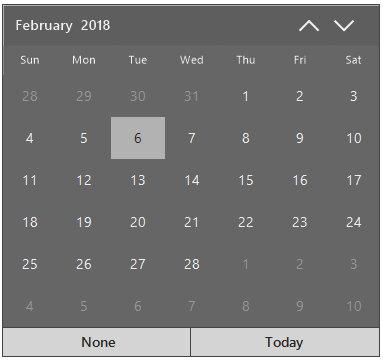
Office2016Black
This option helps to set the Office2016Black Theme.
// Office2016Black

 calendar.ThemeName = "Office2016Black";
' Office2016Black
calendar.ThemeName = "Office2016Black"
Hide trailing dates
The SfCalendar allows you to hide the days of next month and previous month in the calendar to enhance the appearance of the calendar. This can be achieved by disabling the TrailingDatesVisible property. The following code example illustrates how to hide trailing dates in the calendar:
// Setting the Next and Previous Months Dates invisible

calendar.TrailingDatesVisible = false;
' Setting the Next and Previous Months Dates invisible
calendar.TrailingDatesVisible = False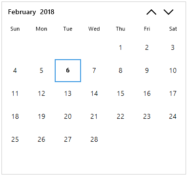
Abbreviating day names
By default, the day names are displayed in an abbreviated form in the calendar control. They can also be displayed in an expanded form by setting the ShowAbbreviatedDayNames property to false. This indicates whether the name of day is abbreviated or expanded. The following code example illustrates how to display the day names in an expanded form:
// Setting the Show Abbreviated Day Names

calendar.ShowAbbreviatedDayNames = false;
' Setting the Show Abbreviated Day Names
calendar.ShowAbbreviatedDayNames = false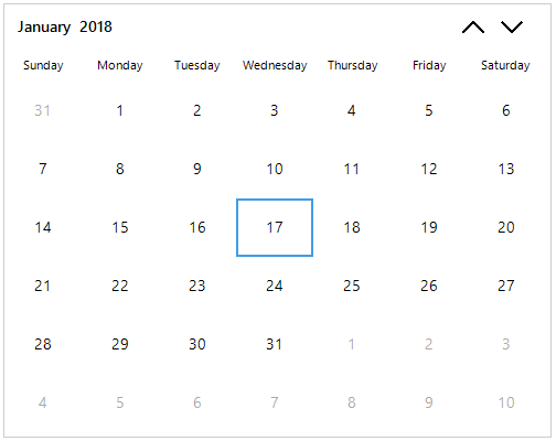
Right-to-left
SfCalendar control elements can be aligned in right-to-left layout. The SfCalendar control is laid out from the right to left when the RightToLeft value is set to Yes. The following code example illustrates the same:
//Enable the Right to Left

calendar.RightToLeft = RightToLeft.Yes;
'Enable the Right to Left
calendar.RightToLeft = RightToLeft.Yes
Highlight today cell
The today cell will be highlighted even the selected date differs from today in the SfCalendar. The highlight of today cell can be changed by the HighlightTodayCell property. The today date cell can also be customized by using the following style properties. The following code snippets illustrates the same:
// Indicating whether Today cell highlighted even selected date is different than today

calendar.HighlightTodayCell = true;
' Indicating whether Today cell highlighted even selected date is different than Today
calendar.HighlightTodayCell = true
Customize today cell appearance
The BackColor, ForeColor, and BorderColor of the today cell in the calendar can be customized. The today cell in the calendar control can be customized by using the following style properties:
- TodayBackColor: Changes the background color of today cell in the calendar.
- TodayForeColor: Changes the foreground color of today cell in the calendar.
- TodayFont: Changes the font that is used to draw the date text of today cell in the calendar.
- TodayHoverBorderColor: Changes the border color of today cell on mouse hover.
Change visibility of the footer
The visibility of the calendar footer can be customized by using the ShowFooter property which contains today and none buttons. The visibility of today and none buttons can be represented separately by ShowToday and ShowNone properties respectively. The following code example illustrates the same:
// Indicating the visibility of none button in footer

calendar.ShowFooter = true;

calendar.ShowNone = false;
' Indicating the visibility of none button in footer
calendar.ShowFooter = true
calendar.ShowNone = false
// Indicating the visibility of today button in footer

calendar.ShowFooter = true;

calendar.ShowToday = false;
' Indicating the visibility of today button in footer
calendar.ShowFooter = true
calendar.ShowToday = false
Customize splitter appearance
The visibility of splitters in the calendar control can be customized by setting the ShowHorizontalSplitter and ShowVerticalSplitter properties. The splitters color for horizontal and vertical splitters can be customized by the HorizontalSplitterColor and VerticalSplitterColor respectively. The following code example illustrates the same:
// Enable Horizontal splitter

 calendar.ShowHorizontalSplitter = true;

// Enable Vertical splitter

calendar.ShowVerticalSplitter = true;

//  color used draw the Horizontal splitter in cell view

calendar.Style.HorizontalSplitterColor = Color.Red;

// color used draw the vertical splitter in cell view

calendar.Style.VerticalSplitterColor = Color.Green;
' Enable Horizontal splitter
calendar.ShowHorizontalSplitter = true
' Enable Vertical splitter
calendar.ShowVerticalSplitter = true
' color used draw the Horizontal splitter in cell view
calendar.Style.HorizontalSplitterColor = Color.Red
' color used draw the vertical splitter in cell view
calendar.Style.VerticalSplitterColor = Color.Green