How can I help you?
Chart Types in UWP Pivot Chart (SfPivotChart)
7 Jan 202524 minutes to read
The SfPivotChart offers different types of charts ranging from column chart to pie chart. Based on your requirements and specifications, any type of chart can be used for data visualization.
Column charts
Column chart
Column charts are the most common chart type that are being used for comparison analysis. It uses vertical bars (called columns) to display different values of one or more items.
The following code snippet shows how to select a simple column chart.
<syncfusion:SfPivotChart x:Name="PivotChart1" ChartType="Column"
                         ItemSource="{Binding ProductSalesData}" PivotAxis="{Binding PivotAxis}"
                         PivotLegend="{Binding PivotLegend}" PivotCalculations="{Binding PivotCalculations}">
</syncfusion:SfPivotChart>PivotChart1.ChartType = PivotChartType.Column;PivotChart1.ChartType = PivotChartType.Column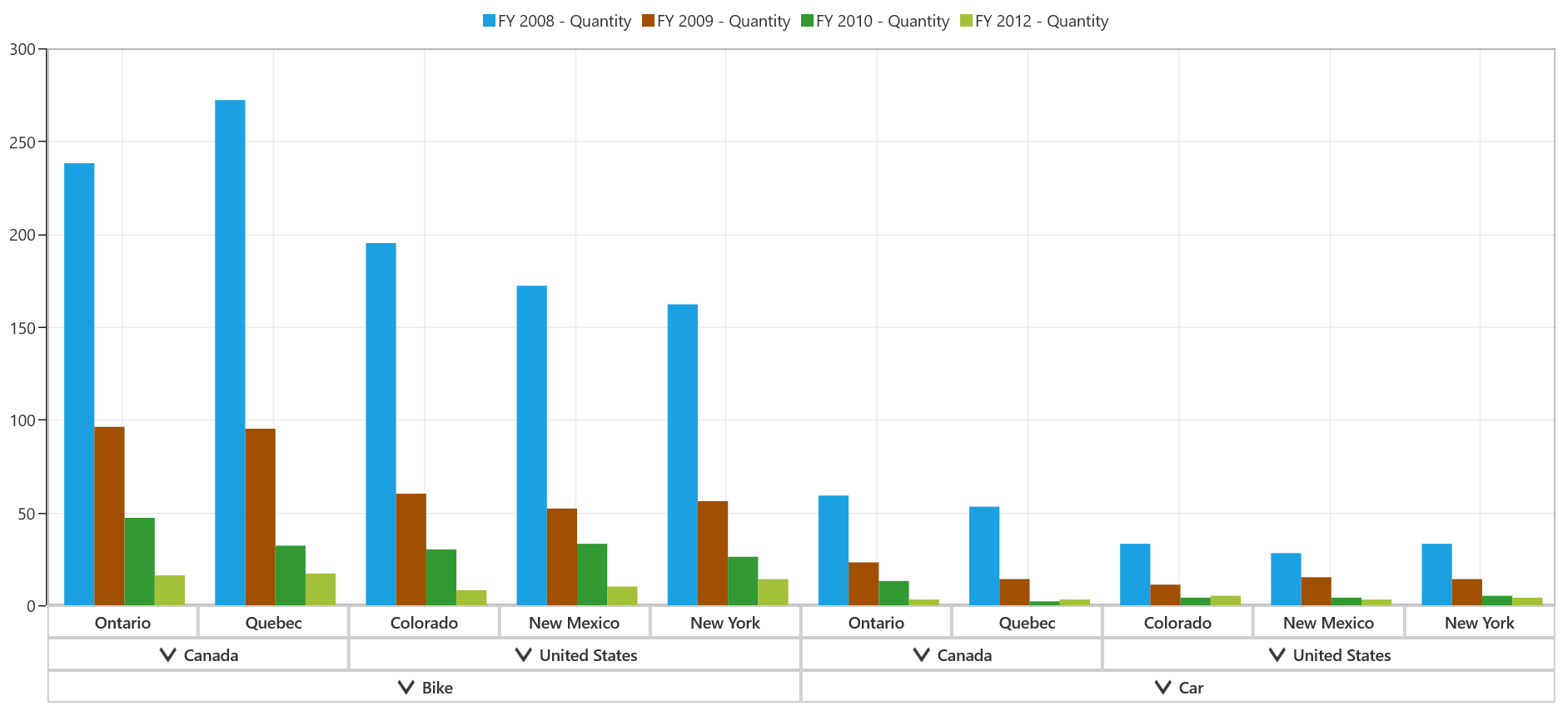
Stacking column chart
Stacking column charts are similar to regular column charts except that the Y values are stacked on top of each other in the specified series order. This chart helps to visualize the relationship of parts to the whole and it is widely used for proportional analysis over a particular period of time.
The following code snippet shows how to select a stacking column chart.
<syncfusion:SfPivotChart x:Name="PivotChart1" ChartType="StackingColumn"
                         ItemSource="{Binding ProductSalesData}" PivotAxis="{Binding PivotAxis}"
                         PivotLegend="{Binding PivotLegend}" PivotCalculations="{Binding PivotCalculations}">
</syncfusion:SfPivotChart>PivotChart1.ChartType = PivotChartType.StackingColumn;PivotChart1.ChartType = PivotChartType.StackingColumn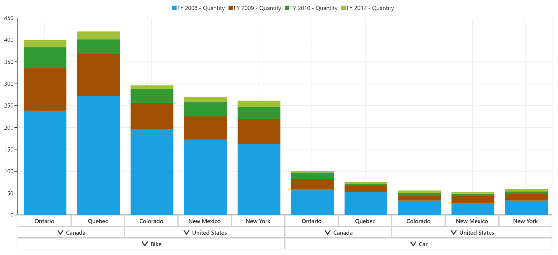
Stacking column 100 chart
Stacking column 100 chart contains stacked segments; it is a simple form of chart. In the 100 % stacked column chart, the cumulative proportion of each stacked element always totals 100%. This type of chart is used for visualizing the relative contribution of each series values to the whole.
The following code snippet shows how to select a stacking column 100 chart.
<syncfusion:SfPivotChart x:Name="PivotChart1" ChartType="StackingColumn100"
                         ItemSource="{Binding ProductSalesData}" PivotAxis="{Binding PivotAxis}"
                         PivotLegend="{Binding PivotLegend}" PivotCalculations="{Binding PivotCalculations}">
</syncfusion:SfPivotChart>PivotChart1.ChartType = PivotChartType.StackingColumn100;PivotChart1.ChartType = PivotChartType.StackingColumn100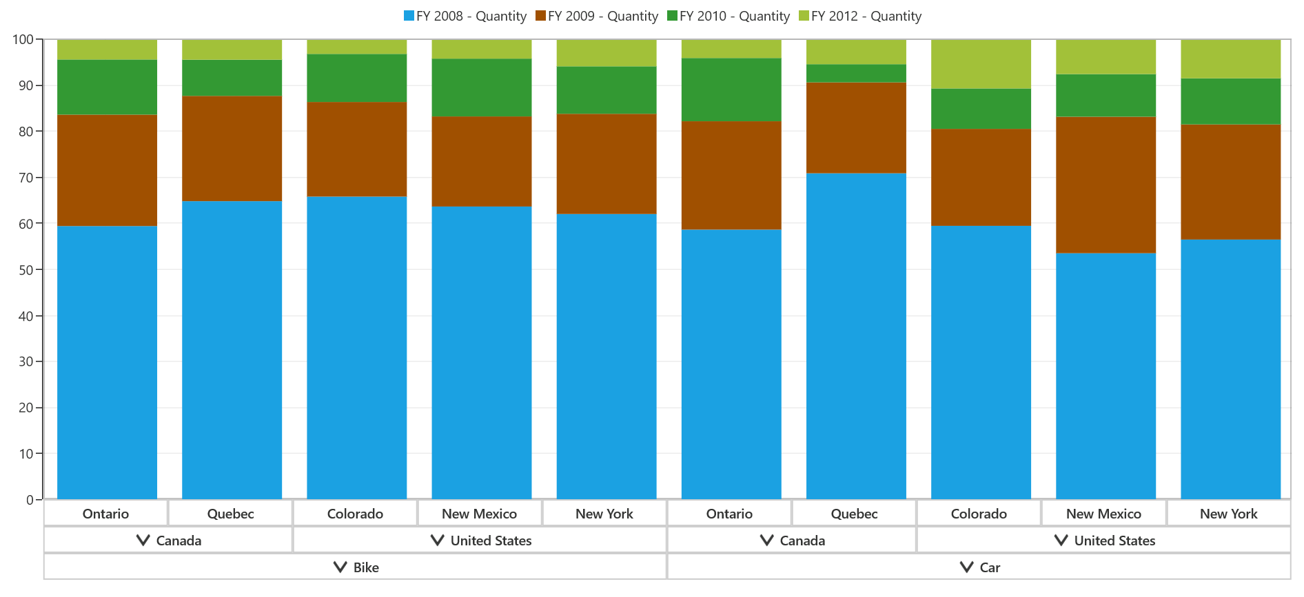
Bar charts
Bar chart
Bar chart is the simplest and most versatile of statistical diagrams. It displays horizontal bars for each point in the series and it is widely used for comparison analysis over a particular period of time.
The following code snippet shows how to select a bar chart.
<syncfusion:SfPivotChart x:Name="PivotChart1" ChartType="Bar"
                         ItemSource="{Binding ProductSalesData}" PivotAxis="{Binding PivotAxis}"
                         PivotLegend="{Binding PivotLegend}" PivotCalculations="{Binding PivotCalculations}">
</syncfusion:SfPivotChart>PivotChart1.ChartType = PivotChartType.Bar;PivotChart1.ChartType = PivotChartType.Bar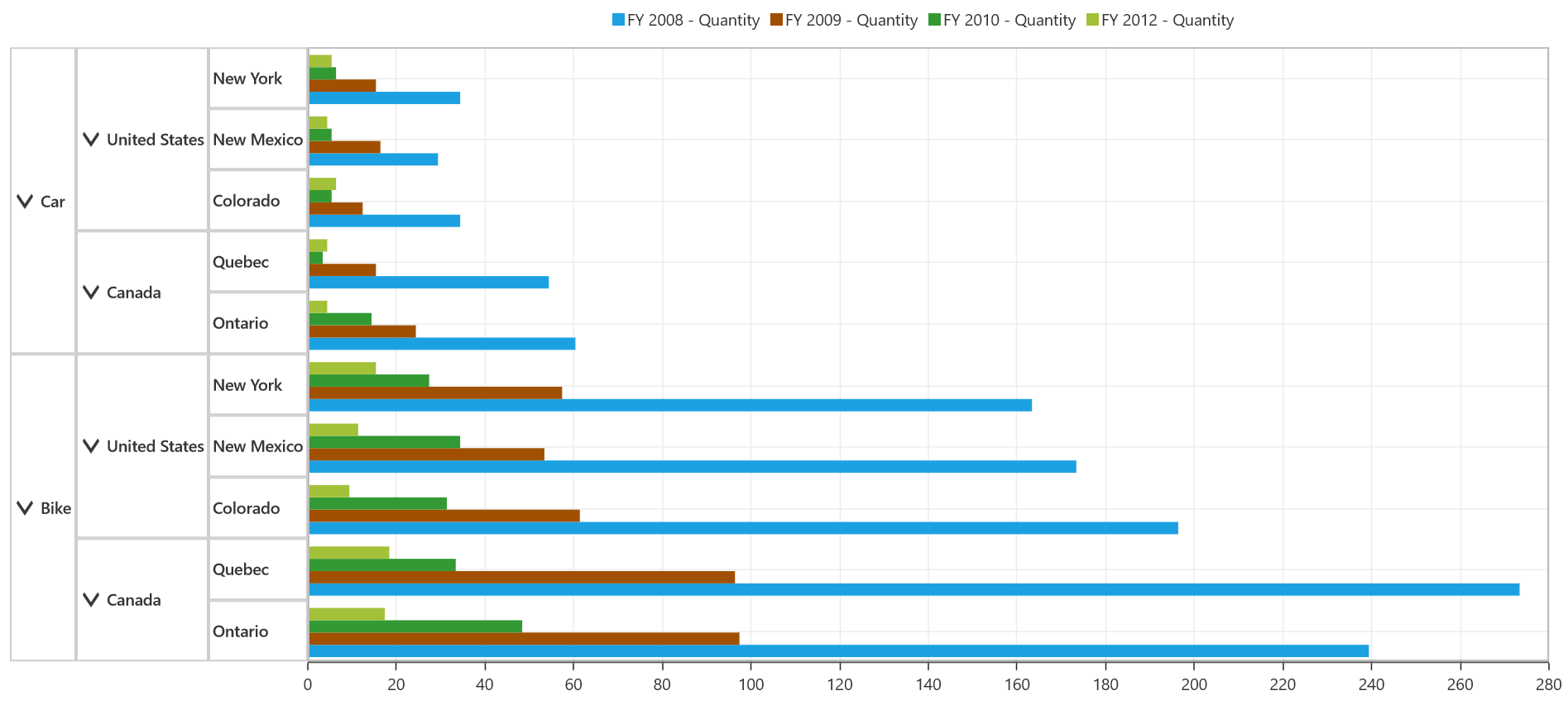
Stacking bar chart
Stacking bar chart is similar to stacking column chart. But, it differs from direction; it is rotated 90 degrees in clockwise direction. This type of chart is widely used for proportional analysis over a particular period of time.
The following code snippet shows how to select a stacking bar chart.
<syncfusion:SfPivotChart x:Name="PivotChart1" ChartType="StackingBar"
                         ItemSource="{Binding ProductSalesData}" PivotAxis="{Binding PivotAxis}"
                         PivotLegend="{Binding PivotLegend}" PivotCalculations="{Binding PivotCalculations}">
</syncfusion:SfPivotChart>PivotChart1.ChartType = PivotChartType.StackingBar;PivotChart1.ChartType = PivotChartType.StackingBar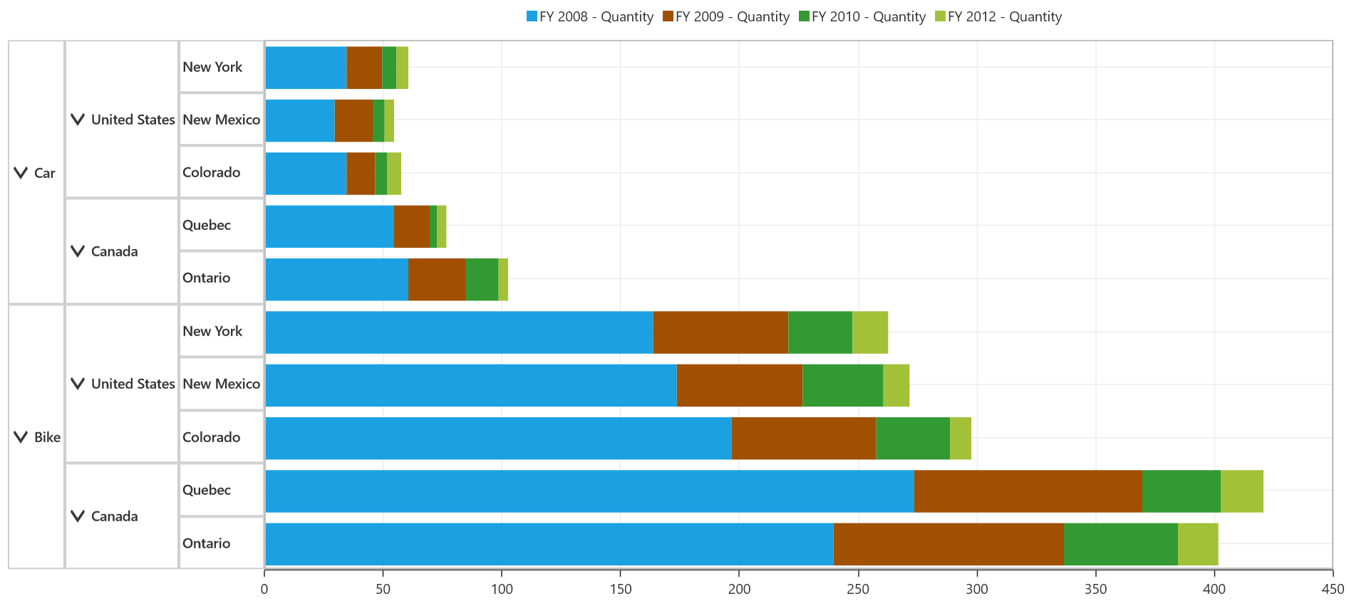
Stacking bar 100 chart
Stacking bar 100 chart is similar to the stacking column 100 chart. But, it differs from direction; it is rotated 90 degree in clockwise direction. This type of chart is widely used for proportional analysis over a particular period of time.
The following code snippet shows how to select a stacking bar 100 chart.
<syncfusion:SfPivotChart x:Name="PivotChart1" ChartType="StackingBar100"
                         ItemSource="{Binding ProductSalesData}" PivotAxis="{Binding PivotAxis}"
                         PivotLegend="{Binding PivotLegend}" PivotCalculations="{Binding PivotCalculations}">
</syncfusion:SfPivotChart>PivotChart1.ChartType = PivotChartType.StackingBar100;PivotChart1.ChartType = PivotChartType.StackingBar100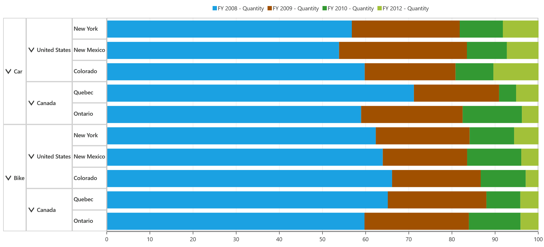
Area charts
Area chart
Area chart fills the quantitative data over a period of time. It is mainly used to compare the quantity that is plotted over two or more series.
The following code snippet shows how to select an area chart.
<syncfusion:SfPivotChart x:Name="PivotChart1" ChartType="Area"
                         ItemSource="{Binding ProductSalesData}" PivotAxis="{Binding PivotAxis}"
                         PivotLegend="{Binding PivotLegend}" PivotCalculations="{Binding PivotCalculations}">
</syncfusion:SfPivotChart>PivotChart1.ChartType = PivotChartType.Area;PivotChart1.ChartType = PivotChartType.Area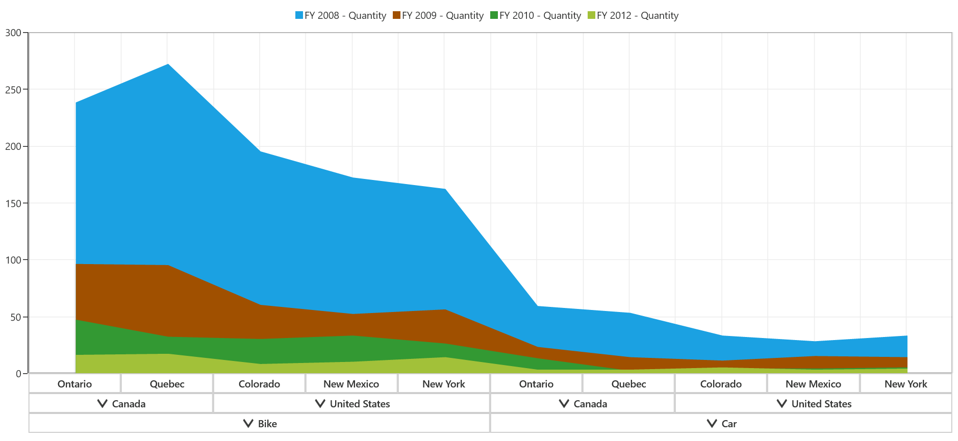
Stacking area chart
Stacking area chart fills the quantitative data over a period of time like the area chart. The variation is plotting each series on the top of the previous series rather than starting from 0 in the horizontal axis. It is mainly used to compare the quantity plotted over two or more series.
The following code snippet shows how to select a stacking area chart.
<syncfusion:SfPivotChart x:Name="PivotChart1" ChartType="StackingArea"
                         ItemSource="{Binding ProductSalesData}" PivotAxis="{Binding PivotAxis}"
                         PivotLegend="{Binding PivotLegend}" PivotCalculations="{Binding PivotCalculations}">
</syncfusion:SfPivotChart>PivotChart1.ChartType = PivotChartType.StackingArea;PivotChart1.ChartType = PivotChartType.StackingArea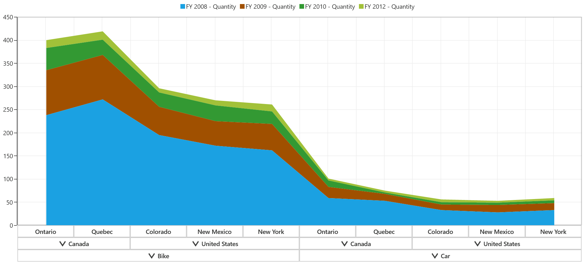
Spline area chart
Spline area chart is mostly used to approximate the intervals with the help of spline curve. It is often used when data points are in limited number.
The following code snippet shows how to select a spline area chart.
<syncfusion:SfPivotChart x:Name="PivotChart1" ChartType="SplineArea"
                         ItemSource="{Binding ProductSalesData}" PivotAxis="{Binding PivotAxis}"
                         PivotLegend="{Binding PivotLegend}" PivotCalculations="{Binding PivotCalculations}">
</syncfusion:SfPivotChart>PivotChart1.ChartType = PivotChartType.SplineArea;PivotChart1.ChartType = PivotChartType.SplineArea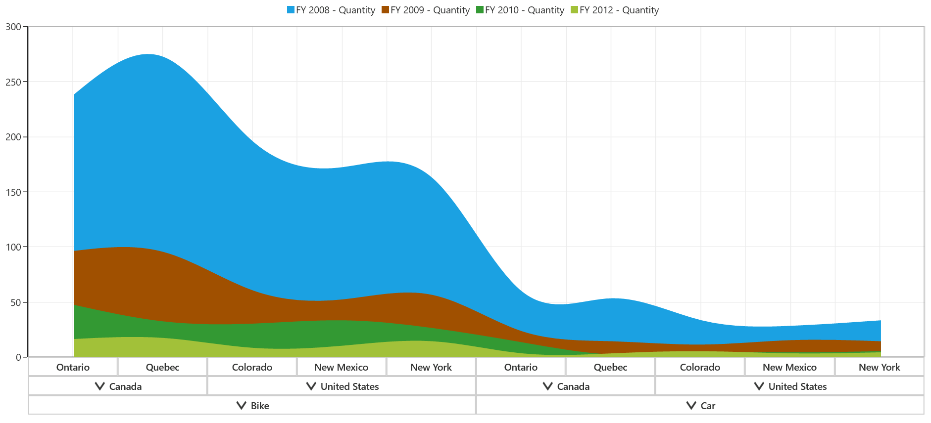
Step area chart
In the step area chart, the points are plotted instead of a straight line tracing the shortest path between points; the values are connected by continuous vertical and horizontal lines.
The following code snippet shows how to select a step area chart.
<syncfusion:SfPivotChart x:Name="PivotChart1" ChartType="StepArea"
                         ItemSource="{Binding ProductSalesData}" PivotAxis="{Binding PivotAxis}"
                         PivotLegend="{Binding PivotLegend}" PivotCalculations="{Binding PivotCalculations}">
</syncfusion:SfPivotChart>PivotChart1.ChartType = PivotChartType.StepArea;PivotChart1.ChartType = PivotChartType.StepArea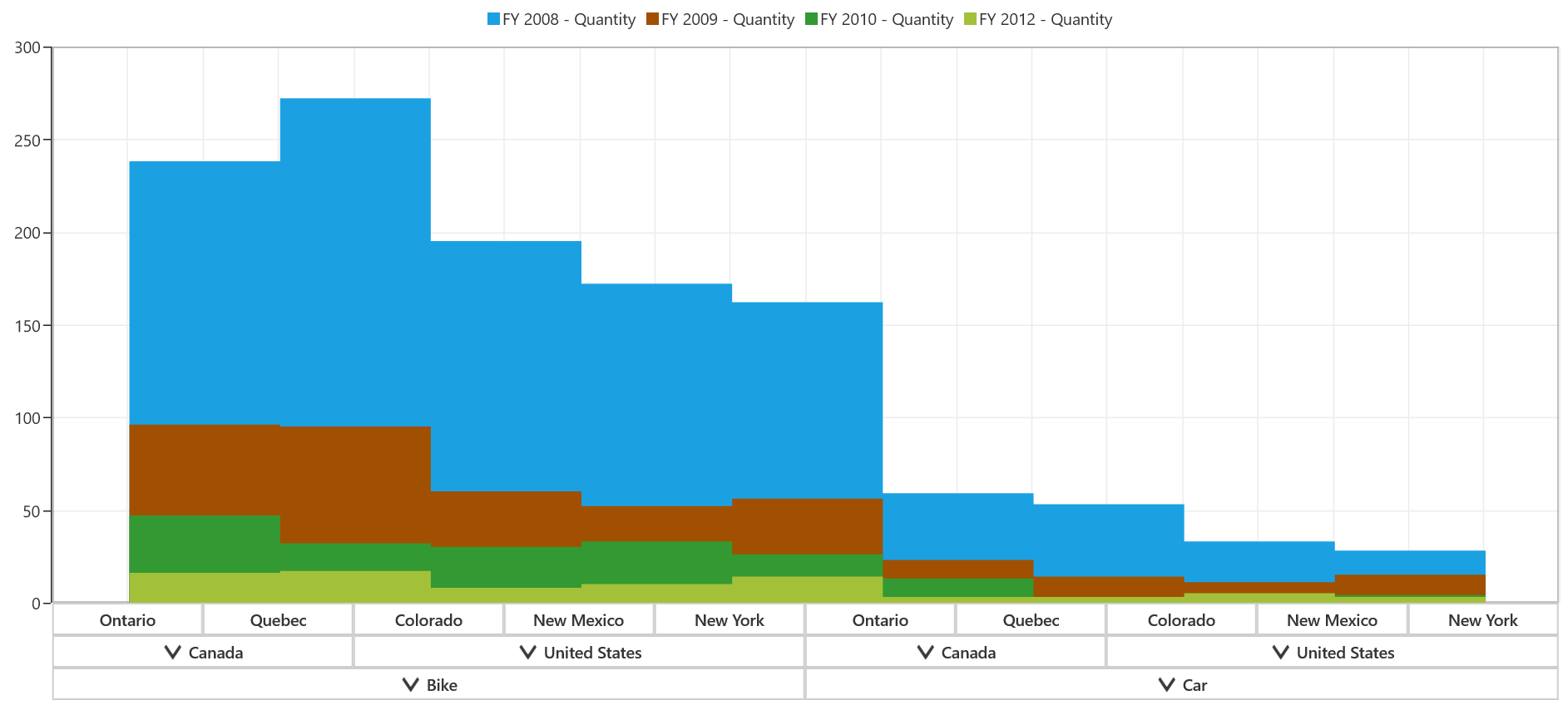
Line charts
Line chart
Line chart is the simple form of chart, which connects a series of data points with a straight line. Usually, it is used for trend analysis, forecasting, or visualizing large data points.
The following code snippet shows how to select a line chart.
<syncfusion:SfPivotChart x:Name="PivotChart1" ChartType="Line"
                         ItemSource="{Binding ProductSalesData}" PivotAxis="{Binding PivotAxis}"
                         PivotLegend="{Binding PivotLegend}" PivotCalculations="{Binding PivotCalculations}">
</syncfusion:SfPivotChart>PivotChart1.ChartType = PivotChartType.Line;PivotChart1.ChartType = PivotChartType.Line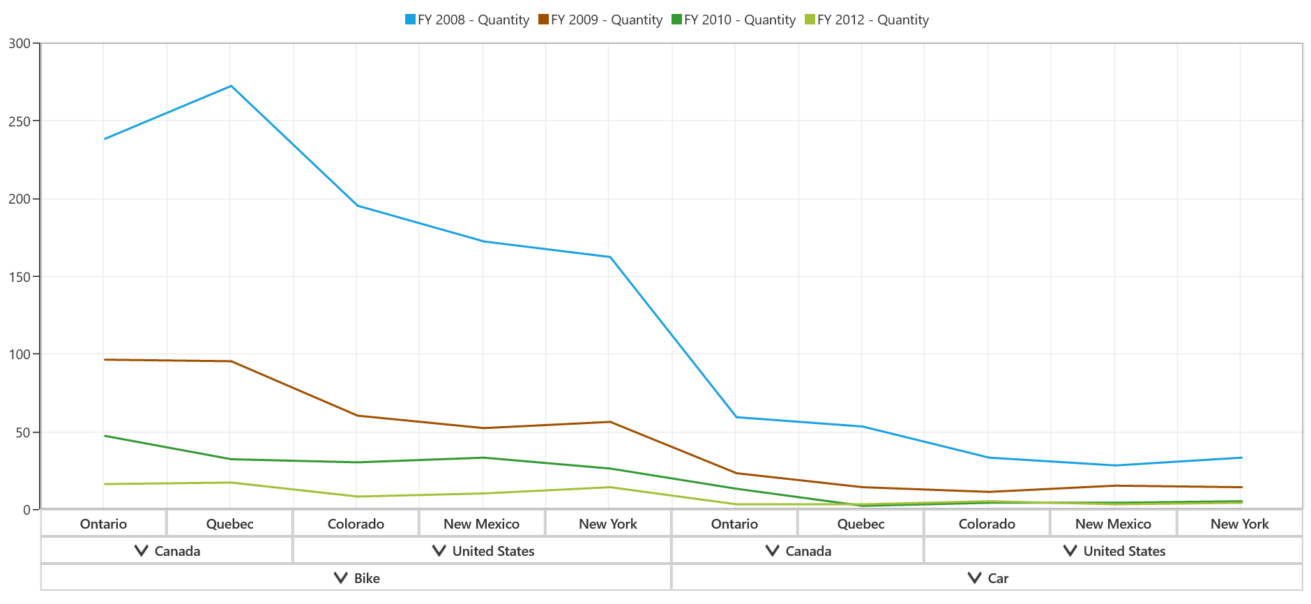
Spline chart
Spline chart is a simple form of chart, which connects the series of data points with an arc rather than a straight line.
The following code snippet shows how to select a spline chart.
<syncfusion:SfPivotChart x:Name="PivotChart1" ChartType="Spline"
                         ItemSource="{Binding ProductSalesData}" PivotAxis="{Binding PivotAxis}"
                         PivotLegend="{Binding PivotLegend}" PivotCalculations="{Binding PivotCalculations}">
</syncfusion:SfPivotChart>PivotChart1.ChartType = PivotChartType.Spline;PivotChart1.ChartType = PivotChartType.Spline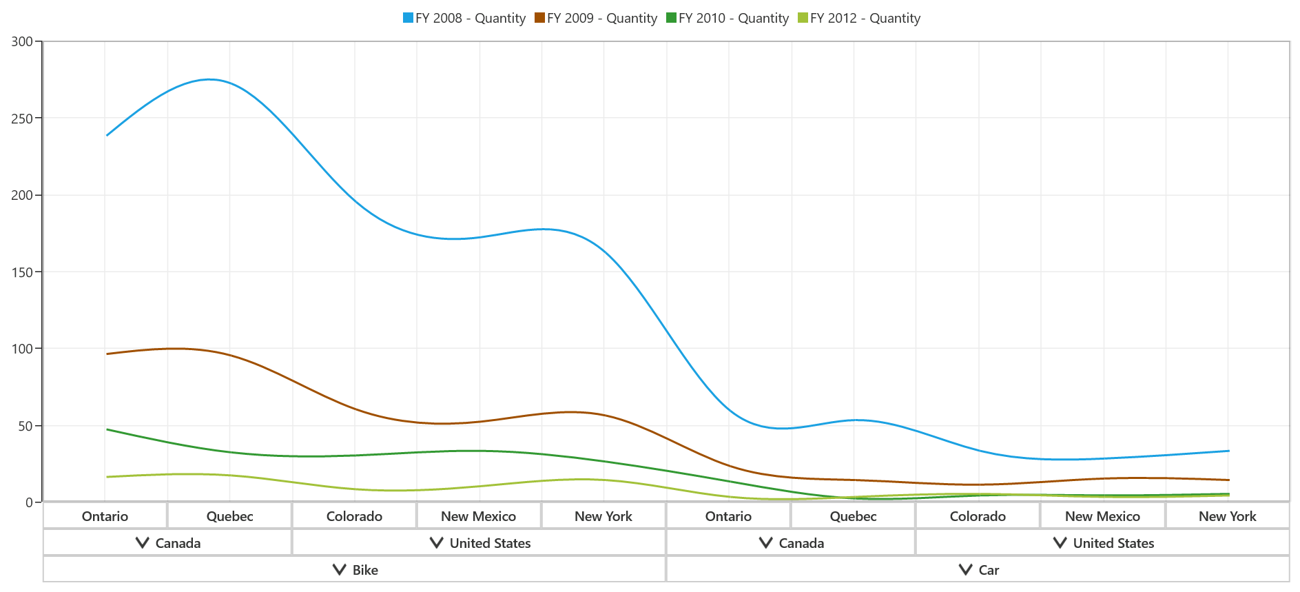
Step line chart
Step line chart is another form of chart, which connects the series of data points by using horizontal and vertical lines.
The following code snippet shows how to select a step line chart.
<syncfusion:SfPivotChart x:Name="PivotChart1" ChartType="StepLine"
                         ItemSource="{Binding ProductSalesData}" PivotAxis="{Binding PivotAxis}"
                         PivotLegend="{Binding PivotLegend}" PivotCalculations="{Binding PivotCalculations}">
</syncfusion:SfPivotChart>PivotChart1.ChartType = PivotChartType.StepLine;PivotChart1.ChartType = PivotChartType.StepLine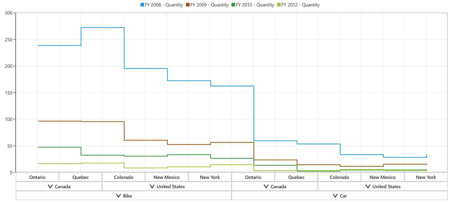
Scatter chart
Scatter chart is a collection of points that are plotted in the rectangular co-ordinate system. It is often used in relationship analysis up to one independent variable. The size of scatter segments can be modified with the help of ScatterWidth and ScatterHeight properties.
The following code snippet shows how to select a scatter chart.
<syncfusion:SfPivotChart x:Name="PivotChart1" ChartType="Scatter" ScatterWidth="20" ScatterHeight="20"
                         ItemSource="{Binding ProductSalesData}" PivotAxis="{Binding PivotAxis}"
                         PivotLegend="{Binding PivotLegend}" PivotCalculations="{Binding PivotCalculations}">
</syncfusion:SfPivotChart>PivotChart1.ChartType = PivotChartType.Scatter;
PivotChart1.ScatterWidth = 20;
PivotChart1.ScatterHeight = 20;PivotChart1.ChartType = PivotChartType.Scatter
PivotChart1.ScatterWidth = 20
PivotChart1.ScatterHeight = 20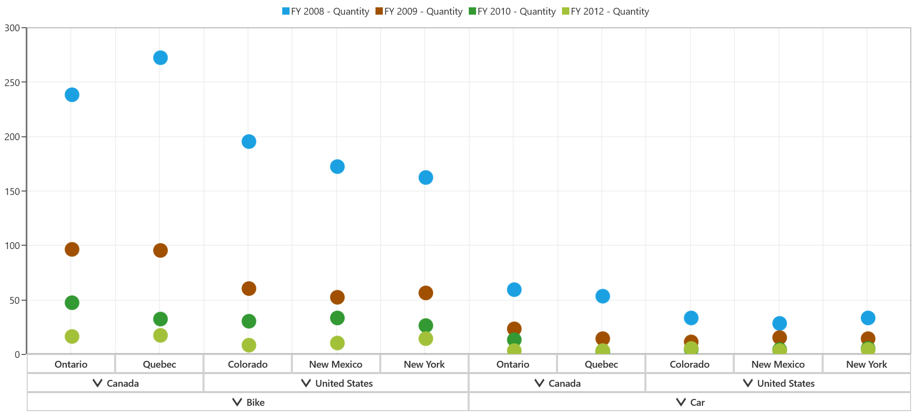
Pie chart
Pie chart renders Y values as slices in a pie. These slices are rendered in a proportion to the whole which is simply the sum of all the Y values in the series. Pie chart can display only one data series at a time.
The following code snippet shows how to select a pie chart.
<syncfusion:SfPivotChart x:Name="PivotChart1" ChartType="Pie"
                         ItemSource="{Binding ProductSalesData}" PivotAxis="{Binding PivotAxis}"
                         PivotLegend="{Binding PivotLegend}" PivotCalculations="{Binding PivotCalculations}">
</syncfusion:SfPivotChart>PivotChart1.ChartType = PivotChartType.Pie;PivotChart1.ChartType = PivotChartType.Pie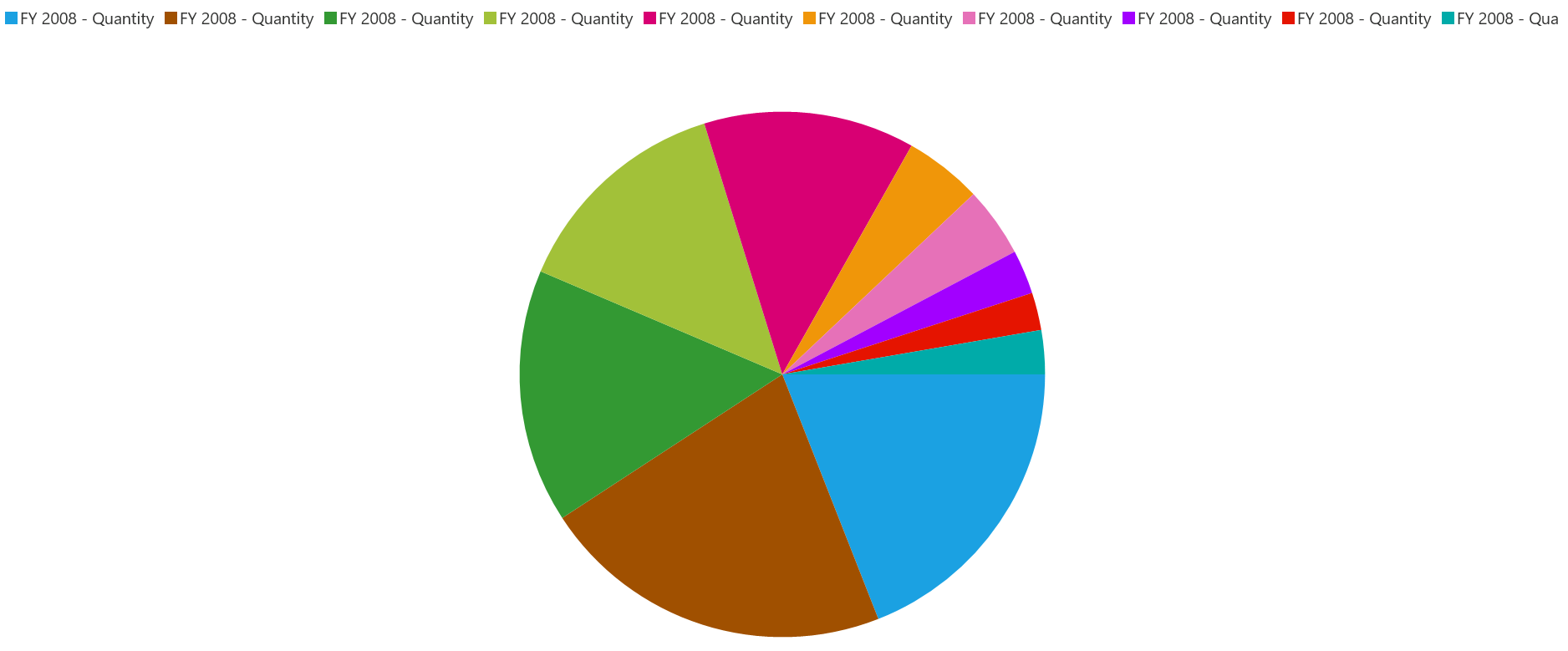
NOTE
Pie chart should not be used for comparison analysis of large data points, because it is harder for people to estimate angles rather than distance.
Fast charts
Fast bar bitmap chart
Fast bar bitmap charts are similar to bar type charts except that it boosts up the performance of loading large data points.
The following code snippet shows how to select a fast bar bitmap chart.
<syncfusion:SfPivotChart x:Name="PivotChart1" ChartType="FastBarBitmap"
                         ItemSource="{Binding ProductSalesData}" PivotAxis="{Binding PivotAxis}"
                         PivotLegend="{Binding PivotLegend}" PivotCalculations="{Binding PivotCalculations}">
</syncfusion:SfPivotChart>PivotChart1.ChartType = PivotChartType.FastBarBitmap;PivotChart1.ChartType = PivotChartType.FastBarBitmap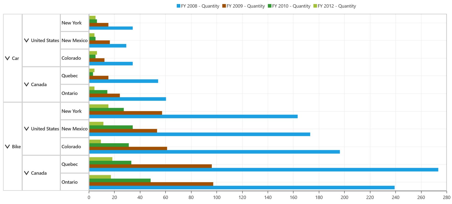
Fast column bitmap chart
Fast column bitmap charts are similar to column type charts except that it boosts up the performance of loading large data points.
The following code snippet shows how to select a fast column bitmap chart.
<syncfusion:SfPivotChart x:Name="PivotChart1" ChartType="FastColumnBitmap"
                         ItemSource="{Binding ProductSalesData}" PivotAxis="{Binding PivotAxis}"
                         PivotLegend="{Binding PivotLegend}" PivotCalculations="{Binding PivotCalculations}">
</syncfusion:SfPivotChart>PivotChart1.ChartType = PivotChartType.FastColumnBitmap;PivotChart1.ChartType = PivotChartType.FastColumnBitmap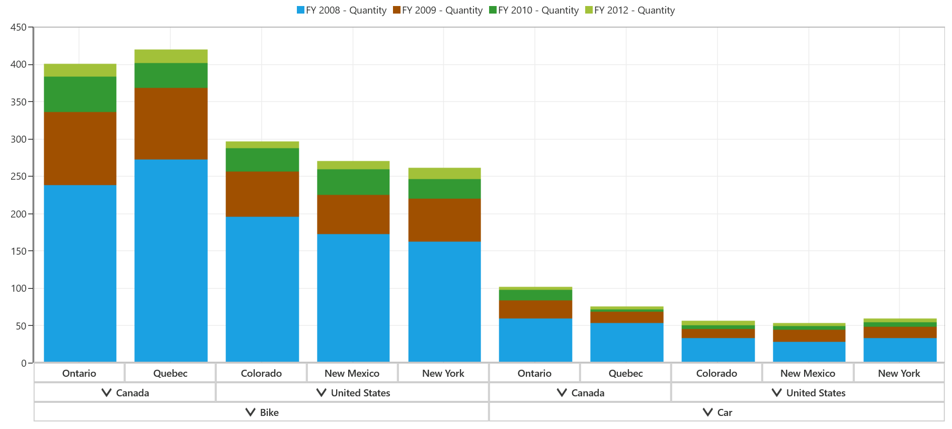
Fast line chart
The fast line chart is a special kind of line chart that renders a huge collection of data points using the polyline segment.
The following code snippet shows how to select a fast line chart.
<syncfusion:SfPivotChart x:Name="PivotChart1" ChartType="FastLine"
                         ItemSource="{Binding ProductSalesData}" PivotAxis="{Binding PivotAxis}"
                         PivotLegend="{Binding PivotLegend}" PivotCalculations="{Binding PivotCalculations}">
</syncfusion:SfPivotChart>PivotChart1.ChartType = PivotChartType.FastLine;PivotChart1.ChartType = PivotChartType.FastLine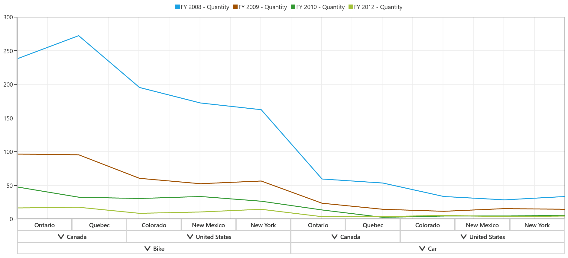
Fast line bitmap chart
The fast line bitmap chart displays a series of line segments that are rendered by using the WriteableBitmap. The advantage of this chart is rendering a million data points in a fraction of seconds.
The following code snippet shows how to select a fast line bitmap chart.
<syncfusion:SfPivotChart x:Name="PivotChart1" ChartType="FastLineBitmap"
                         ItemSource="{Binding ProductSalesData}" PivotAxis="{Binding PivotAxis}"
                         PivotLegend="{Binding PivotLegend}" PivotCalculations="{Binding PivotCalculations}">
</syncfusion:SfPivotChart>PivotChart1.ChartType = PivotChartType.FastLineBitmap;PivotChart1.ChartType = PivotChartType.FastLineBitmap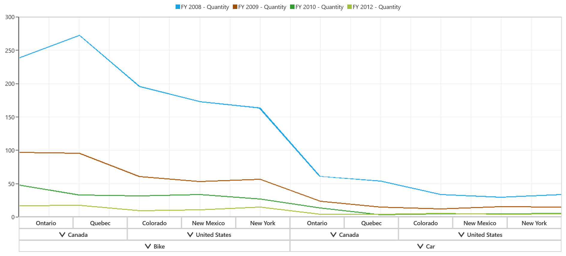
As this chart is rendered using bitmap, there might be some jagged lines at the edges and it can be reduced by enabling the EnableAntiAliasing property as follows.
<syncfusion:SfPivotChart x:Name="PivotChart1" ChartType="FastLineBitmap" EnableAntiAliasing="True"
                         ItemSource="{Binding ProductSalesData}" PivotAxis="{Binding PivotAxis}"
                         PivotLegend="{Binding PivotLegend}" PivotCalculations="{Binding PivotCalculations}">
</syncfusion:SfPivotChart>PivotChart1.ChartType = PivotChartType.FastLineBitmap;
PivotChart1.EnableAntiAliasing = true;PivotChart1.ChartType = PivotChartType.FastLineBitmap
PivotChart1.EnableAntiAliasing = True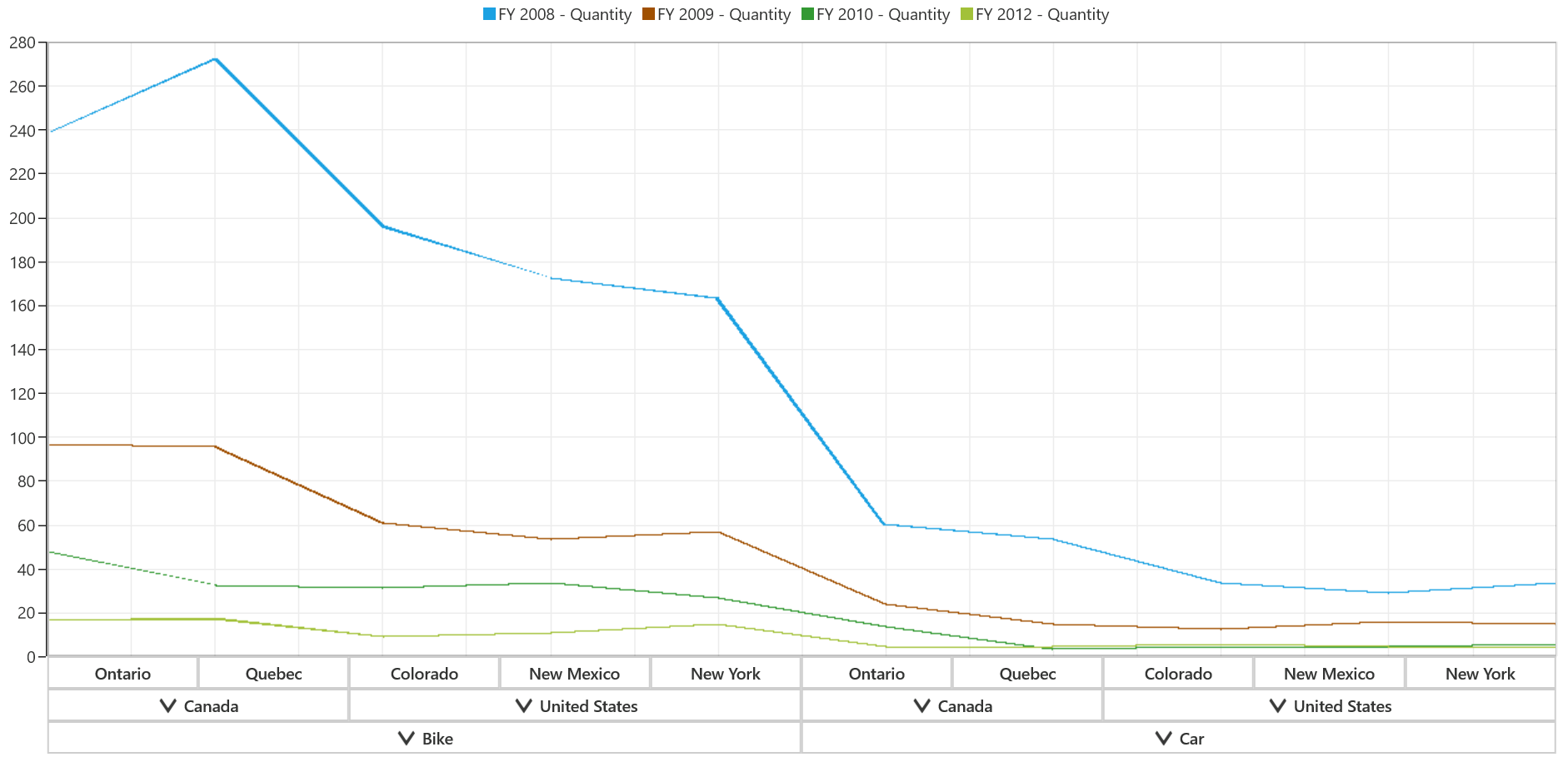
Fast scatter bitmap chart
The fast scatter bitmap chart is used to display a large set of scatter points. The following code snippet shows how to select a fast scatter bitmap chart.
<syncfusion:SfPivotChart x:Name="PivotChart1" ChartType="FastScatterBitmap"
                         ItemSource="{Binding ProductSalesData}" PivotAxis="{Binding PivotAxis}"
                         PivotLegend="{Binding PivotLegend}" PivotCalculations="{Binding PivotCalculations}">
</syncfusion:SfPivotChart>PivotChart1.ChartType = PivotChartType.FastScatterBitmap;PivotChart1.ChartType = PivotChartType.FastScatterBitmap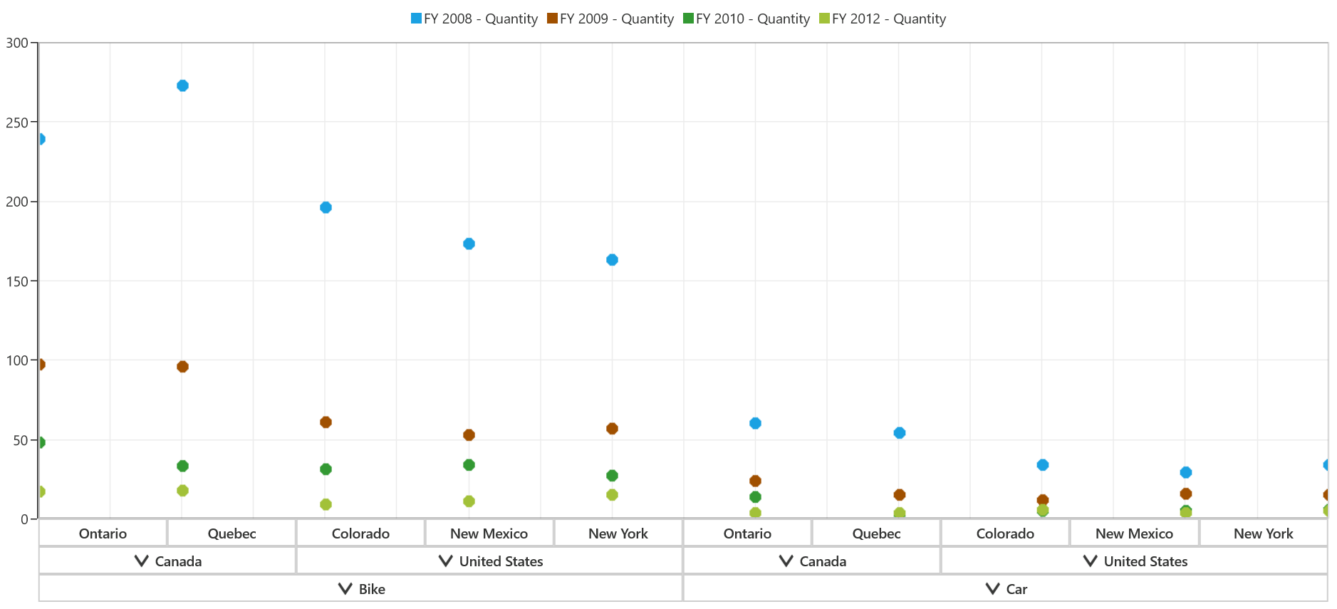
The size of the scatter points can be customized with the help of ScatterWidth and ScatterHeight properties as follows.
<syncfusion:SfPivotChart x:Name="PivotChart1" ChartType="FastScatterBitmap" ScatterWidth="7" ScatterHeight="7"
                         ItemSource="{Binding ProductSalesData}" PivotAxis="{Binding PivotAxis}"
                         PivotLegend="{Binding PivotLegend}" PivotCalculations="{Binding PivotCalculations}">
</syncfusion:SfPivotChart>PivotChart1.ChartType = PivotChartType.FastScatterBitmap;
PivotChart1.ScatterWidth = 7;
PivotChart1.ScatterHeight = 7;PivotChart1.ChartType = PivotChartType.FastScatterBitmap
PivotChart1.ScatterWidth = 7
PivotChart1.ScatterHeight = 7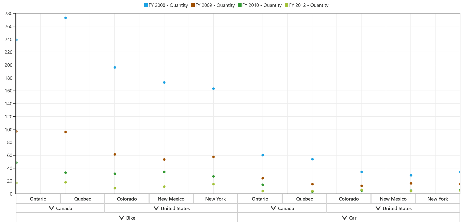
Fast stacking column bitmap chart
The fast stacking column charts are similar to stacking column charts but it loads faster and provides better performance comparatively.
<syncfusion:SfPivotChart x:Name="PivotChart1" ChartType="FastStackingColumnBitmap"
                         ItemSource="{Binding ProductSalesData}" PivotAxis="{Binding PivotAxis}"
                         PivotLegend="{Binding PivotLegend}" PivotCalculations="{Binding PivotCalculations}">
</syncfusion:SfPivotChart>PivotChart1.ChartType = PivotChartType.FastStackingColumnBitmap;PivotChart1.ChartType = PivotChartType.FastStackingColumnBitmap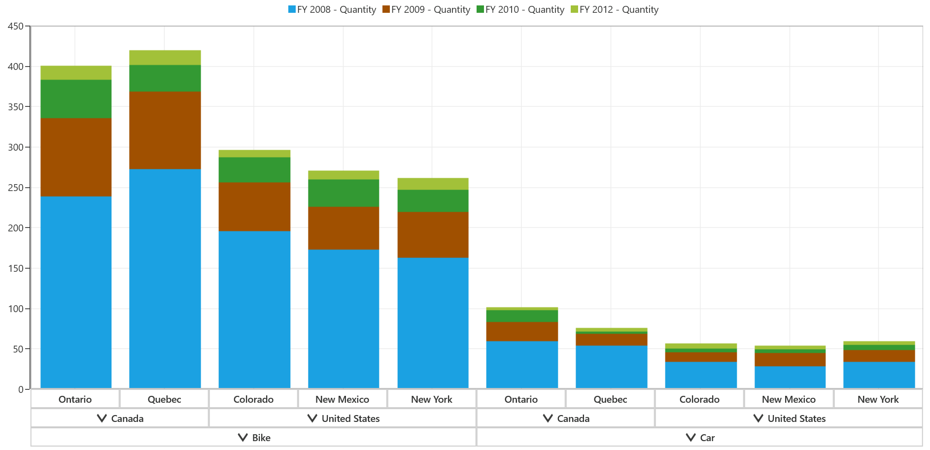
Fast step line bitmap chart
The fast step line charts are the high performance version of step line charts.
<syncfusion:SfPivotChart x:Name="PivotChart1" ChartType="FastStepLineBitmap"
                         ItemSource="{Binding ProductSalesData}" PivotAxis="{Binding PivotAxis}"
                         PivotLegend="{Binding PivotLegend}" PivotCalculations="{Binding PivotCalculations}">
</syncfusion:SfPivotChart>PivotChart1.ChartType = PivotChartType.FastStepLineBitmap;PivotChart1.ChartType = PivotChartType.FastStepLineBitmap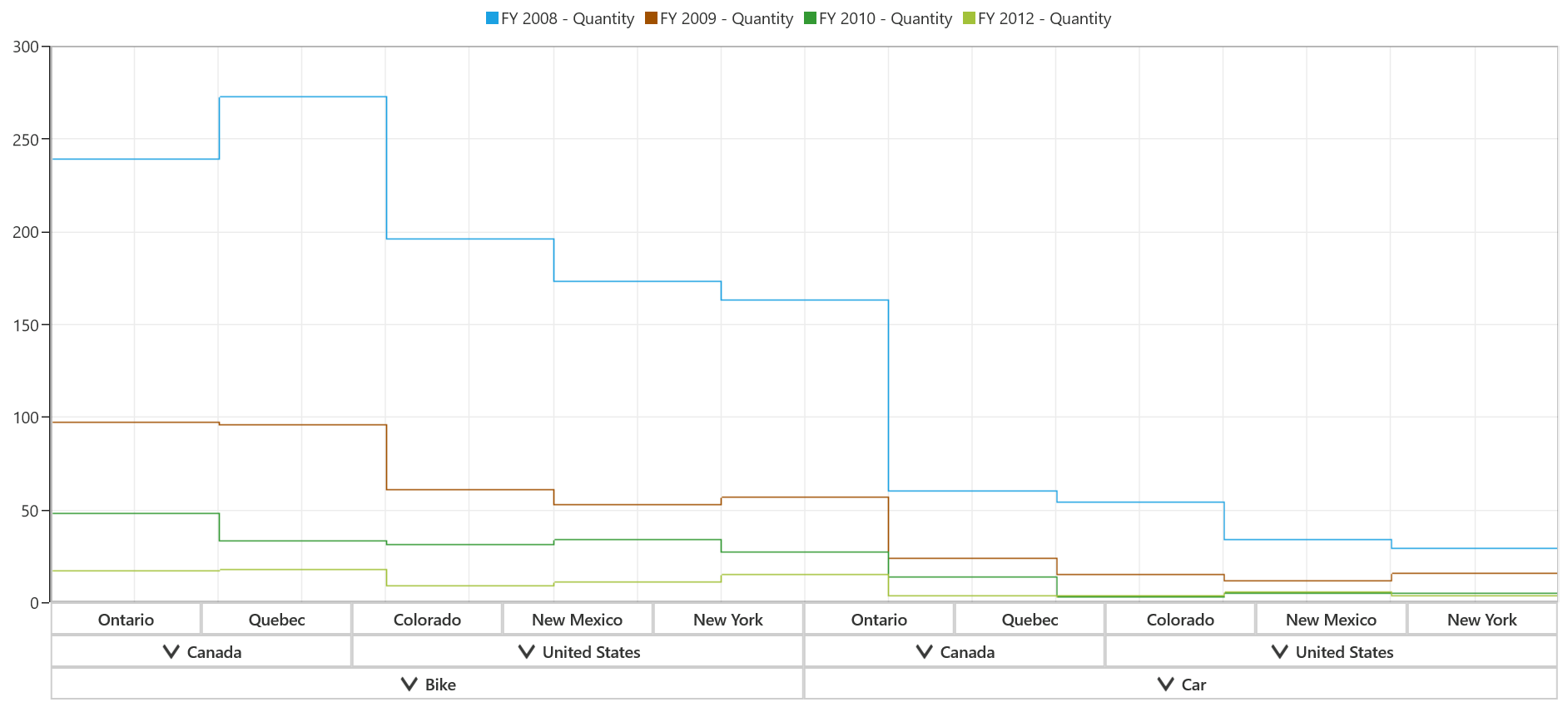
As fast step line bitmap chart is rendered using bitmap, some jagged lines can be occurred at the edges and it can be reduced by enabling the EnableAntiAliasing property as follows.
<syncfusion:SfPivotChart x:Name="PivotChart1" ChartType="FastStepLineBitmap" EnableAntiAliasing="True"
                         ItemSource="{Binding ProductSalesData}" PivotAxis="{Binding PivotAxis}"
                         PivotLegend="{Binding PivotLegend}" PivotCalculations="{Binding PivotCalculations}">
</syncfusion:SfPivotChart>PivotChart1.ChartType = PivotChartType.FastStepLineBitmap;
PivotChart1.EnableAntiAliasing = true;PivotChart1.ChartType = PivotChartType.FastStepLineBitmap
PivotChart1.EnableAntiAliasing = True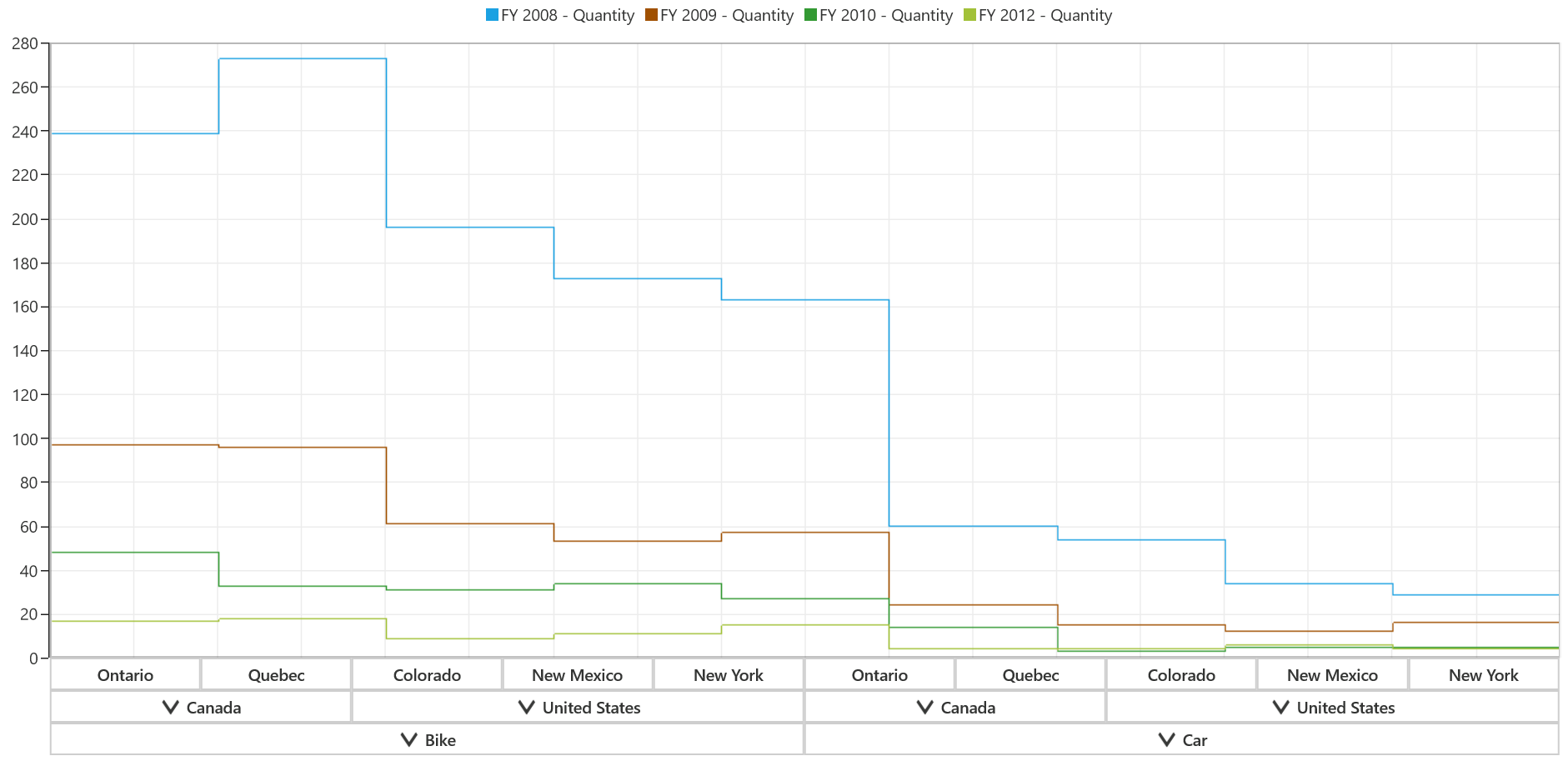
A demo sample is available in the following location.
{system drive}:\User3s\<User Name>\AppData\Local\Syncfusion\EssentialStudio\<Version Number>\Samples\UWP\SampleBrowser\PivotChart\PivotChart\View\ChartType.xaml