Axis in UWP Pivot Chart (SfPivotChart)
15 Jul 202612 minutes to read
Axis is used to locate a data point inside the chart area. Generally, two axes are required along each direction to locate the data point in the chart, i.e., horizontal and vertical. The vertical axis (y-axis) represents numerical values and the horizontal axis (x-axis) represents categorical values.
Axis style
The primary axis style can be modified by using the PrimaryAxisStyle property and the secondary axis style can be modified by using the SecondaryAxisStyle property in the SfPivotChart.
Grid line style
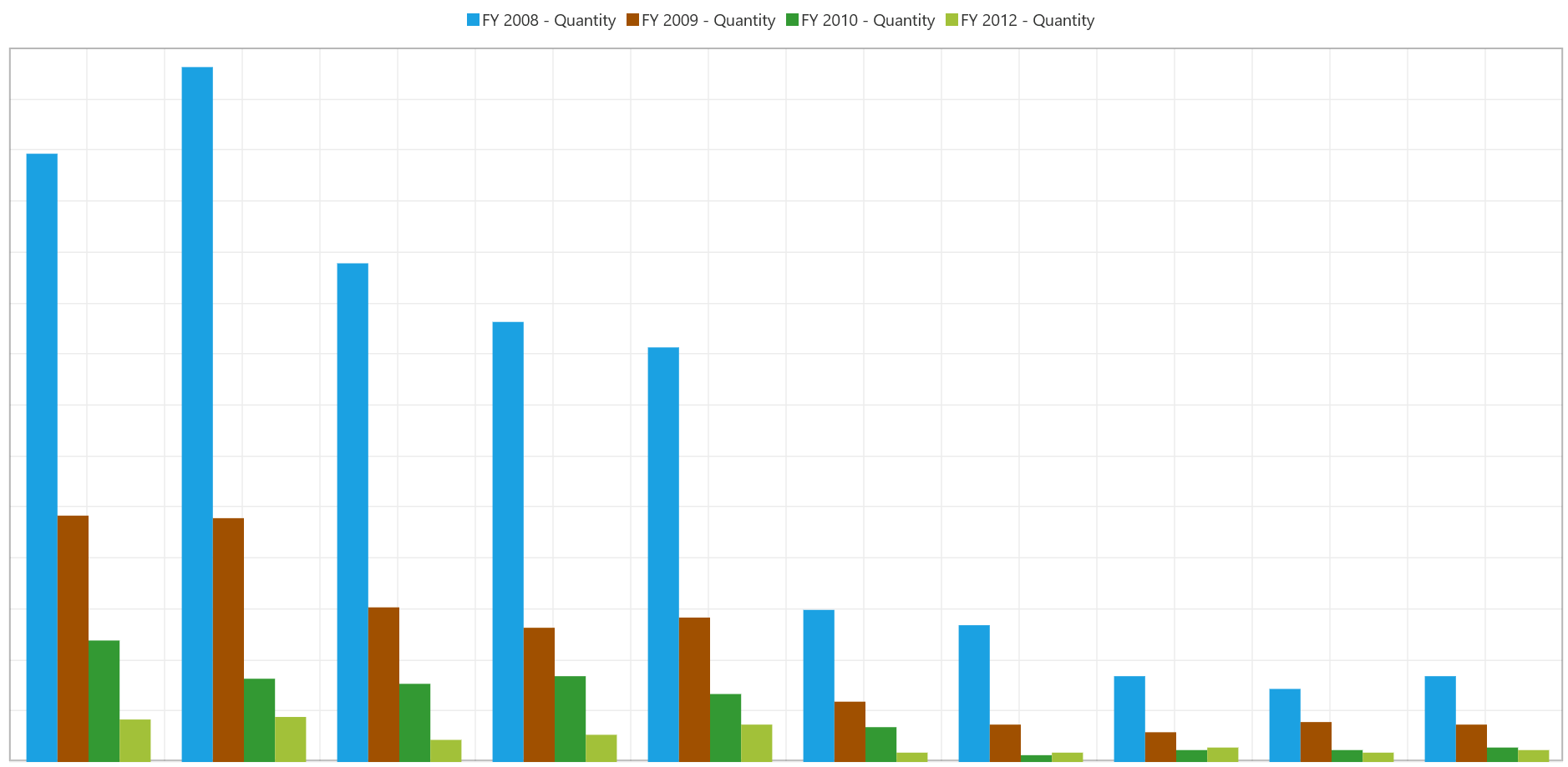
To customize the grid line of chart axis, you can use the GridLineStyle property.
The following code snippet describes how to customize the style of grid lines in the primary axis.
<Page.Resources>
    <Style x:Key="LineStyle" TargetType="Line">
        <Setter Property="Stroke" Value="Red"/>
        <Setter Property="StrokeDashArray" Value="1,2"/>
    </Style>
</Page.Resources>

<syncfusion:SfPivotChart.PrimaryAxisStyle>
    <syncfusion:PivotChartAxisStyle GridLineStyle="{StaticResource LineStyle}"/>
</syncfusion:SfPivotChart.PrimaryAxisStyle>PivotChart1.PrimaryAxisStyle.GridLineStyle = Resources["LineStyle"] as Style;PivotChart1.PrimaryAxisStyle.GridLineStyle = TryCast(Resources("LineStyle"), Style)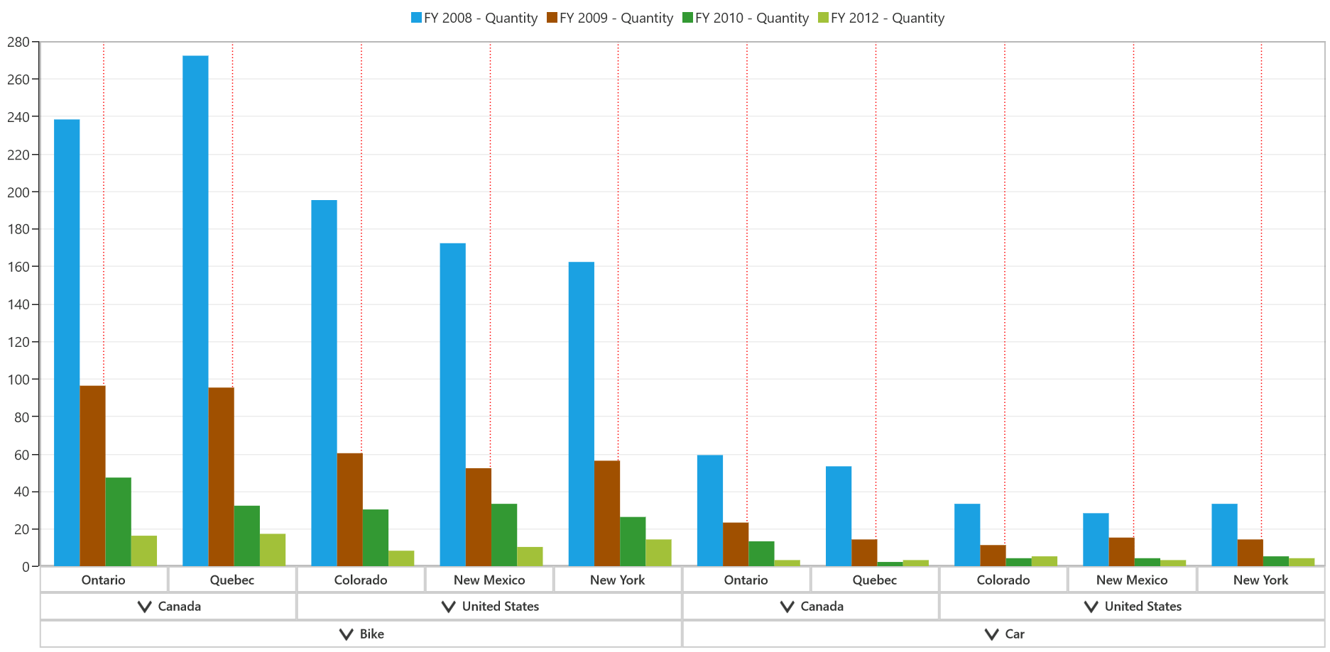
The following code snippet describes how to customize the style of gridlines in the secondary axis.
<Page.Resources>
    <Style x:Key="LineStyle" TargetType="Line">
        <Setter Property="Stroke" Value="Red"/>
        <Setter Property="StrokeDashArray" Value="1,2"/>
    </Style>
</Page.Resources>

<syncfusion:SfPivotChart.SecondaryAxisStyle>
    <syncfusion:PivotChartAxisStyle GridLineStyle="{StaticResource LineStyle}"/>
</syncfusion:SfPivotChart.SecondaryAxisStyle>PivotChart1.SecondaryAxisStyle.GridLineStyle = Resources["LineStyle"] as Style;PivotChart1.SecondaryAxisStyle.GridLineStyle = TryCast(Resources("LineStyle"), Style)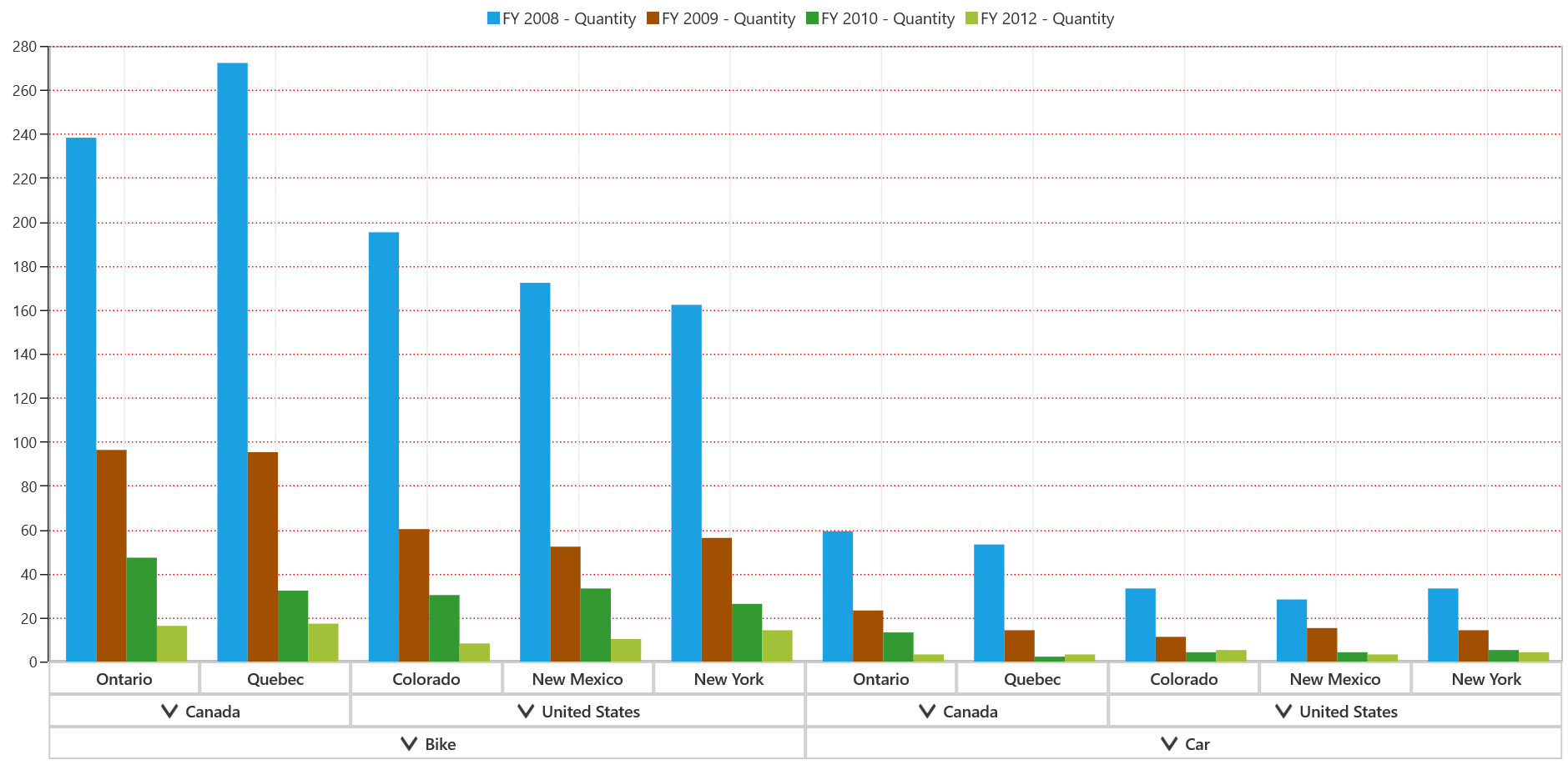
Expander style
To customize the expanders of primary axis labels, you should assign the ExpanderStyle property in the PivotChartAxisStyle. It is applicable only for the primary axis having expanders in labels.
The following code snippet describes how to customize the style of expanders in primary axis labels.
<Page.Resources>
    <Style x:Key="PrimaryAxisExpanderStyle" TargetType="ToggleButton">
        <Setter Property="Template">
        <Setter.Value>
        <ControlTemplate TargetType="ToggleButton">
            <Grid Visibility="{TemplateBinding Visibility}">
                   <VisualStateManager.VisualStateGroups>
                   <VisualStateGroup x:Name="CommonStates">
                   <VisualState x:Name="Normal"/>
                   <VisualState x:Name="PointerOver"/>
                   <VisualState x:Name="Pressed"/>
                   <VisualState x:Name="Disabled"/>
                   <VisualState x:Name="Checked">
                        <Storyboard>
                            <ObjectAnimationUsingKeyFrames Storyboard.TargetName="ExpandPath" Storyboard.TargetProperty="Data">
                                <DiscreteObjectKeyFrame KeyTime="0">
                                    <DiscreteObjectKeyFrame.Value>
                                        <Geometry>M0,2L0,3 5,3 5,2z</Geometry>
                                    </DiscreteObjectKeyFrame.Value>
                                </DiscreteObjectKeyFrame>
                            </ObjectAnimationUsingKeyFrames>
                        </Storyboard>
                    </VisualState>
                    <VisualState x:Name="CheckedPressed"/>
                    <VisualState x:Name="CheckedDisabled"/>
                    <VisualState x:Name="Indeterminate"/>
                    <VisualState x:Name="IndeterminatePointerOver"/>
                    <VisualState x:Name="IndeterminatePressed"/>
                    <VisualState x:Name="IndeterminateDisabled"/>
                    </VisualStateGroup>
                </VisualStateManager.VisualStateGroups>
                            <Border x:Name="border" HorizontalAlignment="Center"
                                Background="Transparent" BorderBrush="Gray" BorderThickness="1"
                                CornerRadius="1" Height="13" Width="13">
                            <Grid>
                                <Path x:Name="ExpandPath" Data="M0,2L0,3 2,3 2,5 3,5 3,3 5,3 5,2 3,2 3,0 2,0 2,2z"
                                      Fill="#FF333333" Stroke="#FF333333" StrokeThickness="1" HorizontalAlignment="Center"
                                      Stretch="Uniform" Height="7" Width="7" VerticalAlignment="Center"/>
                            </Grid>
                        </Border>
                    </Grid>
                </ControlTemplate>
            </Setter.Value>
        </Setter>
    </Style>
</Page.Resources>

<syncfusion:SfPivotChart x:Name="PivotChart1" OlapDataManager="{Binding OlapDataManager}">
    <syncfusion:SfPivotChart.PrimaryAxisStyle>
        <syncfusion:PivotChartAxisStyle ExpanderStyle="{StaticResource PrimaryAxisExpanderStyle}"/>
    </syncfusion:SfPivotChart.PrimaryAxisStyle>
</syncfusion:SfPivotChart>PivotChart1.PrimaryAxisStyle.ExpanderStyle = Resources["PrimaryAxisExpanderStyle"] as Style;PivotChart1.PrimaryAxisStyle.ExpanderStyle = TryCast(Resources("PrimaryAxisExpanderStyle"), Style)
Group line customization
To customize the appearance of group line around primary axis labels, the GroupLineStroke and GroupLineStrokeThickness properties of PivotChartAxisStyle are used. The following code snippet describes how to customize the appearance of group lines in the primary axis.
<syncfusion:SfPivotChart x:Name="PivotChart1">
    <syncfusion:SfPivotChart.PrimaryAxisStyle>
        <syncfusion:PivotChartAxisStyle GroupLineStroke="Red" GroupLineStrokeThickness="1.5"/>
    </syncfusion:SfPivotChart.PrimaryAxisStyle>
</syncfusion:SfPivotChart>PivotChart1.PrimaryAxisStyle.GroupLineStroke = new SolidColorBrush((Colors.Red));
PivotChart1.PrimaryAxisStyle.GroupLineStrokeThickness = new Thickness(1.5);PivotChart1.PrimaryAxisStyle.GroupLineStroke = New SolidColorBrush((Colors.Red))
PivotChart1.PrimaryAxisStyle.GroupLineStrokeThickness = New Thickness(1.5)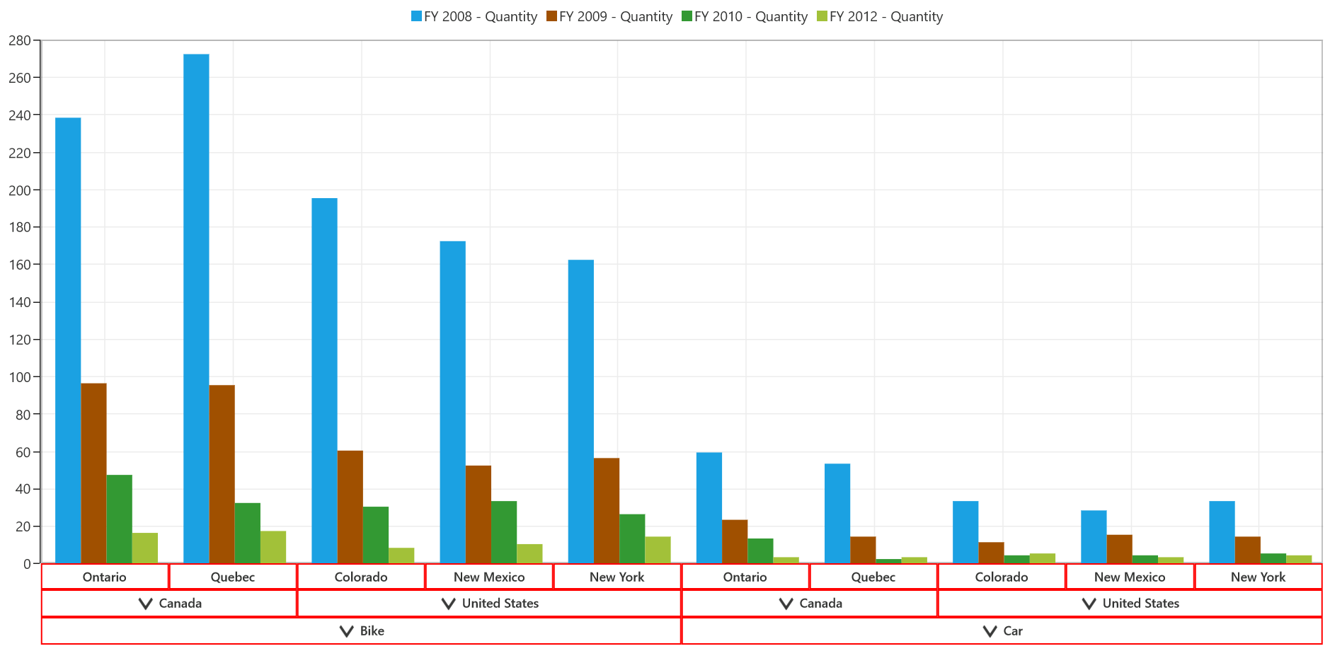
Label customization
To customize the labels of pivot chart axis, the properties like LabelFontFamily, LabelFontSize, and LabelForeground can be used.
<syncfusion:SfPivotChart.PrimaryAxisStyle>
    <syncfusion:PivotChartAxisStyle LabelFontFamily="Arial" LabelFontSize="14" LabelForeground="DarkGray"/>
</syncfusion:SfPivotChart.PrimaryAxisStyle>

<syncfusion:SfPivotChart.SecondaryAxisStyle>
    <syncfusion:PivotChartAxisStyle LabelFontFamily="Arial" LabelFontSize="14" LabelForeground="DarkGray"/>
</syncfusion:SfPivotChart.SecondaryAxisStyle>PivotChart1.PrimaryAxisStyle.LabelForeground = new SolidColorBrush(Colors.DarkGray);
PivotChart1.PrimaryAxisStyle.LabelFontFamily = new FontFamily("Arial");
PivotChart1.PrimaryAxisStyle.LabelFontSize = 14d;
PivotChart1.SecondaryAxisStyle.LabelForeground = new SolidColorBrush(Colors.DarkGray);
PivotChart1.SecondaryAxisStyle.LabelFontFamily = new FontFamily("Arial");
PivotChart1.SecondaryAxisStyle.LabelFontSize = 14d;PivotChart1.PrimaryAxisStyle.LabelForeground = New SolidColorBrush(Colors.DarkGray)
PivotChart1.PrimaryAxisStyle.LabelFontFamily = New FontFamily("Arial")
PivotChart1.PrimaryAxisStyle.LabelFontSize = 14.0
PivotChart1.SecondaryAxisStyle.LabelForeground = New SolidColorBrush(Colors.DarkGray)
PivotChart1.SecondaryAxisStyle.LabelFontFamily = New FontFamily("Arial")
PivotChart1.SecondaryAxisStyle.LabelFontSize = 14.0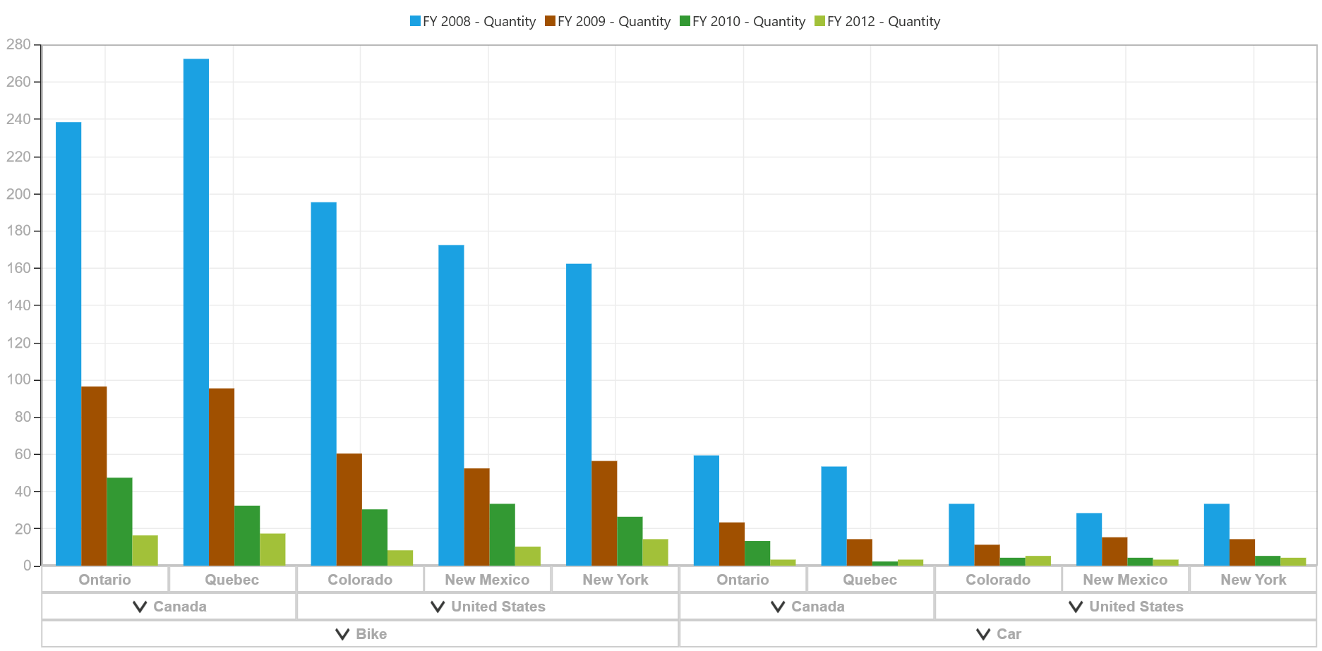
Label formatting
To modify the format of axis labels, you should use the LabelFormat property. The following code sample describes how to display the ‘%’ symbol in secondary axis labels.
<syncfusion:SfPivotChart.SecondaryAxisStyle>
     <syncfusion:PivotChartAxisStyle LabelFormat="00.00%"/>
</syncfusion:SfPivotChart.SecondaryAxisStyle>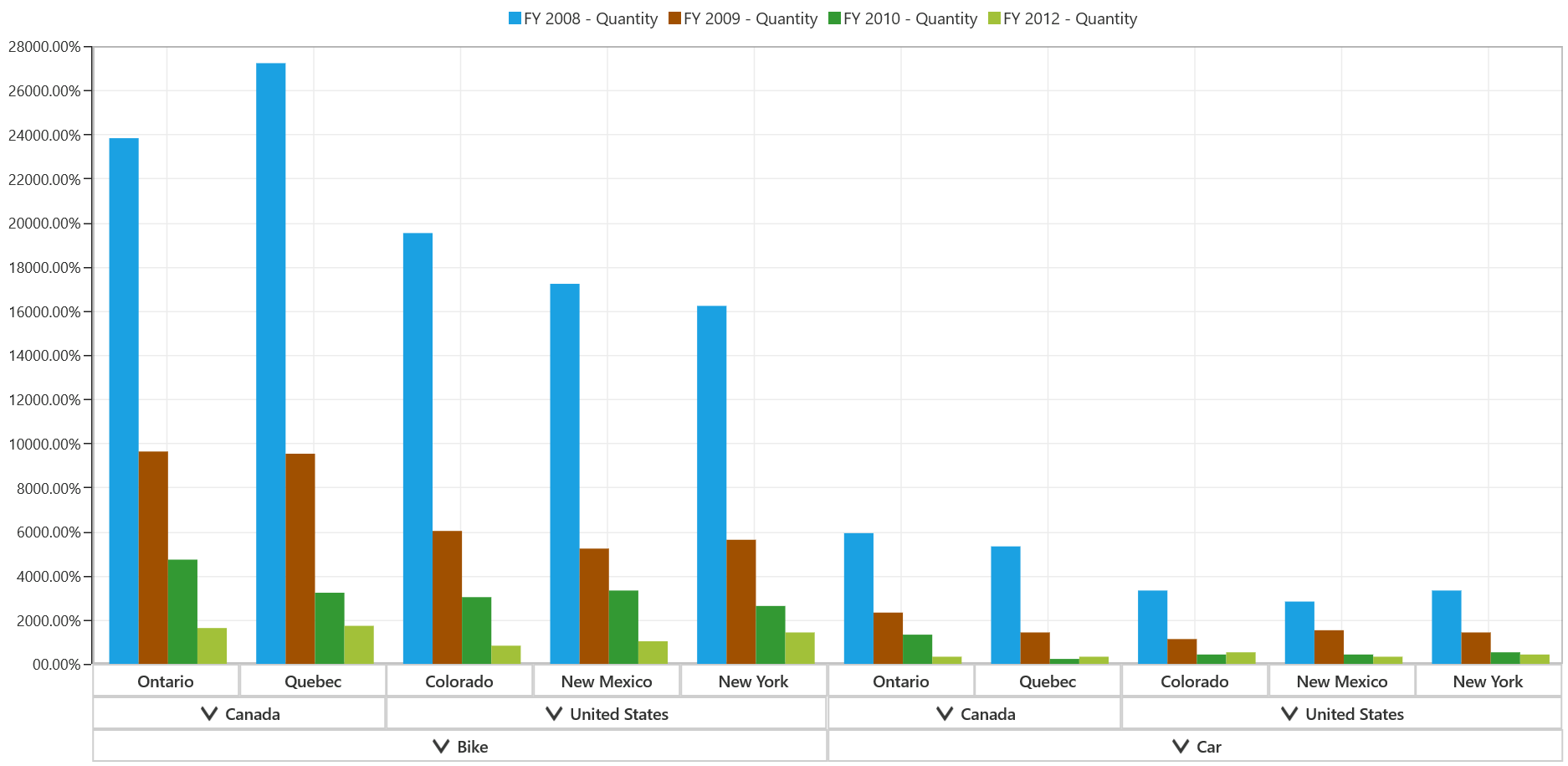
Label rotation
The labels of primary axis and secondary axis can be rotated with the help of LabelRotationAngle property in the PivotChartAxisStyle. The following code snippet illustrates how to rotate the angle of primary axis labels to -20 degrees.
<syncfusion:SfPivotChart.PrimaryAxisStyle>
    <syncfusion:PivotChartAxisStyle LabelRotationAngle="-20"/>
</syncfusion:SfPivotChart.PrimaryAxisStyle>PivotChart1.PrimaryAxisStyle.LabelRotationAngle = -20;PivotChart1.PrimaryAxisStyle.LabelRotationAngle = -20
Show/hide axis
The visibility of pivot chart axis can be toggled by setting the Visibility property of PrimaryAxis or SecondaryAxis. The following code snippet shows how to hide the primary axis of the SfPivotChart.
PivotChart1.PrimaryAxis.Visibility = Windows.UI.Xaml.Visibility.Collapsed;
PivotChart1.SecondaryAxis.Visibility = Windows.UI.Xaml.Visibility.Collapsed;PivotChart1.PrimaryAxis.Visibility = Windows.UI.Xaml.Visibility.Collapsed
PivotChart1.SecondaryAxis.Visibility = Windows.UI.Xaml.Visibility.Collapsed