About Syncfusion® .NET MAUI Slider Control
18 Nov 20185 minutes to read
The Syncfusion® .NET MAUI Slider (SfSlider) is a highly interactive UI control, allowing users to select a single value from a range of values. It provides rich features, such as track, labels, ticks, dividers, and tooltip.
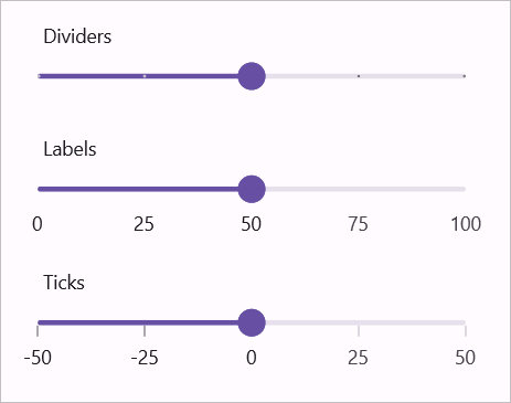
Business use cases
- Applications that require adjusting numeric values such as volume, brightness, or intensity using a Slider.
- Data-driven apps that allow users to filter or refine results based on a selected value range.
- Configuration panels that use Sliders for setting thresholds or tuning parameters.
- Mobile applications that require quick and intuitive value selection through touch interaction.
Key features
- Numeric value selection allows selecting a single value within a defined minimum and maximum range.
- Orientation allows displaying the Slider in horizontal or vertical layouts based on design requirements.
- Customizable label allows rendering value labels with user-defined formatting.
- Ticks and dividers allows visualizing intervals clearly using major and minor ticks.
- Discrete mode allows moving the Slider thumb in fixed steps using defined intervals.
- Tooltip allows displaying the selected value clearly during interaction.
Globalization
The following table summarizes the globalization support available in the control.
 Full Support
 No Support
 Not Applicable
| Control | Localization | RTL | Time zone | Screen reader | Keyboard navigation |
|---|---|---|---|---|---|
| Slider | |
|
|
|
|
Related controls
- Range Slider for selecting a range of values using slider-based interaction.
- Range Selector for advanced range selection with integrated content and visualization.
- Numeric Entry for precise numeric input using text-based entry.
See Also
- Getting Started shows a step‑by‑step guide to begin using the Slider control.
- Thumb & Overlay explains how to customize the thumb and its overlay to make it easy to see and simple to use.
- Labels helps configure labels and interval display.
- UI Kit provides interactive demos and ready‑made UI examples.
Resources
Feature Tour
Get a quick overview of key features and capabilities to kick start your journey.
Explore Features
Tutorial Videos
Watch step‑by‑step video guides to quickly understand concepts and implementation.
Watch now
Knowledge Base
Find practical solutions, troubleshooting tips and how‑to guides for common scenarios.
Search KB's