How can I help you?
Track in .NET MAUI Slider (SfSlider)
17 Jan 202513 minutes to read
This section helps to learn about how to customize the track in the slider.
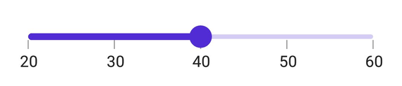
Minimum
The minimum value that the user can select. The default value of the Minimum property is 0 and it must be less than the Maximum value.
Maximum
The maximum value that the user can select. The default value of the Maximum property is 1 and it must be greater than the Minimum value.
Value
It represents the value currently selected in the slider. The slider’s thumb is drawn corresponding to this value.
<sliders:SfSlider Minimum="20"
                  Maximum="60"
                  Value="40"
                  Interval="10"
                  ShowTicks="True"
                  ShowLabels="True" />
SfSlider slider = new SfSlider()
{
Minimum = 20,
Maximum = 60,
Value = 40,
Interval = 10,
ShowTicks = true,
ShowLabels = true,
};
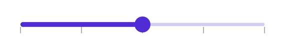
Track color
Change the active and inactive track color of the slider using the ActiveFill and InactiveFill properties of the TrackStyle class.
The active side of the slider is between the Minimum value and the thumb.
The inactive side of the slider is between the thumb and the Maximum value.
<sliders:SfSlider>
    <sliders:SfSlider.TrackStyle>
        <sliders:SliderTrackStyle ActiveFill="#EE3F3F"
                                  InactiveFill="#F7B1AE" />
    </sliders:SfSlider.TrackStyle>
</sliders:SfSlider>
SfSlider slider = new SfSlider();
slider.TrackStyle.ActiveFill = new SolidColorBrush(Color.FromArgb("#EE3F3F"));
slider.TrackStyle.InactiveFill = new SolidColorBrush(Color.FromArgb("#F7B1AE"));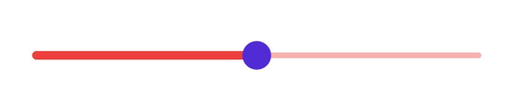
Track height
Change the active and inactive track height of the slider using the ActiveSize and InactiveSize properties of the TrackStyle class. The default value of the ActiveSize and the InactiveSize properties are 8.0 and 6.0 respectively.
<sliders:SfSlider>
    <sliders:SfSlider.TrackStyle>
        <sliders:SliderTrackStyle ActiveSize="10"
                                  InactiveSize="8" />
    </sliders:SfSlider.TrackStyle>
</sliders:SfSlider>
SfSlider slider = new SfSlider();
slider.TrackStyle.ActiveSize = 10;
slider.TrackStyle.InactiveSize = 8;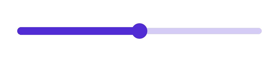
Track extent
Extend the track at the edges using the TrackExtent property. The default value is 0 and it should be in pixels.
<sliders:SfSlider Interval="0.25"
                  ShowTicks="True"
                  TrackExtent="25" />
SfSlider slider = new SfSlider()
{
Interval = 0.25,
TrackExtent = 25,
ShowTicks = true,
};Without track extent
With track extent

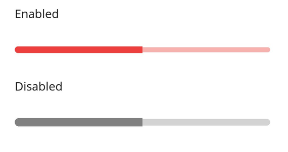
Disabled track
Change the state of the slider to disabled by setting false to the IsEnabled property. Using the Visual State Manager (VSM), customize the slider track properties based on the visual states. The applicable visual states are enabled(default) and disabled.
<ContentPage.Resources>
    <Style TargetType="sliders:SfSlider">
        <Setter Property="Interval"
                Value="0.25" />
        <Setter Property="ThumbStyle">
            <sliders:SliderThumbStyle Radius="0" />
        </Setter>
        <Setter Property="VisualStateManager.VisualStateGroups">
            <VisualStateGroupList>
                <VisualStateGroup>
                    <VisualState x:Name="Default">
                        <VisualState.Setters>
                            <Setter Property="TrackStyle">
                                <Setter.Value>
                                    <sliders:SliderTrackStyle ActiveSize="8"
                                                              InactiveSize="6"
                                                              ActiveFill="#EE3F3F"
                                                              InactiveFill="#F7B1AE" />
                                </Setter.Value>
                            </Setter>
                        </VisualState.Setters>
                    </VisualState>
                    <VisualState x:Name="Disabled">
                        <VisualState.Setters>
                            <Setter Property="TrackStyle">
                                <Setter.Value>
                                    <sliders:SliderTrackStyle ActiveSize="10"
                                                              InactiveSize="8"
                                                              ActiveFill="Gray"
                                                              InactiveFill="LightGray" />
                                </Setter.Value>
                            </Setter>
                        </VisualState.Setters>
                    </VisualState>
                </VisualStateGroup>
            </VisualStateGroupList>
        </Setter>
    </Style>
</ContentPage.Resources>

<ContentPage.Content>
    <VerticalStackLayout>
        <Label Text="Enabled"
               Padding="24,10" />
        <sliders:SfSlider />
        <Label Text="Disabled"
               Padding="24,10" />
        <sliders:SfSlider IsEnabled="False" />
    </VerticalStackLayout>
</ContentPage.Content>
VerticalStackLayout stackLayout = new();
SfSlider defaultSlider = new();
defaultSlider.ThumbStyle.Radius = 0;
SfSlider disabledSlider = new() { IsEnabled = false };
disabledSlider.ThumbStyle.Radius = 0;
VisualStateGroupList visualStateGroupList = new();
VisualStateGroup commonStateGroup = new();
// Default State.
VisualState defaultState = new() { Name = "Default" };
defaultState.Setters.Add(new Setter
{
Property = SfSlider.TrackStyleProperty,
Value = new SliderTrackStyle
{
ActiveFill = Color.FromArgb("#EE3F3F"),
InactiveFill = Color.FromArgb("#F7B1AE"),
ActiveSize = 8,
InactiveSize = 6,
}
});
// Disabled State.
VisualState disabledState = new() { Name = "Disabled" };
disabledState.Setters.Add(new Setter
{
Property = SfSlider.TrackStyleProperty,
Value = new SliderTrackStyle
{
ActiveFill = Colors.Gray,
InactiveFill = Colors.LightGray,
ActiveSize = 10,
InactiveSize = 8,
}
});
commonStateGroup.States.Add(defaultState);
commonStateGroup.States.Add(disabledState);
visualStateGroupList.Add(commonStateGroup);
VisualStateManager.SetVisualStateGroups(defaultSlider, visualStateGroupList);
VisualStateManager.SetVisualStateGroups(disabledSlider, visualStateGroupList);
stackLayout.Children.Add(new Label() { Text = "Enabled", Padding = new Thickness(24, 10) });
stackLayout.Children.Add(defaultSlider);
stackLayout.Children.Add(new Label() { Text = "Disabled", Padding = new Thickness(24, 10) });
stackLayout.Children.Add(disabledSlider);
this.Content = stackLayout;