Day and Week Views in .NET MAUI Event Scheduler (SfScheduler)
7 Jul 202624 minutes to read
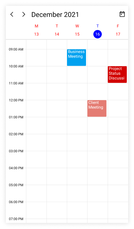
The .NET MAUI Scheduler provides the ability to display the day, week, workweek views, and the current day will be visible by default. The appointments on a specific day will be arranged in the respective timeslots based on their duration.
-
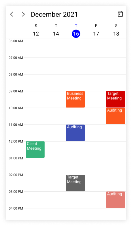
Day view: It displays a single day of the Scheduler.
-
Week view: It displays all the days of a week.
-
Work week view: It displays only the working days of a week. By default, Saturday and Sunday are not working days. It can be customized with any day of the week.
Number of days visible in the days view
The .NET MAUI Scheduler number of visible days in the day, week, and workweek can be adjusted by changing the NumberOfVisibleDays property of the DaysView.
<scheduler:SfScheduler x:Name="Scheduler"
                        View="Week">
    <scheduler:SfScheduler.DaysView>
        <scheduler:SchedulerDaysView
                        NumberOfVisibleDays="3"/>
    </scheduler:SfScheduler.DaysView>
 </scheduler:SfScheduler>
SfScheduler scheduler = new SfScheduler();
scheduler.View = SchedulerView.Week;
scheduler.DaysView.NumberOfVisibleDays = 3;
this.Content = scheduler;
Change time interval
The time interval between the time slots in the day, week, and workweek views can be customized by using the TimeInterval property of the DaysView.
<scheduler:SfScheduler x:Name="Scheduler"
                        View="Week">
    <scheduler:SfScheduler.DaysView>
        <scheduler:SchedulerDaysView
                        TimeInterval="2:0:0" />
    </scheduler:SfScheduler.DaysView>
 </scheduler:SfScheduler>
SfScheduler scheduler = new SfScheduler();
scheduler.View = SchedulerView.Week;
scheduler.DaysView.TimeInterval = new TimeSpan(2, 0, 0);
this.Content = scheduler;
NOTE
To modify the
TimeIntervalvalue (in minutes), change the time labels format by setting theTimeRulerFormatvalue to hh:mm.
Change time interval height
The time interval height can be customized for each time slot cell of the day, week, and workweek view by using the TimeIntervalHeight property of DaysView.
<scheduler:SfScheduler x:Name="Scheduler"
                       View="Week">
    <scheduler:SfScheduler.DaysView>
        <scheduler:SchedulerDaysView
                       TimeIntervalHeight="120"/>
    </scheduler:SfScheduler.DaysView>
</scheduler:SfScheduler>
SfScheduler scheduler = new SfScheduler();
scheduler.View = SchedulerView.Week;
scheduler.DaysView.TimeIntervalHeight = 120;
this.Content = scheduler;
Flexible working days
By default, the .NET MAUI Scheduler considers the weekdays from Monday to Friday as working days. The days which are defined in this non-working days collection are considered as non-working days. Therefore, the weekend days are set to hide from the Scheduler.
The NonWorkingDays property of DaysView can also be used to show only the nonworking days of the week.
<scheduler:SfScheduler x:Name="Scheduler"
                        View="WorkWeek">
    <scheduler:SfScheduler.DaysView>
        <scheduler:SchedulerDaysView
                       NonWorkingDays="Monday,Wednesday" />
    </scheduler:SfScheduler.DaysView>
 </scheduler:SfScheduler>
SfScheduler scheduler = new SfScheduler();
scheduler.View = SchedulerView.WorkWeek;
scheduler.DaysView.NonWorkingDays = SchedulerWeekDays.Monday | SchedulerWeekDays.Wednesday;
this.Content = scheduler;NOTE
The
workweekview displays exactly the defined working days on Scheduler control, whereas other views displays all the days.
Flexible working hours
The default values for StartHour and EndHour are 0 and 24 respectively, to show all the time slots for a day, week, or workweek view. These properties may be set to show only the required time periods in DaysView. The StartHour and EndHour in time duration can be set to show the required time duration in minutes.
<scheduler:SfScheduler x:Name="Scheduler"
                       View="Week">
    <scheduler:SfScheduler.DaysView>
        <scheduler:SchedulerDaysView
                       StartHour="9"
                       EndHour="16" />
    </scheduler:SfScheduler.DaysView>
</scheduler:SfScheduler>
SfScheduler scheduler = new SfScheduler();
scheduler.View = SchedulerView.Week;
scheduler.DaysView.StartHour = 9;
scheduler.DaysView.EndHour = 16;
this.Content = scheduler;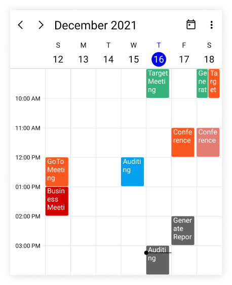
NOTE
- The
NonWorkingDaysproperty will be applicable only forworkweekandTimeline workweekviews only. It is not applicable for the remaining views.- No need to specify the decimal point values for
StartHourandEndHour, if you do not want to set the minutes.- The number of time slots will be calculated based on the total minutes of a day and time interval (total minutes of a day ((start hour - end hour) * 60) / time interval).
- If a custom timeInterval is given, then the number of time slots calculated based on the given
TimeIntervalshould result in an integer value (total minutes % timeInterval = 0), otherwise the next immediate time interval that results in integer value when dividing total minutes of a day will be considered. For example, if TimeInterval=2 Hours 15 minutes and total minutes = 1440 (24 Hours per day), then theTimeIntervalwill be changed to ‘144’ (1440%144=0) by considering (total minutes % TimeInterval = 0), it will return integer value for time slots rendering.- If the custom
StartHourandEndHourare given, then the number of time slots calculated based on the givenStartHourandEndHourshould result in integer value, otherwise the next immediateTimeIntervalwill be considered until the result is integer value. For example, if theStartHouris 9 (09:00AM),EndHouris 18.25 (06:15 PM),TimeIntervalis 30 minutes, and total minutes = 555 ((18.25-9)*60), then theTimeIntervalwill be changed to ’37 minutes’ (555%37=0) by considering (total minutes % timeInterval = 0) it will return the integer value for time slots rendering.
NOTE
Customize All-Day appointment height in Day, Week, and Work Week Views
The AllDayAppointmentHeight property specifies the height of all-day appointments displayed in the all-day panel of the Day, Week, and WorkWeek views. Increasing this value provides additional space for appointment content and can improve readability. By default, each all-day appointment is rendered with a height of 19.
<scheduler:SfScheduler x:Name="Scheduler"
                       View="Day">
    <scheduler:SfScheduler.DaysView>
        <scheduler:SchedulerDaysView AllDayAppointmentHeight="50" />
    </scheduler:SfScheduler.DaysView>
</scheduler:SfScheduler>
SfScheduler scheduler = new SfScheduler();
scheduler.View = SchedulerView.Day;
scheduler.DaysView.AllDayAppointmentHeight = 50;
this.Content = scheduler;
Display spanned appointments in time slots
The AllowSpannedAppointmentsInTimeSlots property determines whether appointments spanning more than 24 hours are displayed in the all-day panel or directly within the timeslot cells of the Day, Week, and WorkWeek views. By default, these appointments are rendered in the all-day panel. Setting AllowSpannedAppointmentsInTimeSlots to true displays spanned appointments within the corresponding time-slot cells.
<scheduler:SfScheduler x:Name="Scheduler"
                       View="Week">
    <scheduler:SfScheduler.DaysView>
        <scheduler:SchedulerDaysView AllowSpannedAppointmentsInTimeSlots="True" />
    </scheduler:SfScheduler.DaysView>
</scheduler:SfScheduler>
SfScheduler scheduler = new SfScheduler();
scheduler.View = SchedulerView.Week;
scheduler.DaysView.AllowSpannedAppointmentsInTimeSlots = true;
this.Content = scheduler;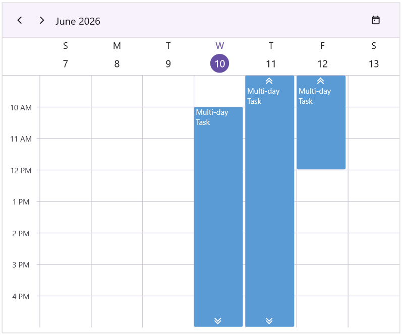
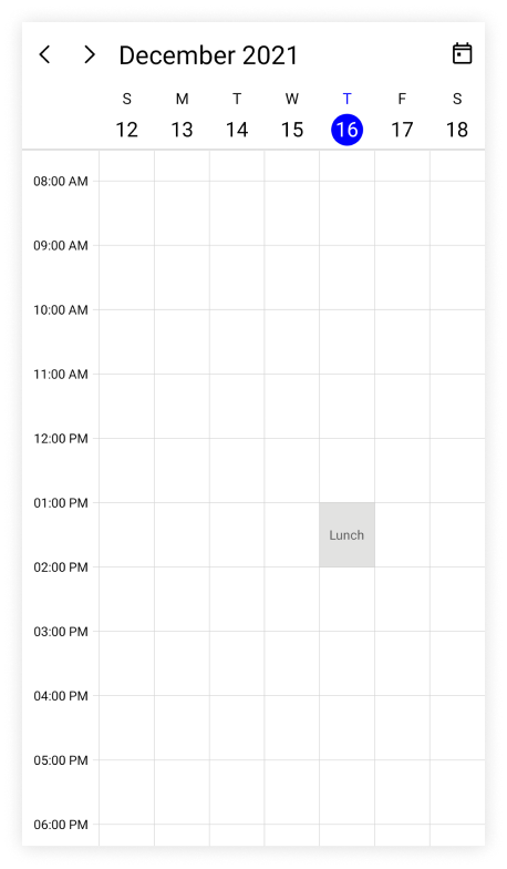
Special time regions
The user interaction such as selection and highlights specific regions of day, week, and workweek views can be restricted by adding the TimeRegions property of the DaysView in the SfScheduler. Set the StartTime and EndTime properties of TimeRegions to create a specialTimeRegion. Use the TimeZone property to set the specific timezone for start and end time of TimeRegions.
Watch the video below for a step-by-step guide on adding and customizing TimeRegions in .NET MAUI SfScheduler
Selection restriction in timeslots
Enable or disable the touch interaction of TimeRegion using the EnablePointerInteraction property of TimeRegion. By default, its value is true.
<scheduler:SfScheduler x:Name="Scheduler"
                       View="Week">
</scheduler:SfScheduler>this.Scheduler.View = SchedulerView.Week;
this.Scheduler.DaysView.TimeRegions = this.GetTimeRegion();
private ObservableCollection<SchedulerTimeRegion> GetTimeRegion()
{
var timeRegions = new ObservableCollection<SchedulerTimeRegion>();
var timeRegion = new SchedulerTimeRegion()
{
StartTime = DateTime.Today.Date.AddHours(13),
EndTime = DateTime.Today.Date.AddHours(14),
Text = "Lunch",
EnablePointerInteraction = false,
};
timeRegions.Add(timeRegion);
return timeRegions;
}
NOTE
This property only restricts the interaction on region and it does not restrict the following:
- The Programmatic selection (if the user updates the selected date value dynamically).
- It does not clear the selection when the user selects the region and dynamically change the
EnablePointerInteractionproperty to false.- It does not restrict appointment interaction when the appointment placed in the region.
- It does not restrict the appointment interaction when the appointment is placed in the region.
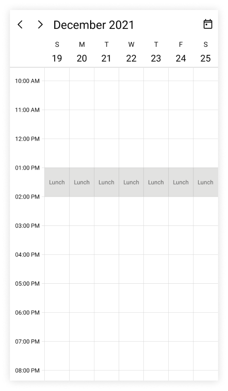
Recurring time region
The recurring time region on a daily, weekly, monthly, or yearly interval. The recurring special time regions can be created by setting the RecurrenceRule property in TimeRegion
<scheduler:SfScheduler x:Name="Scheduler"
                       View="Week">
</scheduler:SfScheduler>this.Scheduler.View = SchedulerView.Week;
this.Scheduler.DaysView.TimeRegions = this.GetTimeRegion();
private ObservableCollection<SchedulerTimeRegion> GetTimeRegion()
{
var timeRegions = new ObservableCollection<SchedulerTimeRegion>();
var timeRegion = new SchedulerTimeRegion()
{
StartTime = DateTime.Today.Date.AddHours(13),
EndTime = DateTime.Today.Date.AddHours(14),
Text = "Lunch",
EnablePointerInteraction = false,
RecurrenceRule = "FREQ=DAILY;INTERVAL=1",
};
timeRegions.Add(timeRegion);
return timeRegions;
}
NOTE
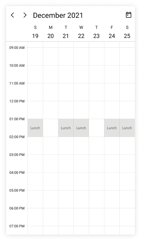
Recurrence exception dates
Any of occurrence that is an exception from the recurrence pattern time region can be deleted by using the RecurrenceExceptionDates property of TimeRegion The deleted occurrence date will be considered as a recurrence exception date.
<scheduler:SfScheduler x:Name="Scheduler"
                       View="Week">
</scheduler:SfScheduler>this.Scheduler.View = SchedulerView.Week;
this.Scheduler.DaysView.TimeRegions = this.GetTimeRegion();
private ObservableCollection<SchedulerTimeRegion> GetTimeRegion()
{
var timeRegions = new ObservableCollection<SchedulerTimeRegion>();
var recurrenceExceptionDates = DateTime.Now.Date.AddDays(3);
var timeRegion = new SchedulerTimeRegion()
{
StartTime = DateTime.Today.Date.AddHours(13),
EndTime = DateTime.Today.Date.AddHours(14),
Text = "Lunch",
EnablePointerInteraction = false,
RecurrenceRule = "FREQ=DAILY;INTERVAL=1",
RecurrenceExceptionDates = new ObservableCollection<DateTime>()
{
recurrenceExceptionDates,
}
};
timeRegions.Add(timeRegion);
return timeRegions;
}
Customize special time region appearance
The special time region appearance customization can be achieved by using the TextStyle and TimeRegionTemplate properties of DaysView in the SfScheduler.
Customize special time region appearance using style
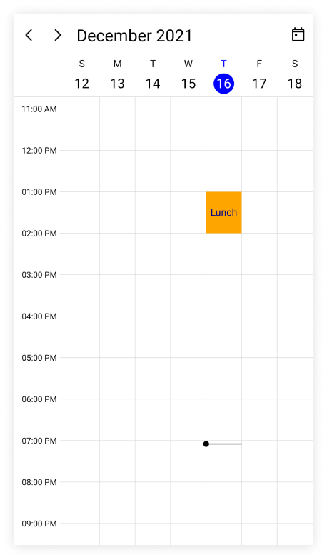
The specialTimeRegion background and text style can be customized by using the Background and TextStyle properties of TimeRegion. It is used to customize the background color for time region background and text style for the text of the specialTimeRegion.
<scheduler:SfScheduler x:Name="Scheduler"
                       View="Week">
</scheduler:SfScheduler>this.Scheduler.View = SchedulerView.Week;
this.Scheduler.DaysView.TimeRegions = this.GetTimeRegion();
private ObservableCollection<SchedulerTimeRegion> GetTimeRegion()
{
var textStyle = new SchedulerTextStyle()
{
TextColor = Colors.DarkBlue,
FontSize = 14,
};
var timeRegions = new ObservableCollection<SchedulerTimeRegion>();
var timeRegion = new SchedulerTimeRegion()
{
StartTime = DateTime.Today.Date.AddHours(13),
EndTime = DateTime.Today.Date.AddHours(14),
Text = "Lunch",
EnablePointerInteraction = false,
Background = Brush.Orange,
TextStyle = textStyle
};
timeRegions.Add(timeRegion);
return timeRegions;
}
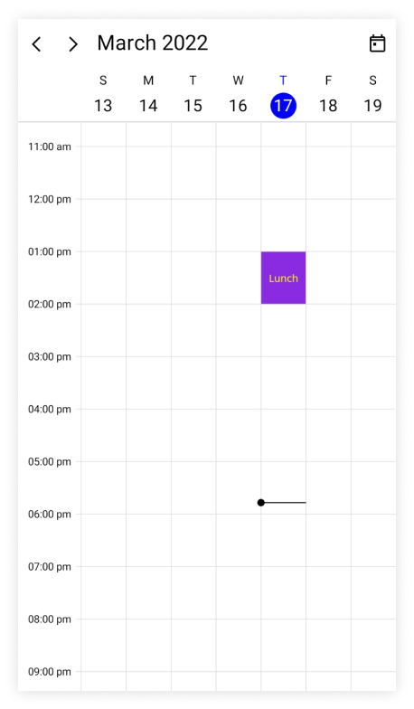
Customize special time region appearance using DataTemplate
You can customize the time region appearance by using the TimeRegionTemplate property of DaysView in the SfScheduler.
<scheduler:SfScheduler x:Name="Scheduler"
                        View="Week">
    <scheduler:SfScheduler.DaysView>
        <scheduler:SchedulerDaysView>
            <scheduler:SchedulerDaysView.TimeRegionTemplate>
                <DataTemplate>
                    <Grid Background="MediumPurple" >
                        <Label x:Name="label" HorizontalOptions="Center" FontSize="10" TextColor="Yellow" VerticalOptions="Center" Text="{Binding Text}" />
                    </Grid>
                </DataTemplate>
            </scheduler:SchedulerDaysView.TimeRegionTemplate>
        </scheduler:SchedulerDaysView>
    </scheduler:SfScheduler.DaysView>
</scheduler:SfScheduler>this.Scheduler.View = SchedulerView.Week;
this.Scheduler.DaysView.TimeRegions = this.GetTimeRegion();
private ObservableCollection<SchedulerTimeRegion> GetTimeRegion()
{
var timeRegions = new ObservableCollection<SchedulerTimeRegion>();
var timeRegion = new SchedulerTimeRegion()
{
StartTime = DateTime.Today.Date.AddHours(13),
EndTime = DateTime.Today.Date.AddHours(14),
Text = "Lunch",
EnablePointerInteraction = false,
Background = Brush.Orange,
};
timeRegions.Add(timeRegion);
return timeRegions;
}
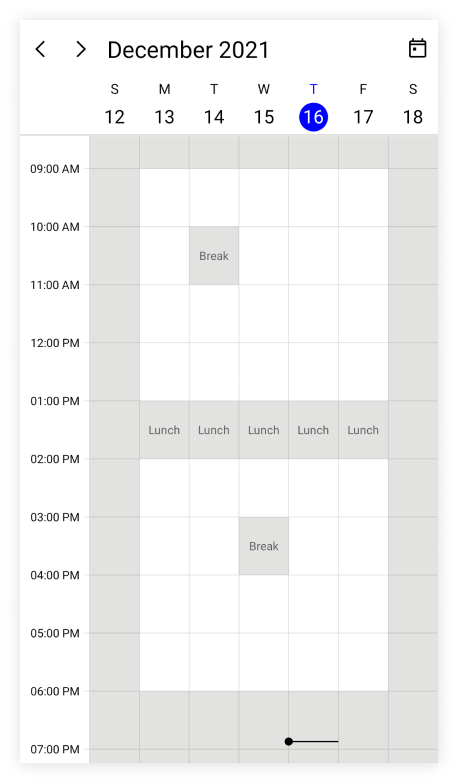
Customize special time region appearance using DataTemplateSelector
You can customize the time region appearance by using the TimeRegionTemplate property of DaysView in the SfScheduler. The DataTemplateSelector can choose a DataTemplate at runtime based on the value of a data-bound to scheduler time region by using the TimeRegionTemplate. It allows you to choose a different data template for each time region, as well as customize the appearance of a particular time region based on certain conditions.
<Grid>
    <Grid.Resources>
        <DataTemplate x:Key="timeRegiontemplate">
            <Grid Background = "LightCyan" Opacity="0.5">
                <Label x:Name="label" HorizontalOptions="Center" TextColor="Red" Text="{Binding Text}" VerticalOptions="Center" />
            </Grid>
        </DataTemplate>
        <DataTemplate x:Key="timeRegiontemplate1">
            <Grid Background = "Lightgreen" Opacity="0.5">
                <Label x:Name="label" HorizontalOptions="Center" TextColor="Orange" Text="{Binding Text}" VerticalOptions="Center" />
            </Grid>
        </DataTemplate>
        <local:TimeRegionTemplateSelector x:Key="timeRegionTemplateSelector"  TimeRegionsTemplate="{StaticResource timeRegiontemplate}"  TimeRegionsTemplate1="{StaticResource timeRegiontemplate1}" />
    </Grid.Resources>
     <scheduler:SfScheduler x:Name="Scheduler"
                            View="Week">
        <scheduler:SfScheduler.DaysView>
            <scheduler:SchedulerDaysView
                            TimeRegionTemplate="{StaticResource timeRegionTemplateSelector}" />
        </scheduler:SfScheduler.DaysView>
    </scheduler:SfScheduler>
</Grid>
public class TimeRegionTemplateSelector : DataTemplateSelector
{
public TimeRegionTemplateSelector()
{
}
public DataTemplate TimeRegionsTemplate { get; set; }
public DataTemplate TimeRegionsTemplate1 { get; set; }
protected override DataTemplate OnSelectTemplate(object item, BindableObject container)
{
var timeRegionDetails = item as SchedulerTimeRegion;
if (timeRegionDetails.EnablePointerInteraction)
return TimeRegionsTemplate;
return TimeRegionsTemplate1;
}
}this.Scheduler.View = SchedulerView.Week;
this.Scheduler.DaysView.TimeRegions = this.GetTimeRegion();
private ObservableCollection<SchedulerTimeRegion> GetTimeRegion()
{
var timeRegions = new ObservableCollection<SchedulerTimeRegion>();
var timeRegion = new SchedulerTimeRegion()
{
StartTime = DateTime.Today.Date.AddHours(13),
EndTime = DateTime.Today.Date.AddHours(14),
Text = "Lunch",
RecurrenceRule = "FREQ=DAILY;INTERVAL=1",
EnablePointerInteraction = true,
};
var timeRegion1 = new SchedulerTimeRegion()
{
StartTime = DateTime.Today.Date.AddHours(17),
EndTime = DateTime.Today.Date.AddHours(18),
Text = "Break",
RecurrenceRule = "FREQ=DAILY;INTERVAL=1",
Background = Brush.Red,
EnablePointerInteraction = false,
};
timeRegions.Add(timeRegion);
timeRegions.Add(timeRegion1);
return timeRegions;
}NOTE
- The BindingContext of the
TimeRegionTemplateis theSchedulerTimeRegion.- When using data template selector, performance issues occur as the conversion template views take time within the framework.
Full screen scheduler
The .NET MAUI Scheduler time interval height can be adjusted based on screen height by changing the TimeIntervalHeight property of DaysView to -1. It will auto-fit the day, week and work week views to the screen height.
<scheduler:SfScheduler x:Name="Scheduler"
                        View="Week">
    <scheduler:SfScheduler.DaysView>
        <scheduler:SchedulerDaysView
                        TimeIntervalHeight="-1"/>
    </scheduler:SfScheduler.DaysView>
 </scheduler:SfScheduler>
SfScheduler scheduler = new SfScheduler();
scheduler.View = SchedulerView.Week;
scheduler.DaysView.TimeIntervalHeight = -1;
this.Content = scheduler;
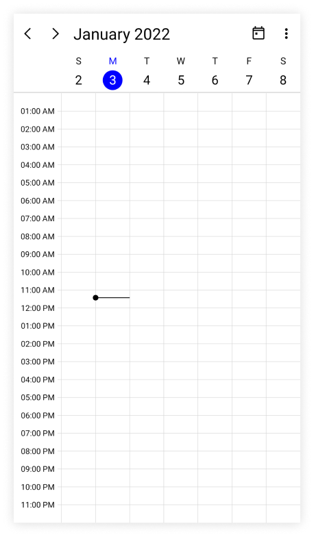
Show current time indicator
You can show or hide the current time indicator in day, week, and workweek views of SfScheduler by using the ShowCurrentTimeIndicator property of DaysView, and by default, its true.
<scheduler:SfScheduler x:Name="Scheduler"
                       View="Week">
    <scheduler:SfScheduler.DaysView>
            <scheduler:SchedulerDaysView
                       ShowCurrentTimeIndicator="False"/>
    </scheduler:SfScheduler.DaysView>
</scheduler:SfScheduler>
SfScheduler scheduler = new SfScheduler();
scheduler.View = SchedulerView.Week;
scheduler.DaysView.ShowCurrentTimeIndicator = false;
this.Content = scheduler;
Customize current time indicator appearance
The current time indicator can be customized by using the CurrentTimeIndicatorBrush property of DaysView in the SfScheduler.
<scheduler:SfScheduler x:Name="Scheduler"
                       View="Week">
    <scheduler:SfScheduler.DaysView>
            <scheduler:SchedulerDaysView
                       CurrentTimeIndicatorBrush="Blue"/>
    </scheduler:SfScheduler.DaysView>
</scheduler:SfScheduler>
SfScheduler scheduler = new SfScheduler();
scheduler.View = SchedulerView.Week;
scheduler.DaysView.CurrentTimeIndicatorBrush = Brush.Blue;
this.Content = scheduler;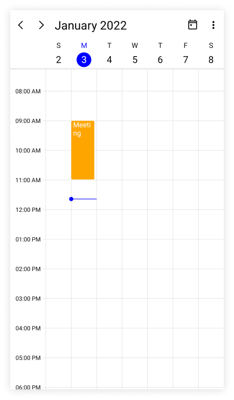
NOTE
The current time indicator color is applied only when the
ShowCurrentTimeIndicatorproperty is enabled.
Change time ruler width
The TimeRulerWidth property of DaysView can be used to customize the size of the time ruler view where the labels with the time are placed.
<scheduler:SfScheduler x:Name="Scheduler"
                       View="Week">
    <scheduler:SfScheduler.DaysView>
        <scheduler:SchedulerDaysView
                       TimeRulerWidth="120"/>
    </scheduler:SfScheduler.DaysView>
</scheduler:SfScheduler>
SfScheduler scheduler = new SfScheduler();
scheduler.View = SchedulerView.Week;
scheduler.DaysView.TimeRulerWidth = 120;
this.Content = scheduler;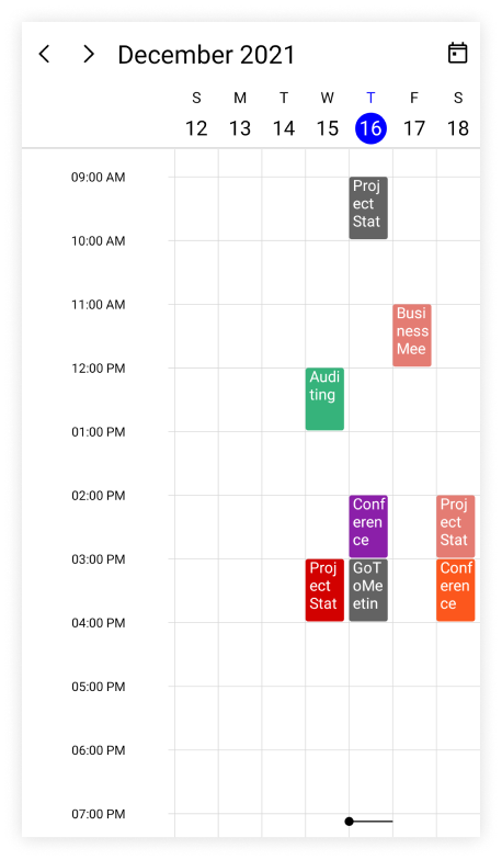
Minimum appointment duration
The MinimumAppointmentDuration property allows to set an arbitrary height to appointments which have a minimum duration in the day, week, and workweek views so that the subject can be readable.
<scheduler:SfScheduler x:Name="Scheduler"
                        View="Week">
    <scheduler:SfScheduler.DaysView>
        <scheduler:SchedulerDaysView
                       MinimumAppointmentDuration="0:30:0" />
        </scheduler:SfScheduler.DaysView>
 </scheduler:SfScheduler>
SfScheduler scheduler = new SfScheduler();
scheduler.View = SchedulerView.Week;
scheduler.DaysView.MinimumAppointmentDuration = new TimeSpan(0, 30, 0);
this.Content = scheduler;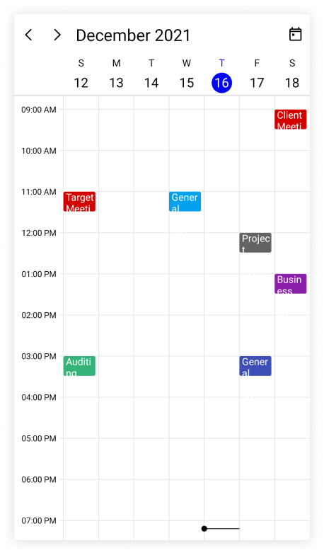
NOTE
- The
MinimumAppointmentDurationvalue will be set when an appointment duration value is lesser thanMinimumAppointmentDuration.- The appointment duration value will be set when the appointment duration value is greater than the
MinimumAppointmentDuration.- The
TimeIntervalvalue will be set when theMinimumAppointmentDurationis greater than theTimeIntervalwith lesser appointment duration.- The all-day appointment does not support
MinimumAppointmentDuration.
NOTE
Customize the appearance of all-day appointments using DataTemplate in the all-day panel
You can customize the all-day appointment appearance by using the AllDayAppointmentTemplate property of DaysView in the SfScheduler.
<scheduler:SfScheduler x:Name="Scheduler" View="Week">
    <scheduler:SfScheduler.DaysView>
        <scheduler:SchedulerDaysView>
            <scheduler:SchedulerDaysView.AllDayAppointmentTemplate>
                <DataTemplate>
                    <Grid Background="MediumPurple">
                        <Label Text="{Binding Subject}" TextColor="White" HorizontalOptions="Center" VerticalOptions="Center" FontSize="12" FontFamily="Bold"/>
                    </Grid>
                </DataTemplate>
            </scheduler:SchedulerDaysView.AllDayAppointmentTemplate>
        </scheduler:SchedulerDaysView>
    </scheduler:SfScheduler.DaysView>
</scheduler:SfScheduler>this.Scheduler.View = SchedulerView.Week;
// Creating an instance for the scheduler appointment collection.
var appointments = new ObservableCollection<SchedulerAppointment>();
for (int i = 1; i <= 5; i++)
{
//Adding scheduler appointment in the scheduler appointment collection.
appointments.Add(new SchedulerAppointment()
{
StartTime = DateTime.Today.AddHours(9),
EndTime = DateTime.Today.AddHours(11),
Subject = "Client Meeting",
Location = "Hutchison road",
IsAllDay = true
});
}
//Adding the scheduler appointment collection to the AppointmentsSource of .NET MAUI Scheduler.
this.Scheduler.AppointmentsSource = appointments;Customize the appearance of more appointments indicator using DataTemplate in the all-day panel
You can customize the default appearance of more appointments indicator in an all-day panel by using the MoreAppointmentsTemplate property of DaysView in the SfScheduler.
<scheduler:SfScheduler x:Name="Scheduler" View="Week">
        <scheduler:SfScheduler.DaysView>
            <scheduler:SchedulerDaysView>
                <scheduler:SchedulerDaysView.MoreAppointmentsTemplate>
                    <DataTemplate>
                        <StackLayout Background="#EAEAEA" HorizontalOptions="FillAndExpand" VerticalOptions="FillAndExpand">
                            <Label Text="{Binding}" TextColor="Black" HorizontalTextAlignment="Center" VerticalTextAlignment="Center">
                            </Label>
                        </StackLayout>
                    </DataTemplate>
                </scheduler:SchedulerDaysView.MoreAppointmentsTemplate>
            </scheduler:SchedulerDaysView>
        </scheduler:SfScheduler.DaysView>
</scheduler:SfScheduler>this.Scheduler.View = SchedulerView.Week;
// Creating an instance for the scheduler appointment collection.
var appointments = new ObservableCollection<SchedulerAppointment>();
for (int i = 1; i <= 5; i++)
{
//Adding scheduler appointment in the scheduler appointment collection.
appointments.Add(new SchedulerAppointment()
{
StartTime = DateTime.Today.AddHours(9),
EndTime = DateTime.Today.AddHours(11),
Subject = "Client Meeting",
Location = "Hutchison road",
Background = Brush.Orange,
IsAllDay = true
});
}
//Adding the scheduler appointment collection to the AppointmentsSource of .NET MAUI Scheduler.
this.Scheduler.AppointmentsSource = appointments;View header
You can customize the default appearance of view header in a day, week, and work week views by setting the DateFormat, DayFormat, Background, DateTextStyle, DayTextStyle, Height, and ViewHeaderTemplate properties of DaysView in the SfScheduler.
View header text formatting
The date and day format of SfScheduler ViewHeader can be customized by using the DateFormat and DayFormat properties of DaysView.
<scheduler:SfScheduler x:Name="Scheduler"
                        View="Week">
    <scheduler:SfScheduler.DaysView>
        <scheduler:SchedulerDaysView>
            <scheduler:SchedulerDaysView.ViewHeaderSettings>
                <scheduler:SchedulerViewHeaderSettings DayFormat="dddd"
                                                       DateFormat="dd" />
                </scheduler:SchedulerDaysView.ViewHeaderSettings>
        </scheduler:SchedulerDaysView>
    </scheduler:SfScheduler.DaysView>
 </scheduler:SfScheduler>
SfScheduler scheduler = new SfScheduler();
scheduler.View = SchedulerView.Week;
scheduler.DaysView.ViewHeaderSettings.DayFormat = "dddd";
scheduler.DaysView.ViewHeaderSettings.DateFormat = "dd";
this.Content = scheduler;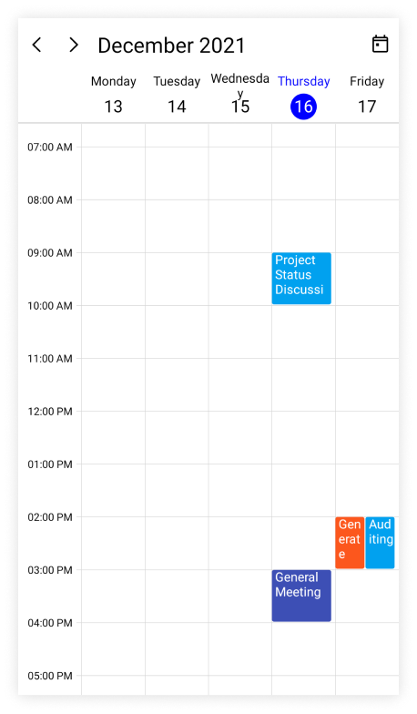
View header height
The height of the ViewHeader in a day, week, and work week views can be customized by setting the Height property of ViewHeaderSettings in DaysView.
<scheduler:SfScheduler x:Name="Scheduler"
                        View="Week">
    <scheduler:SfScheduler.DaysView>
        <scheduler:SchedulerDaysView>
            <scheduler:SchedulerDaysView.ViewHeaderSettings>
                    <scheduler:SchedulerViewHeaderSettings Height="100" />
            </scheduler:SchedulerDaysView.ViewHeaderSettings>
    </scheduler:SchedulerDaysView>
</scheduler:SfScheduler.DaysView>
SfScheduler scheduler = new SfScheduler();
scheduler.View = SchedulerView.Week;
scheduler.DaysView.ViewHeaderSettings.Height = 100;
this.Content = scheduler;
Customize view header appearance
The view header appearance customization can be achieved by using the TextStyle and ViewHeaderTemplate properties of DaysView in the SfScheduler.
Customize view header appearance using text style
The background color and text style for the labels mentioning the time can be customized, by setting the Background, DateTextStyle, and DayTextStyle properties of DaysView in the Scheduler.
<scheduler:SfScheduler x:Name="Scheduler"
                       View="Week">
    <scheduler:SfScheduler.DaysView>
        <scheduler:SchedulerDaysView>
            <scheduler:SchedulerDaysView.ViewHeaderSettings>
                <scheduler:SchedulerViewHeaderSettings Background="LightGreen" />
            </scheduler:SchedulerDaysView.ViewHeaderSettings>
        </scheduler:SchedulerDaysView>
    </scheduler:SfScheduler.DaysView>
</scheduler:SfScheduler>this.Scheduler.View = SchedulerView.Week;
var dateTextStyle = new SchedulerTextStyle()
{
TextColor = Colors.Red,
FontSize = 12,
};
this.Scheduler.DaysView.ViewHeaderSettings.DateTextStyle = dateTextStyle;
var dayTextStyle = new SchedulerTextStyle()
{
TextColor = Colors.Red,
FontSize = 12,
};
this.Scheduler.DaysView.ViewHeaderSettings.DayTextStyle = dayTextStyle;
this.Scheduler.DaysView.ViewHeaderSettings.Background = Brush.LightGreen;
Customize view header appearance using DataTemplate
You can customize the view header appearance by using the ViewHeaderTemplate property of DaysView in the SfScheduler.
<scheduler:SfScheduler x:Name="Scheduler"
                        View="WorkWeek">
    <scheduler:SfScheduler.DaysView>
        <scheduler:SchedulerDaysView>
            <scheduler:SchedulerDaysView.ViewHeaderTemplate>
                <DataTemplate>
                    <StackLayout x:Name="stackLayout" Orientation="Vertical" Background="MediumPurple">
                        <Label x:Name="label" HorizontalOptions="Center"  VerticalOptions="Center" Text="{Binding StringFormat='{0:dd}'}" FontSize="Small" FontFamily="Bold" TextColor="White" >
                            <Label.Triggers>
                                <DataTrigger TargetType = "Label" Binding="{Binding}" Value="{x:Static system:DateTime.Today}">
                                    <Setter TargetName = "label" Property="TextColor" Value="Orange"/>
                                </DataTrigger>
                            </Label.Triggers>
                        </Label>
                        <Label x:Name="label1" HorizontalOptions="Center"  VerticalOptions="Center" Text="{Binding StringFormat='{0:ddd}'}"  FontSize="Small" FontFamily="Bold" TextColor="White">
                            <Label.Triggers>
                                <DataTrigger TargetType = "Label" Binding="{Binding}" Value="{x:Static system:DateTime.Today}">
                                    <Setter TargetName = "label1" Property="TextColor" Value="Orange"/>
                                </DataTrigger>
                            </Label.Triggers>
                        </Label>
                        <StackLayout.Triggers>
                            <DataTrigger TargetType = "StackLayout" Binding="{Binding}" Value="{x:Static system:DateTime.Today}">
                                <Setter TargetName = "stackLayout" Property="Background" Value="MediumPurple"/>
                            </DataTrigger>
                        </StackLayout.Triggers>
                    </StackLayout>
                </DataTemplate>
            </scheduler:SchedulerDaysView.ViewHeaderTemplate>
        </scheduler:SchedulerDaysView>
    </scheduler:SfScheduler.DaysView>
 </scheduler:SfScheduler>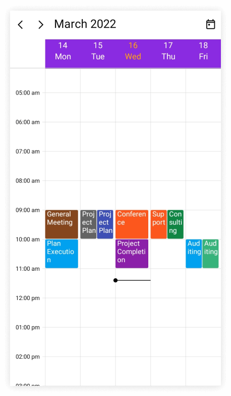
NOTE
- The BindingContext of the
ViewHeaderTemplateis theDateTime.TheSelectableDayPredicate,MinimumDateTime,andMaximumDateTimeproperties of date and time values can be used directly in the data template selector.
Customize view header appearance using DataTemplateSelector
You can customize the view header appearance by using the ViewHeaderTemplate property of DaysView in the SfScheduler. The DataTemplateSelector can choose a DataTemplate at runtime based on the value of a data-bound to scheduler view header by using the ViewHeaderTemplate. It allows you to choose a different data template for each view header, as well as customize the appearance of a particular view header based on certain conditions.
<Grid>
    <Grid.Resources>
        <DataTemplate x:Key="normalDateTemplate">
            <StackLayout x:Name="stackLayout" Orientation="Vertical" Background="MediumPurple">
                <Label x:Name="label" HorizontalOptions="Center"  VerticalOptions="Center" Text="{Binding StringFormat='{0:dd}'}" FontSize="Small" FontFamily="Bold" TextColor="White" />
                <Label x:Name="label1" HorizontalOptions="Center"  VerticalOptions="Center" Text="{Binding StringFormat='{0:ddd}'}"  FontSize="Small" FontFamily="Bold" TextColor="White"/>
            </StackLayout>
        </DataTemplate>
        <DataTemplate x:Key="todayDateTemplate">
            <StackLayout x:Name="stackLayout" Orientation="Vertical" Background="MediumPurple">
                <Label x:Name="label" HorizontalOptions="Center"  VerticalOptions="Center" Text="{Binding StringFormat='{0:dd}'}" FontSize="Small" FontFamily="Bold" TextColor="Yellow" />
                <Label x:Name="label1" HorizontalOptions="Center"  VerticalOptions="Center" Text="{Binding StringFormat='{0:ddd}'}"  FontSize="Small" FontFamily="Bold" TextColor="Yellow"/>
            </StackLayout>
        </DataTemplate>
        <local:ViewHeaderTemplateSelector x:Key="viewHeaderTemplateSelector" TodayDateTemplate="{StaticResource todayDateTemplate}" NormalDateTemplate="{StaticResource normalDateTemplate}"/>
    </Grid.Resources>
    <scheduler:SfScheduler x:Name="Scheduler"
                           View="Week" >
        <scheduler:SfScheduler.DaysView>
            <scheduler:SchedulerDaysView ViewHeaderTemplate="{StaticResource viewHeaderTemplateSelector}" />
        </scheduler:SfScheduler.DaysView>
    </scheduler:SfScheduler>
 </Grid>
public class ViewHeaderTemplateSelector : DataTemplateSelector
{
public ViewHeaderTemplateSelector()
{
}
public DataTemplate NormalDateTemplate { get; set; }
public DataTemplate TodayDateTemplate { get; set; }
protected override DataTemplate OnSelectTemplate(object item, BindableObject container)
{
var dateTime = (DateTime)item;
if (dateTime.Date == DateTime.Today.Date)
return TodayDateTemplate;
else
return NormalDateTemplate;
}
}this.Scheduler.View = SchedulerView.Week;NOTE
- The BindingContext of the
ViewHeaderTemplateis theDateTime.TheSelectableDayPredicate,MinimumDateTime,andMaximumDateTimeproperties of date and time values can be used directly in the data template selector.- When using data template selector, performance issues occur as the conversion template views take time within the framework.
Time ruler text formatting
The format for the labels mentioning the time can be customized by setting the TimeFormat property of DaysView in the SfScheduler.
<scheduler:SfScheduler x:Name="Scheduler"
                       View="Week">
    <scheduler:SfScheduler.DaysView>
        <scheduler:SchedulerDaysView
                       TimeFormat="hh:mm"/>
    </scheduler:SfScheduler.DaysView>
</scheduler:SfScheduler>
SfScheduler scheduler = new SfScheduler();
scheduler.View = SchedulerView.Week;
scheduler.DaysView.TimeFormat = "hh:mm";
this.Content = scheduler;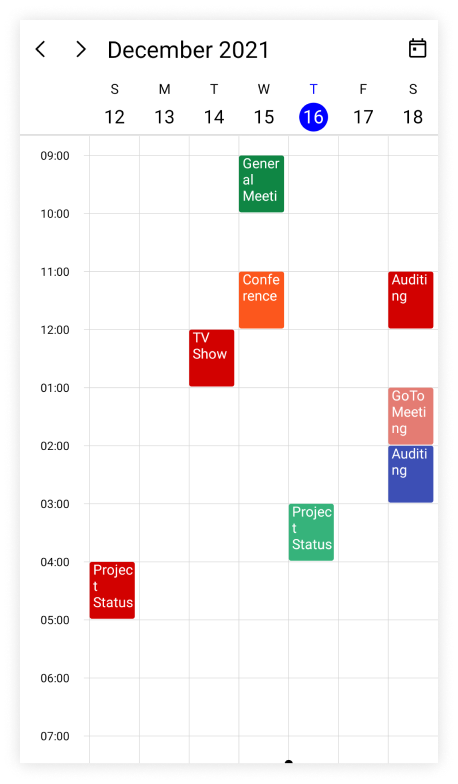
NOTE
- By default, the scheduler time text format is
hh:mm tt.
Customize time ruler text style
The text style for the labels mentioning the time can be customized, by setting the TimeRulerTextStyle property of DaysView in the SfScheduler.
<scheduler:SfScheduler x:Name="Scheduler"
                       View="Week">
</scheduler:SfScheduler>this.Scheduler.View = SchedulerView.Week;
var timeRulerTextStyle = new SchedulerTextStyle()
{
TextColor = Colors.Red,
FontSize = 12,
};
this.Scheduler.DaysView.TimeRulerTextStyle = timeRulerTextStyle;