How can I help you?
Cell Selection View in .NET MAUI Event Scheduler (SfScheduler).
7 Jan 20253 minutes to read
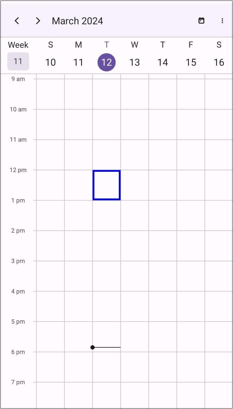
The Scheduler provides the capability to customize the selection of month and timeslot cells using the Cellselectionview.
Stroke
The cell selection border color can be customized by using the Stroke property in the Cellselectionview.
<scheduler:SfScheduler x:Name="Scheduler">
    <scheduler:SfScheduler.CellSelectionView>
            <scheduler:SchedulerCellSelectionView Stroke="Red"/>
    </scheduler:SfScheduler.CellSelectionView>
</scheduler:SfScheduler>this.Scheduler.CellSelectionView.Stroke = Brush.Green;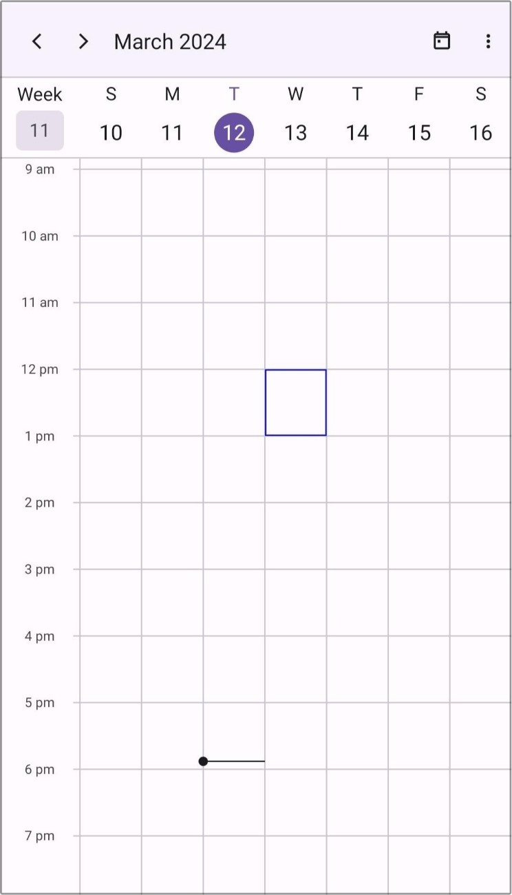
Background
The cell selection background color can be customized by using the Background property in the Cellselectionview.
The default value is Brush.Transparent.
NOTE
As default, Stroke will have value; if Background alone is required, you can set the Stroke property to
Brush.Transparent.
<scheduler:SfScheduler x:Name="Scheduler">
    <scheduler:SfScheduler.CellSelectionView>
            <scheduler:SchedulerCellSelectionView Background="Red" Stroke="Transparent"/>
    </scheduler:SfScheduler.CellSelectionView>
</scheduler:SfScheduler>this.Scheduler.CellSelectionView.Background = Brush.Green;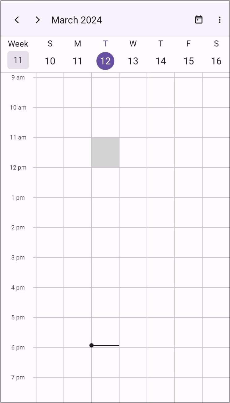
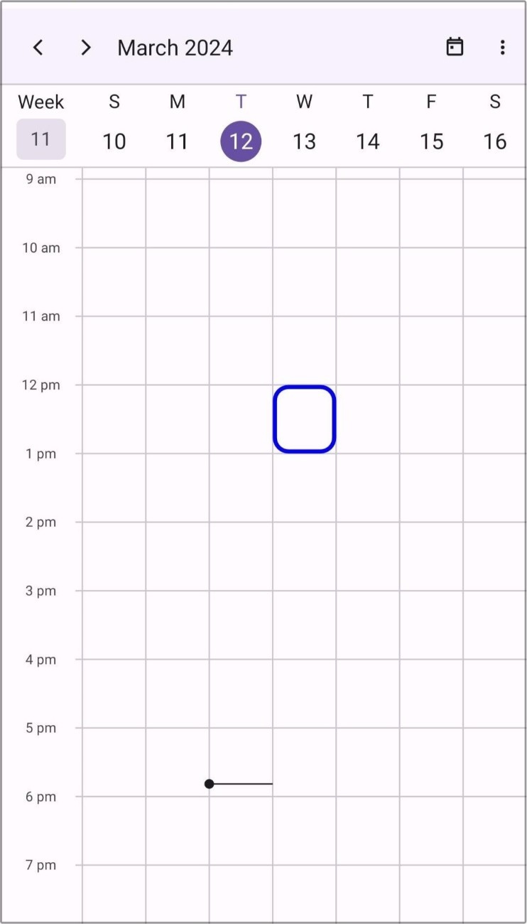
Corner Radius
The corner radius of cell selection view can be customized by using the CornerRadius property in the Cellselectionview.
<scheduler:SfScheduler x:Name="Scheduler">
    <scheduler:SfScheduler.CellSelectionView>
            <scheduler:SchedulerCellSelectionView  Background="Red" CornerRadius="2"/>
    </scheduler:SfScheduler.CellSelectionView>
</scheduler:SfScheduler>this.Scheduler.CellSelectionView.Stroke = Brush.Green;
this.Scheduler.CellSelectionView.CornerRadius = 2;
Stroke Thickness
The thickness of the selection view Stroke can be customized by using the StrokeWidth property in the Cellselectionview.
NOTE
The StrokeWidth is only applicable for the Stroke property.
<scheduler:SfScheduler x:Name="Scheduler">
    <scheduler:SfScheduler.CellSelectionView>
            <scheduler:SchedulerCellSelectionView  Stroke="Red" StrokeWidth="2"/>
    </scheduler:SfScheduler.CellSelectionView>
</scheduler:SfScheduler>this.Scheduler.CellSelectionView.Stroke = Brush.Green;
this.Scheduler.CellSelectionView.StrokeWidth = 2;
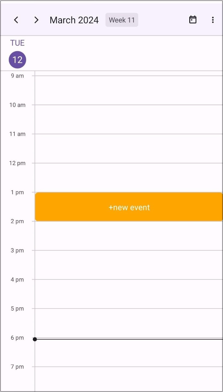
Template
The scheduler allows you to use the custom view as a selection view by using the Template property in the Cellselectionview.
<scheduler:SfScheduler.CellSelectionView>
    <scheduler:SchedulerCellSelectionView>
        <scheduler:SchedulerCellSelectionView.Template>
            <DataTemplate>
                <Button BackgroundColor = "#FF9800"
                        Text="+ Add event"
                        TextColor="White"/>
            </DataTemplate>
        </scheduler:SchedulerCellSelectionView.Template>
    </scheduler:SchedulerCellSelectionView>
</scheduler:SfScheduler.CellSelectionView>