Date Navigation and Restriction in .NET MAUI Scheduler
7 Jul 202612 minutes to read
Date navigation
The .NET MAUI Scheduler control allows to navigate through dates either programmatically or by using the forward and backward buttons, and it is applicable to all the Scheduler views.
NOTE
Touch gesture is not working, as framework is facing an issue
Programmatic date navigation
The DisplayDate property of SfScheduler programmatically navigates the dates in scheduler.
<scheduler:SfScheduler x:Name="Scheduler"
                       View="Week">
</scheduler:SfScheduler>
SfScheduler scheduler = new SfScheduler();
scheduler.View = SchedulerView.Week;
scheduler.DisplayDate = DateTime.Today.AddMonths(-1).AddHours(9);
this.Content = scheduler;NOTE
When navigating before a minimum date, the date will be reset to the scheduler minimum date, and when navigating beyond a maximum date, the date will be reset to the scheduler maximum date.
Programmatic date selection
You can programmatically select the dates in scheduler by using the SelectedDate property of SfScheduler.
<scheduler:SfScheduler x:Name="Scheduler"
                       View="Week">
</scheduler:SfScheduler>
SfScheduler scheduler = new SfScheduler();
scheduler.View = SchedulerView.Week;
scheduler.SelectedDate = DateTime.Today.AddHours(9);
this.Content = scheduler;NOTE
It is not possible to use the
SelectedDateto select before minimum display date time and beyond maximum display date time.
Programmatically change to adjacent dates
The next and previous views can be accessed through swiping the control from right to left and left to right. With SfScheduler, the view can be changed programmatically as well.
Forward
The SfScheduler allows to view the next immediate date using the Forward method. If the scheduler view is month, it moves on to the next month, similarly for week and day views it moves on to the next day.
<Grid>
    <Grid.RowDefinitions>
        <RowDefinition />
        <RowDefinition Height="30" />
    </Grid.RowDefinitions>
    <scheduler:SfScheduler x:Name="Scheduler"
                           View="Week" >
    </scheduler:SfScheduler>
    <Button x:Name="button" Text="Forward" Clicked="OnButtonClicked" GridLayout.Row="1" HorizontalOptions="FillAndExpand" VerticalOptions="FillAndExpand" />
</Grid>this.button.Clicked += OnButtonClicked;
private void OnButtonClicked(object sender, EventArgs e)
{
this.Scheduler.Forward();
}Backward
The SfScheduler allows to view the previous immediate date using the Backward method. If the scheduler view is month, it moves on to the previous month, similarly for week and day views it moves on to the previous day.
<Grid>
    <Grid.RowDefinitions>
        <RowDefinition />
        <RowDefinition Height="30" />
    </Grid.RowDefinitions>
    <scheduler:SfScheduler x:Name="Scheduler"
                           View="Week" >
    </scheduler:SfScheduler>
    <Button x:Name="button" Text="Backward" Clicked="OnButtonClicked" GridLayout.Row="1" HorizontalOptions="FillAndExpand" VerticalOptions="FillAndExpand" />
</Grid>this.button.Clicked += OnButtonClicked;
private void OnButtonClicked(object sender, EventArgs e)
{
this.Scheduler.Backward();
}Allow view navigation
By using the AllowViewNavigation property of the SfScheduler, you can quickly navigate to the respective day or timeline day view by tapping on the month cell or view header of the following scheduler views: week, work week, month, agenda, timeline week, timeline work week, and timeline month views.
<scheduler:SfScheduler x:Name="Scheduler"
                        AllowViewNavigation="True">
 </scheduler:SfScheduler>
SfScheduler scheduler = new SfScheduler();
scheduler.AllowViewNavigation = true;
this.Content = scheduler;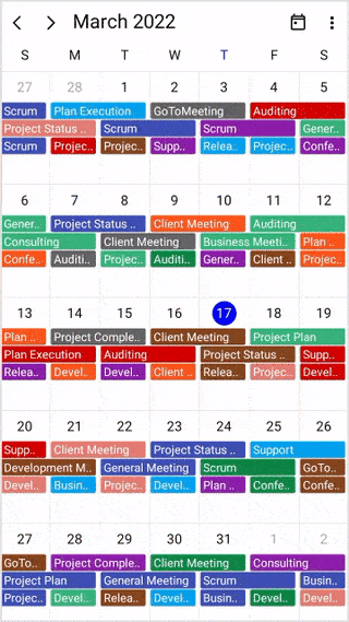
NOTE
- The default value of
AllowViewNavigationisfalse.- The
AllowViewNavigationis not applicable for thedayandtimeline dayviews.
Show date picker
You can enable the date picker for the scheduler by using the ShowDatePickerButton property in the SfScheduler, which displays the date picker in the header view. It allows you to quickly switch between, months, years, decades or century where you can directly jump to a specific date by selecting it from a date picker.
<scheduler:SfScheduler x:Name="Scheduler"
                       ShowDatePickerButton="True">
</scheduler:SfScheduler>
SfScheduler scheduler = new SfScheduler();
scheduler.ShowDatePickerButton = true;
this.Content = scheduler;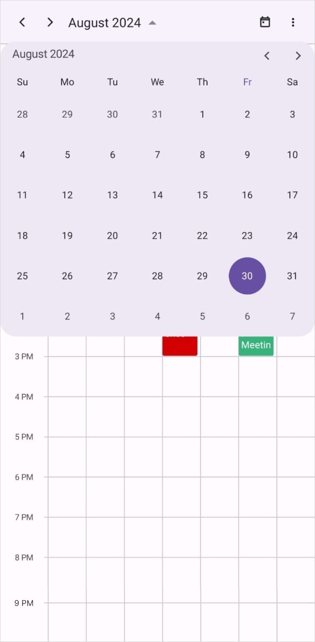
Add allowed views
The SfScheduler allows to quickly switch between the different scheduler views using the AllowedViews property. These views will display as a button in the scheduler header.
There will be more icons available for all platforms as this UI will be responsive.
The default value of AllowedViews property is SchedulerViews.Default.
<scheduler:SfScheduler x:Name="Scheduler"
                       AllowedViews="Day,Week,WorkWeek,Month,TimelineDay,TimelineWeek,TimelineWorkWeek,TimelineMonth" >
</scheduler:SfScheduler>
SfScheduler scheduler = new SfScheduler();
scheduler.AllowedViews = SchedulerViews.Day | SchedulerViews.Week | SchedulerViews.WorkWeek | SchedulerViews.Month | SchedulerViews.TimelineDay | SchedulerViews.TimelineWeek | SchedulerViews.TimelineWorkWeek | SchedulerViews.TimelineMonth;
this.Content = scheduler;
Change the visibility of allowed views
The SfScheduler allows users to toggle the visibility of the allowed views by setting value to the ShowAllowedViews. By setting this property to false, users can simplify the interface, making it cleaner and more focused, especially in scenarios where view switching is unnecessary. The default value for the property ShowAllowedViews is true.
NOTE
When ShowAllowedViews is
falsethe view navigation buttons in the scheduler header are hidden, but AllowViewNavigation still works for views added in the AllowedViews property. For AllowedViews is set toDefault, no scheduler view navigation buttons are added, so AllowViewNavigation does not work.
<scheduler:SfScheduler x:Name="Scheduler"
                       AllowedViews="Day,Week,WorkWeek,Month,TimelineDay,TimelineWeek,TimelineWorkWeek,TimelineMonth"
                       ShowAllowedViews="false">
</scheduler:SfScheduler>
SfScheduler scheduler = new SfScheduler();
scheduler.AllowedViews = SchedulerViews.Day | SchedulerViews.Week | SchedulerViews.WorkWeek | SchedulerViews.Month | SchedulerViews.TimelineDay | SchedulerViews.TimelineWeek | SchedulerViews.TimelineWorkWeek | SchedulerViews.TimelineMonth;
scheduler.ShowAllowedViews = false;
this.Content = scheduler;Enable or disable swipe navigation
The EnableSwipeNavigation property determines whether users can navigate between dates using the scheduler’s built-in navigation interactions. By default, EnableSwipeNavigation is set to true, allowing users to navigate using swipe gestures and the navigation buttons in the scheduler header. Setting EnableSwipeNavigation to false disables these navigation interactions.
<scheduler:SfScheduler x:Name="scheduler"
                       EnableSwipeNavigation="False"/>
SfScheduler scheduler = new SfScheduler();
scheduler.EnableSwipeNavigation = false;
this.Content = scheduler;
Date restriction
In .NET MAUI Scheduler, you can restrict the available dates to a range of dates using the properties MinimumDateTime, MaximumDateTime and SelectableDayPredicate. It is applicable to all the Scheduler views.
Change minimum display date and time
The minimum date time will restrict backward navigation of date selections as well as the ability to swipe the views beyond the minimum date range. Any dates that appear before the minimum date will be disabled. The default value of MinimumDateTime is DateTime.MinValue.
<scheduler:SfScheduler x:Name="Scheduler"
                       View="Week">
</scheduler:SfScheduler>
SfScheduler scheduler = new SfScheduler();
scheduler.MinimumDateTime = DateTime.Today.AddMonths(-3).AddHours(9);
this.Content = scheduler;Change maximum display date and time
The maximum date time will restrict forward navigation of date selections as well as the ability to swipe the views beyond the maximum date range. Any dates that appear after the maximum date will be disabled. The default value of MaximumDateTime is DateTime.MaxValue .
<scheduler:SfScheduler x:Name="Scheduler"
                       View="Week">
</scheduler:SfScheduler>
SfScheduler scheduler = new SfScheduler();
scheduler.MaximumDateTime = DateTime.Today.AddMonths(3).AddHours(12);
this.Content = scheduler;Selectable day predicate (Blackout dates)
The SelectableDayPredicate functions allows certain days for selection. Only the days that SelectableDayPredicate returns true will be selectable in the Scheduler.
<scheduler:SfScheduler x:Name="Scheduler"
                       View="Week">
</scheduler:SfScheduler>this.Scheduler.SelectableDayPredicate = (date) =>
{
if (date.DayOfWeek == DayOfWeek.Sunday || date.DayOfWeek == DayOfWeek.Saturday)
{
return false;
}
return true;
};Customizing the disabled date and time appearance
You can customize the background color and text style for the minimum date time, maximum date time, and selectable day predicate, by setting the DisabledDateBackground, and DisabledDateTextStyle properties of SfScheduler.
<scheduler:SfScheduler x:Name="Scheduler"
                       View="Week">
</scheduler:SfScheduler>
var disabledDateTextStyle = new SchedulerTextStyle()
{
TextColor = Colors.Red,
FontSize = 12,
};
this.Scheduler.DisabledDateTextStyle = disabledDateTextStyle;
this.Scheduler.DisabledDateBackground = Brush.LightSkyBlue;
NOTE
- The
DisabledDateTextStyleandDisabledDateBackgroundproperties will be applicable for the following properties such asMinimumDateTime,MaximumDateTime,andSelectableDayPredicateof theSfScheduler.- The
DisabledDateBackgroundproperty is not applicable for month cells and view header cells.